It’s movie award season and film buffs are eagerly awaiting to hear who will win Best Picture. But who will win for Best Poster Design? An iconic movie poster, when done right, can nearly outshine the film itself.
So what does it really take for a 27×40 poster to entice millions to sit through an hour and a half feature? A good movie poster design tells moviegoers everything they need to know – the movie’s theme, genre, storyline, etc.
Graphic designers use several techniques to creatively advertise a feature film.
- AIDA (Attention, Interest, Desire, Action) — Does the design attract and incentivize moviegoers to buy a ticket?
- Iconography — Does the imagery identify the main themes in the film?
- Style — Is the theme easily marketable across various mediums?
- Appeal — Does the movie look inviting to a broad demographic?
- Focus point — Does the design draw the eye to a central location on the poster?
- Typography — Does the typeface introduce the theme of the movie?
- Colors — Do the color choices give a clue to the genre?
- Space — Do the visuals and copy complement or overpower each other?
- Recognizable — Will the movie poster be recognized beyond the film?
The Overnight Prints Design Services team gives its Oscar picks on 2016’s most critically acclaimed motion pictures.
 Source: IMDB
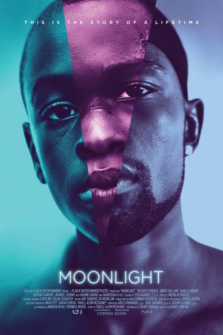
WINNER: MOONLIGHT (8.5 out of 10)
Moonlight is a visual and cinematic masterpiece. Its subtle blue and purple hues tell an entire story from a single headshot by transitioning moviegoers through the main character’s milestone phases from adolescence to adulthood.
Cindy – 9
Moonlight’s poster is extremely captivating. The use of image manipulation and the cool yet vibrant color palette really draws you in. The overall layout is clean, which is also appealing. While it is easily recognizable, I feel that it would benefit from some indication of the movie’ subject matter.
Nghia – 9
Very nice composition. I love the color choice and how the head is tilted to the side.
Pam – 8
I like the simplicity and light treatment creating a bit of dimension. Nice colors and clean. Shows struggle and phases of life…well, it does say “story of a lifetime”!
Boris – 8
Nice use of imagery. The ’80s color palette translates really nicely on this photo. The image has a lot of emotion and feeling. The type is nice and tasty.
 Source: IMDB
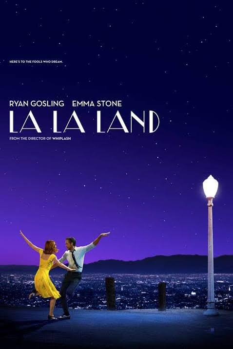
LA LA LAND (8.3 out of 10)
Moviegoers have gone gaga for La La Land’s jazz-themed musical. Its well-composed poster design does a lot with a little. The simple imagery perfectly balances three elements – brightly dressed dancers lit up by a single lamppost against a seductive violet Los Angeles cityscape. Add to it an art deco typeface, and La La Land is in the running for best movie poster of all time.
Nghia – 10
Beautifully stunning. Perfect visual flow from the title to the light pole and ended up with the actors. Great choice for a color palette. Perfect choice of typeface that really matches the whole Jazz theme.
Boris – 9
Nice poster. Good use of typography. Great photo that creates an area of focus. Although minimal, it has a lot of personality, and through the use of typography and imagery, it says a lot about the film itself.
Pam – 9
I love musicals, so this speaks to me. Love the colors and photo framing. Title is simple and not too much text. Only change I would make is bring in text from the left side in a little more…too close to left edge.
Brian – 5
A nicely executed photo composite and color scheme are the only elements that stand out for this nominee. The purple cityscape and subject matters in the foreground blend nicely together as the purple background and yellow dress the actress is wearing are complementary. Overall, the concept does little to demonstrate a theme or genre of the film. This poster design does appeal to multiple demographics, which is good. However, with such minimal content, it makes this poster easily forgettable.
 Source: IMDB
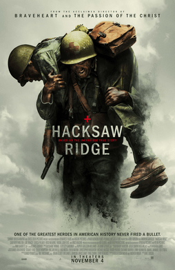
HACKSAW RIDGE (7.8 out of 10)
Hacksaw Ridge’s gritty art sets a somber tone for die-hard fans of action-packed battlefield scenes. In the midst of the poster is a central figure struggling to carry another across his back – a clear depiction of this war story about saving soldiers.
Brian – 10
By far one of the better concepts in comparison to the other movie posters for this year’s Oscar nominees. The billowing smoke in the background creates a natural frame for the strong image in the foreground. This helps draw the viewer’s attention to the most important element of the design – the title. The color and contrast as well as the powerful imagery help express emotion to the viewer, giving good insight as to what the overall theme of this film will be prior to stepping into a cinema. Well done.
Pam – 8
Beautiful art!
Nghia – 7
I have strong impression with this one. The cropped off legs of the carrier subtly boost the violence of war to a higher level.
Boris – 6
Very expected. Could be a poster for any war movie. The typography is nice and the color palette is appropriate. The overall execution is nice, but again, it falls into a realm of the expected, and so doesn’t do much for me.
 Source: IMDB
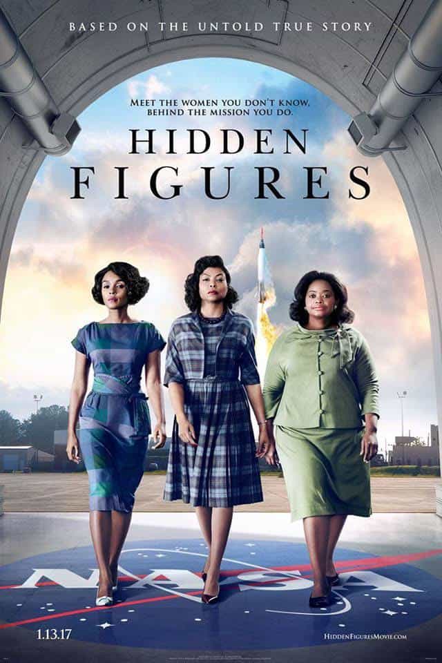
HIDDEN FIGURES (7.5 out of 10)
Hidden Figures brings forward its award-winning cast as a nod to the movie title. A NASA logo and rocket ship subtly placed in the background make apparent to moviegoers the brains behind its rocket engineering technology.
Cindy – 10
The design of this movie poster is spot on. The subject matter is concise and well balanced. The imagery and hierarchy of the information easily navigates the eye.
Boris – 7
Great movie. Too bad the poster doesn’t do it justice. Nice composition and framing, but it’s just so expected. This feels like a missed opportunity to make something really conceptual. Overall nice but could have been great.
Pam – 7
Art speaks well to the movie! Nice alignment and title.
Nghia – 6
Nice composition, very balanced and well made. If only I could change the color of the dress of the lady on the left to something else, it could be less blueish dominant in here. I feel like there could be a better choice for the typeface.
 Source: IMDB
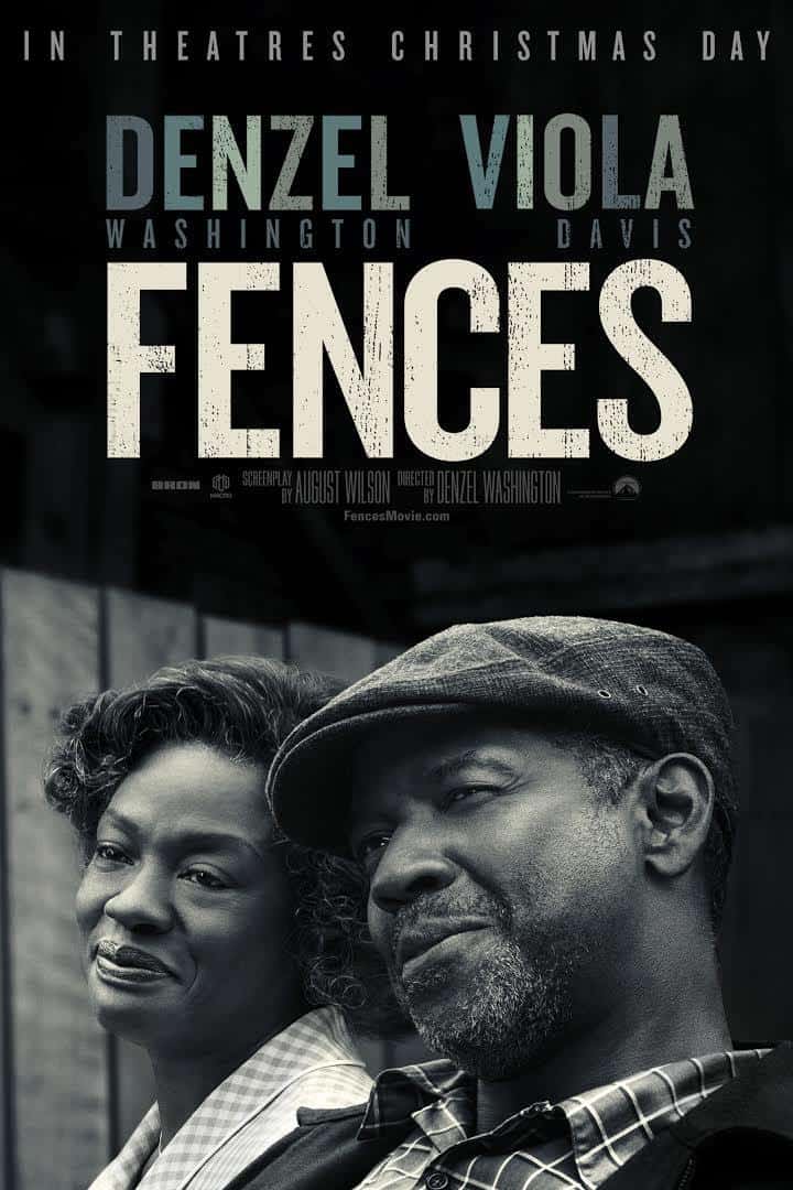
FENCES (6.3 out of 10)
Fences, a film adaptation of an American play by August Wilson, isn’t really about fences (notice it is blurred and buried in the background). This poster design hits the nail on the head with the actors’ names in large, colored marquees against a black and white image.
Pam – 8
Love the black and white photo with the bold type and matching color treatment in the actors’ names. Mostly good typography; her last name is bothering me on right alignment. Simple, bold – shows feel-good movie.
Boris – 8
Strong poster. Beautiful B/W image with a great typeface combination. It’s nice to see the characters not looking at the camera. It is strong, bold and captivating. Good execution.
Nghia – 7
Visually beautiful. The characters, typefaces, color schemes work well together. The characters both not looking at something out of the canvas is the anchor point of the whole poster.
Cindy – 2
This is my least favorite of them all. While simplicity is admirable, this poster is pretty lackluster. Based on the previews, this appears to be an emotional film, and I wish that the poster design would have been more reminiscent of that. It isn’t memorable and doesn’t cause the viewer to gravitate towards the film.
 Source: IMDB
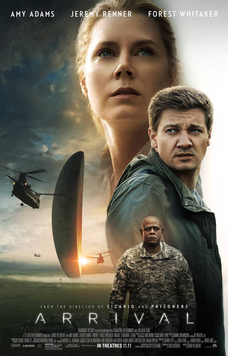
ARRIVAL (5.8 out of 10)
Arrival is a sci-fi thriller whose poster design is less than scintillating. Staggering the stars in varying sizes unnecessarily overpowers half the poster, and forces moviegoers to search for the film’s meaning (not to mention the title).
Cindy – 8
This design strikes a nice balance. The imagery is interesting and piques the viewer’s curiosity. The type is set in a sensible manner that doesn’t detract from the focal point.
Boris – 5
Great movie, but the poster suffers from every Hollywood poster cliché that exists. The stars’ photos at different sizes, the image in the back kind of Photoshopped and fake looking. The typography, although nice, is a bit uninspired. Nicely executed, but a lack of idea.
Nghia – 5
I don’t understand the white space on the right side of Amy, it seems like a mistake. If we can move the helicopter down to the bottom, it would create a better visual flow.
Pam – 5
Actors are recognizable at first glance. Title treatment and vague images in the background makes me think of a “UFO” type of movie. Title does not stand out well.
 Source: IMDB
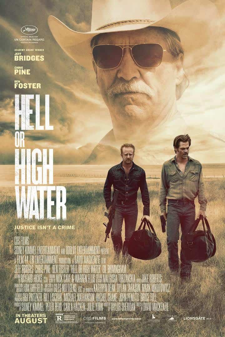
HELL OR HIGH WATER (4.8 out of 10)
Hell or High Water’s use of hazy colors does well to depict modern-day outlaws in West Texas. But the barren desert scene gets overrun by an excessive amount of credits in an all-too-predictable typeface.
Brian – 7
This has a fairly even amount of pros and cons; however, the poster design is well-formatted. The balance between negative/positive space was executed perfectly when fitting all of the body content and movie title into this design. The designer picked a good and simple typeface for the title – thin yet bold enough to see from a distance and not too overpowering. The design as a whole is visually appealing but lacks much needed color and contrast with these dull color choices. The muted color scheme does help give off a sense of emotion, though it seems that the overall look and feel of this poster would not cater to all demographics.
Pam – 5
I saw this movie and the dull art matches…very open desert movie. Too much text!
Boris – 4
Ughhhh. Can you say too much stuff going on? Is that how the movie is? I mean, a cliché image and cliché typographic configuration. Nothing creative here.
Nghia – 3
A jungle of text, and the condensed typeface makes it even worse. The title and credit are both screaming, “Guys, stay away from the characters.”
 Source: IMDB
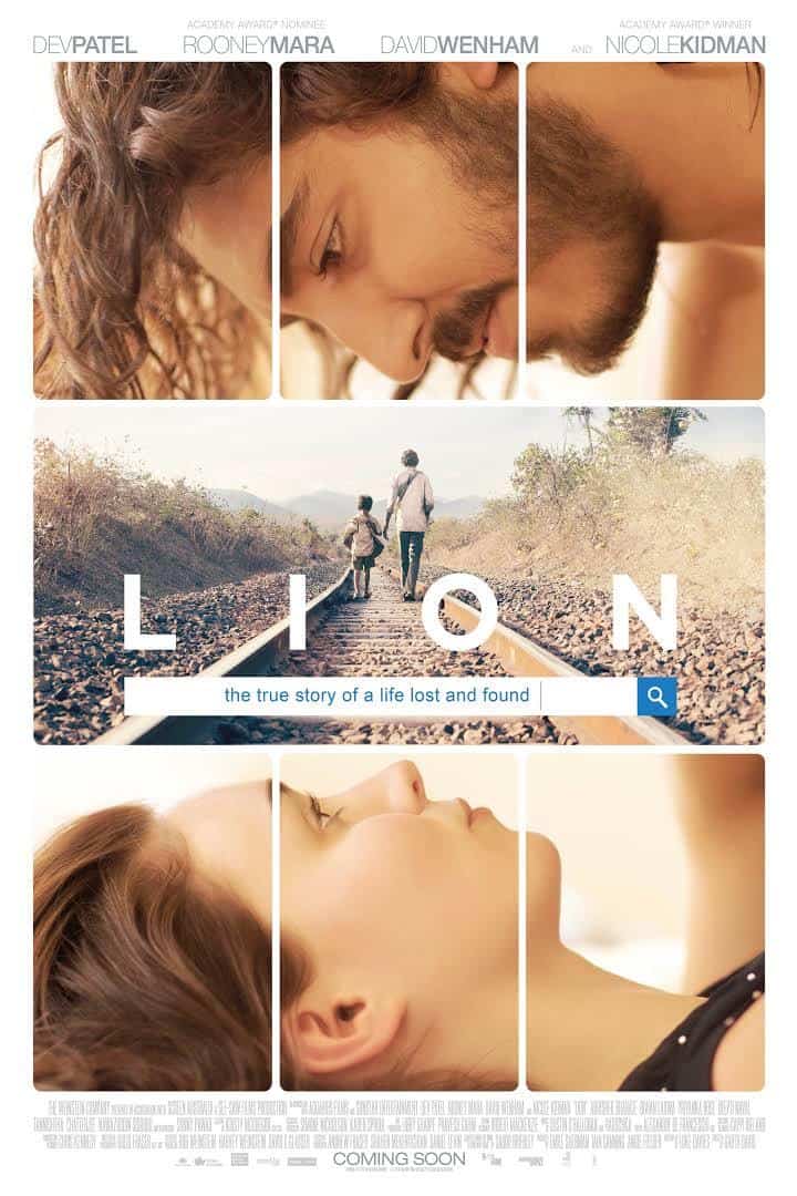
LION (4 out of 10)
A young Indian boy isn’t the only thing that gets lost in Lion’s poster design. The oddity of the retro layout does more to baffle than entice for the emotionally charged drama. Divided between the couple and the train tracks, moviegoers completely lose sight of the awkwardly placed search bar containing the subtitle.
Pam – 5
Looks like a foreign film. Old school movie poster treatment with actors at top and info on bottom. Art does not tell me anything about the movie. Not sure what the hovering creepy guy and girl have to do with the middle image.
Boris – 4
Well, we have all seen this kind of thing before and it was not impressive then. Kind of boring and doesn’t say much about the film.
Nghia – 3
Totally have no clue what is going on with this movie. A search bar and a train rail do not get along well in this composition, and the scene with the two characters looking at each other is kind of creepy. I’m not sure if I would watch this movie even if I were on a 5-hour long flight and had nothing to do.
 Source: IMDB
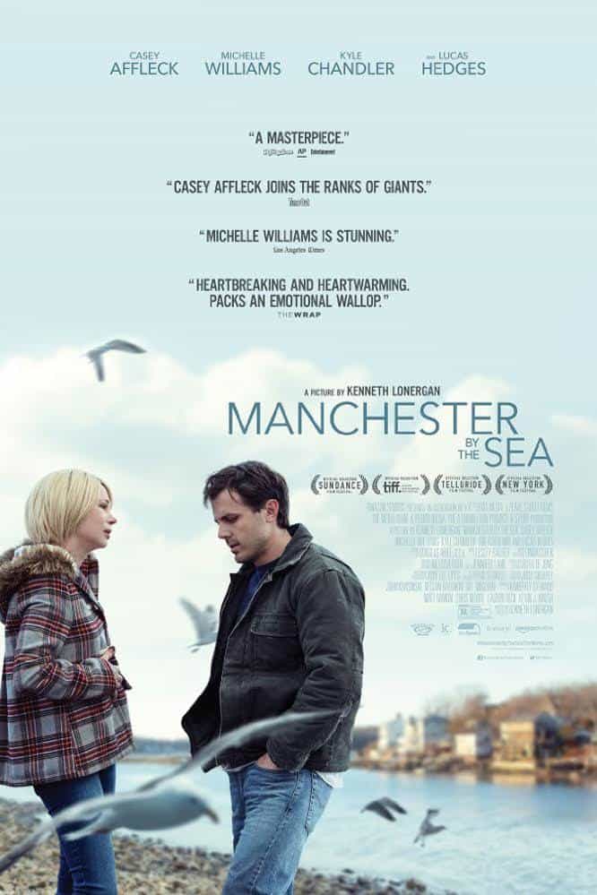
MANCHESTER BY THE SEA (3 out of 10)
The majesty of Manchester by the Sea dies along with the character’s brother. The mismatched text treatment takes away from the quiet simplicity of the image that would have shone a brighter light on emerging movie star Casey Affleck.
Cindy – 3
While the imagery utilized is nice, the way the rest of the information was placed makes the overall design appear discombobulated. While I can appreciate aligning the information to the man’s silhouette, the abrupt change in alignment does a definite disservice to the design’s composition.
Pam – 3
Heard this is supposed to be an amazing movie and it screams LOW BUDGET with that layout. Image wouldn’t be that bad but type all over with no alignment kills it. A mess!
Nghia – 3
Scattered texts + flying seagulls tear the whole composition apart. Meh.
Boris – 3
Meh.
To schedule a consultation with an expert graphic designer, visit
Overnight Prints Design Services.