I want to talk about the importance of selecting the right fonts today, and offer some tips for making your selections. But first. . .an activity to try!
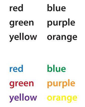
Read the following two lists of words quickly, without making any mistakes:

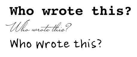
Did you find yourself delayed in reading the list in the second example? This activity is borrowed from a classic psychology experiment to demonstrate the influence of a competing visual element (color) on the comprehension of words. So why am I showing it here? Imagine instead of color, the variation is now the shape of the letter forms. It’s not difficult to imagine that similar to this experiment, fonts can influence the meaning we pull from a block of text. Here’s another example. What does the font choice for each sentence say about the speaker?

When I view the three samples, I imagine the speaker of the first sentence to be a writer or literary type, the second to be an elegant older woman, and the last to be a man—probably a creative type, and in his mid twenties.
You may be thinking that my characterization is grossly stereotypical. And you’d be right. But that’s how our brains work. Lacking complete information, we base initial judgments on the information that’s given, modifying our perceptions as more information becomes available. It’s a sort of shortcut for making sense of the world as quickly as possible so we’re able to react as needed.
So back to the issue of fonts. Hopefully I’ve impressed upon you that the selection of fonts influences the viewer’s perception and even comprehension of words and who is speaking them. The bottom line? Be deliberate in your font selection. Here are some tips:
1) Look beyond your computer’s installed fonts. Limiting your selection to fonts that are installed on 90% of all computers runs the risk of presenting a message that is cliche and unimaginative. I’ve seen headlines in Papyrus for everything from Christian rock bands to homemade candles. Can one font really be right for so many disparate products? Looking beyond your computer’s installed fonts will free you to find THE ONE font that really conveys the message of your brand.
2) Use a font manager to browse fonts. My favorite program is Extensis Suitcase. You can type in a word or phrase and see how it will look as you scroll through fonts you have loaded on your computer. Or, you can narrow your search to a specific font attribute (serif, sans serif, decorative, script, and more!). You can also create and save font sets for different projects to keep track of fonts you find along your search. Using this program broadens your search beyond the highlight-text-in-Word-and-select-a-font-from-the-pulldown-menu approach.
3) Consider readability. Yes, Zapf Chancery is a lovely font selection for designing a wedding program. But NO, Zapf Chancery is not ideal for large blocks of text. Save Zapf Chancery for headlines and use a less-embellished font for the main content. A good general rule: for reading large blocks of text, you want to notice the content before you notice the letter forms. Save the very decorative fonts for headlines, logos, or artful applications.
4) Consider historical references. Fonts have deep ties to historical periods that should be considered when selecting a font. For example, Blackletter fonts are based on hand calligraphy of the late medieval period. There are Art Deco fonts, Art Nouveau fonts, fonts associated with the first books, WWII propaganda posters, 1950s children’s books, modern fonts, Psychedelic fonts, and much more! Be intentional about the history you evoke when selecting a font. Understand who created the font and why before you use it. Or, if you plan to reference an historical era, look at examples of printed pieces from that time. A good reference is The History of Graphic Design, by Philip Meggs.
5) Check out these fun resources. Here are some of my favorite fonts sites to check out, with varying prices:
FontShop | Find, Try, Download Fonts
Emigre Home
Emigre, Inc. is a digital type foundry, publisher and distributor of graphic design related software and printed materials based in Northern California. Founded in 1984, coinciding with the birth of the Macintosh, Emigre was one of the first independent type foundries to establish itself centered around personal computer technology.
T.26 Digital Type Foundry
Letterhead Fonts: Rare and Unique Typefaces for Artists
P22 type foundry | Foundry | FontShop
Underware fonts
Underware is a (typo)graphic designstudio which is specialized in designing and producing typefaces, which are published for retail sale or specially tailor-made.
Fontifier – Your own handwriting on your computer!
Your own handwriting on your computer!
WhatTheFont : MyFonts
Download fonts for Mac and PC at MyFonts, the world’s largest collection of fonts online.
TYPE Hoefler & Frere-Jones | Online Catalog
Welcome to Phil’s Fonts
Terminal Design
Our Favorite Fonts of 2005 Part 1 | Typographica
A daily journal of typography featuring news, observations, and open commentary on fonts and typographic design.
Wood Type
Dafont.com
Chank Fonts
Veer
Above all, remember that fonts are as much a graphic element in your layout as any image, color, or shape you place there. Carefully selected fonts will make your design stand out and send a visual shortcut the viewer about the content within.
___________________
Katrina Hase is principal and creative director at Mix Creative, a Twin Cities graphic design, marketing and advertising firm. Follow her superbly helpful and informative design blog.


3 Comments
Cool, there is actually some great ideas on here some of my subscribers may find this relevant, I will send them a link, many thanks.
Good article on your site, too.
You’ve made some really good points there. I checked on the internet to find out more about the issue and found most individuals will go along with your views on this web site.