When Avatar, the biggest grossing movie of all time was released, graphic designers were in an uproar. They despised the font that director James Cameron had chosen for the subtitles (Papyrus). Can you imagine that fonts can impact sales? Overnight Prints decided to test this phenomenon:
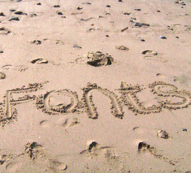
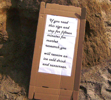
We tested this theory in focus groups and at the beach, using sandwich boards and sunscreen. The photos above show glimpses of our market research team in action.
- We went to the coastlines of Southern California with four sandwich boards in tow.
- Each board contained the same generic printed message, offering free sunscreen and soda to anyone who read the message.
- Each board was printed in a different font. We tested Helvetica, handwritten, retro and gothic.
- We sat back and observed which board lured the most visitors.
More than 65% percent of the beach-goers were allured by the board with the retro font.
Every target market is different. We learned that fonts are powerful, and can have a huge impact on sales. The web is loaded with articles about proper font selection.
There are even guides about the most loved and most hated fonts.
Don’t make the same mistake James Cameron made. Test your fonts! There is no perfect font for everyone.
Courtney’s Action Items:
- Print a simple message about your product, or use an existing caption. The message should be one to three lines long.
- Print the message on four sheets of paper. Use a different font for each. Experiment with diverse styles. For example try these four: handwritten, artsy, conservative, and gothic.
- Ask five of your customers/friends to look at the flyers for a few seconds each.
Ask these questions:
- Which one stands out and why?
- Which one is the most credible? Why?
- Did any fonts instill a particular feeling? If so, what?
Integrate the feedback into your next postcard marketing campaign. Compare the results with a previous campaign.
See what people had to say about why they chose the old fashioned looking font:”
By:Courtney Knapp

