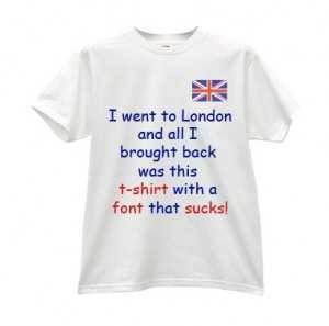
Being a design and marketing professional for a fair few years now, I feel reasonably justified in presenting you with my personal list of truly dreadful font ch
 oices.
Personally, I find these fonts utterly detestable and I cringe every time I see them being used. If you regularly use these fonts then my advice is to STOP using them! I am not in the minority in my condemnation of these typographical eyesores!
1] Hobo
It’s ugly, fat, and dumb! You might be forgiven for using this font to advertise your children’s party business, or if you sell balloons for a living, but in almost any other circumstances it’s a bad font choice!
Unfortunately, I tend to see this anywhere where people want to “force” fun into their designs or literature. I can’t tell you how many times I’ve seen this font advertising a company party or get-together! Grown people (unless they’re raving lunatics) should not be using this childish and slightly manic font.
Hobo is not fun! It is a silly font!

2] Viner Hand ITC
This typeface is a sharp and pointy cursive-style typographical nightmare (based on Viner’s own handwriting). It’s the typographical equivalent of a misunderstood, stroppy teenager who wishes to appear deep and poetic!
If you’re under the age of 16 and a fan of the twilight movies, then feel free to use this whenever and wherever possible (I’m sure you already do). Everyone else should stay well clear!

3] Vivaldi
The age of romance is never dead as long as someone is using Vivaldi to signify true love! This larger-than-life, foppish-dandy of a calligraphic font just loves to be surrounded by love-hearts , sparkles, white roses, and all other Gordy graphics.
Please people! This Valentines Day, DON’T use Vivaldi! There are so many great typefaces that could replace it as a font to display beauty and sophistication. Personally, I don’t much like calligraphic-style fonts but I have used Aquiline before for a wedding invitation design.

4] Tekton Pro
People talk about how much they dislike Comic Sans – the most popular cheap and cheerful font in the world (there are even websites devoted to it’s use/misuse.) However, I think that Tekton Pro, its slightly more serious handwritten brother is slightly worse! It’s just awful!
Unlike Comic Sans, it is less “jokey” in it’s longer and more upright appearance but it has these really funky “blobby bits” all over it to signify the beginning and end of a pen-stroke! It believes that it’s fun, confident, and cool. Unfortunately, Tekton Pro is more like some aging hipster from the seventies who still thinks that he looks good wearing a 100% polyester shirt and sporting long, balding hair!

5] Algerian Mesa
Oooh! Algerian! You enigma! You’re not from my world and I don’t quite understand you? Every time I see you I’m transported to a world of magic carpets, belly dancers, sultans, and magic lamps! I’m confounded by your clumsy serifs and your “mysterious” and “evil” drop-shadow that causes dizziness and nausea if looked upon for too long!
Used frequently by carpet wholesalers and stores that sell bargain ornaments and oddments – not to be used in ANY serious design work EVER!!!

6] Papyrus.
An immensely popular typeface that’s seen everywhere from Christian rock band covers, to the latest blockbuster, Avatar! It seems to me that anytime someone wants to illustrate “ancient wisdom” or “new age’iness”, they dust off Papyrus as their font choice!
Maybe it’s because I see it used so often that I dislike it so much, but it’s probably more to do with the faux distressed and slightly “gimmicky” quality! If you want to illustrate “age” or “wisdom” with your font choice, there are far better fonts available to you (check out some of the Roman and Gothic fonts in dafont for some “ancient font” inspiration)

7] Jokerman!
Not much I can say about this fun, fun, fun font! Jokerman is a wild and crazy fool! Unless you are a company that sells 12-gallon party packs of salsa, you shouldn’t be using it!
It’s a typographical abomination!

8] Brush Script
This is my all time most hated font! I can’t even stand to look at it. If Vivaldi is the king of calligraphy fonts, Brush script is its monstrous and more powerful sibling that is kept chained-up in the basement!
I see it used all the time and it bugs the heck out of me. It’s so badly designed – the fat, short, inky lines that don’t possess any style or grace. It’s supposed to represent a loose, bold, readable, handwritten style of calligraphy! Unfortunately, all those elements have combined together to spawn a monstrous font!
My advice is that you never ever, ever, ever, EVER use this font…for ANYTHING!!! (and don’t use it’s sportier but just as hideous twin-brother “Mistral” either)

There are many other fonts that I find unbearable but I think that my list is complete (for now). I would love to hear your thoughts on these worst font choices! Maybe you have your own list, or maybe you would like to defend one of these fonts! It’s just design. It’s all entirely subjective!


20 Comments
I do use Vivaldi, Tekton, Hobo & Papyrus — but only on freelance work (wedding invites & showers, baby showers and kids birthday party invites). I would never use any of these on a professional layout or marketing piece though! Vivaldi’s caps make for great wedding monograms. I have to use papyrus VERY sparingly, along with Zapfino, because I’m getting sick of them.
I am with you on the NEVER, EVER for Brushscript, ComicSans, Viner & Jokerman though. lol
It all sounds good but how is everything related together?
Papyrus is definitely the most over used font of all time. I wish it would go away. Comic Sans and Hobo would get my vote for second and third worst fonts.
Agreed but you didn’t go far enough. I hate ALL fonts and have refused to use ANY of them until someone shows me that they have created one that can be utilized for every occasion. So until then I will not use any font and I hope you will all join me in this. It is the only way things will improve. Hope and change.
I am embarrassed to say that I found this site while searching for a place to download Tekton (it seems to be missing from my current computer). But your article begs the question — what would you recommend as a replacement for all of these?
Don’t feel bad about liking Tekton – I’m sure there are millions of designers out-there who use it and love it! I just don’t like it! I don’t like handwritten fonts in general. I looked in my fonts folder and found this one: http://www.urbanfonts.com/fonts/Journal.htm (although I can’t remember ever using it)I’m not wild about it but I think it’s a far better font than Tekton!
That’s hilarious lol
http://www.etsy.com/shop/skittlesrtasty
I’m a fan of everything related to typography, I’ll be sure to come back later
I agree that Papyrus is way over used and abused. It’s like a bad low-budget bulletin header that won’t leave.
hey this blog is great. I’m glad I came by this blog. Maybe I can contribute in the near future. PM ME on Yahoo AmandaLovesYou702
[…] to being a creative way to present your text, various fonts convey various ideas and attitudes.ABOMINABLE FONT CHOICE! My list of dreadful Typography …ABOMINABLE FONT CHOICE! My list of dreadful Typography! February 9th, 2010 by Ben … font to […]
thank you for posting are there feeds to your blog? I’d like to save them
Ha! I loved this post. I have to say, the two fonts that I really would die before using are Papyrus and Jokerman. Ok, 3 – Comic Sans. Did you know there is a font called “I hate Comic Sans”?
I think the fact that most of the fonts that you mentioned are overused is the thing that I hate most about them. I was so happy when I talked a client of mine out of using Papyrus for the logo for her new line of cosmetics. I explained to her that it’s a trend, and in two years it will be dated (in my opinion it already is)! And it drove me crazy to see Papyrus in “Avatar”!
One thing about design that I think is crucial is that you have to go beyond the surface and find something unusual or unexpected. Using one of the above fonts is almost like using clip art. It’s not original and you see it everywhere, so it’s that much easier to get overlooked..
I get excited when i receive wedding invitations. sometimes i also make customized wedding invitations.,*”
There is obviously a lot to know about this. I think you made some good points in Features also. Keep working, great job!
I really enjoy reading your article. I shall give notice your web site to my facebook and twitter friends. Thank you for the solid post.
I couldn’t agree with you more about Brush Script. That font is an abomination!
I had no idea this was such an issue! I stumbled upon this as I was researching, and I am honestly cracking up. Fonts are so much fun to play with, the more different the better. There’s so many that are so similar, the difference can’t even be seen. Ah this world amuses me so, the things that are taken so seriously. To passionately hate a typeface…lmfa right o.
I want to point out my affection for your kindness in support of those who actually need guidance on the area. Your special commitment to getting the message around became extraordinarily functional and have usually encouraged women like me to attain their desired goals. Your amazing useful guideline entails a great deal to me and substantially more to my office colleagues. Many thanks; from each one of us.
Thank you so much for reading! Please make sure to bookmark our blog for future blog posts 🙂