Breathe in, breathe out. Ahhh. When there’s balance and order, one feels complete and at peace. In yoga, poses completed on the right side must also be repeated exactly on the left. In art and design, visual balance is achieved by organizing elements to feel equal, either in weight or direction.
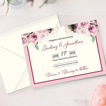
Formal events, like graduation announcements and wedding invitations, are denoted by a balanced print design. During the ceremony, a procession of pairs walk up a center aisle, then split to flank the stage or the happy couple. Graduates and wedding parties are divided evenly to create uniform rows on both sides, adding a sense of prestige to the event.
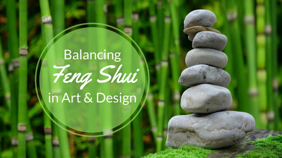
Feng shui is a practice for harmonizing your energy with your surroundings. To bring about the most positive flow of energy, objects in the home and office space are usually arranged accordingly to harness its chi and repel negative energy. This concept can be applied to art and design.
Well-balanced designs feel more comfortable and can be studied more clearly. An imbalanced composition feels less harmonious and could leave some parts to be overlooked. Visual balance is typically achieved by equally distributing elements, space and color. To begin, one must understand the two principles that influence visual balance – visual weight and visual direction.
VISUAL WEIGHT
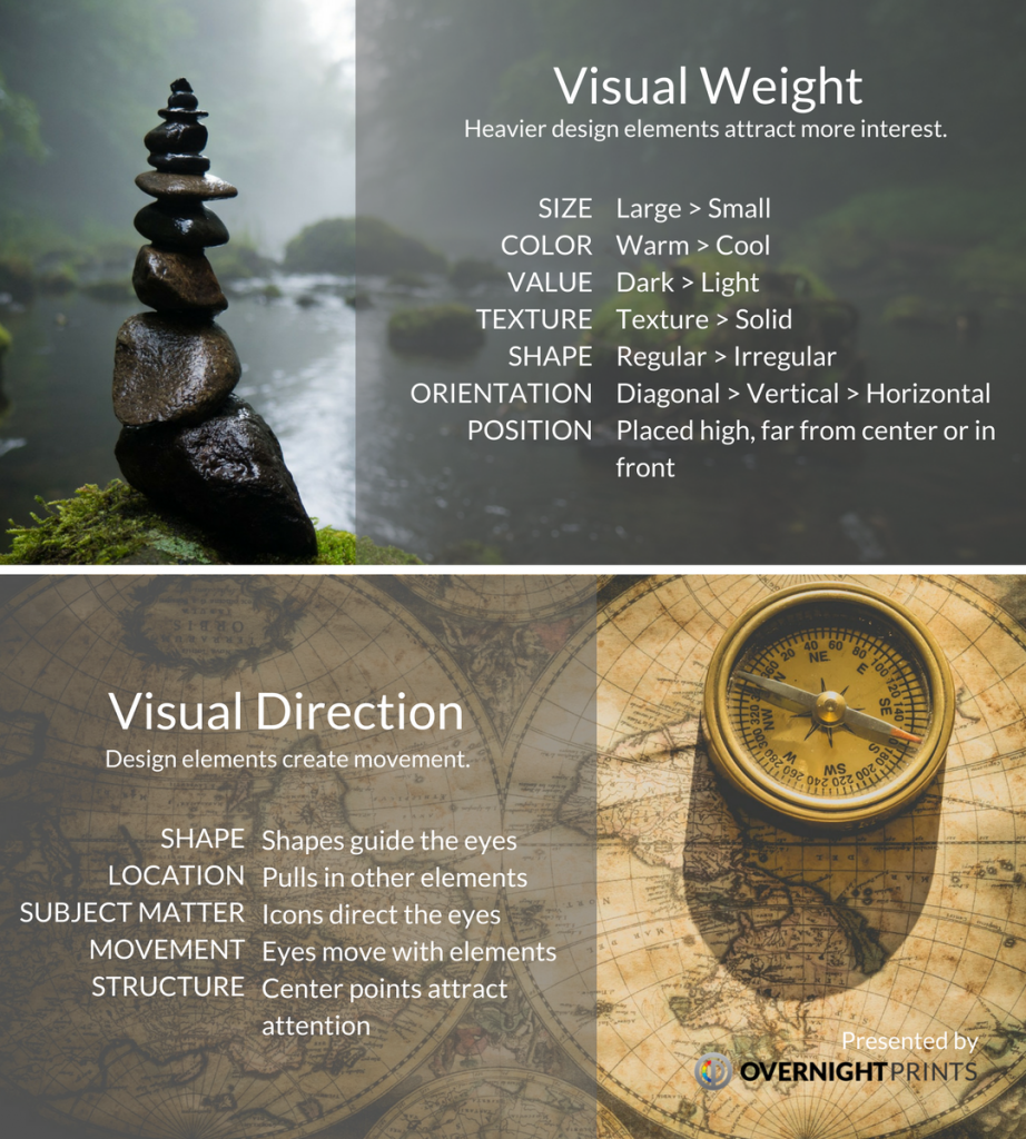
Visual weight measures how much the eye is drawn to a particular element. The heavier the element appears in weight rather than size, the more it attracts the eye. To put emphasis on a particular design element, consider these characteristics for creating contrast.
- Size: Making one element physically larger than another attracts more attention.
- Color: Warmer colors bring elements to the foreground. Red is the heaviest color, yellow is the lightest color.
- Value: Darker elements carry more weight and create more interest.
- Position: Elements placed higher in a composition, farther from the center or in the foreground are more intriguing.
- Texture: Three-dimensional texture adds an appearance of mass and actual weight to an element.
- Shape: Regular shapes seem heavier than irregular shapes.
- Orientation: Diagonal elements carry the most weight, then vertical elements followed by horizontal ones.
Keep in mind that visual weight is based on a combination of these characteristics.
VISUAL DIRECTION
Visual direction is the perceived direction that an element seems to move. Design elements have a way of leading the eye from one point of interest to the next. To create movement, adjust these characteristics to suggest the direction of an element or overall composition.
- Shape: Elements create an imaginary parallel axis that guide the eye in the same direction.
- Location: An element can pull other elements in the same direction.
- Subject matter: Directional icons lead the eye a certain way – up, down, left, right, etc.
- Movement: The way an element appears to move will also move the eye in that direction.
- Structure: The eye is naturally drawn to the center points of a composition.
VISUAL BALANCE
There are three main types of visual balance: symmetrical, asymmetrical and radial.
1. Symmetrical Balance
Draw a line down the center or across an art piece or design. If the image looks like it is repeated on both sides, this is symmetrical or formal balance. The visual balance can be vertical or horizontal for an identical or nearly identical set of elements to appear stable and orderly. This is mostly seen in institutional architecture, like government buildings or museums.
The Chicago state flag has two light blue bars running horizontally on a field of white with four six-pointed red stars in between representing different historical events. Adopted in 1917, the flag can be divided down the middle or across for a perfect match on either side for symmetrical balance.
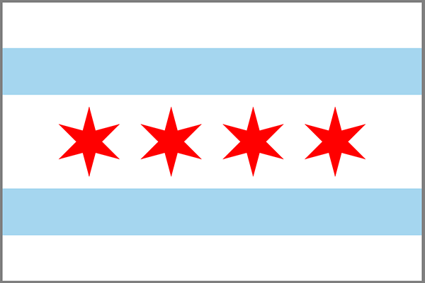 The Chicago state flag, bearing two blue bars and four red stars, is symmetrical both vertically and horizontally.
A bilateral symmetry occurs when there is a mirror image on either side of the central axis or even multiple axes. Think of perfectly matching butterfly wings or a snowflake’s pure reflection symmetry in all directions.
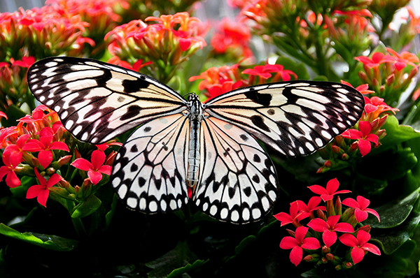 The pattern and coloring of butterfly wings are exactly the same on the left and right sides.
2. Asymmetrical Balance
Asymmetrical balance is when two unequal elements look balanced. This abstract technique is more difficult to achieve than symmetrical balance. The tension from the imbalance draws the eye to “heavier” elements first. But offsetting two dissimilar elements actually evens them out in an unstable, yet still balanced, composition.
When England and Scotland came under the same monarch in the early 1600’s, King James VI commissioned a British flag with the combined crosses of St. George and St. Andrew. Since the diagonal red bars do not align across the center, they are asymmetrically balanced. The placement of the bars also determines the orientation that the flag must be flown. The diagonal red bars closest to the hoist must run beneath the broad white stripes.
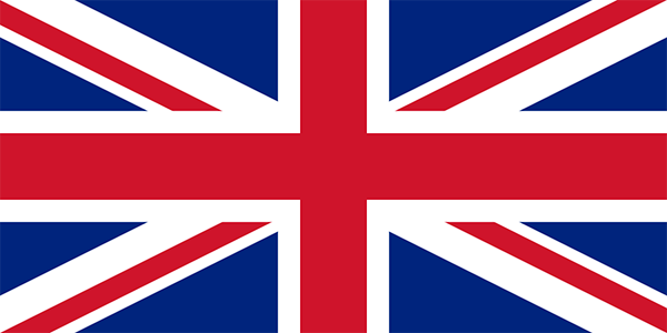 Britain’s Union Jack flag is asymmetrical due to the slightly offset pinwheel.
The flag looks well-balanced, but upon closer examination, is slightly offset in a pinwheel pattern that creates an asymmetrical balance.
3. Radial Balance
When elements seem to radiate from a center point, this creates radial or rotational balance. The eye not only travels from the main focal point to the edges, but also inwards toward the middle. Elements aren’t necessarily equal in size or spacing, but the composition is a circular shape. Examples in nature include the petals of a sunflower.
After facing opposition from Greeks for flying a flag bearing the Vergina Sun, a symbol Greece wanted to claim as its own, the Republic of Macedonia redesigned its flag in 1995 to a bright yellow sun in a field of red. The eight sun rays radiate from the center to create radial balance.
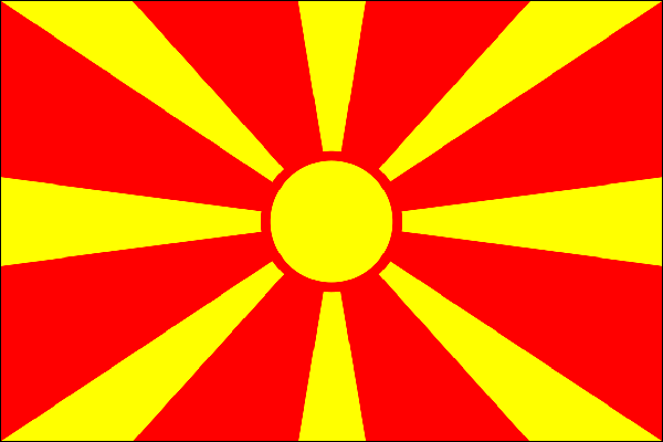
A yellow sun against a red background represents the Republic of Macedonia.
Each ray tapers outward to the four corners and four sides of the rectangular flag. The large yellow circle in the center serves as an anchor point that creates a circular design.
4. Mosaic Balance
Also called allover or crystallographic balance, this technique is based on repetition. Design elements are consistently repeated in similar colors, shapes or sizes, and appear uniform throughout the composition. Although this type of visual balance does not generally have a central focal point, the organized mess is pleasing to the eye.
The American flag, also known as The Stars and Stripes, consists of two patterns. A blue block in the upper left corner contains 50 white five-pointed stars representing the 50 states while 13 red and white alternating horizontal stripes stand for the original founding colonies.
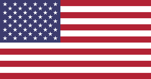 America combines two repetitious patterns with its 50 stars and 13 stripes.
Separately, the two designs have no similarity aside from the common use of white. However, each repeated pattern is uniform and well-spaced, making the pairing agreeable in a mosaic balance.
Well-balanced designs are aesthetically pleasing to the eye and attract the viewer’s attention. Apply these principles to a composition to create a sense of Zen in art and design.
For expert help in achieving visual balance in print design, consult with Overnight Prints Design Services at designservices@overnightprints.com.