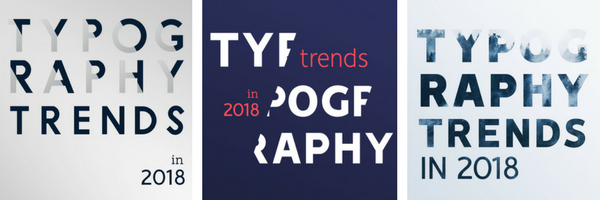
If you consider yourself a trendsetter, you need to know the latest typography trends predicted to take over in 2018. Undoubtedly making their way into print and digital marketing this year, a few are classic throwbacks while some are taking leaps forward.
First lesson: What is typography? Its basic definition is the visual art of the written word. One may argue that words are words are words, but presentation, either spoken or in writing, can actually define what is being communicated.
Typography attaches emotions to the written word. For example, cursive script raises the elegance of a brand or event, and it requires the careful study of each letter. Sans serif, on the other hand, is considered casual and youthful, and is typically used for road signs for quick legibility.
Different treatments of the same words can take on different connotations and achieve different marketing goals. Whether designing for a web page, printed signage or book cover, etc., consider a few key principles when selecting typography.
- Font size is not created equal. The same pixels in one font is not the same in another because this value only measures the box in which the type will live. This also applies to the spacing between lines and characters. Base the font size on the typeface rather than the point value.
- Adjusting spacing is relative. Consider proportionality when playing with values for font size, letter spacing and line height. For example, letter spacing for different font sizes will not be the same value between a smaller font size and a larger one, which may need tighter letter spacing.
- Screen sizes are the long and short of it. Lines need to be defined with a minimum length, maximum length and line breaks as needed, or else readability is affected when jumping between a desktop and mobile device, such as a laptop or smartphone.
- Bow down to hierarchy. Organizing text by function or in order of importance also determines its font size, placement and treatment. For example, header text is typically the largest body of text on a page, is placed at the top and can be more decorative in design. For legibility, navigation menus and body copy are kept simpler and consistent to guide readers.
Follow these easy step-by-step tutorials to recreate the latest typography trends for yourself, which include a few pro tips and keyboard shortcuts.
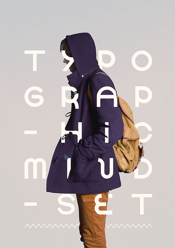
#1 Cropped Typography
Coming in hot from 2017 is cropped typography where parts of letters are erased but still readable. This requires the reader to fill in the rest of the letters, seemingly placed in front of or behind the subject matter, with their imagination. Graphic Mama says retaining legibility with this technique takes a truly creative mind to achieve.
TUTORIAL: Cropped Typography
- In Adobe Photoshop, open a background image.
- Select the entire image (Ctrl+A), copy (Ctrl+C) and then create a New Document (Ctrl+N).
- Paste the copied image into the new document (Ctrl+V).
- Add and place text. Pro tip: Typefaces with a heavier weight work best with this treatment.
- Reduce the text transparency so that the image is visible.
- Use the pen tool (Ctrl+P) to draw out paths along the contours of the subject matter where the text overlaps to crop it.
- Once all paths have been set, add a Layer Mask to the Type layer.
- Under the Path tab, select Paths as a Selection.
- Return to the Layers tab.
- On the Layer Mask, use the brush tool to paint over the selected areas in black. This helps ensure adjustments can be made later as needed.
- Adjust the transparency of the text layer back to 100%.
- Save image in the desired format.
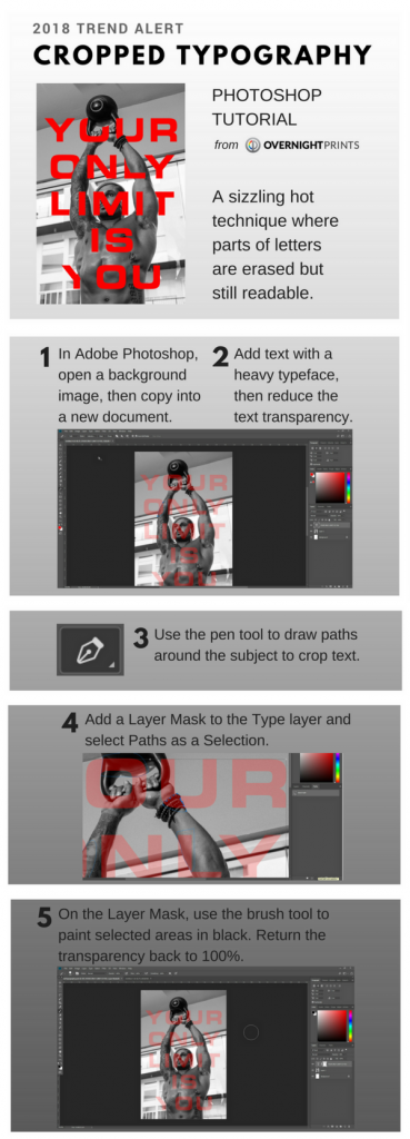 Courtesy of Overnight Prints
#2 Overlay
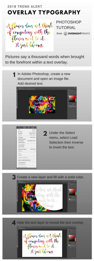
Surfacing in 2018 will be a lot of text overlay to bring background images to the front. Think Design says the trick is to maintain structure and a sense of hierarchy.
TUTORIAL: Overlay Typography
- In Adobe Photoshop, open an image file in a new document.
- Use the Type tool (T) to add desired text, then press enter.
- Under the Select menu, select Load Selection to make all of the text active (dancing ants outline the text). Go back to the Select menu and select Inverse to invert the text.
- Create a new layer.
- Fill with a solid color.
- Hide the text layer.
- Save image in the desired format.
 Courtesy of Overnight Prints
#3 Gradient
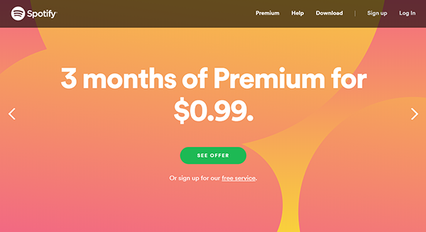
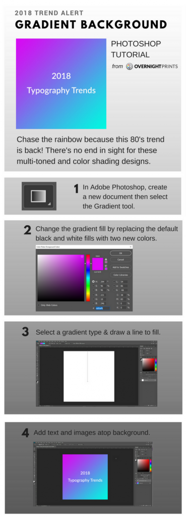
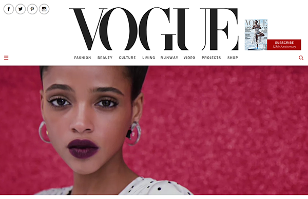
Chase the rainbow because this 80’s trend is back! There’s no end in sight for these multi-toned and color shading designs. Credit Facebook and Spotify for helping thrust this trend back into the mainstream.
TUTORIAL: Gradient Background
-
- In Adobe Photoshop, create a new document.
- Select the Gradient tool (G).
- Click on the Gradient Editor to change the gradient fill.
- Replace the default black and white with the colors of choice.
- Select a gradient type, then draw a line to dictate the starting point and the end point. Shades will blend at the center of the drawn line. Pro tip: Start at top-center. To make smooth lines at 45° angles in any direction, hold the Shift key while drawing. The longer the line length, the larger the gradient will be.
- Add any desired text and content.
- Save image in the desired format.
 Courtesy of Overnight Prints
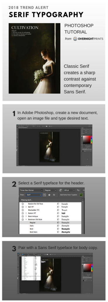
#4 Serif
Uncool Serif used to take a backseat to hip and modern Sans Serif. This year, Serif moves up to the front seat and will contrast against Sans Serif in web design and print ads.
TUTORIAL: Serif Typography
- In Adobe Photoshop, create a new document or open an image file.
- Select a Serif typeface. Think along the lines of Book Antiqua, Georgia or Times New Roman.
- Use the Type tool (T) to add desired text for the header, then select all (Ctrl+A). Pro tip: Serif typefaces work well as headers.
- Pair with a Sans Serif typeface for body copy.
- Save image in the desired format.
 Courtesy of Overnight Prints
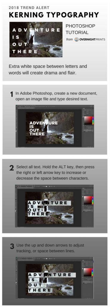
#5 Kerning
If gradient designs and Serif seem like graphic design is taking a step back, exaggerated kerning will take it two steps forward. Extra white space between letters and words will create drama and flair.
TUTORIAL: Kerning Typography
- In Adobe Photoshop, create a new document or open an image file.
- Use the Type tool (T) to add desired text, then select all (Ctrl+A).
- While holding the ALT key, press the right or left arrow key to increase or decrease the kerning (space) between characters.
- To adjust tracking (space between lines), use the up and down arrows.
- Save image in the desired format.
 Courtesy of Overnight Prints
Ready to refresh your print marketing materials? Contact designservices@overnightprints.com to consult with an expert graphic designer.