Nowadays, it’s all about texting or posting online, and scribbling one’s signature is perfectly acceptable. There’s virtually no need to perfect one’s handwriting anymore, right? January 23 celebrates National Handwriting Day and the beauty of the written word. It’s also the birthday of John Hancock, who was the first to famously put ink to paper and sign the Declaration of Independence.

Even cursive handwriting is all but history in public school curriculums. When most U.S. states adopted the Common Core curriculum standards in 2010, learning script was no longer a requirement. Instead, the new English Language Arts and Literacy standards favored lessons in keyboarding or other media and technology.
The art of penmanship is establishing its merit again, however, both in education and business. States have been passing their own laws that require cursive proficiency in public schools. These states are helping students write faster, think better and keep an art form alive.
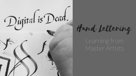
In an age of mobile devices and digital communication, lettering and calligraphy are making a strong comeback at weddings, for holiday greetings and corporate branding. That means lettering artists and calligraphers are highly sought for their artistry.
What’s the difference between lettering and calligraphy? According to type designer Gerrit Noordzij, lettering is defined as a composition of letters hand drawn in multiple strokes whereas calligraphy consists of individual words written with a single pass of the pen.
Those fancy curls and swirls can pay big bucks. One of the most expensive pieces auctioned off for $64 million is a calligraphy hand scroll by Huang Tingjian during the Song Dynasty titled “Di Zhu Ming.” The 20-foot Chinese scroll features rare cursive penning an essay on morality and justice.
Master artists share their advice on tools, techniques, tips and good reads for creating striking handwritten words that can transform your print marketing materials.
Seb Lester
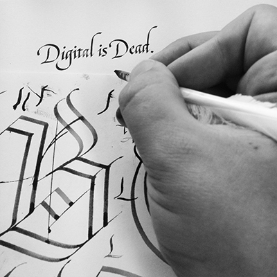
He’s known as the “Banksy of Calligraphy” for his mesmerizing Instagram (@seblester) videos of calligraphy and hand lettering. Sebastian “Seb” Lester of East Sussex, England, is a master calligrapher and type designer whose graceful curves and dense strokes landed him gigs with NASA, for redesigns of J.D. Salinger book covers and as creator of Neo Sans, the official typeface chosen for the 2010 Vancouver Winter Olympics.
Website: seblester.com
- Tools:
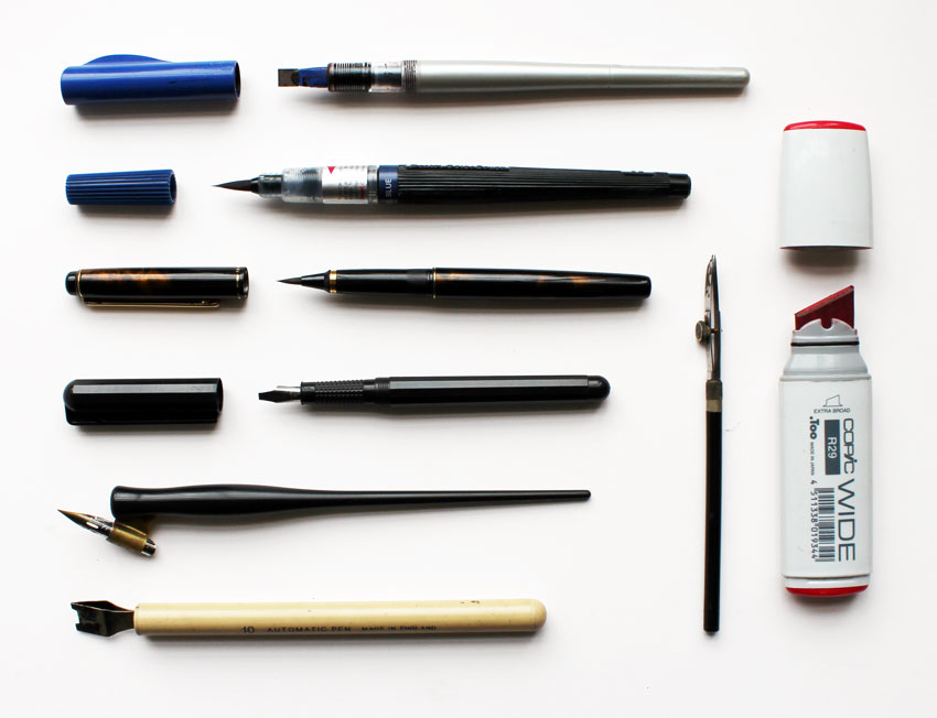
- Beginner: Pilot Parallel Pens; Manuscript Calligraphy Fountain Pens
- Novice: Brause Calligraphy Nibs; William Mitchell Calligraphy Nibs; and Automatic Pens
- Expert: Nikko G Nibs
- Reads:
- “Scribe: Artist of the Written Word” by John Stevens
- “Foundations of Calligraphy” by Sheila Waters
- “Mastering Calligraphy: The Complete Guide to Hand Lettering” by Gaye Godfrey-Nicholls
- Any of “The Speedball Textbook” series
John Stevens
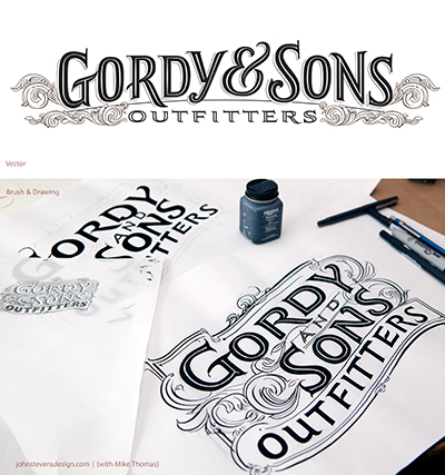
Renowned lettering artist, author and teacher of the art, John Stevens (@calligraphile) was originally a sign painter in New York. Today he is a well-admired and highly sought-after lecturer at universities, conferences and exclusive workshops. With much influence from Roman letterforms, his A-list clients include Disney, HBO, Lucasfilm, Rolling Stone and Pepsi with mentions in dozens of books and publications.
Website: johnstevensdesign.com
- Tools:
- Beginner: Pentel Fude Touch Sign Pen; Tombow Fudenosuke Brush Pen; Kuretake Zig Letter Pen; Pilot Futayaku Double-Sided Brush Pen
- Dramatic Lettering: Pentel Pigment Brush Pen; Copic Gasenfude Nylon Brush Pen; Royal Talens Ecoline Watercolor Brush Pen; Uni Brush Pen Set
- Asian calligraphy: Pentel Pocket Brush Pen; Sailor Mitsuo Aida Double-Sided Brush Pens; Kuretake Bimoji Brush Pen; Kuretake No. 13 Fountain Brush Pens
- Techniques & Tips:
- The Roman letterform is not one fixed style and has a simplicity within its complexity.
- Basic structures for lettering should be learned in the following order: capitals, minuscules, then cursive.
- Using a ductus to practice does not allow artists to add variation and movement to lettering.
- Working through problems helps develop your penmanship.
Paul Antonio
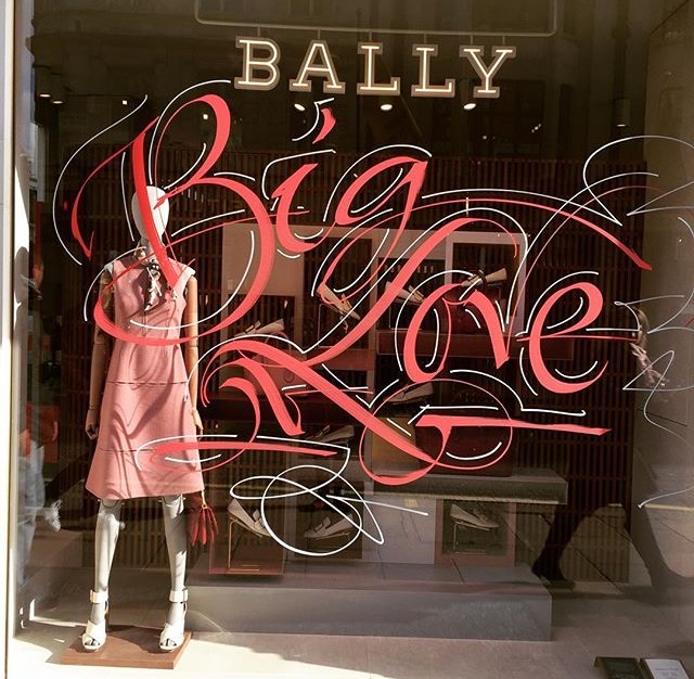
As a young boy in his native Trinidad, Paul Antonio (@pascribe) would comb the beach for turkey vulture feathers to use as his writing instrument. Inspired by maps bearing decorative Gothic lettering, the future calligrapher developed a fascination for flowery script. Fast forward to present day, Antonio has made London his home where he produces gorgeous lettering and calligraphy for luxury brands, such as Tiffany & Co. and Versace, and is also a scribe producing official royal documents for the Crown Office.
Website: paulantonioscribe.com
- Tools:
- Pointed pen work: Manuscript Leonardt EF Principal, Gillott 303, Hunt 56 and Hunt 22B with Pelikan 4001 ink
- Square pen work: William Mitchell Roundhand nibs, Manuscript Roundhand nibs and Automatic pens
- Techniques & Tips:
- 80 percent is thinking, 20 percent is writing.
- Before beginning, adjust position, posture and placement of the paper. Posture is critical: Sit straight, feet flat on the floor, shoulders relaxed and paper on the table at a 55-degree angle.
- Reads:
- “The Art of Calligraphy: A Practical Guide to the Skills and Techniques” by David Harris
Callie Hegstrom
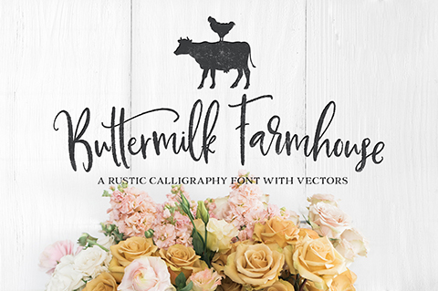
Overnight Prints customer Callie Hegstrom (@makemediaco) went from freelance designer to full-time font-maker and lettering queen. She focuses on colors, shapes and design composition to create original font families like the rustic Buttermilk Farmhouse and charming Magnolia Merchant as a follow-up. Hegstrom has designed nearly a dozen handcrafted fonts using her beloved iPad Pro and Apple Pencil. Her work has graced the covers of Better Housekeeping and Sports Illustrated magazines, and has been used by Bath & Body Works, Michael’s, Minted and Dole.
- Tools:
- iPad Pro and Apple Pencil
- Techniques & Tips:
- Influences from lettering artists Stefan Kunz, Ian Barnard, Jessica Hische, Angela Southern and Nicky Laatz.
- Reads:
- How to Learn Lettering: 50 Free Tutorials and Pro Tips by CreativeMarket.com
Katie King Rumford
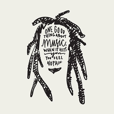
A childhood passion for hand lettering and sign making became an award-winning specialty for designer, illustrator and Overnight Prints customer Katie King Rumford (@katiekingrumford). From self-taught font creations to brushes with legendary chalk-lettering artist Dana Tanamachi, Rumford combines her formal degrees in fine arts and graphic design with “fun free time” for her notable work with Google and awards from the Art Director’s Club. She enjoys creating in any medium including charcoal, paint and even honey in India ink, used to imitate a spilled oil drum. Rumford draws inspiration from the work of Jessica Walsh, James Victore and the collective work of Franz Kline.
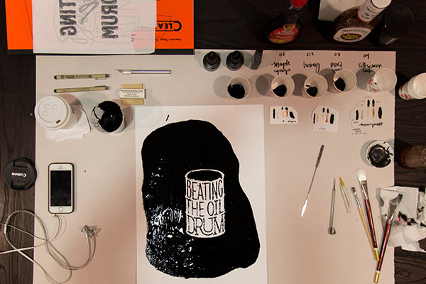
Website: katiekingrumford.com
- Tools:
- Faber Castell PITT Artist Pen B (Black 199)
- Tombow ABT Dual Brush Pen (N15)
- Tracing paper and graph paper
- Pencil and a really great eraser
- Techniques & Tips:
- Use softer brush nibs and hand motions to guide the natural weight of letters.
- Refine hand illustrations with tracing paper and pencil or pen.
- Reads:
- “Hand to Type: Scripts, Hand-Lettering and Calligraphy” published by Gestalten
- “DIY Type: 50+ Typographic Stencils for Decorating, Crafting, and Gifting” by Dana Tanamachi – A good starting point for a beginner interested in the field.
- “Sharpie Art Workshop: Techniques and Ideas for Transforming Your World” by Timothy Goodman – A fun approach to lettering.
Practice your “John Hancock” and keep the tradition of cursive handwriting alive not just today but every day.
For more art and design inspiration, subscribe to the Overnight Prints Blog.


