Your company letterhead captures the essence of your company’s purpose and style. It’s your brand and identity, and lets your customers know just how professional your company is. Here are six essential tips for designing an effective letterhead for your business.
1. Design an Eye-Catching Letterhead
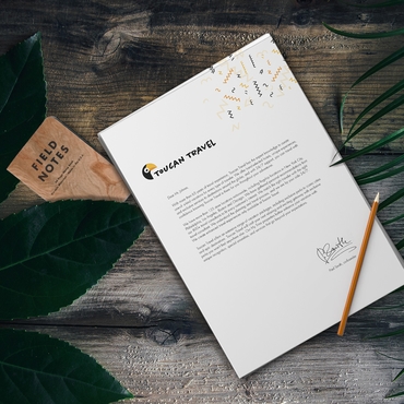
Traditionally, a letterhead is not known for its exciting design or graphics! Most letterhead designs are as simple as a sheet of white paper with a company logo at the header and an address and contact at the footer! Although this may work for some companies, you don’t HAVE to be so formulaic with your design. Try adding some photo components and some interesting graphics that will set your letterhead apart from other businesses.
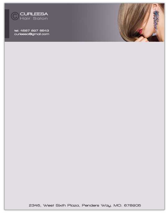
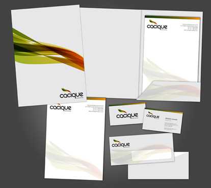
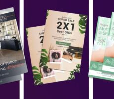
Be professional with your brand but don’t be boring! Although you should never lose sight of the fact that you need to leave plenty of white (or negative) space on your letterhead for your correspondence (you should reserve approx. 8 inches of clear space for messaging) there is no reason why you can’t include some really sharp graphics. The letterhead designs below are good examples of how you can create a really subtle, elegant, and professional looking letterhead that is also really eye appealing:
By providing customers with richer colors and higher resolution letterhead printing, Overnight Prints enables you to add photo elements and detailed graphics without loss of color or print sharpness. Being able to add photo elements to a letterhead can make it more impersonal and better reflects the personality of you and your product!
2. Make your Letterhead more than just a Company Logo!
You are not limited to simply a logo, a contact number and address! You could add:
• A company branding slogan or other catchy advertising proposition to your letterhead design. Use whatever messaging you think will appeal to customers.
• Product graphics
• Graphics that show your company or employees in action.
There are no set-in-stone rules for letterhead design! Although “letterhead purists” may claim that your letterhead should be your logo and contact details only, I believe that your letterhead can be so much more! It can effectively communicate who you are, what you do, how you do it, and whom you do it for!
3. Have a couple different styles of letterhead
You don’t have to settle for just one letterhead design. You might want to use a more austere professional piece for important and legal information and have a second with a more casual design for informal correspondence.
If you have customers in different business sectors that have very different graphical tastes, you may want to create a couple of designs that suit that specific target market!
4. Design a Letterhead that is Readable
A letterhead showcases the name of your company, which means the choice of font size, color, and style are all-important. Stay away from really complicated and fancy fonts – they’re too hard to read! But also try to steer clear of over used fonts such as Arial and Times Roman (people are sick of seeing them!). Read our previous article about selecting good fonts
Ensure that all your type is at least 9 pt. so that it can be read without difficulty.
5. Print Clever
Ensure that you have enough letterhead on hand for daily use. However, you also don’t want to print so many that you are forced to throw hundreds of letterhead away should your company phone number or address change!
Strike a balance between the economies of large print jobs and the inefficiencies of paper storage. For small businesses, a decent print amount is around 1,000 to 2,000 at a time!
6. Match your Letterhead with other marketing prints for a Professional Brand!
Think about having a cohesive brand and message that runs through all your promotions. Your Letterhead should at the very least match your:
By displaying a common theme and design thread throughout your design brand, you are instilling confidence in your customers who think, “This is a company that is professional, knows how to market themselves correctly, and has taken the time and effort to create a strong brand for themselves!” Miss-matched corporate identity products don’t suggest an organized and thoughtful company!
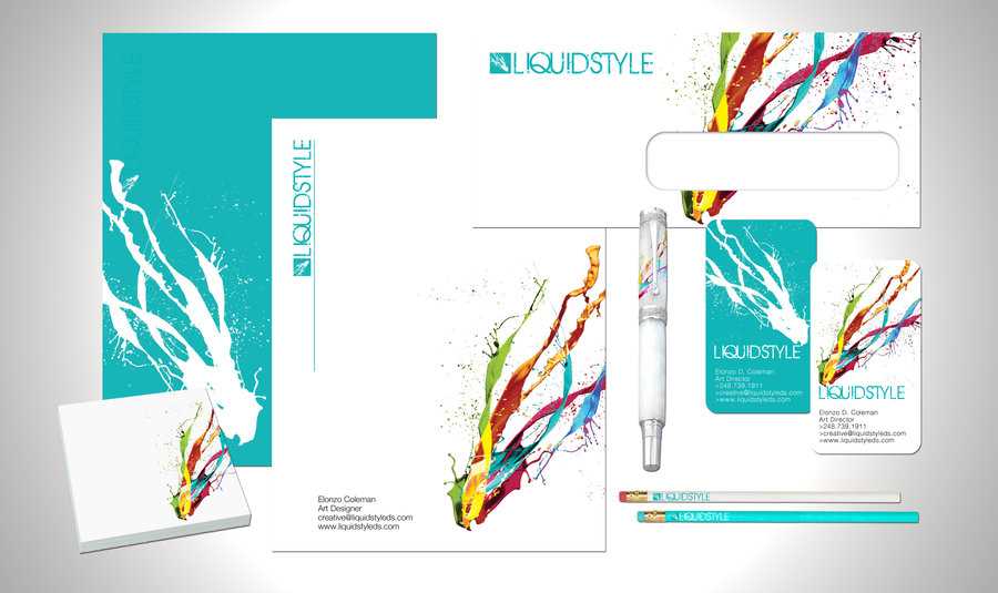
Having a solid design style that runs through your letterhead, envelope, and business card designs has the added advantage that it looks really good when posting your business correspondences! It’s so much nicer to get a correspondence with all-matching business card, envelope and letterhead!
This article has been written as part of our Marketing Toolkit promotions; a New Years campaign in support of start up businesses and small business entrepreneurs.
Click here to see the other products in our marketing toolkit and to receive great offers on everything you need to build successful print marketing campaigns.



1 Comments
Hiya, I am really glad I have found this info. Today bloggers publish just about gossips and net and this is really annoying. A good blog with interesting content, that’s what I need. Thank you for keeping this site, I’ll be visiting it. Do you do newsletters? Can’t find it.