Your letterhead says more about your business than you might realize.
From proposals and contracts to client letters and invoices, it frames every communication. A polished, professional design builds trust and reinforces your brand identity.
Whether you’re a freelancer, small business, or growing company, here’s how to create letterhead that looks professional, and why it matters.
Why Letterhead Still Matters
In an age of digital communication, physical documents carry weight. A well-designed letterhead:
- Conveys professionalism in every interaction
- Reinforces your brand through consistent design
- Helps you stand out from competitors who rely on plain templates
Even invoices and thank-you notes look more credible when they carry your brand’s visual signature.
👉 Related blog: Essential Print Materials for Freelancers and Consultants
Key Elements of Professional Letterhead
Think of your letterhead as a brand asset, not just stationery. The design should include:
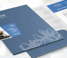
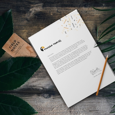
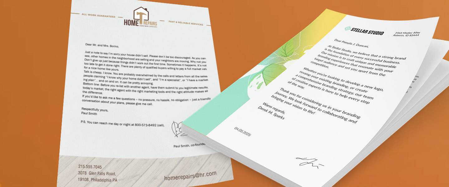
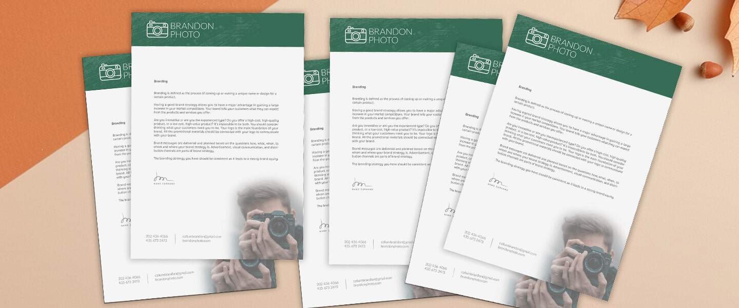
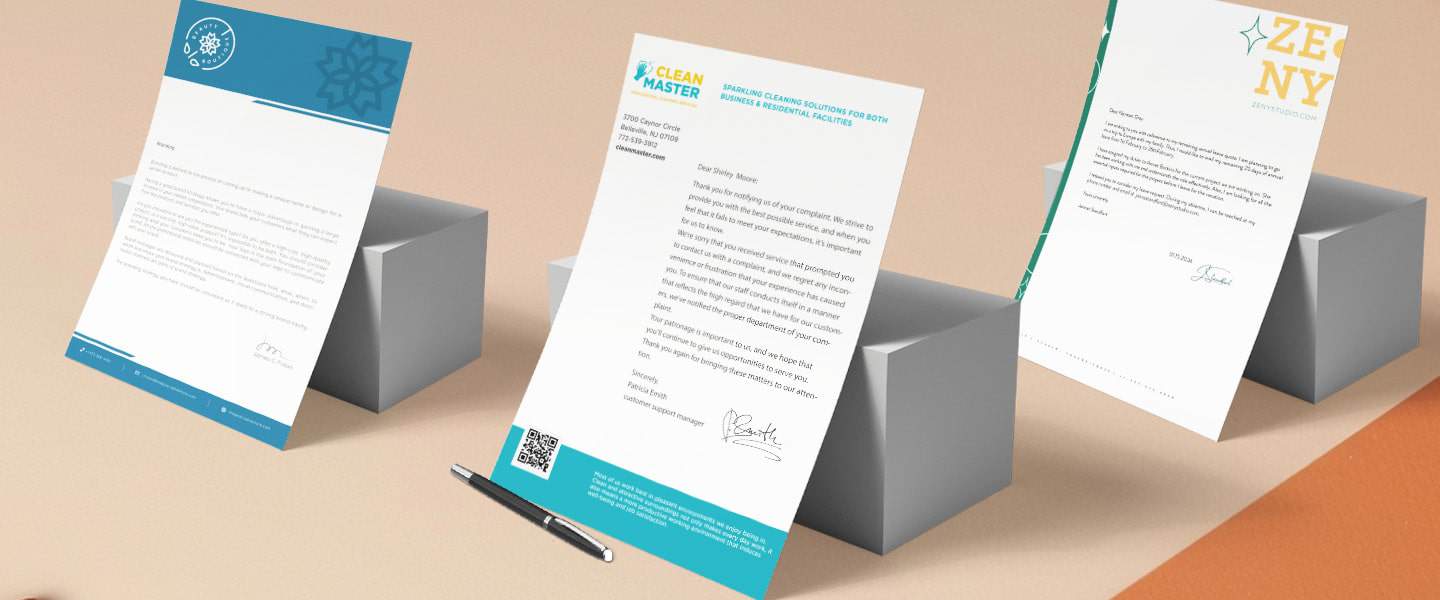
- Logo & Business Name: Usually placed at the top or in a corner for instant recognition.
- Contact Information: Phone, email, and website — easy to find at a glance.
- Consistent Fonts & Colors: Align with your overall brand guidelines.
- Whitespace Balance: Leave room for the letter itself; design should frame, not overwhelm.
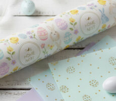
- Optional Extras: Tagline, watermark, or secondary logo marks.
📌 Product link: Custom Letterhead
Design Tips That Elevate Your Letterhead
If you want your letterhead to feel premium rather than generic, focus on details:
- Paper Choice Matters: Heavier stock with a matte or linen finish feels substantial.
- Subtle Branding: Use brand colors sparingly — think accent lines or logo marks, not full backgrounds.
- Hierarchy of Info: Place logo at top, contact info at bottom, leaving space for body text.
- Digital + Print Friendly: Design so it looks sharp when exported as a PDF and professional in print.
👉 Related blog: A Complete Guide: Types of Paper for High-Quality Printing
When to Update Your Letterhead
Professional businesses refresh their letterhead whenever their brand evolves. Consider redesigning if:
- You’ve updated your logo or color palette
- Your contact details have changed
- You’re repositioning your brand ahead of a new year or Q4 marketing push
👉 Related blog: Print Products That Make Your Brand Look Bigger Than It Is
Real-World Inspiration
- A law firm used heavy-stock letterhead with embossed logos to build trust and authority.
- A startup agency created minimalist letterhead with bold accent colors to stand out.
- A freelancer added a subtle watermark to reflect creativity without overwhelming the text.
5 Must-Haves for Professional Letterhead
- Logo & Business Name
Placed at the top or corner for instant recognition. - Contact Information
Phone, email, and website clearly visible. - Brand Colors & Fonts
Consistent with your other print + digital assets. - Quality Paper
Heavier stock, matte or linen finish for a premium feel. - Clean Layout
Whitespace balance that frames — not clutters — your message.
💡 Pro Tip: Keep a digital version on hand for PDFs and invoices, but always print on premium stock for client-facing communications.
📌 Start here: Custom Letterhead
Final Thoughts
Professional letterhead is a simple investment that makes a lasting impression. It communicates who you are before a single word is read. By choosing the right layout, paper, and branding details, you ensure that every client interaction feels professional, polished, and consistent.
🎯 Ready to upgrade? Start here: Custom Letterhead
👉 Related resources: