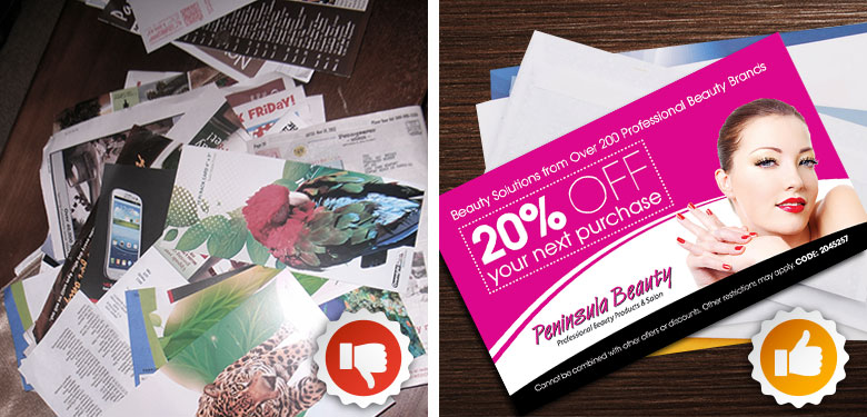
Does your postcard mailer stay on the desk or refrigerator, or does it go straight to the round file, aka trash can?
We are bombarded every single day, with a ridiculous amount of junk mail. Our mail boxes are brimming over with unwanted flyers, brochures, advertisements and postcards. In response, much of America has resorted to opening its mail over the trash can.
Is it possible then, to create direct mailers that people read, keep, and act on? Is it worth the time and energy?
According to a study published in a recent article in Forbes magazine, direct mail has made a comeback! To avoid the common pitfalls here are a few postcard mailing tips.
How to make your direct mailer stand out:
- Use relevant fonts that resonate with your target audience.
- Captivate your readers with compelling headlines.
- Put thought into your color scheme. There are a variety of articles and resources about the psychology of color.
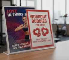
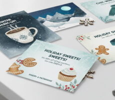
- Your mailer should include a free offer, discount, or reward. This will give readers an incentive to hold onto it.
- Provide an expiration date. This creates a sense of urgency.
- Embed a colorful QR code on your mailer that takes scanners to an exclusive exciting offer.
- Use an extra-large postcard size. Larger mailers get read more often.
- Keep it simple. The design should be simple, yet effective. Browse through several design templates.
- Plan for several mailings. You won’t usually see much of an impact, until you’ve sent out 4-6 mailers.
- Repetition is key in postcard mailing.
Award winning designer Chris Taylor of Creative Beard says if you are a start up business, design the piece for the business you want to be, not what you are today.
For inspiration, check out www.overnightprints.com‘s wide variety of templates. They also have designers on hand to create a customized design for you.
Courtney’s Action Items:
Before you send out your mailer, test it among friends and family.
Print two or three versions on regular copy paper, and ask friends to answer these questions:
- On a scale of 1-5 (5 being the highest), how likely would you be to take action based on this postcard?
- Explain your thought process.
- What can I do to improve or make the postcard more compelling?
- Make sure you ask people who will be tell you the truth. Experiment with three or four versions.
Implement a few of our tips and test your postcard before you finalize the design. These simple tasks will put you one step ahead of your competition.
By:Courtney Knapp
If you have a postcard mailer that stands out from the rest, or would like to learn more about related topics, email us with your comments and questions
resourcecenter@overnightprints.com


