Readers of this blog who are new to Photoshop may find this tutorial really useful. It outlines some essential Photoshop techniques! I’m sure many designers reading this article are all too familiar with the clipping mask and text warp tools, however, I think that this “retro” postcard idea is a fantastic design idea for anyone who wants to create a “red-hot” design for the coming summer season!
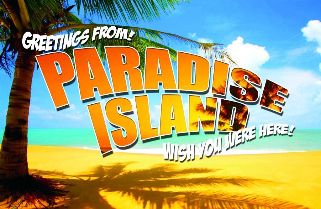
How to create your Summer Holiday Postcard in 10 easy steps
1. Download the postcard start file in the design guide page at OvernightPrints.com open it in Photoshop > delete all layers except the background layer.
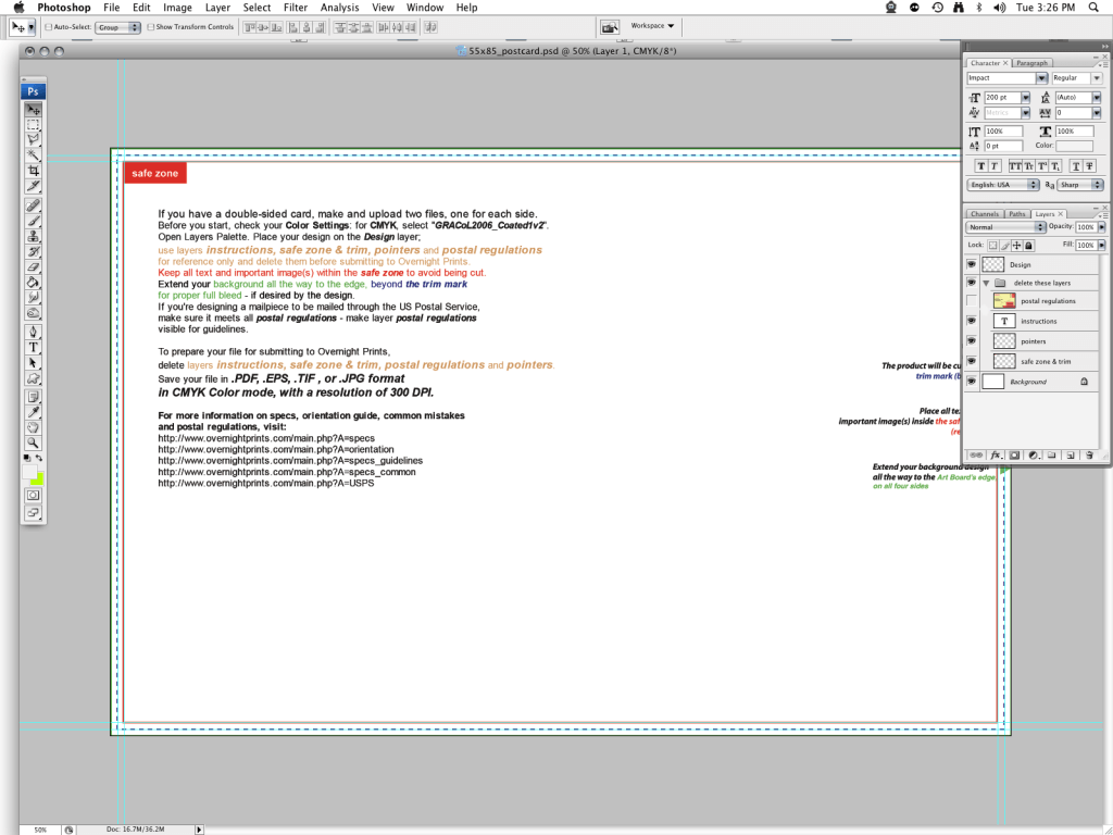
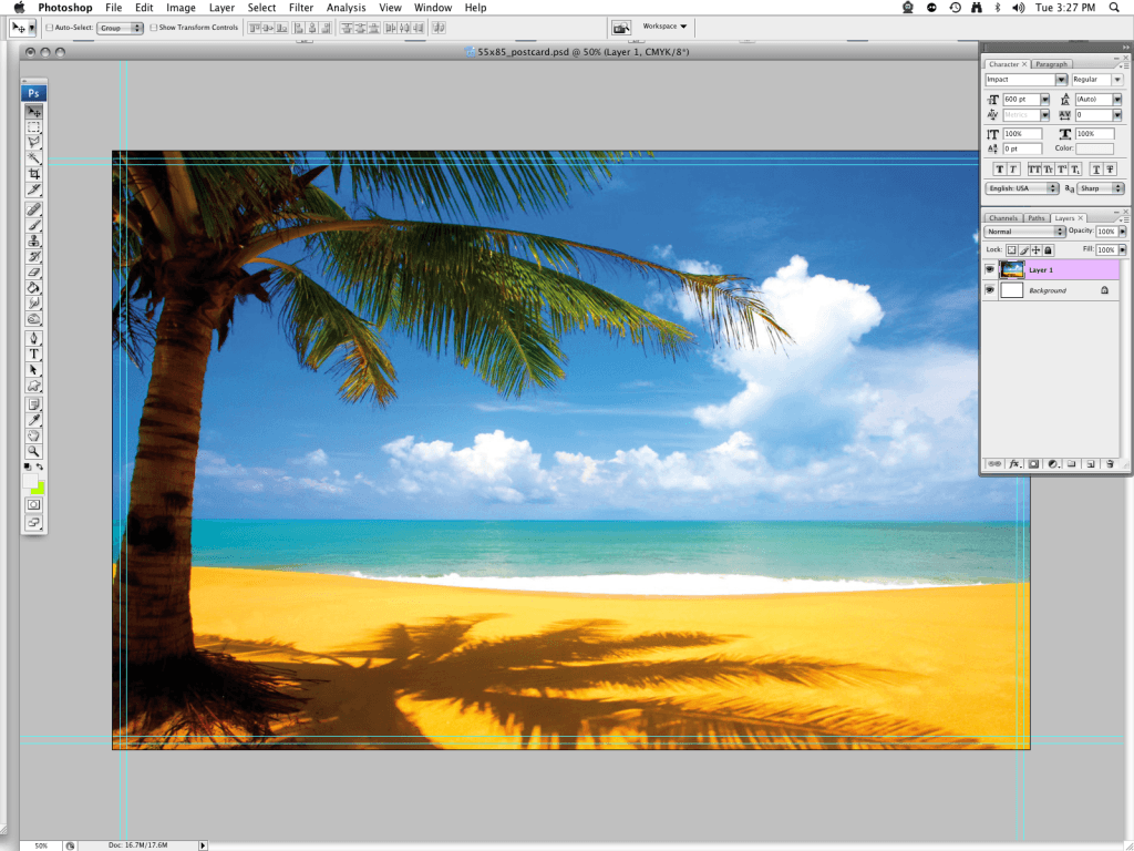
2. Paste your first (daytime beach scene) image into a new layer This will act as your background image.
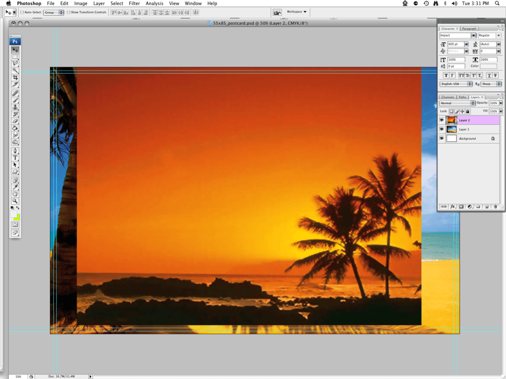
3. Paste your second (sunset/nighttime beach scene) image into another new layer
4. Create a new layer > choose Fill from your edit menu > change the drop-down setting to “color” and choose a mid-color for your fill (it doesn’t really matter what color shade- this layer is going to act as a temporary background for your clipped text)
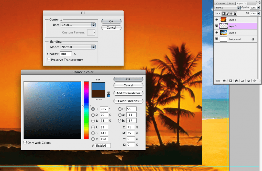
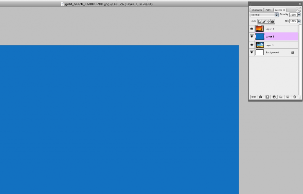
5. Create a text layer (any color that’s visible on the fill layer) and choose a reasonably bold font – I have used Impact > resize your text to suit
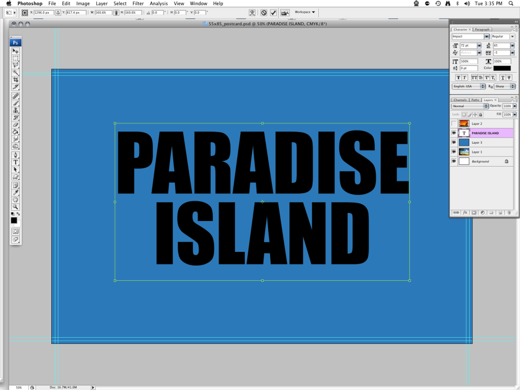
6. Create your Clipping mask
Turn your fill layer off with the eye tool (click on eye icon to the left of the layer thumbnail – the eye icon will vanish and your layer will no longer be visible)
With the text layer selected, hold the alt key down and drag your pointer upwards towards layer 2
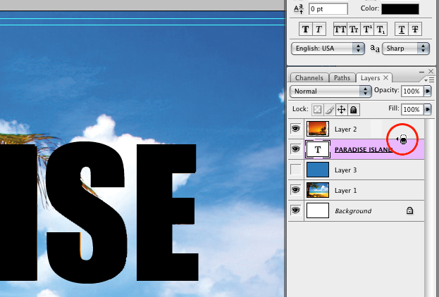
A circular symbol will appear > Click to join the layers when you see the circular symbol.
You will now witness the magical joining of these two layers and the transformation of your plain text to image text! This is a clipping mask – both the text layer and the image layer above it can be grabbed and moved with the pointer, so that you can find the best place for text and image to combine.
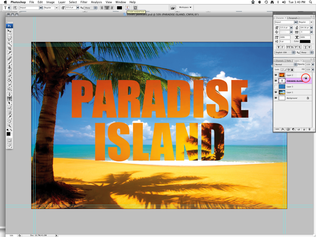
7. Using the text warp tool
Select your text layer. Click on the warped “T” icon in the upper-center of your text menu
This reveals a “Warp Text” pop-up box that contains a drop down menu and a toggle menu.
In the drop-down menu (top), select a text effect. I’ve chosen “Arc” to create a simple bend in the text (these warp effects range from subtle changes in text appearance to unreadable warped effects.)
Make sure that the “horizontal” button is checked so that your text loops upwards.
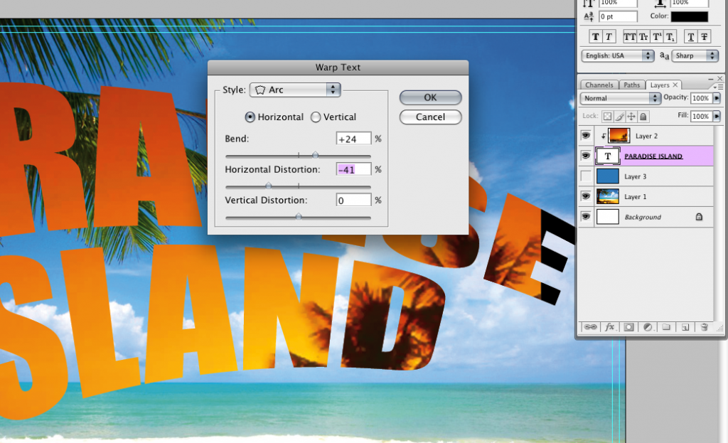
Use the “bend” and “horizontal” toggle buttons to make your ark. The bend toggle controls the circumference of the bend and the horizontal toggle – toggled to the left will cause your text to heighten from the left – creating a more dramatic effect
Click OK when done.
Resize your text to better suit the design parameters
8. Add “Layer Style” effects to your text
To make the text “jump off the page” more, add a few layer style effects by double clicking on your text layer and bringing up your Layer Style menu.
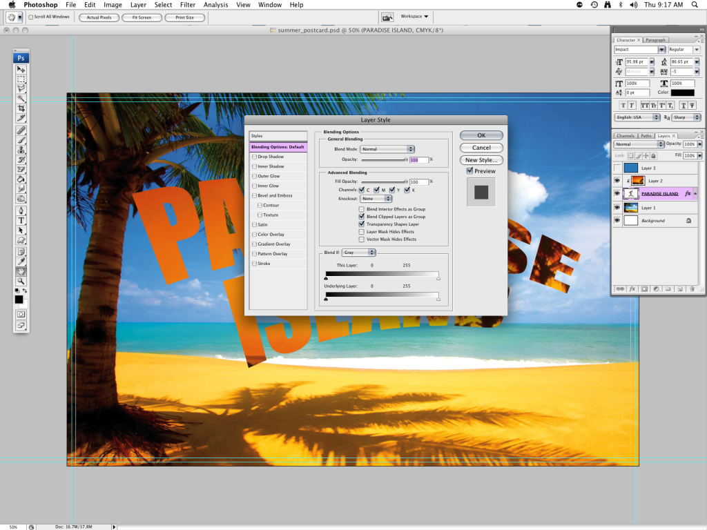
Drop Shadow
Firstly, check the “drop shadow” option in the left-hand side “styles” menu to highlight the drop shadow editable options> choose “multiply” in the blend mode drop-down> change the opacity to around 75% in the opacity toggle box> set your angle to around 88°
In the Distance/Spread/Size menus I chose a distance of 31px, a spread of 0%, and a size of 5px (choose accordingly to suit your design– with the preview button checked on the right hand side of the Layer Style menu, you can preview your style changes)
Stroke
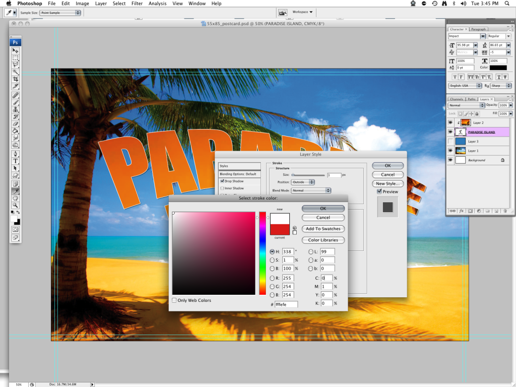
Check the “stroke” option at the bottom of the left-hand menu.
Change the size to 8px> In the “position” drop-down menu, make sure that it is set to “normal”> The opacity box should be set to 100%
In the drop-down “fill type” menu, ensure that it is set for “color”> Click in the color box below (default red color) and pick a white shade from your “select a stroke” menu.
Inner Shadow
Check the inner shadow box (second from the top)
In the inner shadow menu choose “Multiply” in the “blend mode” drop-down and make sure that the color box to the right has a black shade selected.
Choose an opacity of 75% in the opacity toggle box> set your angle to around 109°
In the Distance/Spread/Size menus I chose a distance of 5px, a spread of 0%, and a size of 5px
In the “Quality” menu, I have kept these as default settings; although you can create some really nice effects by playing around with the “contour” pattern (click inside a contour pattern in the contour drop –down menu to path edit the density and angle of your shadow contour.)
Leave the “noise” setting at 0% percent and the “anti-aliased” box unchecked
Once you are happy with all your text style choices, click OK to continue.
9. Create a new text layer> choose a “fun” font such as BadaBoom to create your first line of secondary text

Repeat step 7 but choose “Flag” in your warp menu to make your text undulate like a wave!
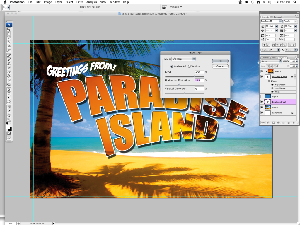
Double-click on your text layer to bring up your Layer Style menu> add a shadow to your text.
10.Right-click the newly created text layer> choose “duplicate layer” from the drop down menu and create a duplicate text layer> grab your pointer tool from the tool menu and reposition the copied layer at the foot of your main text layer> click on the text tool in your tool menu, highlight your text, type in your new line of text.
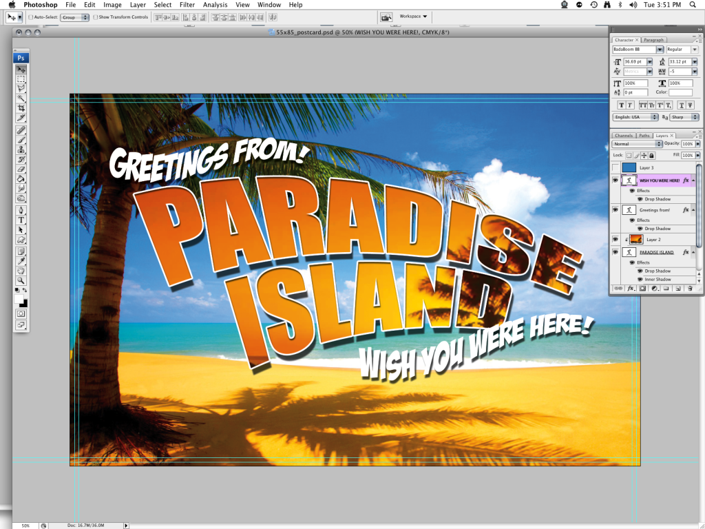
And there you have it! A sun-filled picture postcard, perfect for summer promotions!
Would you like to contribute your own design tutorials to this blog? All contributions would be greatly appreciated! Click on the “submit an article” link at the top right hand side of this blog site to submit your own tutorial.




3 Comments
Thank you…Thank You…Thank You! I have been trying to order postcards, and each and every time my product does not fit the template when I upload. I’m excited you took the time to demonstrate how to create in Photoshop. Now, I will try and see what happens.
What’s the best way to save the project?
Save as a tiff or jpeg file before uploading.
Thank you for reading!