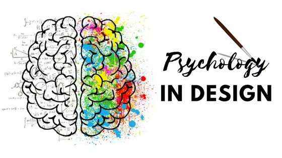
Marketing design is a test in human psychology. How do a few words and images have the power to persuade? Put yourself in the buyer’s shoes to go from graphic designer to expert marketer.
Each line, each color, each shape carries significance when creating visual content. All text and images must be carefully considered for a design to influence a customer’s buying decision.
READING PATTERN
How do you normally read content? Is it print or web? Is there a hierarchy? Are there attention-grabbing focal points? One’s reading pattern really depends on the medium and design.
There are three general reading patterns: the Gutenberg diagram, the Z-pattern layout and the F-pattern layout. In each pattern, readers typically scan the print collateral or web page rather than read line by line. For this reason, it is suggested that important text and images be placed along these gravity paths and ultimately leads to a call to action.
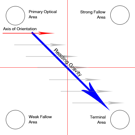
Gutenberg Diagram
For large blocks of text, like novels or newspapers, the natural reading pattern is generally diagonal from top left to bottom right. These readers tend to skip or overlook the top right and bottom left areas.
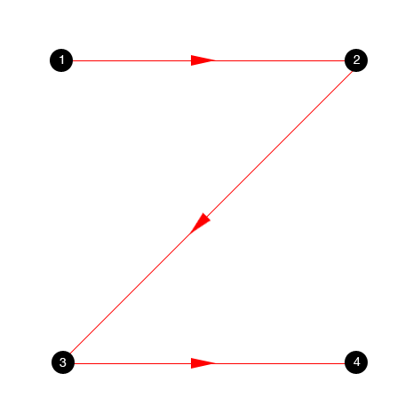
Z-Pattern Layout
Storytelling designs follow the zig-zag pattern beginning at top left and moving horizontally to the right, then diagonally to the bottom right before moving horizontally again to the right, ending at the bottom right. Sometimes, readers move in a smaller series of z-movements down the entire page.
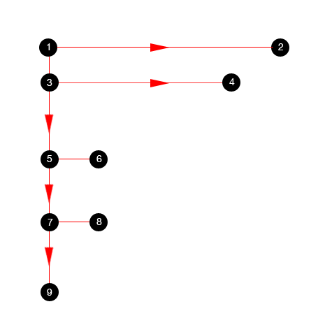
F-Pattern Layout
Mostly applied to web, the F-pattern starts at the top left then moves horizontally to the right before returning to the start point and moving down vertically. Readers continue returning to the left edge to progress down the page as they move across in shorter and shorter sweeps, ending at the bottom left.
In the Gutenberg diagram and z-pattern, readers start at the top left and end at the bottom right, whereas the web-based F-pattern strongly favors the left edge. The F-pattern is based on the viewer’s search for valuable information since web content is often presented in blocks of text, denoted by subheadings or images, as they scroll further down the page.
If, however, a page is designed with specific focal points and creates its own hierarchy and flow, none of the reading patterns apply. Guiding the reader is a job for the designer. Using visual weight, designers can move readers from one focal point to the next. The use of typography and other visual cues can direct the reading path.
COLOR ASSOCIATION
Colors are associated with different moods and feelings. Marketers use color psychology, particularly in logo design, to establish brand recognition and to affect action. Understanding the personality of each color helps designers choose color palettes to evoke emotion in art and design. The following guide pertains mostly to associations in the Western culture.
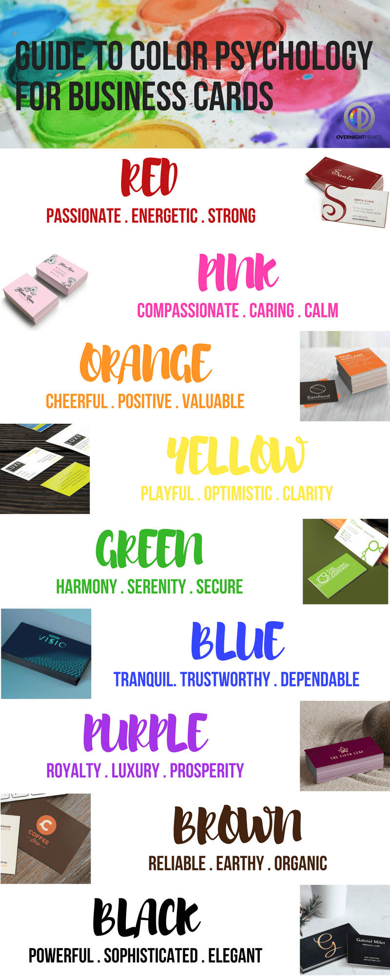
Red
Passionate, energetic, strong
Exciting red stimulates the senses, such as energy, appetite and passion, and also creates a feeling of urgency. The arousing color is often used by fast food restaurants or to indicate clearance sales.
Pink
Compassionate, caring, calm
Affectionate pink is both feminine and friendly. The color is full of emotions from romance to kindness to innocence. It is playful enough to represent sugary treats, beauty products or young tech companies.
Orange
Cheerful, positive, valuable
Enthusiastic orange is a creative color that encourages action. In between happy yellow and energetic red, the bright color stands out as both confident and cautious. Orange is used by kid-friendly brands and those looking to grab attention.
Yellow
Playful, optimistic, clarity
Sunny yellow evokes feelings of warmth and happiness. But the energetic hue also warns of danger. The highly visible color is used by youthful brands and for caution signs.
Green
Harmony, serenity, secure
Relaxing green calms with close ties to health, wealth and nature. Making use of the sense of renewal, eco-friendly brands keep it fresh with shades of green.
Blue
Tranquil, trustworthy, dependable
Cool, refreshing blue lowers blood pressure and curbs the appetite. It is often associated with calm waters and clear skies, making the peaceful color feel safe and secure. Blue often used to establish trust and reliability in a brand.
Purple
Royal, luxury, prosperity
Regal purple is connected with nobility and affluence, often donned by legendary kings. While mysterious, the rich color is seen as sophisticated and elevates any brand.
Brown
Reliable, earthy, organic
Down-to-earth brown feels natural, calm and useful. Its rustic simplicity combined with a grounded personality makes it easy for brands to adopt the warm color as a symbol of reliability.
Black
Powerful, sophisticated, elegant
Bold and beautiful black feels prestigious and authoritative. Classic and timeless, the distinct color predominantly promotes luxury brands or those making a powerful statement.
SHAPES
Visual grammar communicates different messages in art and design. It’s akin to a language made up of shapes and structures that organize information, symbolize ideas, create movement, convey emotions, etc. Finding the hidden meaning behind each shape helps designers use them to communicate.
There are three categories within which shapes can be characterized.
- Geometric shapes:Often symmetric and connected by lines.
- Organic shapes: Free-flowing and found in nature.
- Abstract shapes: Lack definition and are usually in the form of an outline.
Squares and Rectangles
Stability, strength, balance, efficiency, masculinity
Squares and rectangles have straight lines, perfect right angles and four points, making them feel anchored, stable and reliable. Representing conformity, formality and order, the trusty shapes are commonly used for building blocks or grids in web design or print, such as newspapers, magazines and books.
Triangles
Power, progression, purpose, direction
Triangles consist of three straight lines in equal or varying lengths with a base that is sometimes unstable or upside-down. Its pointed shape implies motion, drawing the eyes from the widest edge to the tip. Depending on its positioning, triangles can possess multiple meanings. While a solid base might represent strength and justice, an out-of-balance triangle screams tension and conflict. Triangles can be seen in institutions, such as religion or law, and are also used by start-up brands as a symbol of disruption or self-discovery.

Circles, Ovals and Ellipses
Community, unity, friendship, relationships, love, femininity
With no beginning and no end, circles are well-rounded and represent infinity. Its curvy form feels graceful and comforting, offering a sense of safety, protection and community. This shape represents many celestial bodies like the sun, moon and earth, and often mimic round objects. Less common than squares and rectangles, the shape stands out when used in design.
Crosses
Spirituality, healing, faith, temperance, hope
Two intersecting lines create a cross in either a “T” or an “X” shape. The strong lines represent connection and relationships. When in a vertical orientation, the cross is seen as a symbol of strength and masculinity. Horizontal crosses, on the other hand, communicate a sense of calm tranquility.
Spirals
Growth, evolution, transformation, fertility
A circular line that begins from a fixed center point and continuously moves away from the point on a curved path. Generally found in nature, the lines of a spiral might move clockwise or counter-clockwise without intersecting. The open, free flowing loop represents stages of growth or a cycle of transformation, such as time, life or seasons.
VON RESTORFF EFFECT
Known as the “isolation effect,” the Von Restorff effect is a method of making design elements more memorable by creating a visual or experiential contrast. Text or images that are noticeably different will capture attention and also have better recall.
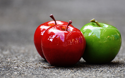
For contrast and emphasis, the text or image does not need to stand alone but should be distinct by design. Highlighting the element in a different color, shape, size, typography, orientation, etc., helps it stand out and raise its importance. For example, a single number in a sequence full of letters will garner attention, as will a green Granny Smith in a bushel of red delicious apples.
This principle is often applied to call to action buttons that are isolated from the rest of the composition to attract the eye and create a sense of urgency. Notification indicators are also accentuated by different colors or shapes to make them unmissable.
HICK’S LAW
Hick’s Law narrows down choices to the most essential to make user selection as fast, easy and straightforward as possible. The objective is to reduce complex obstacles or frustrations that might distract, delay or even deter action. The key to Hick’s Law is functional design that simplifies the decision-making process. The more time saved, the faster a decision is reached.
In design, Hick’s Law means organizing graphic elements to lead viewers to the main message. This could be accomplished by placing more emphasis on the call to action or valuable content above the rest of the composition with typography, colors, patterns, etc.
Another method is to introduce information or steps in stages. Breaking down the entire decision-making process might make it easier for users to complete one action at a time, making the entire process seem less daunting and providing better control over expectations.
One thing to keep in mind is the overall user experience. Simplifying choices does not mean removing all other choices, but rather arranging design elements to have a logical flow. User-friendly web designs make use of navigation bars, drop-down menus and search tools, and especially categorizing large amounts of information.
Card sorting is a technique used to build the architecture of a web page. It is especially useful in determining the most efficient layout that isn’t too time-consuming nor oversimplified for the user by grouping and labeling information into appropriate topics or categories. This method is best applied to pages like shopping carts rather than information-rich resources intended for research and more complex decisions.
GESTALT PSYCHOLOGY
The whole is greater than the sum of its parts, meaning one will group individual parts together as a single figure before identifying each separate piece. The reason behind this? The mind is trying to make sense of the visual and will automatically unify the image to quickly interpret its meaning.
Proximity
Placing elements physically closer together also relates them closer together in the mind. The farther away, the more separated the elements may seem. Elements may be placed in the same group or even combined to form a single image.

Similarity
Two separate elements with shared characteristics create a relationship and will be grouped together. Color, shape and size are a few ways that two different elements could be associated with one another.
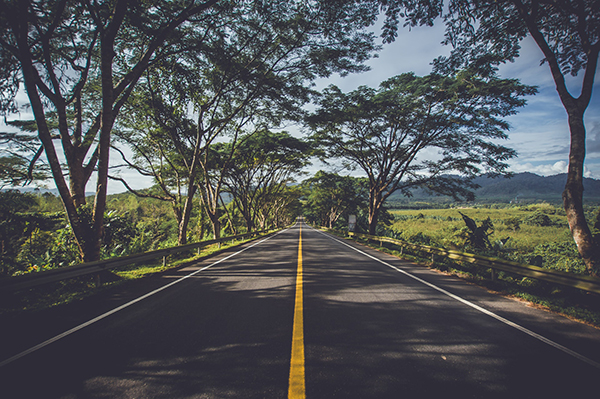
Continuity
The eye will follow the path directed or created by a line or curve until it ends or gets disrupted by another element. A road, tunnel or arrow, for example, will lead the eye in the direction it is heading. Continuous smooth lines may also be seen as a single figure.
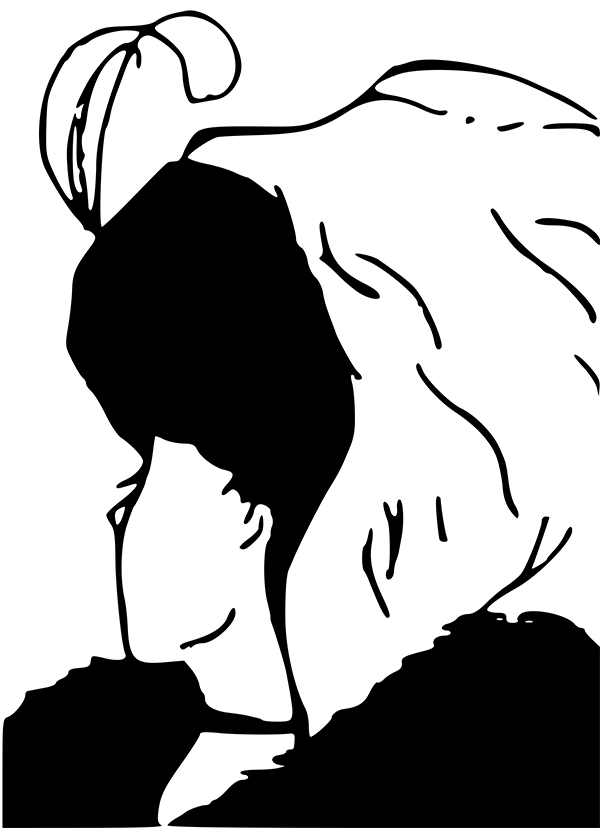
Closure
An incomplete element or object can appear whole because the eye fills in what’s missing and closes the figure. The technique relies on human nature when observing stencils and other open shapes.
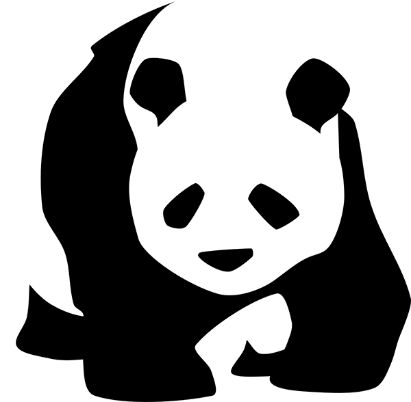
Figure/ground
The mind tends to separate a figure (in the foreground) from the ground (the background). Negative space in a composition is typically assigned as the ground. This technique is often used in optical illusions that form two distinct shapes or structures by shifting between the positive and negative spaces to see a different figure in each.
Art and design have a way of influencing people’s thoughts, opinions and even shopping habits. By employing psychology, designers can lead the eye and shape the marketing message to meet goals like increasing brand awareness or moving buyers to action.
For design help with marketing materials, consult with Overnight Prints Design Services at designservices@overnightprints.com.