The iCard
I came across a blog post the other day about Steve Jobs’ business card from the 1970’s. It was comparing his card to Steve Wozniaks (co-founder of Apple Computers) business card from 2006. Looking at these two cards, they seem to have strangely followed the same design path as the Apple Mac; starting out as a simple “beigey” colored object and evolving into a “cold metal” hi-tech machine!
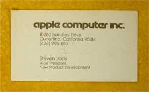 Apparantely, The number on this card is still in operation if you have an issue you’d like to discuss with Apple!
I’m a Mac guy and I personally like the “cold metal” look of my G5, but I’m not keen on Steve Wozniaks fancy laser-cut stainless steel number. It’s not very practical, affordable, or even particularly attractive!
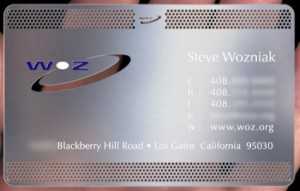 Wozniak’s Stainless Steel Business card with laser cut and hand painted lettering
I prefer Steve Jobs’ simple business card design from the 70’s. Despite its “dated” font (Motter Tektura – the old Apple font) it has a simple elegance. It pre-dates full color printing – when business cards performed a function – simply passing ones business information to another person. This was before the days of “rainbow-colored-sprinkled” digital color – the ruination of design in the 90’s.
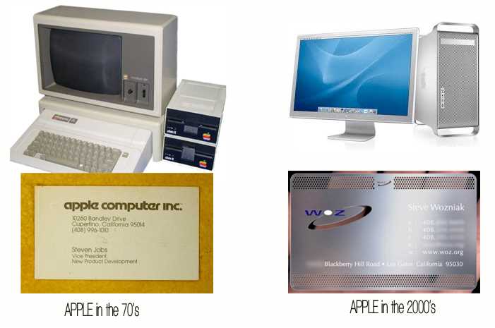 Wozniak and Jobs cards almost exactly match the design aesthetic of Apple from the 70’s through to the present day.
The question I’d like to ask readers of this blog is, do you think we’ve gone too far with business card design; making business cards out of metal, wood, rubber, and even meat? Although I do love original and cool business card designs and ideas, there is something to be said to keeping unnecessary images and colors out of a business card? Tell me what you think? or better, still, send me your own business card designs to show on the blog!