Bland stationery is easy to forget.
But great stationery design? That sticks with people.
A thoughtfully designed business card, letterhead, or envelope doesn’t just share information — it shapes how customers perceive your brand before you even speak to them.
That’s why strong stationery design still matters in 2026.
From premium business cards to minimalist letterheads, the best stationery designs combine creativity, consistency, and personality to create a brand identity people actually remember.
In this guide, we’re showcasing creative stationery design ideas from talented designers around the world — along with the branding principles that make these designs so effective for modern businesses.
Whether you’re building a new brand or refreshing your visual identity, these examples can help inspire stationery that feels polished, memorable, and professional.
Why Stationery Design Still Matters for Branding
Your stationery says a lot about your business before anyone reads a word.
Strong business stationery helps create:
- credibility
- consistency
- professionalism
- stronger first impressions
- brand recognition
And in a world dominated by digital communication, physical print materials often feel more intentional and memorable.
A premium business card.
A clean letterhead.
A beautifully designed envelope.
These small details influence how customers perceive quality and trust.
As we explored in our article on what makes a business look established at first contact, print materials often shape brand perception faster than websites or ads.
What Makes a Great Stationery Design?
Before diving into the examples, it helps to understand what separates average stationery from memorable branding.
The best stationery designs usually combine:
Consistent Branding
Colors, typography, spacing, and layouts should feel cohesive across every printed piece.
Strong Typography
Clean, intentional typography instantly makes a brand feel more professional.
White Space
Minimalist layouts often feel more premium and easier to read.
Premium Materials
Paper thickness, finishes, and texture dramatically affect perceived quality.
Creative but Functional Layouts
Good design still needs to communicate clearly.
These elements work together to create stationery that feels polished instead of forgettable.
20 Creative Stationery Design Examples to Inspire Your Branding
Nicole Kraieski
Nicole Kraieski’s stationery design uses bold contrast and vibrant colors to create immediate visual impact.
High-contrast palettes naturally attract attention and help brands feel energetic and modern. This is a great example of how color psychology can make business stationery more memorable without overwhelming the design.
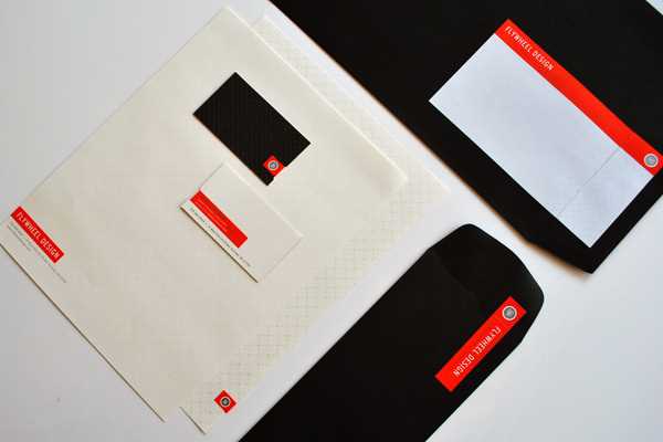
POGO

POGO proves that stationery doesn’t need to feel corporate or predictable.
The playful graphics and creative composition make this stationery set feel approachable, modern, and highly original. This kind of visual personality works especially well for creative agencies, startups, and lifestyle brands.
Sachin Bavkar
Sachin Bavkar’s elegant stationery design uses monotone colors and clean graphical elements to create sophistication through simplicity.
Minimalist stationery designs often feel more premium because they allow typography and layout to breathe naturally.
This approach works especially well for luxury brands, consultants, and professional services.
Jonathan Herman
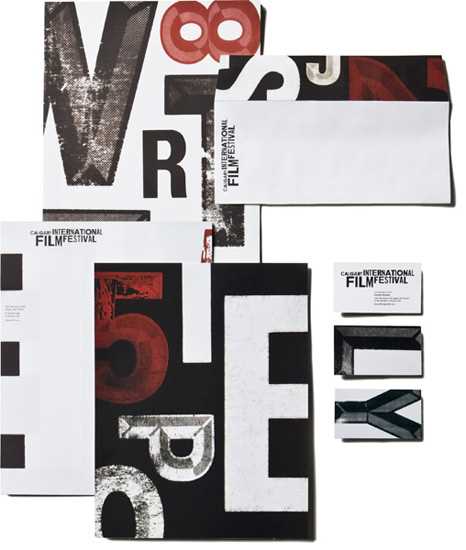
Jonathan Herman’s work is a perfect example of typography-driven branding.
Instead of relying on heavy graphics, the design allows typography to become the centerpiece of the visual identity.
Strong typography creates confidence, professionalism, and memorability — especially when paired with clean layouts and high-quality printing.
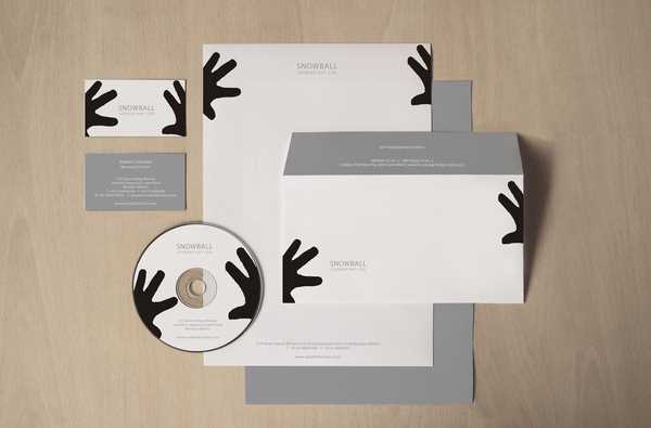
Martin Stousland

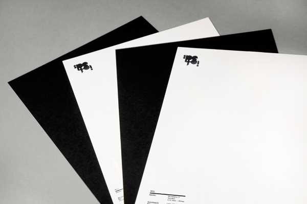
Martin Stousland creates striking contrast using black-and-white stationery elements across business cards, envelopes, and letterheads.
The consistency between each printed piece strengthens the overall branding and creates a cohesive visual system.
This is a strong reminder that good stationery design isn’t about individual pieces — it’s about how every element works together.
Businesses investing in complete stationery systems often benefit from combining:
for a more professional brand experience.
Mash Creative
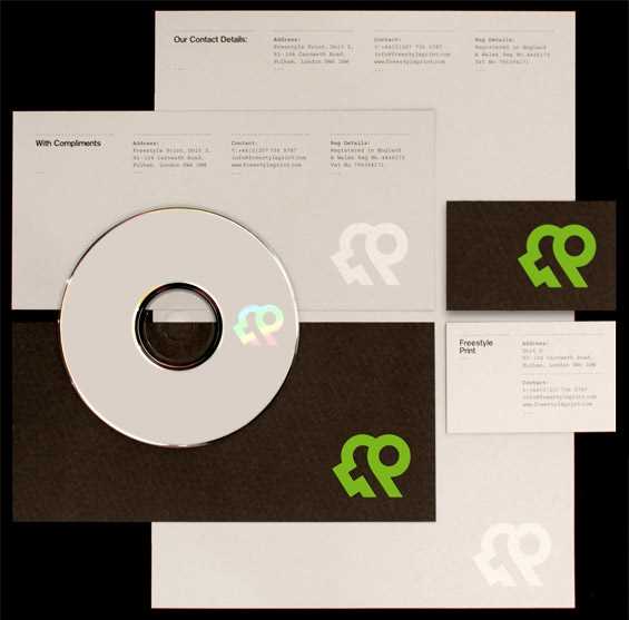
Mash Creative uses vivid colors and modern layouts to transform traditional stationery into something visually exciting.
Bright color palettes can help brands stand out, but balance is important. Here, the structure and spacing keep the design polished instead of chaotic.
This is a great example of creative stationery design that still feels professional and intentional.

The vivid colors and brilliant composition showcase how even corporate stationery can be daring and fresh.


5 Comments
Awesome stationary designs…www.pelayodesigns.com. Keep up the great posts & Thanks 🙂
Excellent article!! I know when I first started designing, the entire print side of things was wild and really hard to comprehend – why would my nice, bright designs come back from the printers all dull?! I didn’t get it, b’coz it’s not talked about adequate, even at uni. So thanks for this article. The more we all talk about it, the better.
Nice collection, however some of these might require a custom stock and cut size for them to print easily…
Great work and nice tutorial. Love the design. Not everything has to be done in Indesign, Illustrator is very capable. I would also encourage designers to look into xara designer pro, for me it outshines illustrator in many ways.
Great content material and great layout. Your blog post deserves all of the positive feedback it has been getting.