Walk into a hotel lobby, visitor center, or coffee shop and you’ll probably see dozens of rack cards sitting untouched.
Same display.
Same format.
Same problem.
Most of them never get picked up.
Not because the business is bad.
Not because the offer is weak.
But because the design gives people no reason to care.
That’s the real challenge with rack cards.
You usually have a few seconds — sometimes less — to catch someone’s attention while they’re walking by, waiting in line, or scanning a crowded display.
And in 2026, attention is harder to win than ever.
The good news?
A well-designed rack card still works incredibly well for local marketing when it’s built strategically.
In this guide, you’ll learn:
- what a rack card actually is
- why some get ignored while others perform
- the design principles that increase pickup rates
- common mistakes businesses make
- how to create rack cards people actually keep
Why Some Rack Cards Get Picked Up (And Most Don’t)
Successful rack cards share a few things in common:
- They communicate one clear benefit instantly
- They’re easy to scan in under five seconds
- They use visuals that show outcomes, not filler
- They include a clear next step (scan, call, visit)
When these elements are missing, even cheap rack cards end up collecting dust.
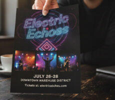
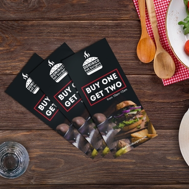
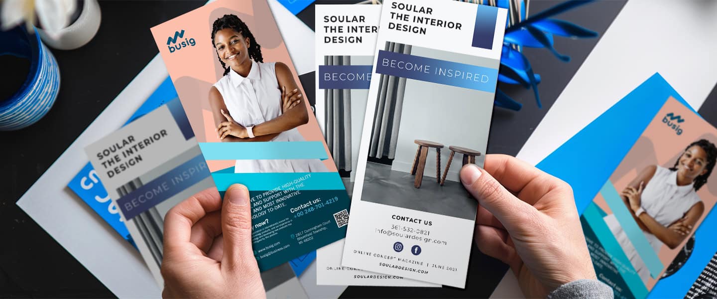
What Are Rack Card?
A rack card is a vertical marketing print piece designed to fit inside brochure racks, countertop displays, or waiting areas.
Most rack cards are:
- 4” × 9”
- printed vertically
- easy to scan quickly
- designed for high-traffic environments
Businesses use Rack Cards for:
- tourism marketing
- local promotions
- real estate marketing
- hospitality businesses
- events
- medical offices
- restaurants
- seasonal campaigns
Think of them as mini billboards people can physically take with them.
Unlike brochures, rack cards are not meant to explain everything.
Their job is simple:
Get enough attention for someone to grab one.
Why Rack Cards Still Work in 2026
A lot of businesses assume print marketing no longer matters.
But physical marketing actually stands out more now because people spend all day ignoring digital ads.
Online, attention disappears in seconds.
Offline, there’s often far less competition.
A strong rack card in:
- a hotel lobby
- a busy café
- a trade show booth
- a waiting room
- a tourism center
can still generate:
- bookings
- calls
- foot traffic
- appointments
- event attendance
Especially when combined with:
- QR codes
- local targeting
- strong offers
- modern design
The businesses getting results from print today are the ones treating it strategically — not just as something “nice to have.”
Reading more print marketing blogs can also help businesses understand which print strategies still work best in 2026.
Why Most Rack Cards Get Ignored
Most rack cards fail for one reason:
They try to say too much.
Too much text.
Too many colors.
Too many competing ideas.
People don’t stop to “study” rack cards.
They scan them.
Usually in this order:
- Headline
- Image
- Offer
- CTA
If the message feels confusing or overwhelming, they move on instantly.
The best rack cards feel effortless to understand.
That’s why high-performing rack cards usually:
- focus on one clear benefit
- use bold, readable headlines
- rely on strong visuals
- guide the eye naturally
- include one obvious next step
Start With One Clear Goal
Before designing anything, ask:
“What do I want someone to do after picking this up?”
That answer should shape the entire rack card.
For example:
- restaurants may want reservations
- realtors may want listing inquiries
- gyms may want free trial signups
- tourism businesses may want bookings
- salons may want appointment calls
Trying to promote too many things at once weakens the message.
The strongest rack cards are built around one action.
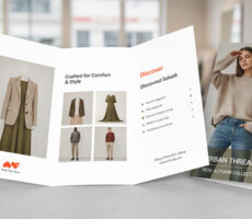
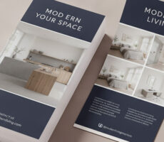
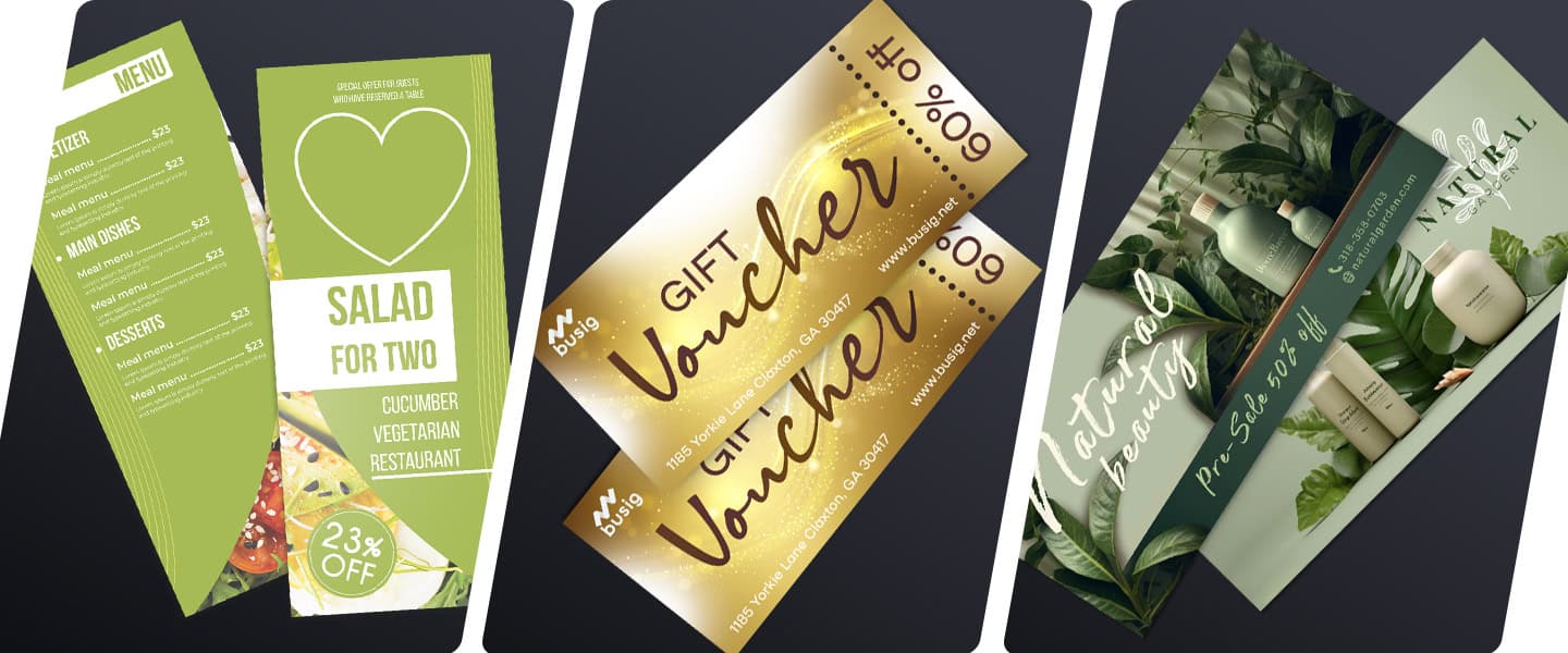
What to Put on a Rack Card
A strong rack card should feel simple and easy to scan.
Most high-performing rack cards include:
- A clear headline
- One main offer or benefit
- Strong visuals
- Short supporting text
- Contact information
- A QR code
- One clear CTA
The goal is not to explain everything about your business.
The goal is to give people enough information to take the next step.
For example:
- a restaurant may highlight a special menu or discount
- a realtor may showcase one featured property
- a gym may promote a free trial
- a tourism business may advertise one popular tour
Too much information usually lowers pickup rates.
The best rack cards focus on clarity, not quantity.
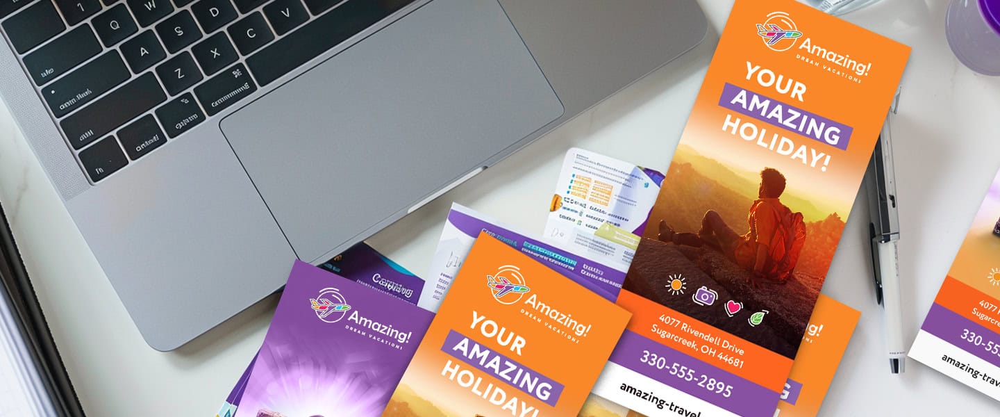
Your Headline Matters More Than Almost Anything Else
Your headline is usually the reason someone decides to:
- pick up the card
- ignore it
- keep reading
- throw it away
Generic headlines blend into the background.
Specific headlines create curiosity and relevance.
For example:
❌ “Welcome to Our Spa”
✅ “Relaxation Packages Starting at $49”
❌ “Professional Real Estate Services”
✅ “Homes Available Near Downtown This Month”
❌ “Tour Packages Available”
✅ “3 Local Tours Tourists Always Miss”
The faster people understand the value, the better your rack card performs.
The same principle also applies to high-converting flyer design.
Design for Fast Scanning, Not Deep Reading
One of the biggest mistakes businesses make is designing rack cards like brochures.
But rack cards are usually viewed:
- while walking
- while waiting
- while distracted
- from a distance first
That means your design should feel easy to process immediately.
The best layouts usually include:
- short sections
- clear spacing
- bold headlines
- bullet points
- visual hierarchy
- minimal clutter
People should understand the core message in under five seconds.
If the design feels heavy or crowded, pickup rates drop fast.
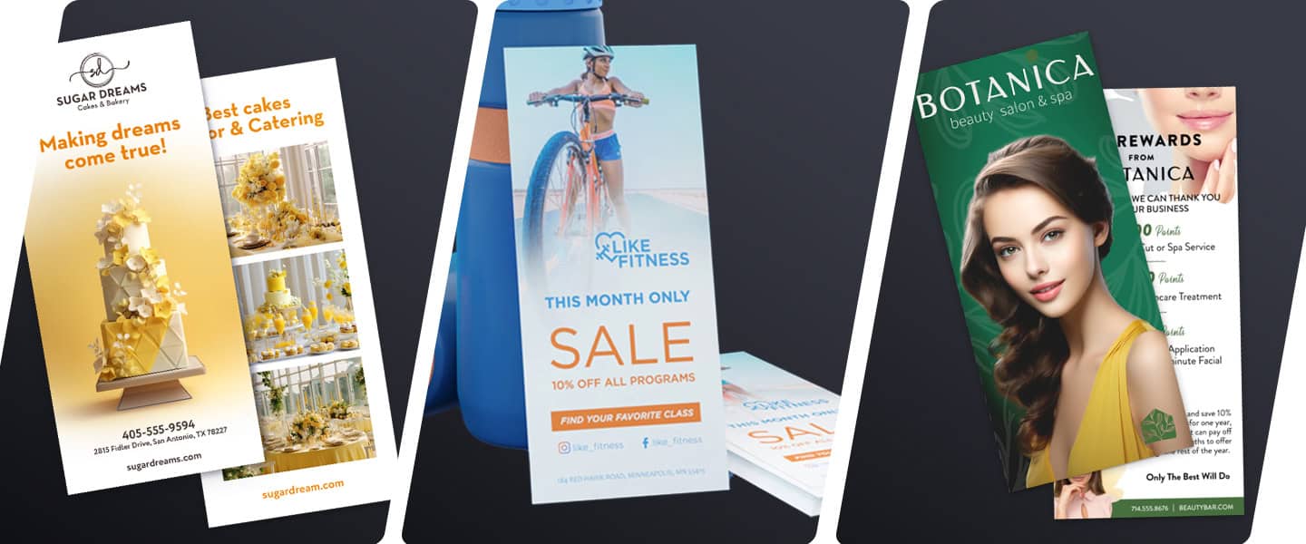
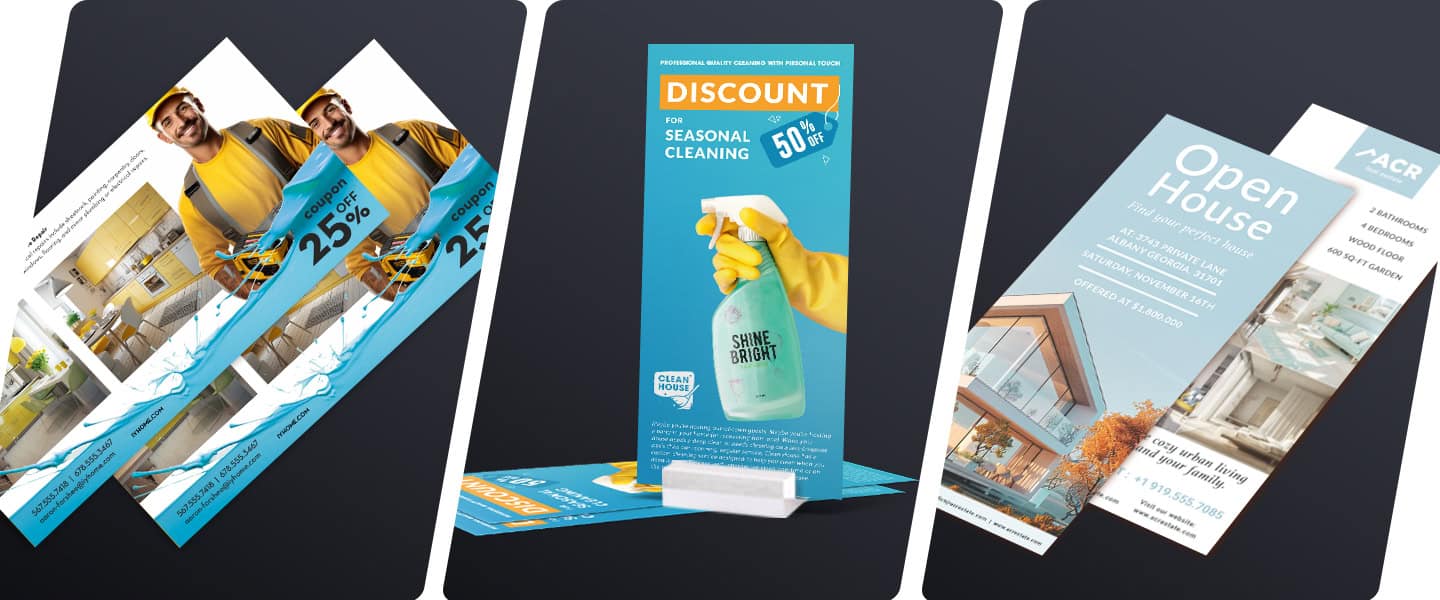
Use Images That Show the Outcome
People respond more strongly to results than services.
Instead of showing:
- generic stock photos
- random office shots
- decorative filler images
show the outcome customers actually want.
Examples:
- smiling travelers
- finished meals
- beautiful spaces
- event experiences
- transformations
- real products in use
For example:
- a realtor should show the lifestyle, not just the house
- a salon should show the final result, not just tools
- a restaurant should show the experience, not just a logo
Strong visuals instantly communicate emotion and value.
QR Codes Are One of the Most Important Features in Modern Rack Cards
In 2026, print works best when it connects directly to digital action.
That’s why QR codes have become essential.
Businesses now use QR codes to:
- book appointments
- display menus
- show maps
- claim discounts
- RSVP to events
- view listings
- access online offers
This makes the customer journey much easier.
Instead of expecting someone to remember your website later, the rack card creates immediate action.
Your CTA Should Be Impossible to Miss
Every rack card needs one clear next step.
Not three.
Not five.
One.
Good CTAs are:
- direct
- visible
- action-focused
Examples:
- “Scan to Book Your Appointment”
- “Call Today for a Free Estimate”
- “Visit Our Booth This Weekend”
- “Claim Your Discount Before Friday”
Weak CTAs create hesitation.
Strong CTAs reduce friction.
Paper Quality Changes How People Perceive Your Brand
People notice print quality more than businesses realize.
A flimsy rack card often feels disposable.
A thicker, high-quality card feels:
- more trustworthy
- more professional
- more premium
Many businesses choose:
- glossy finishes for vibrant colors
- matte finishes for a cleaner look
- thicker cardstock for durability
Especially in hospitality, tourism, and luxury industries, presentation matters.
Businesses often pair rack cards with:
to create stronger local campaigns.
If you’re unsure which stock works best, this guide on paper types for high-quality printing can help.
Where Rack Cards Perform Best
Rack cards work especially well in places where people naturally browse or wait.
Common locations include:
- hotels
- coffee shops
- tourism centers
- airports
- gyms
- trade shows
- medical offices
- retail counters
- real estate offices
The key is placement.
A great rack card in the wrong location performs poorly.
An average rack card in the right location can still generate results.
Context matters.
Common Rack Card Mistakes Businesses Make
Too Much Text
People scan first.
Long paragraphs reduce attention immediately.
Weak Headlines
Generic wording disappears into the background.
Low-Quality Images
Blurry or outdated visuals reduce trust instantly.
Too Many Colors
Busy layouts feel chaotic and unprofessional.
No Clear CTA
If people don’t know what to do next, they usually do nothing.
Trying to Promote Everything
The best rack cards focus on one clear message.
Real Businesses Using Rack Cards Successfully
Restaurants
Promoting brunch specials, local offers, and seasonal menus.
Realtors
Showcasing listings, neighborhood guides, and open houses.
Tourism Businesses
Advertising tours, attractions, and local experiences.
Gyms & Fitness Studios
Offering free classes, promotions, and membership campaigns.
Medical & Wellness Offices
Promoting services, patient offers, and appointment bookings.
The strongest rack cards usually focus on solving one specific problem instead of explaining an entire business.
Frequently Asked Questions
What is a rack card used for?
Rack cards are used to promote businesses, services, events, or attractions in public display areas.
What size is a standard rack card?
Most rack cards are 4” × 9” and designed vertically for brochure displays.
Are rack cards still effective?
Yes. Rack cards still perform well for local marketing, tourism, hospitality, real estate, and events.
What should a rack card include?
A strong headline, clear visuals, contact information, one CTA, and an easy-to-understand offer.
What makes a rack card stand out?
Simple layouts, bold headlines, strong visuals, and clear messaging usually perform best.
Final Takeaway
The best rack cards don’t try to say everything.
They do one thing extremely well:
They make people stop long enough to care.
Because in crowded spaces filled with distractions, attention is everything.
And in 2026, businesses that win with print are the ones designing for human behavior — not just filling space on a page.