Print materials get read when they are designed for clarity, relevance, and real human behavior, not decoration. Effective print design prioritizes readability, message hierarchy, and context over visual overload, helping flyers, postcards, and rack cards stand out instead of being ignored.
Most print materials don’t get thrown away because people hate print.
They get thrown away because they’re confusing, overwhelming, or irrelevant in the first few seconds.
In reality, people still read print, when it respects how they actually consume information. They skim. They glance. They decide quickly whether something deserves attention.
This article breaks down how to create effective print design that works in the real world, focusing on readable flyers, postcards, and rack cards that earn attention instead of ending up in the trash.
Why Print Design Fails Before Content Ever Does
One of the most common misconceptions is that print fails because of declining attention spans. In practice, print usually fails because the design asks too much from the reader.
If someone has to:
- Figure out what the piece is about
- Search for the main message
- Decode visual hierarchy
They’re already gone.
A frequent question small businesses ask is:
“Why do my flyers get ignored even when the offer is good?”
The answer is almost always design-related, not offer-related. If the message isn’t immediately obvious, people won’t invest time to find it.
Effective Print Design Starts With One Clear Point
The strongest print materials don’t explain everything. They explain one thing well.
Many flyers and postcards fail because they try to:
- Promote multiple offers
- Explain the business history
- List every service
This creates visual noise and cognitive overload.
Print that gets read starts with a single decision:
What is the one takeaway this reader should remember?
Everything else in the design should support that one idea—or be removed.
Readability Is the Real Conversion Tool
Creativity gets attention, but readability keeps it.
Print materials are rarely read in calm, focused environments. They’re seen:
- While walking
- While waiting
- While distracted
That’s why readability matters more than clever layouts or decorative fonts.
Readable print uses:
- Clear type sizes
- Strong contrast
- Short lines of text
- Obvious hierarchy
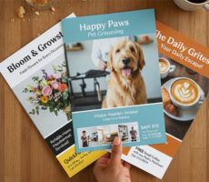
This is especially critical for readable flyers, which are often scanned in seconds.
Product reference: Flyer
A common concern is:
“Does font choice really affect whether people read print?”
Yes. If text feels hard to read, people disengage immediately—no matter how good the message is.
Typography: The Difference Between Read and Ignored

Typography quietly determines whether print works or fails.
Using too many fonts, overly stylized type, or text that’s too small creates friction. Friction equals abandonment.
Effective print design usually relies on:
- One primary font for headlines
- One simple font for body text
- Clear size contrast between sections
The goal isn’t to impress, it’s to be understood quickly.
Why White Space Makes Print Feel Easier to Read
One of the biggest design mistakes SMBs make is trying to “fill the page.”
In print, empty space isn’t wasted—it’s functional.
White space:
- Separates ideas
- Guides the eye
- Makes content feel approachable
Crowded designs signal effort. Calm designs invite reading.
This principle applies across flyers, postcards, and rack cards.
Common Print Design Mistakes That Cause Materials to Be Ignored
Many print materials fail for the same reasons over and over again. The problem usually isn’t the offer or even the print quality—it’s the design choices that make the message harder to understand.
Too Much Information
Businesses often try to fit everything onto one flyer or postcard:
- Every service
- Every promotion
- Every contact method
- Every company detail
The result is information overload.
When everything is important, nothing stands out.
Weak Headlines
A headline should immediately tell readers why they should care.
Compare:
“Professional Services Available”
vs.
“Save 20% Before July 31”
The second gives people a reason to keep reading.
Small Text
One of the most common flyer design mistakes is shrinking text to fit more information.
If people have to strain to read, they won’t.
Too Many Fonts
Using several font styles creates visual clutter and weakens hierarchy.
Most effective print materials use only one or two fonts consistently.
Low Contrast
Light gray text on a white background might look modern on a computer screen, but it often becomes difficult to read in real-world conditions.
Strong contrast improves readability instantly.
Multiple Calls to Action
Should readers call?
Visit your website?
Scan a QR code?
Visit your store?
Choose one primary action. The more options people have, the less likely they are to take any of them.
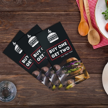
Designing Flyers That People Actually Read
Flyers are often the most abused print format. They’re expected to do too much in too little space.
Flyers perform best when they feel simple and intentional. The most effective flyer designs:
- Make the headline obvious
- Keep supporting text minimal
- Highlight one action
A question that often comes up is:
“Should flyers include lots of details?”
Only if those details help someone act immediately. Otherwise, they reduce readability and impact.
Flyers are not brochures, they’re invitations to act.
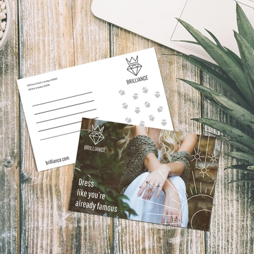
Designing Postcards That Don’t Get Ignored
Postcards are handled differently than flyers. People usually pick them up, flip them, or glance at both sides.
That makes clarity even more important.
Effective postcard design relies on:
- One dominant visual or statement
- Very limited copy
- A clear reason to care
Do postcards need less text than flyers?
In most cases, yes. Postcards work best when the message can be understood instantly.
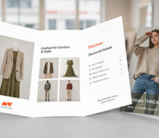
Product reference: Postcards
Rack Cards: Designed to Compete, Not Explain
Rack cards live in crowded environments. They’re surrounded by other print pieces competing for attention.
This means rack cards shouldn’t explain—they should attract.
Effective rack card design focuses on:
- Strong top messaging
- Vertical hierarchy
- Immediate value
If the card doesn’t communicate relevance in seconds, it won’t be picked up.
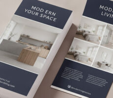
Product reference: Rack Cards
Related guide for deeper insight: Rack Card Design Tips: Stand Out & Get Picked Up
Color and Contrast: Designed for Real Conditions
Print materials are rarely viewed under perfect lighting.
They’re seen near windows, on counters, outdoors, or in busy spaces. That’s why contrast matters more than aesthetics.
A frequent design question is:
“Should brand colors always be used exactly?”
Not if they reduce legibility. Effective print design prioritizes contrast and clarity over strict color rules.
Design Checklist for Small Businesses (Use Before You Print)

Before approving any print material, small businesses should pause and check a few fundamentals. This step alone prevents most design failures.
Ask yourself:
- Can someone understand the message in under 5 seconds?
- Is there one clear focal point?
- Is the text readable from arm’s length?
- Does the design guide the eye naturally?
- Is there only one main action?
If the answer to any of these is no, the design needs refinement.
This checklist is especially useful for SMBs managing design without a full creative team.
Design for Context, Not Just Layout
One overlooked question is where the print piece will actually be seen.
A flyer taped to a window needs different design priorities than a postcard mailed to a home. Context affects font size, contrast, and message structure.
Print that’s designed for its environment performs better—because it meets people where they are.
How Different Industries Use Print Successfully
Effective print design changes depending on the audience and environment.
Real Estate
Realtors often use postcards, flyers, and property sheets.
The most successful designs typically feature:
- One strong property image
- A clear price point
- Minimal copy
- One contact method
Too much information can distract from the listing itself.
Restaurants
Restaurant flyers and postcards work best when they focus on:
- One featured menu item
- One promotion
- Strong food photography
Customers often decide visually before they ever read the details.
Gyms and Fitness Studios
Fitness marketing performs best when the design emphasizes transformation and results.
Successful gym flyers usually highlight:
- One offer
- One success story
- One action step
Local Service Businesses
Plumbers, electricians, landscapers, and home service companies benefit from highly readable designs.
Customers want quick answers:
- What do you do?
- Where do you serve?
- How do I contact you?
The faster those questions are answered, the more effective the print piece becomes.
Retail Stores
Retail promotions often perform best with large product imagery, limited text, and one featured offer.
A cluttered promotion can reduce urgency and make it harder for shoppers to act.
Choosing the Right Print Format
Not every print product serves the same purpose. Choosing the wrong format can make even a great design less effective.
Use this quick comparison as a starting point:
| Print Format | Best For | Attention Span | Recommended Copy Length |
|---|---|---|---|
| Flyers | Promotions, events, sales | Low | Short |
| Postcards | Direct mail campaigns | Very Low | Very Short |
| Rack Cards | Tourism, hospitality, local attractions | Low | Short |
| Brochures | Services, product information, storytelling | Medium | Medium to Long |
| Posters | Brand awareness, events, storefronts | Seconds | Minimal |
| Business Cards | Networking and referrals | Seconds | Minimal |
The most effective print materials align the format with the reader’s expectations. A brochure can provide detail, while a postcard or flyer often needs to communicate its message in just a few seconds.
Less Information Often Leads to More Engagement
Many businesses worry that simplifying means leaving value out.
In reality, print works best when it sparks interest, not when it explains everything.
A strong print piece:
- Communicates the core message
- Invites the next step
- Leaves details for later
This is how print supports, not replaces, other channels.
Why Effective Print Design Still Works in a Digital World
Print doesn’t compete with digital, it complements it.
When designed well, print:
- Cuts through digital noise
- Feels intentional
- Slows people down just enough
This is why print that’s designed to be read still works—even now.
Real-World Examples of Effective Print Design
A useful way to evaluate print design is to imagine someone seeing it for the first time.
Example 1: The Effective Flyer
A local gym wants to promote a free trial week.
Instead of listing every membership option, class type, and trainer bio, the flyer focuses on:
Headline: Free 7-Day Pass
Visual: One energetic workout image
CTA: Scan to Claim Your Pass
Everything supports one action.
Example 2: The Effective Postcard
A realtor mails postcards to homeowners.
The front features:
- One property image
- One headline
- One market statistic
The back contains contact information and a simple call to action.
The message is clear within seconds.
Example 3: The Effective Rack Card
A tourist attraction places rack cards in local hotels.
Instead of explaining every feature, the card highlights:
- One key experience
- One compelling image
- One reason to visit
The goal is curiosity, not complete education.
In each example, simplicity improves readability and increases the likelihood that someone engages with the message.
Final Takeaway
Print materials don’t get read because they exist.
They get read because they are designed with clarity, restraint, and respect for attention.
When small businesses focus on readability, hierarchy, and context, flyers, postcards, and rack cards stop being disposable, and start becoming effective.