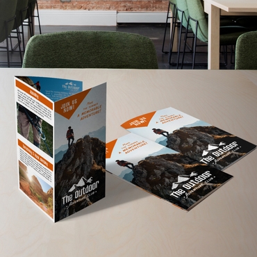
One of my pet peeves is when a small business owner tries to pack everything they can possibly think of into their brochure, then they sit back and wonder why their brochure isn’t earning the return on investment they’d hoped for.
You see, they mistakenly believe brochures are printed to inform customers.
The fact is that brochures are not tidy little information-givers. They’re marketing tools and should be strategically designed as such. That’s why less is more when it comes to printing brochures: less clutter, more sales.
Your brochure should have a singular and definitive goal, and that goal should be designed before you jot down the first line of copy. Your goal might be to motivate customers to call you for a demo, visit a website, sign up for a newsletter, make a purchase or visit your retail location. You can answer all their questions when they follow up.
This isn’t to say you shouldn’t give any information; but it does mean you should only tell your customers what they need to know in order to be motivated to take the next step in the purchasing process.
Tell your customers:
- How your product or service will make life easier and better, and solve a problem
- Why your product, service and company is the best solution
- Any supporting data to that end
- Why now is the time to buy with a time-limited coupon offer
- What to do next
Anything else is extraneous information that gets in the way of your marketing pitch. Naturally, each of these points manifests itself differently for every individual company and campaign. One company might promote itself as trustworthy because it is a family business with decades of experience, while another in the same industry might promote its trustworthiness by explaining the benefits of a new cutting-edge technology. Put yourself in your customers’ shoes to determine what would motivate you to buy. That’s what your brochure should contain, and nothing more.
Ask yourself: Is this information going to help me make a sale? Why? Justify every aspect of your brochure by demonstrating how it will help you make sales; if a block of text or design element has no sales purpose, cut it. Don’t let your pride get in the way of profits.
Employ your graphic design prowess to draw customers in to your key selling points, offer, and call to action; but don’t clutter. White space is inviting space, it helps customers focus their attention, and it’s comfortable. It can be your best design and marketing tool because it frames your other elements, without the need for frames.


