Some fonts instantly make your design look unprofessional.
Others make it look outdated, messy… or just hard to take seriously.
The problem?
Most people don’t realize they’re using them.
In this guide, we’ll break down the worst fonts to avoid in design, why they don’t work, and what to use instead if you want your brand to look clean, modern, and credible.
Because in print, your font choice can make or break your first impression.
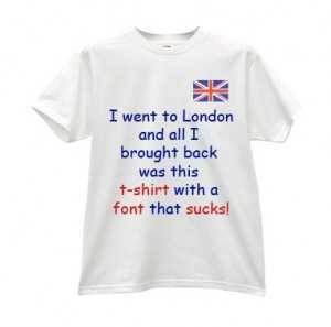
If you’re designing professional business cards, choosing the right font is just as important as layout and finish.
Worst Fonts to Avoid (Quick List)
- Hobo
- Viner Hand ITC
- Vivaldi
- Tekton Pro
- Algerian
- Papyrus
- Jokerman
- Brush Script
These fonts are often considered unprofessional, outdated, or difficult to read — especially in business or marketing materials.
Why Using the Wrong Font Hurts Your Design
Using the wrong font doesn’t just affect how your design looks — it affects how people perceive your brand.
A poor font choice can make your business seem:
- less professional
- harder to trust
- outdated
Even if your layout and colors are strong, typography can quietly undermine everything.
What Makes a Good Font for Print?
If you want your printed materials to stand out, look for fonts that are:
- Easy to read (even from a distance)
- Clean and modern
- Consistent with your brand tone
- Optimized for print clarity
This is especially important for:
If you’re designing business cards, choosing the right font is just as important as the finish. See our guide on Best Business Card Finish: Matte vs Glossy vs Soft Touch.
1] Hobo: Feels Forced and Unprofessional
Hobo is often used when people try to make a design feel “fun” — but it usually does the opposite.
Instead of playful, it comes across as:
- childish
- outdated
- unpolished
Where it fails:
- business materials
- event promotions
- professional branding
What to use instead:
- Rounded sans-serif fonts (like Poppins or Nunito) for a cleaner, modern “friendly” look

2] Viner Hand ITC: Messy and Difficult to Read
Viner Hand ITC tries to mimic handwriting, but ends up looking chaotic and inconsistent.
The sharp angles and uneven strokes make it:
- hard to read
- visually distracting
- overly stylized
Where it fails:
- marketing materials
- flyers
- anything with important information
If people have to slow down to read your text, you’ve already lost attention.
What to use instead:
- Pacifico
- Dancing Script
These keep a handwritten feel while staying readable and clean.

If you’re creating flyer printing for local marketing, readability should always come first.
3] Vivaldi: Overly Decorative and Hard to Use
Vivaldi is a highly decorative calligraphy font often used to signal elegance or romance.
The problem? It’s too much.
It quickly becomes:
- difficult to read
- visually overwhelming
- outdated in modern design
Where it fails:
- wedding invitations (ironically)
- branding
- promotional materials
It may look elegant at first glance, but it doesn’t scale well or communicate clearly.
What to use instead:
- Playfair Display
- Great Vibes
These give a refined, elegant look without sacrificing readability.

4] Tekton Pro: Tries to Be Casual, Feels Unpolished
Tekton Pro is meant to look like natural handwriting — but it ends up feeling inconsistent and unfinished.
Its irregular strokes and exaggerated details make it:
- visually noisy
- unbalanced
- slightly amateur
Where it fails:
- professional branding
- presentations
- printed marketing materials
It tries to feel human, but instead feels careless.
What to use instead:
- Raleway
- Lato
These offer a clean, modern look with subtle personality.

5] Algerian: Distracting and Over-Stylized
Algerian is one of those fonts that immediately dominates any design — and not in a good way.
Its heavy serifs and built-in shadow effect make it:
- hard to read
- visually overwhelming
- difficult to pair with other fonts
Where it fails:
- logos
- posters
- business materials
Instead of supporting your message, it competes with it.
What to use instead:
- Oswald
- Bebas Neue
These create strong visual impact without clutter.

When designing poster printing for events, your font needs to be readable from a distance.
6] Papyrus: Overused and Instantly Recognizable
Papyrus is one of the most overused fonts in design.
It’s often used to suggest:
- “ancient”
- “natural”
- “spiritual”
But because it’s everywhere, it feels:
- generic
- cliché
- unoriginal
Where it fails:
- branding
- logos
- professional print materials
Instead of adding meaning, it weakens your message.
What to use instead:
- Trajan
- Cinzel
These create a timeless, classic feel without looking overused.

7] Jokerman: Too Playful for Most Use Cases
Jokerman is designed to be bold and fun — but it quickly becomes chaotic.
With exaggerated shapes and decorative elements, it feels:
- loud
- unstructured
- difficult to read
Where it fails:
- business promotions
- signage
- branding
Unless your brand is extremely niche, it’s too distracting to be effective.
What to use instead:
- Fredoka
- Baloo
These keep a fun tone while staying readable and modern.

8] Brush Script: Outdated and Overused
Brush Script is one of the most commonly misused fonts in design.
It was originally meant to feel casual and handwritten, but today it feels:
- outdated
- generic
- overly stylized
Where it fails:
- business cards
- logos
- marketing materials
It often makes designs look like they haven’t been updated in years.
What to use instead:
- Montserrat
- Open Sans
These offer a clean, professional look that works across print and digital.

There are many other fonts that I find unbearable but I think that my list is complete (for now). I would love to hear your thoughts on these worst font choices! Maybe you have your own list, or maybe you would like to defend one of these fonts! It’s just design. It’s all entirely subjective!
Final Thoughts: Choose Fonts That Represent Your Brand
Trendy or “fun” fonts might grab attention — but the wrong choice can cost you credibility.
If your goal is to look professional, modern, and memorable, stick to fonts that support your message — not distract from it.
Ready to create print materials that actually look professional? Explore our custom printing options and bring your design to life.