Choosing the best business card finish can completely change how your brand is perceived. Whether you’re deciding between matte vs glossy business cards or considering soft-touch business cards, each option creates a different impression. In this guide, you’ll learn how each finish works, when to use it, and how to choose the right one for your brand.
Pick the right one, and your card feels intentional, professional, even premium.
Pick the wrong one, and it can feel cheap, distracting, or forgettable.
Here’s the simple truth:
The best business card finish isn’t about what looks good.
It’s about what fits your brand and how you want to be remembered.
If you’re wondering what the best finish for business cards is, it depends on how you want your brand to be perceived—clean, bold, or premium.
In this guide, you’ll learn the difference between matte, glossy, and soft-touch business cards, when each works best, and how to choose the right finish for your goals.
Best Business Card Finish (Quick Answer)
- Matte = clean, professional, easy to read
- Glossy = bold, vibrant, attention-grabbing
- Soft-touch = smooth, premium, high-end feel
If you’re deciding quickly:
- Choose matte for clarity and trust
- Choose glossy for strong visuals
- Choose soft-touch for a premium impression
Comparison Table (after the Quick Answer section)
| Finish | Best For | Appearance | Feel | Can Write On It? |
|---|---|---|---|---|
| Matte | Professional services, consultants, lawyers | Clean, non-reflective | Smooth | ✅ Yes |
| Glossy | Realtors, photographers, retail | Bright, vibrant | Slick | ❌ No |
| Soft-Touch | Luxury brands, agencies, creatives | Elegant, subtle | Velvety | ⚠️ Limited |
Most People Choose a Finish Based on Looks, That’s the Problem
When ordering business cards, most people focus on colors, layout, or logos.
The finish? It’s usually an afterthought.
But the finish is the first thing people feel.
It’s what decides if your card:
- Feels premium or cheap
- Looks clean or distracting
- Gets kept… or thrown away
If your goal is to make a strong first impression, the finish matters just as much as the design.
What This Guide Will Help You Decide
Instead of listing options, this guide will help you answer one question:
Which finish makes the most sense for your brand and how you use your cards?
We’ll break down when each finish works best, and when it doesn’t.
Matte Business Cards: Clean, Professional, Reliable
A matte finish is often the safest and most versatile choice.
It has a smooth, non-reflective surface that makes text easy to read and gives your card a clean, modern feel.
Business Cards with a matte finish work especially well if you want to come across as:
- Professional
- Minimal
- Easy to trust
This is why matte is common in industries like:
- Consulting
- Legal services
- Corporate roles
Another advantage: you can easily write on matte cards, which is useful for notes or appointments.
If your brand is more about clarity than flash, matte is a strong choice.
Glossy Business Cards: Bold, Bright, Attention-Grabbing
Glossy finishes reflect light, which makes colors appear more vibrant.
If your design includes:
- Photos
- Bright colors
- Strong visuals
Then glossy can make a noticeable difference.
Premium Business Cards with a glossy finish are often used by:
- Real estate agents
- Photographers
- Retail brands
Because they help visuals stand out.
But there’s a trade-off.
Glossy cards can:
- Be harder to read under certain lighting
- Feel less subtle
- Show fingerprints more easily
If your goal is to grab attention quickly, glossy works, but it’s not always the most refined option.
Soft-Touch Business Cards: Premium Without Being Loud
Soft-touch finishes are designed to feel different.
They have a velvety texture that immediately signals quality and intention.
When someone holds a soft-touch card, they notice it—even if the design is simple.
Premium Business Cards with soft-touch finishes are often chosen by:
- High-end brands
- Creative professionals
- Agencies
Because they create a quiet but strong impression.
They don’t rely on shine or color, they rely on feel.
If your brand is positioned as premium, this is one of the strongest choices.
What Each Finish Looks Like in Real Life
Seeing the difference can make the decision much easier.
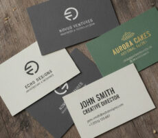
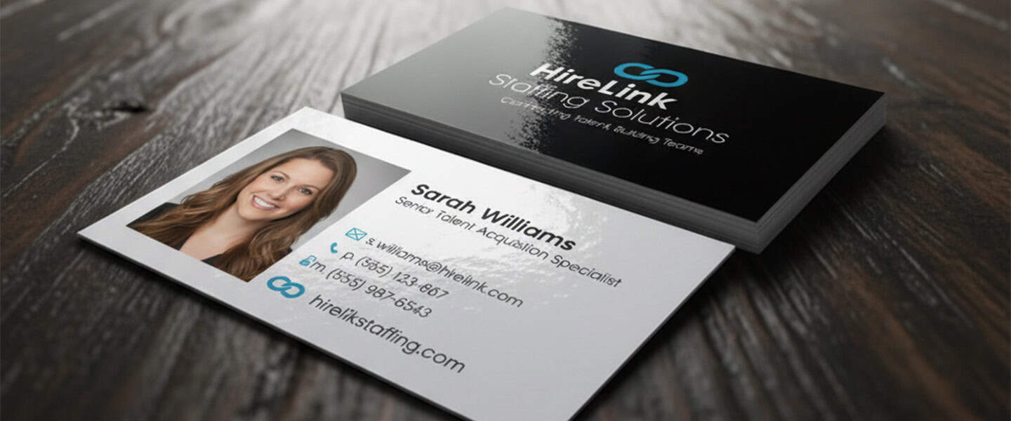
Matte Business Card Example
Example image: minimalist consulting or legal business card.
Notice how the text remains easy to read from every angle, with no glare or reflections.
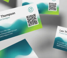
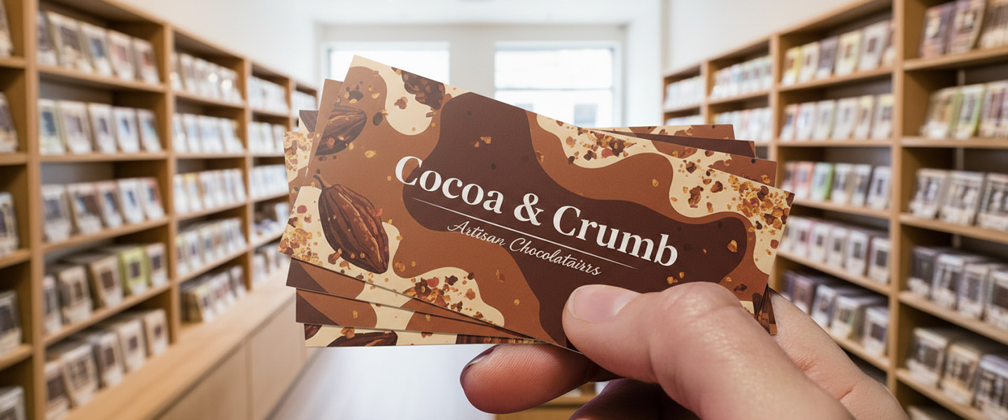
Glossy Business Card Example
Example image: real estate or photography card with vibrant colors.
The glossy coating makes colors pop and creates a more attention-grabbing appearance.
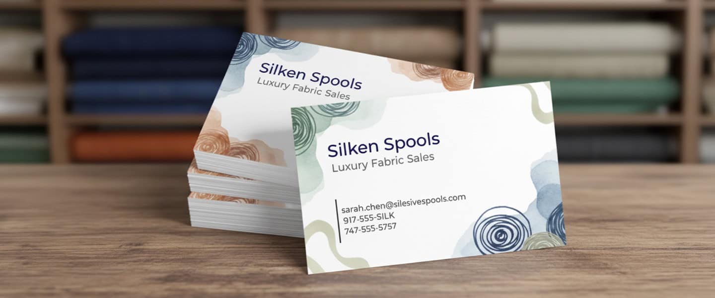
Soft-Touch Business Card Example
Example image: luxury brand or agency card.
Soft-touch cards stand out because of how they feel. The velvety texture creates a premium experience the moment someone picks up the card.
So… Which One Should You Choose?
This is where most people hesitate.
Here’s the simplest way to decide:
- Choose matte if you want clarity, readability, and a professional tone
- Choose glossy if your design relies on visuals and color
- Choose soft-touch if you want to feel premium and memorable
The mistake isn’t choosing the “wrong” finish.
It’s choosing one that doesn’t match your brand.
Which Business Card Finish Should You Choose?
Choose Matte if:
✔ You work in a professional industry
✔ Your design contains a lot of text
✔ You want a clean, trustworthy look
Choose Glossy if:
✔ Your design relies on photos or graphics
✔ You want bright, vibrant colors
✔ Standing out visually is the priority
Choose Soft-Touch if:
✔ You sell premium services
✔ Brand perception is important
✔ You want your card to feel memorable
Still unsure? Matte is usually the safest option for most businesses because it balances professionalism, readability, and versatility.
Matte vs Glossy Business Cards: What’s the Difference?
This is one of the most common questions — and for good reason.
Both finishes can look great, but they behave very differently.
Matte business cards:
- No shine → easier to read
- More subtle and professional
- Easier to write on
Glossy business cards:
- Reflect light → colors look brighter
- Better for images and bold designs
- Harder to read under glare
Simple rule:
- Matte = clarity and trust
- Glossy = attention and visuals
What People Often Overlook
A business card isn’t just something you hand out.
It’s something people experience.
And that experience is shaped by:
- Touch
- Light
- Texture
If your finish doesn’t align with your brand, it creates friction, even if the design looks good.
If you’re still refining your overall card strategy, this guide on How to Make Your Business Cards Stand Out (Even on a Budget) can help you think beyond just finishes.
Common Mistakes When Choosing a Business Card Finish
- Choosing glossy for text-heavy designs → hard to read
- Choosing matte when visuals need to stand out
- Ignoring how the card feels in hand
- Not matching finish to brand positioning
Fix: Always match finish to your goal (clarity, attention, or premium feel).
Final Recommendation
If you’re unsure, start with what aligns with your brand:
- Clean and simple → matte
- Bold and visual → glossy
- Premium and tactile → soft-touch
Then build from there.
The goal isn’t to pick what looks best, it’s to pick what feels right for your audience.
FAQ SECTION
What is the best finish for business cards?
The best business card finish depends on your brand. Matte is professional, glossy is bold, and soft-touch feels premium.
Are matte or glossy business cards better?
Matte is better for readability and a clean look, while glossy is better for vibrant colors and images.
What are soft-touch business cards?
Soft-touch business cards have a smooth, velvety texture that gives a premium, high-end feel.
Do business card finishes matter?
Yes. The finish affects how your card looks, feels, and how people perceive your brand.
Explore business card finishes and find the one that fits your brand, your design, and the impression you want to leave.