Colors influence how customers feel about your business before they even read a single word.
In print marketing, the right colors can help your flyers, brochures, postcards, and business cards attract attention, build trust, and encourage action.
That’s because color psychology is closely connected to emotion and decision-making. Certain shades can make a brand feel more professional, urgent, luxurious, calming, or trustworthy within seconds.
And unlike digital ads that disappear with a scroll, printed marketing materials stay in customers’ hands longer, giving color an even bigger impact.
In this guide, we’ll break down how print color psychology works, which colors perform best for different industries, and how to choose shades that make your marketing materials stand out.
Why Color Matters in Print Marketing
Color is one of the most powerful tools in marketing design.
Studies show that color can increase brand recognition and strongly influence first impressions. Customers often form opinions about a business before reading the actual message, simply based on visual presentation.
In print marketing, color becomes even more important because printed materials feel more intentional, physical, and memorable than digital ads.
The right colors can help your print materials:
- Grab attention quickly
- Increase readability
- Highlight important offers
- Build trust and credibility
- Create emotional connections
- Improve brand recognition
Whether you’re designing flyers, brochures, postcards, or presentation folders, choosing the right color palette can directly affect how customers respond to your marketing.
Learn more in Print Products That Make Your Brand Look Bigger Than It Is
How Colors Print Differently on Paper
One of the biggest mistakes businesses make is choosing colors that look great on a screen but print poorly on paper.
That’s because digital designs use RGB colors, while professional printing uses CMYK ink combinations.
As a result:
- Colors may appear slightly darker in print
- Neon shades may lose intensity
- Glossy finishes make colors appear brighter
- Matte finishes create softer, more premium tones
Paper stock also changes how colors look.
For example:
- Glossy paper makes vibrant colors pop
- Matte paper creates a softer, elegant look
- Thick cardstock often feels more luxurious and professional
This is why testing print samples before large production runs is important, especially for direct mail campaigns or premium marketing materials.
Best Colors for Flyers and Print Marketing
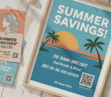
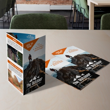
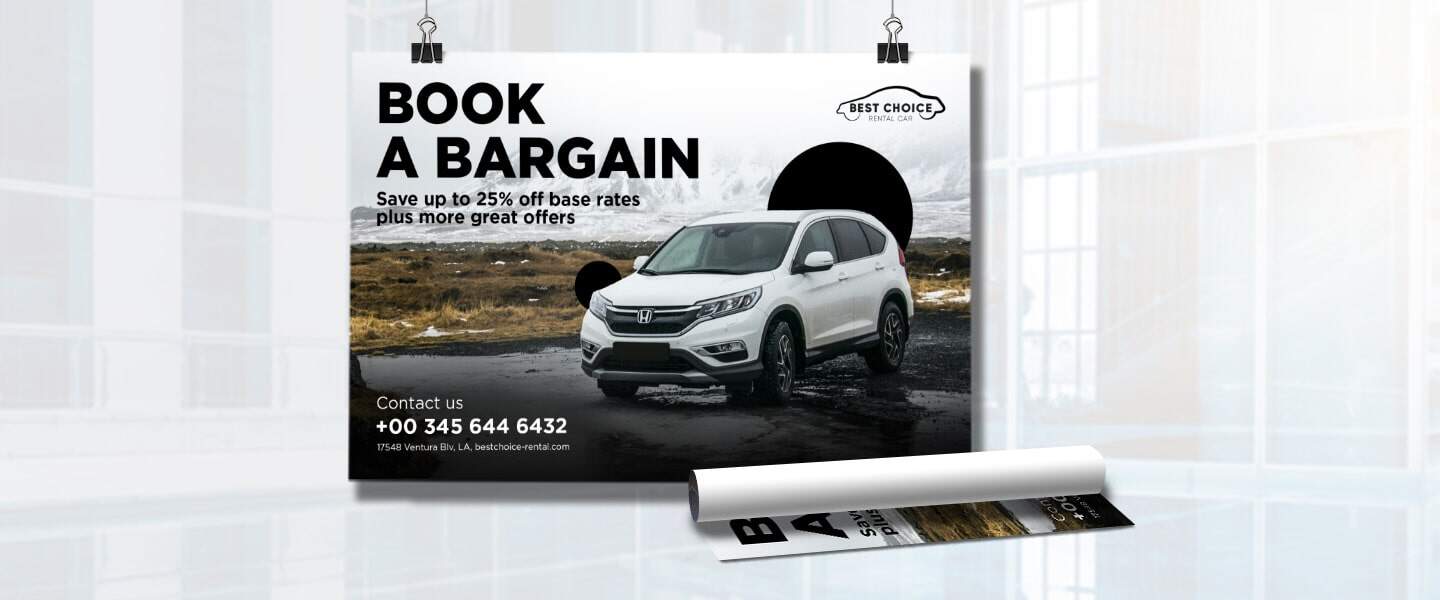
🔴 Red: Energy, Urgency & Action

Red is one of the strongest attention-grabbing colors in marketing.
It creates a sense of:
- Excitement
- Urgency
- Fast action
Businesses often use red for:
- Limited-time sales
- Clearance promotions
- Restaurant flyers
- Seasonal offers
Best print uses for red:
- Sale flyers
- Promotional postcards
- Discount signage
- Event promotions
Red works especially well when paired with strong contrast and bold typography.
🔵 Blue: Trust & Stability
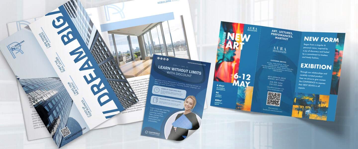
Blue is one of the most commonly used business colors because it feels reliable and professional.
It helps communicate:
- Trust
- Security
- Calmness
- Stability
Blue is especially effective for:
- Financial businesses
- Healthcare providers
- Consultants
- Real estate marketing
Best print uses for blue:
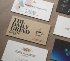
- Business cards
- Corporate brochures
- Service-based flyers
- Presentation folders
🟡 Yellow: Optimism & Attention
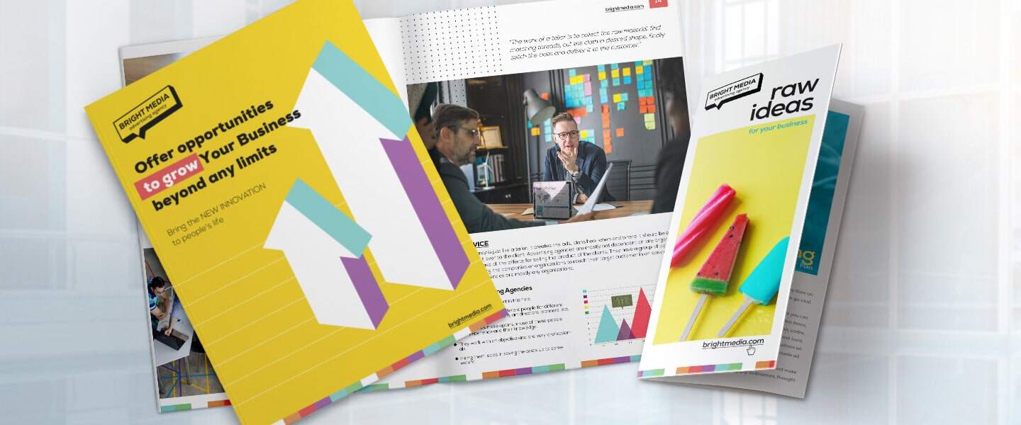
Yellow naturally attracts the eye and creates a positive, energetic feeling.
Businesses use yellow to:
- Highlight important messages
- Draw attention to headlines
- Create a friendly tone
However, too much yellow can feel overwhelming in print, so it works best as an accent color.
Best print uses for yellow:
- Event flyers
- Retail promotions
- Rack cards
- Seasonal campaigns
Yellow is particularly effective for businesses targeting younger or highly social audiences.
🟢 Green: Growth, Wellness & Sustainability
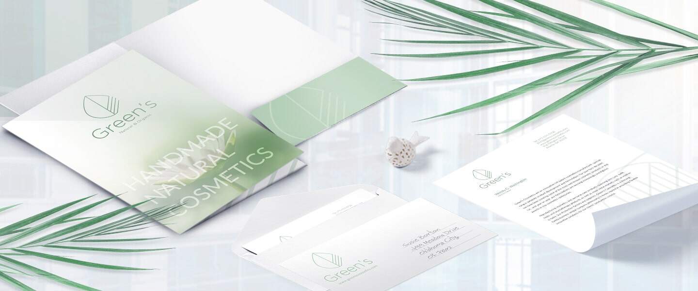
Green is strongly associated with:
- Health
- Nature
- Relaxation
- Financial growth
This makes it a popular choice for:
- Wellness brands
- Eco-friendly businesses
- Financial services
- Organic products
Best print uses for green:
- Wellness brochures
- Eco-friendly packaging
- Healthcare marketing
- Sustainability campaigns
Lighter greens often feel fresh and calming, while darker greens communicate luxury and stability.
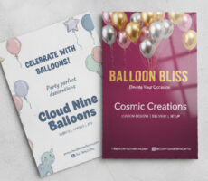
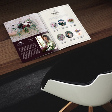
🟣 Purple: Luxury & Creativity
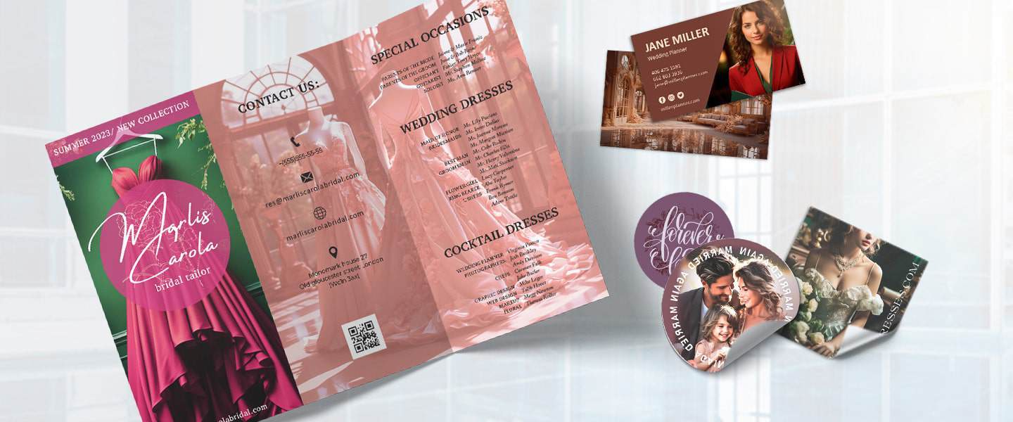
Purple is often associated with:
- Creativity
- Luxury
- Exclusivity
Because fewer businesses use purple heavily, it can help marketing materials stand out quickly.
Best print uses for purple:
- Premium business cards
- Beauty industry brochures
- Creative agency marketing
- Event invitations
Purple works especially well when combined with minimalist layouts and premium paper stocks.
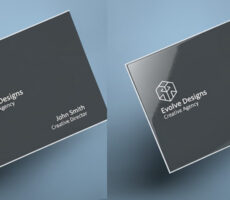
⚫ Black & White: Elegance & Simplicity
Black and white designs remain timeless in print marketing.
They help create:
- Clean layouts
- Strong typography focus
- Sophisticated branding
- Modern aesthetics
Black and white also work well for businesses wanting a more minimalist or luxury appearance.
Best print uses for black and white:
- Letterhead
- Notecards
- Luxury branding
- High-end business cards
When used correctly, black and white designs can often feel more premium than colorful layouts.
Best Print Colors by Industry
Different industries benefit from different emotional responses.
Here are some common print color strategies businesses use:
| Industry | Recommended Colors | Why They Work |
|---|---|---|
| Restaurants | Red, orange, yellow | Encourage appetite and urgency |
| Healthcare | Blue, green | Build trust and calmness |
| Real Estate | Blue, black, gold | Professional and premium feel |
| Fitness | Red, black, neon accents | Energy and motivation |
| Beauty | Purple, blush, black | Luxury and creativity |
| Finance | Blue, green | Trust and stability |
Choosing colors that match customer expectations can help your marketing feel more natural and trustworthy.
Tips for Choosing Colors That Sell
Keep Your Brand Consistent
Your flyers, brochures, postcards, and business cards should all follow a similar color palette to strengthen brand recognition.
Consistency helps customers remember your business more easily.
Use Contrast Carefully
Strong contrast improves readability and helps important messages stand out.
For example:
- Dark text on light backgrounds
- Bright CTA buttons against neutral layouts
- Bold headlines with clean spacing
Too many competing colors can make print materials feel cluttered and confusing.
Think About Print Readability
Colors that look great digitally may become difficult to read once printed.
Avoid:
- Light gray text on white backgrounds
- Neon shades with low contrast
- Overly busy color combinations
Always test readability before printing large quantities.
Match Colors to Customer Emotion
Before choosing colors, ask yourself:
- Should this design feel urgent?
- Trustworthy?
- Luxurious?
- Friendly?
- Calm?
The emotional goal should guide your palette choices.
Dive deeper into effective print design in:
Frequently Asked Questions About Print Color Psychology
What color attracts the most attention in print?
Red and yellow typically attract the most immediate attention because they create strong visual contrast and energy.
What colors build trust in marketing?
Blue and green are commonly associated with trust, professionalism, and reliability.
What is the best color for promotional flyers?
Red, orange, and yellow often perform well for promotional flyers because they create urgency and visibility.
Why do colors look different in print?
Printed materials use CMYK inks instead of RGB digital colors, which can slightly change brightness and tone.
What colors work best for luxury brands?
Black, gold, deep blue, and purple are often associated with premium and luxury branding.
Final Thoughts: Color Can Make or Break Your Print Marketing
Color is more than a design decision.
It directly influences how customers feel about your business, how long they pay attention, and whether your marketing materials feel trustworthy, exciting, or premium.
The right print colors can help your flyers stand out, make your brochures easier to read, and give your brand a stronger visual identity.
Whether you’re creating postcards, brochures, rack cards, or business cards, thoughtful color choices can turn simple print materials into more effective marketing tools.
Start designing professional print marketing materials with Overnight Prints today.