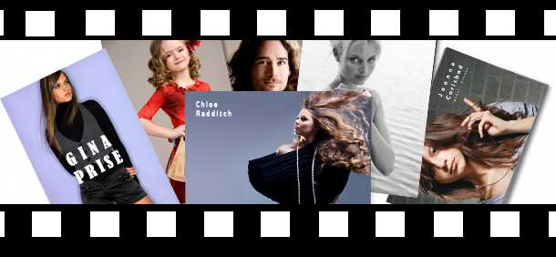
Comp cards or “zed cards,” as they are also referred to, are postcard portraits for models, actors and other people in the fashion/entertainment industry trying to make it in Hollywood!

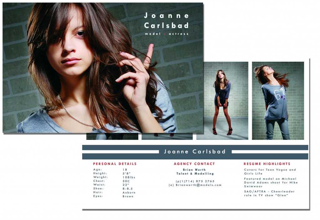
Your Comp Card should act as a visual resume. They serve as a standardized way for models and entertainers to promote themselves. Generally, they refer to an 8.5” x 5.5” postcard. However, it’s not uncommon to create a 4″ x 6″, 8″ x 10″ or other flyer-sized versions. The most important aspect of creating a comp card is to communicate your visual resume as effectively as possible.
When choosing the size of your comp card, my suggestion is that you try to go “smaller” rather than larger. That way you can easily have them to-hand in your purse, bag or glove compartment. When the opportunity arises, you can hand them to a potential employer (don’t forget to take your comp cards to any parties or functions you are going to!).
When creating your card, there are standards that you really should adhere to:
Front side
Headshot – your best professional portrait that will really “wow” the viewer!
Back Side
- Body shot or multiple shots that show your versatility
- Information such as height, body measurements, shoe size, eye/hair color and contact info are a must (especially for models)
- Agency contact
- Actors could include stills from TV, film or theater roles
- You can also include personal information and major achievements, i.e., magazines worked on, famous photographers you may have worked with, productions, shows, film appearances (and other relevant work history)
If you’re serious about making it in the business as a famous model or actor, then comp cards are an absolutely essential tool for getting recognized by agencies and casting agents. Presenting one, especially a well-composed one, is extremely important – it represents yourself as a serious professional who is serious about their work.
To make your portraits look as clean and crisp as possible, you really should be looking at offset printing rather than cheaper digital printing. The difference is clearly visible. If you’ve gone to the expense and effort to get professional portraits done, then you really need to present those photographs in the best light possible.
If you decide to design your comp cards yourself, here’s a Photoshop and Illustrator 8.5” x 5.5” comp card design:
DOWNLOADABLE COMP CARD PSD TEMPLATE FILE
This PSD file is a nice clean comp card design that you can download yourself. Simply replace the photographs and text with your own copy.
For more postcard templates or to design your own, visit overnightprints.com.


2 Comments
I am so grateful to find this post! I’ve been looking for layout ideas for the model comp cards at our agency, which believe it or not is an online virtual one. I tried to download the psd file to use it as a base to work from. It only gives the front photo, not the template for the back part. Is that correct or have I downloaded something incorrectly? Thanks for any help!
When you open the psd file in photoshop, look at the layers palette. If you turn the eye ball icon off of the “front” folder you can see the layers for the backside.