This simple but “crafty” Photoshop tutorial is inspired by the kind of handmade cards that you often see being sold on Etsy, HowAboutOrange, and Dawanda.
This really easy Photoshop tutorial is perfect for those readers who are new to Photoshop and who want to develop their skills in working with paths, fills, and styles (Note: You will need to utilize both Illustrator and Photoshop to create the card in this particular tutorial, but the various photoshop effects can be applied to any “path” elements and objects that you wish to create)
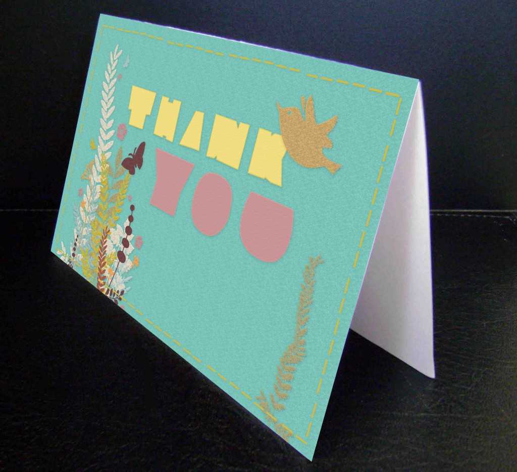
>>DOWNLOAD ORIGINAL GREETING CARD PSD FILE HERE<<
PSD GREETING CARD TUTORIAL
I actually started off this project in Illustrator. After downloading the following vector file from Vecteezy:

Open this file in Illustrator.
While this illustrator file is open, create a new file in Photoshop, sized at 4.25 x 5×5 – this will be the front of your card (alternately, you can download the Overnight Prints greeting card template here). Change your background color layer to #a3c4be (in your tools menu, click your foreground (front) color box and input the number #a3c4be into the number field in the bottom left of your color picker menu)
Select the vector elements you wish to use (using your selection tools in the top of your tools menu in Illustrator.) Copy and paste (not drag) the Illustrator layer into Photoshop. Do this twice – choosing to import the layer:
– Firstly, as a “smart object”
and
– Secondly, as a “path”
Pasting the layer twice is important – you will need to utilize a “selectable” path layer.
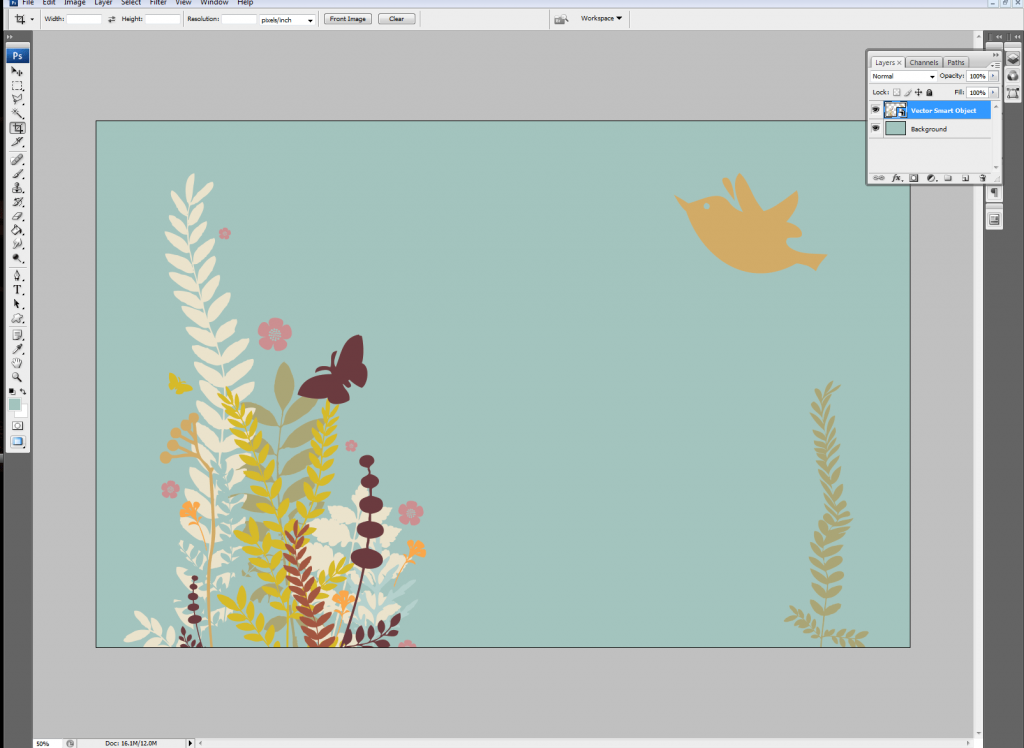
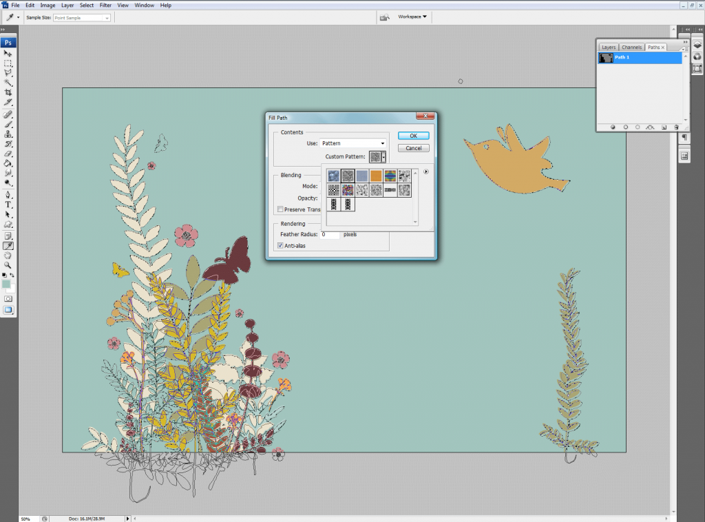
Create a new layer in Photoshop. Name it “texture”. With this layer active, open your “path” menu. Right click on the path layer and choose “Fill Path” In the fill path menu, click on the “custom texture” icon and choose “wrinkles” (128×128 px grayscale) from your default pattern menu.
Click on your layers menu and change the opacity to 13% in your “texture” layer.
Rasterize your smart object layer by right clicking the layer and choosing “rasterize layer”. After rasterizing the layer, double -click on it and bring-up the effects menu.
In the layer style menu, check the drop shadow sub-menu. Change the settings to the following:
– Blend mode to “multiply”
– Opacity to 9%
-Angle to 120% (check global light box)
– Distance to 5px
-Spread to 27%
– Size to 18px
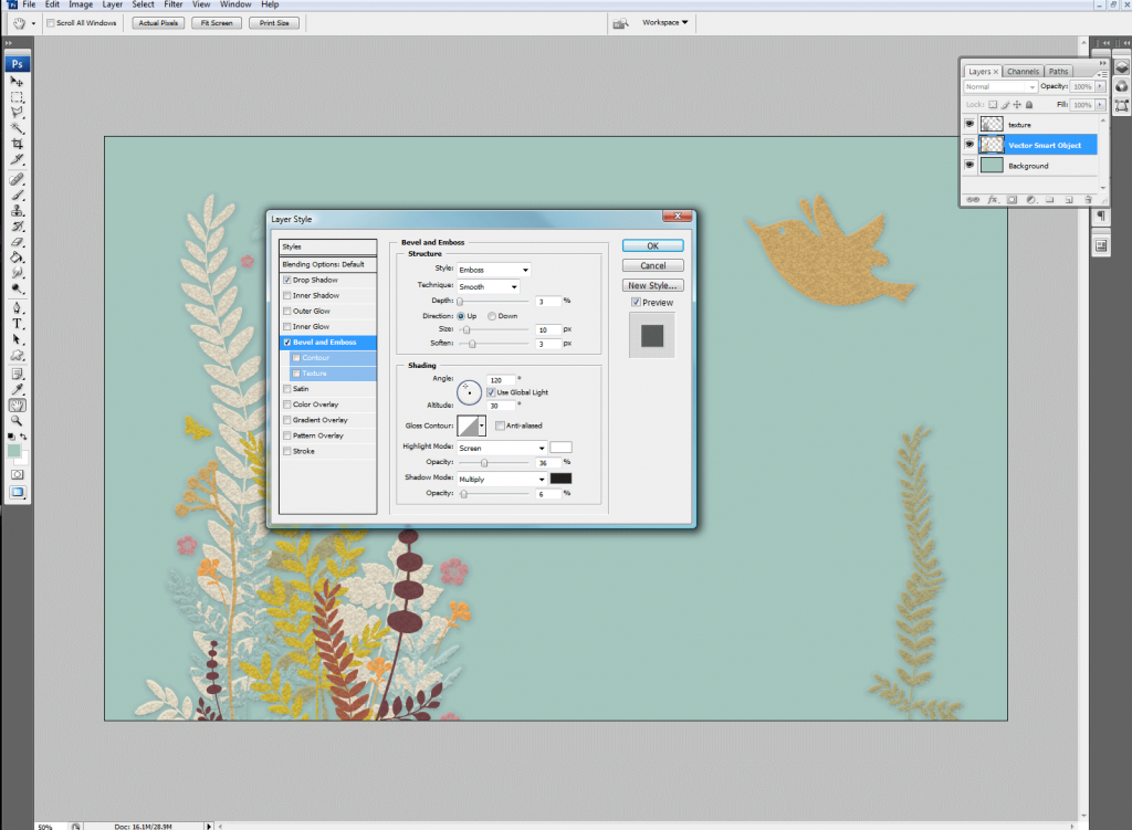
Once you have finished adding your shadow effects, click on the bevel and emboss sub-menu in your style menu and add the following settings:
– Style – emboss
-Technique – smooth
– Depth – 3%
– Direction – up
– Size – 10px
– Soften – 3%
(leave the “shading” settings on their default settings)
Now that you have your basic greeting card design, it’s time to add some finishing touches.
Adding text to your greeting card design
Click on your text tool and create your card message using your favorite “crafty” font.
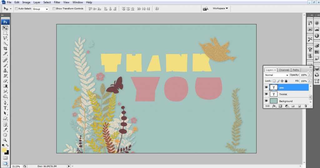
Right click on your image layer and choose “copy layer style” from the pop-up menu. Then, right click on your text layer and choose “paste layer style” from your pop-up menu. The shadows and bevels from your image have now been added to the text layer.
Right click on your text layer and choose “convert to shape” from your pop-up menu.
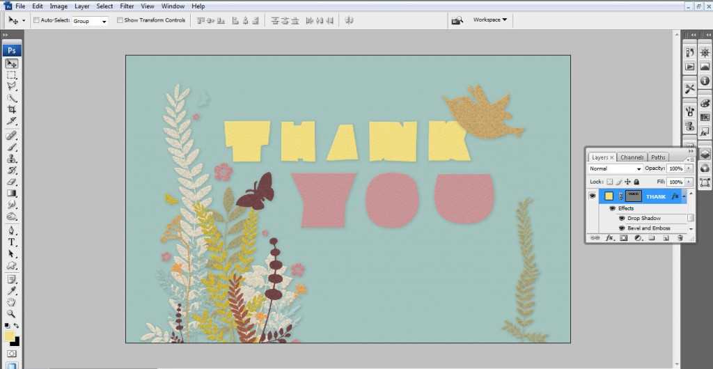
Double click on your text layer to bring up the style menu. In the “texture” sub-menu, click on the pattern icon and choose “wrinkles” from the pattern icon menu. Give it a:
-Scale of 73%
and a
-Depth of -20o
Now that your text is complete, it’s time to add some color and texture to your background:
Create a new layer.
Click on the color picker in your tool menu and input #a3c4be into the number field in the bottom left of your color picker menu. Click the paint bucket icon in your tools menu and flood the layer with this color.
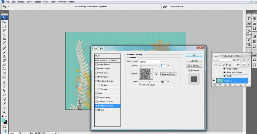
Double click on this layer. In the styles menu, bring the “general blending” opacity down to 50%
Check the pattern overlay option. In the pattern overlay menu, choose:
-“Wrinkles” from the pattern icon menu
-Blend mode – normal
-Opacity – 10%
-Scale – 100%
Stitched effect in Photoshop
To finish off the card, I added a “stitched effect” .
Firstly, I changed the foreground color to #d4bb41 in my color menu.
Then I created a new layer.
In this layer, I drew a rectangle with my shape tool (change the icon to “fill pixels” in the top left hand side of your shapes header menu- 3rd icon from the left)
By selecting this shape and copying and pasting it in various alignments, I was able to create a realistic stitched pattern.
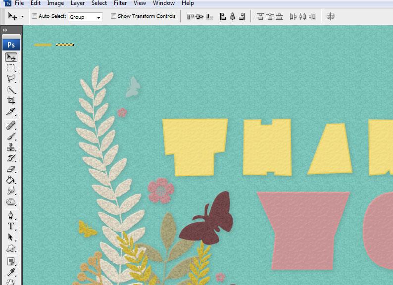
To create the vertical stitches, I simply selected a series of stitch shapes, copied the selection, and then pasted the stitched pattern.
With the sequence of stitches still selected, I chose “transform” from the edit header menu and then “rotate 90 CW°.” Once aligned, I pasted this shape again and aligned it on the opposite side of the card.
To finish of my stitch pattern, I added the same shadow and pattern style that I had attributed to my text layer.
I think the end result is a really “crafty” style card that does a good job of replicating that “homemade feel”.
If you wish to write a guest tutorial for our blog, feel free to send us your work. Click here to submit your article.






3 Comments
Hi I attempted to sign up to your RSS and the link seems to be broken. How can i get around this?
Thanks
I’ve checked it, It’s fine now (maybe the link was broken for a short time?) Thanks for letting me know!
Just out of interest, what kind of paper did you use when you printed out this card? The card in the photo at the top of this post looks very professional.