A rack card only works if someone actually takes it. The most effective rack cards stop people mid-walk, communicate one clear benefit, and make the next step obvious. Whether you’re experimenting with how to print rack cards at home or planning to order business rack cards professionally, smart design and layout choices make the difference between being ignored and being picked up.
Rack cards are everywhere — hotel lobbies, coffee shops, medical offices, real estate waiting rooms. Yet most of them never leave the display. This guide breaks down how to design rack cards that actually get picked up, while still keeping costs under control if you’re aiming for rack cards cheap without sacrificing quality.
If you’re planning multiple print touchpoints throughout the year, this 2025 Print Campaigns marketing calendar can help you decide when rack cards make the most sense.
Why Some Rack Cards Get Picked Up (And Most Don’t)
Successful rack cards share a few things in common:
-
They communicate one clear benefit instantly
-
They’re easy to scan in under five seconds
-
They use visuals that show outcomes, not filler
-
They include a clear next step (scan, call, visit)
When these elements are missing, even cheap rack cards end up collecting dust.
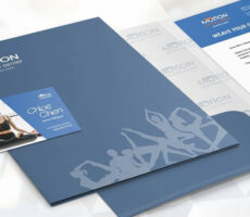
What Are Rack Cards (And Why Should You Use Them)?
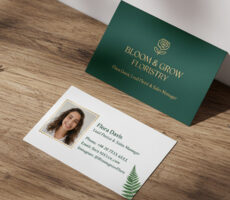
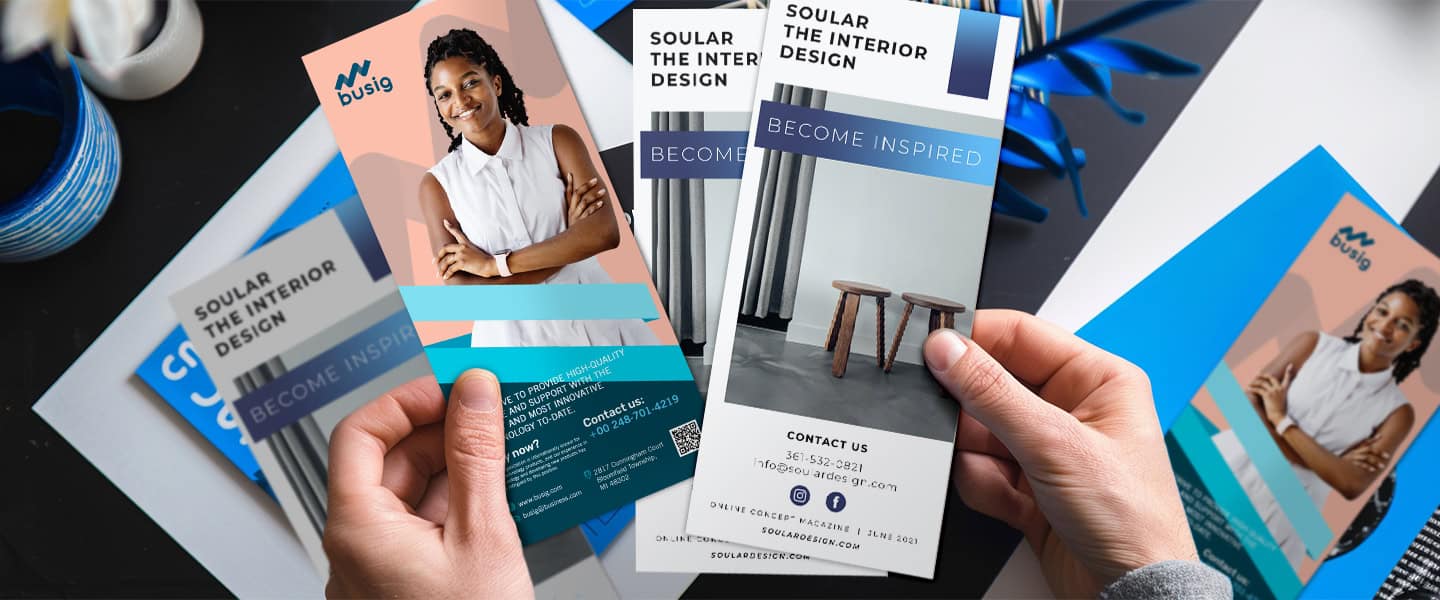
A rack card is a vertical print marketing piece, typically 4″ x 9″, designed to fit into high-traffic display racks. They’re a staple in locations where people naturally browse printed business rack cards while waiting or passing by.
They work well because:
- They grab attention quickly with bold headlines and visuals
- They’re easy to display and distribute in public spaces
- They provide more room than a business card, but are still compact
- They’re ideal for tourism, events, real estate, medical practices, and local services
Think of rack cards as mini-billboards that work 24/7. When designed strategically, they can drive calls, visits, or bookings without needing any additional touchpoint, even if you’re working with rack card printing cheap for a budget-friendly campaign.
For businesses comparing formats, this breakdown of flyers vs. posters vs. rack cards explains when rack cards are the better choice.
Step-by-Step: How to Design a Rack Card That Gets Picked Up
1. Start With a Clear Goal
Rule: Every effective rack card is designed around one action.
Before you start designing anything, clarify what you want the rack card to accomplish. This will influence everything from layout to word choice.
Do you want people to:
- Book an appointment?
- Visit your website or physical location?
- Call for a quote?
- Scan a QR code to RSVP to an event?
Every element on the card should guide readers toward that one main action.
Trying to do everything weakens the message, especially if you’re trying to print rack cards cheap and need maximum return from each card.
2. Write a Headline That Stops the Scroll (Or the Walk-By)
Rule: Your headline must communicate a benefit immediately.
You get one chance to catch their eye.
Your headline should:
- Communicate a clear benefit
- Be specific, not generic
- Use simple language and powerful verbs
Examples:
- “Struggling with Back Pain? Relief Starts Here.”
- “Your Dream Home Is Just a Scan Away.”
- “Locals Save 20% This Month Only.”
If you want help applying these principles across other formats, this guide on flyers that actually convert uses the same headline logic.
3. Structure the Message for Fast Scanning
Rule: If it’s not skimmable, it won’t get read.
Rack cards should be easy to skim.
Break your content into sections using:
- Subheadings
- Bullet points
- Icons or visuals
A proven structure:
- Problem or question (hook)
- Solution or offer (your service/product)
- How it works (steps, highlights)
- Call to action (what they should do next)
Avoid long paragraphs or dense blocks of text. The easier it is to digest, the more likely they’ll read it —and respond to it, especially if your design makes rack cards cheap without sacrificing quality.
The easier it is to digest, the more likely they’ll read it, and respond to it, especially if your design makes print rack cards cheap without sacrificing quality.
This layout works well whether you’re using discount rack card printing or testing smaller batches first.
4. Use Visuals That Show Results

Rule: Visuals should show the outcome of your service, not just the service itself.
Visuals aren’t just decoration, they carry meaning.
Choose images that:
- Reinforce your message (e.g., a smiling customer, a product in use)
- Match your brand tone and color palette
- Are high-resolution and print-ready
Avoid stock photos that look generic or unrelated. If you’re in real estate, use a photo of the actual home or neighborhood. If you’re promoting wellness services, show the outcome (relaxation, vitality, confidence).
Consider adding a QR code linked to a brochure, booking page, or event invite. This works just as well if you’re experimenting with how to print rack cards cheap at home for a smaller test run.
Understanding paper finish and print quality matters here. This guide to paper types for high-quality printing explains how stock and coating affect results.
5. Include a Clear, Specific Call to Action
Rule: Every rack card should tell the reader exactly what to do next.
Your CTA should:
- Be direct: Tell them exactly what to do next
- Be visible: Use color contrast or boxed styling
- Be relevant: Match your goal from Step 1
Examples:
- “Scan to Book Your Appointment Now”
- “Visit Our Showroom at 123 Main St.”
- “Call Today for a Free Quote”
If your CTA sends readers online, pairing rack cards with postcards or flyers can reinforce the message beyond the rack.
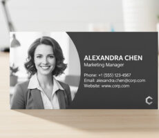
6. Make Contact Details Easy to Find
Rule: If it’s hard to contact you, people won’t try.
Even if your CTA includes a phone number or web link, make sure your contact information is repeated clearly:
- Website URL
- Phone number
- Email address
- Physical address (if relevant)
- Social media (only if consistently active)
Avoid tiny font sizes or placing this info in hard-to-read areas. Remember: the goal is ease.
Also consider adding branded elements like your logo, tagline, or slogan near this section to tie everything together.
Clear contact details matter even more when you’re focused on rack card printing cheap and relying on volume for results.
7. Choose Paper & Finish That Match Your Message
Rule: How your rack card feels affects how trustworthy your business appears.
People judge your business based on how your materials feel.
Rack cards are often touched, held, and sometimes stashed for later. A flimsy card with dull print says “budget.” A thick, glossy card with crisp print says “professional.”
At Overnight Prints, we offer:
- Thick, durable cardstock
- Glossy UV coating to enhance colors and protect from smudging
- Double-sided full-color printing
- Fast turnaround (even overnight delivery!)
Print quality is a key part of your brand experience. Don’t cut corners here — even if you’re looking for cheap rack cards that still look premium.
If you’re testing how to print rack cards at home, compare results against professionally printed rack cards before scaling.
Industry Examples: Rack Cards That Work
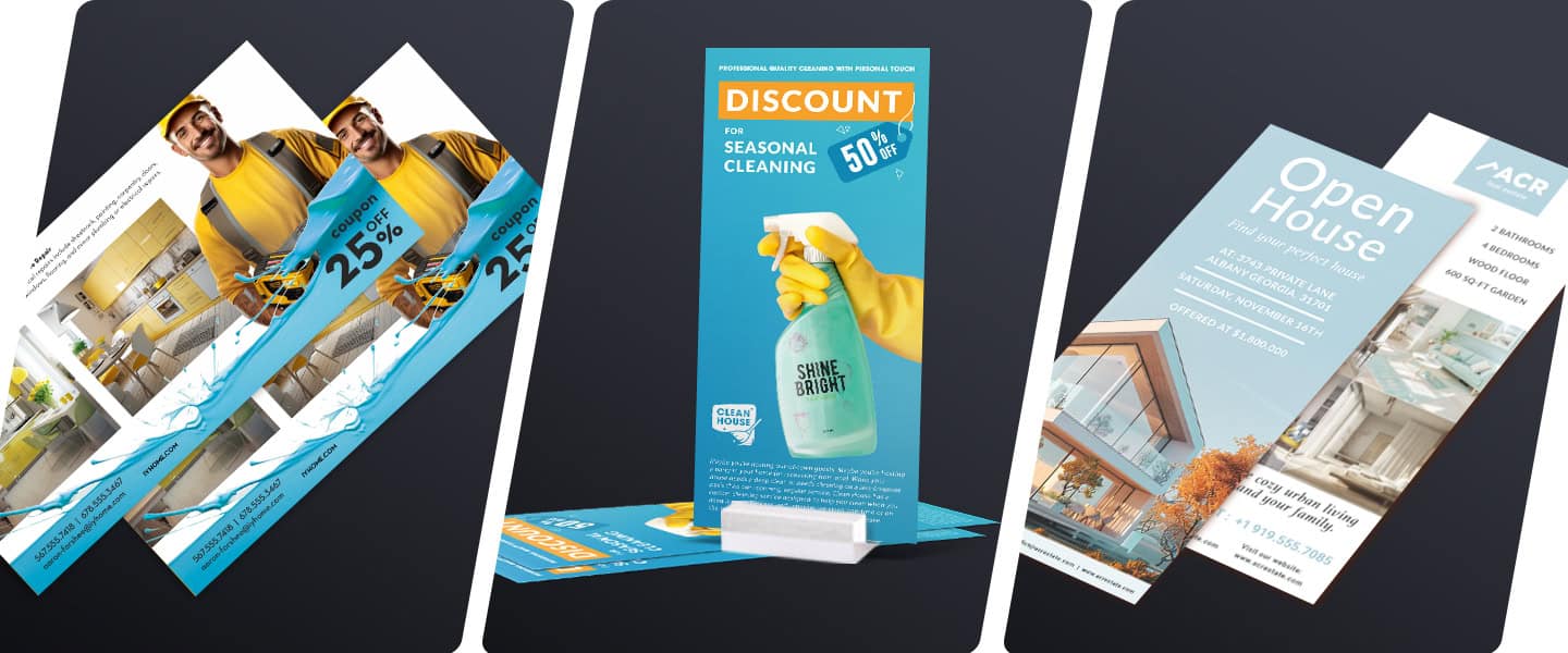
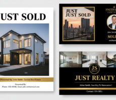
Real Estate
- Showcase property features with bold visuals
- Include agent info and QR code to schedule a tour
- Use testimonials for social proof
Rack cards pair especially well with real estate print materials like postcards and brochures.
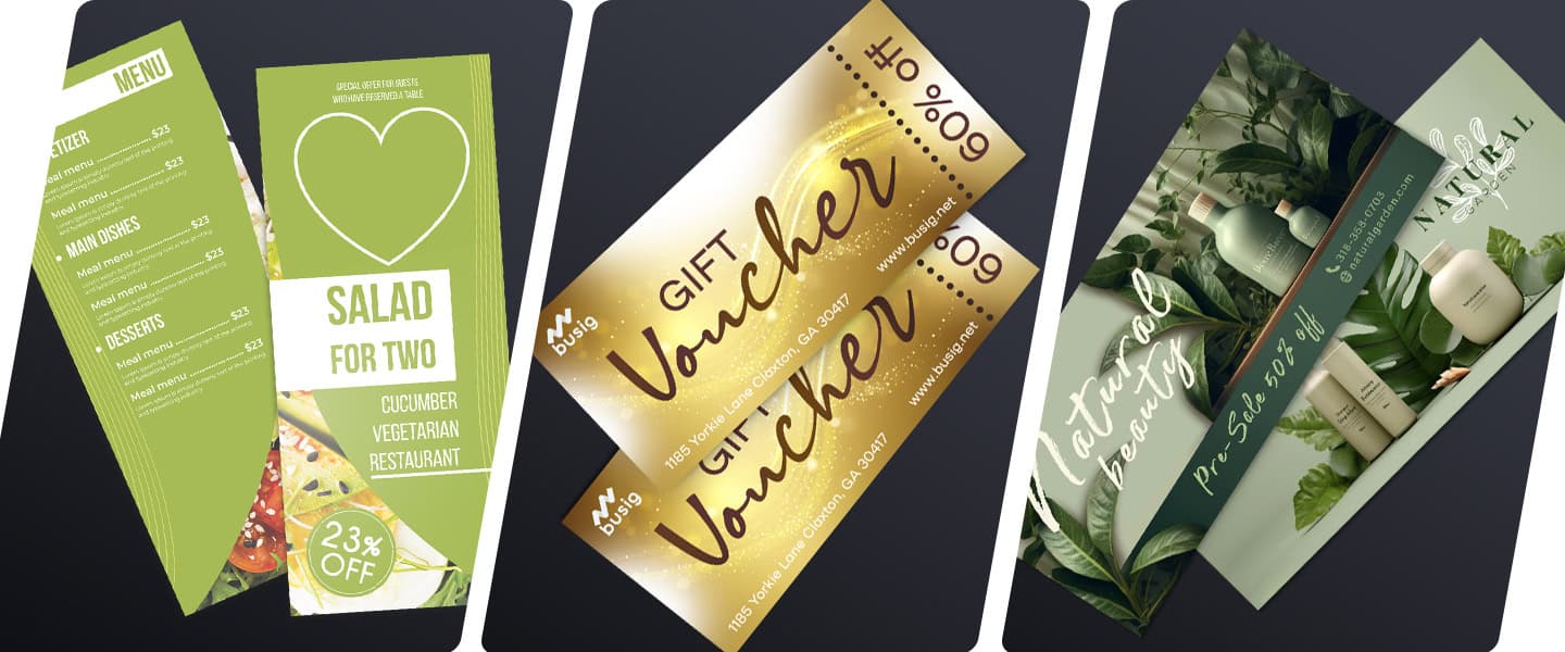
Medical & Wellness
- Display new patient promotions or accepted insurances
- Explain key services or treatment benefits
- Include a map or parking instructions
Events & Conferences
- Use as mini agendas or speaker lineups
- Include schedules, maps, or QR links to register
- Promote early bird offers or upgrades
Rack cards work well alongside brochures or presentation folders for registration areas.
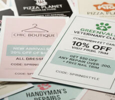
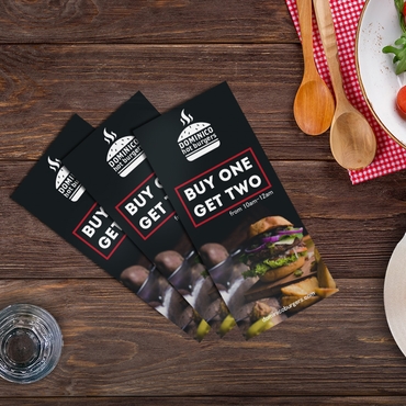
Retail & Local Services
- Feature service menu, pricing, or seasonal sales
- Add coupons or promo codes
- Encourage repeat visits with loyalty offers
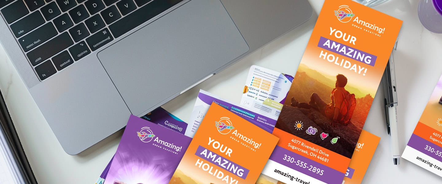
Tourism & Hospitality
- Offer day trip options or restaurant guides
- Highlight maps or local attractions
- Include business hours and reservation info
Common Rack Card Mistakes to Avoid
-
Walls of text
-
No clear CTA
-
Low-resolution images
-
Missing contact details
-
Cheap paper that curls or fades
These mistakes reduce ROI far more than investing slightly more upfront.
Final Thoughts: Make Your Rack Cards Work for You
Rack cards are small but mighty. For many local brands, business rack cards are one of the simplest ways to stay visible in high-traffic areas without ongoing ad spend.
When well-designed, they become a low-cost, high-impact part of your print marketing strategy.
Whether you’re a local business, national brand, or solo entrepreneur, the principles are the same: be clear, be visual, and guide the reader to action.
You can order rack cards professionally printed or try how to print them at home if you prefer DIY marketing.
Explore Rack Cards from Overnight Prints for durable stock, clean printing, and fast turnaround — without compromising quality.