Would you believe that in a time of viral tweets and YouTube stardom a powerful print marketing piece can actually steal the spotlight? You might argue, “But people always throw away flyers and brochures.” This may be true, but it doesn’t mean that your prints are one-and-done.
The idea is that not only did you put your business in the consumer’s hands, but also in his or her mind. A printed piece, or a leave-behind, has much influence and staying power because it “leaves behind” a lasting impression.
Let’s take, for instance, Airbnb. Everything you need to book a weekend getaway in someone’s spare room can be found online, from searching for room availability to narrowing down prices to reading guest reviews. So why did the tech company team up with Hearst Magazines to produce traditional print magazines?
Peek inside #airbnbmag—the new print magazine with human stories from around the globe and tips for your next trip.https://t.co/oVXlBPLd6m pic.twitter.com/4Nd7Dw9eoO
— Airbnb (@Airbnb) May 23, 2017
“In a world that is increasingly digital and transactional, creating something that you can hold in your hand, and that hosts can put on their coffee tables and share with their guests, is something special,” explained Brian Chesky, CEO and head of community, Airbnb.
Airbnbmag is an inside look at hidden travel destinations from the local’s perspective. The travel lifestyle magazine creates a community for the modern traveler with real stories and tips for exploring different cities on each page. Primarily intended for hosts to share with their overnight guests, the print magazine will also be sold at airports and newsstands, and even mailed out to select subscribers.
The point is the human need to physically hold something tangible translates to a deeper emotional connection to traditional print marketing. The great news is that if you’ve already created digital content, it can easily be converted to print and VOILA! By going old school, you now stand out from the competition.
TRADE SHOWS
Trade show attendees brag about all the swag they collected, not the convention hall maze that left them with sore feet. You desperately want your information-rich brochure or enviable business card to be one of the coveted few items that make it home with an attendee and not left behind in the hotel room. But why is this considered a measure of success?
Ask this instead: What’s the whole purpose of conferences, conventions and trade shows? The in-person experience sells. You simply can’t argue with the more than 180,000 industry professionals at the record-breaking CES 2017. The downside is that approximately 65 percent of printed materials get thrown away, according to the Global Association of the Exhibition Industry.

Before you throw up a red flag, know this – there are ways to increase ROI on print materials. One of the biggest concerns for exhibitors is the high cost of bringing literature to the booth, and rightfully so. Is it worth printing, shipping and distributing just to find your prized brochure in the trash bin? Not to worry. Knowing how to get the most value out of your print collateral will save you money and headache.
First, display only a few flyers or postcards but not all your print materials. You want the opportunity to chat up attendees instead of making your expensive print collateral a grab-and-go situation. Putting out a limited number of handouts will make it look like a hot commodity and help invite them in.
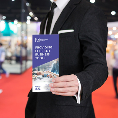
Second, qualify potential leads. DON’T just hand out presentation folders to anyone who briefly stops by looking for a branded pen to swipe. DO qualify booth visitors to determine who is worthy of the prized glossy booklet or tri-fold brochure. Outline tiered qualifiers for your sales team based on attendee interest level and time spent at the booth.
Example:
- All booth visitors: One-sheet
- Prospect (5+ minutes of conversation): Detailed brochure
- Qualified lead (engaged decision maker): Full sales kit
Moving a booth visitor into the qualified column is only one small step away from securing a customer. The “engaged” attendee has earned himself reading material for when the flight attendant has told him to put away his electronics for takeoff.
There’s one more thing to consider. Print and digital marketing channels do not need to be mutually exclusive. They can and should be used to support one another. Including an offer with a link back to your website will help you track prospective buyers and continue the conversation online.
Next is what to print for your next con or trade show. Below are some popular sizes and uses for the most value-added convention collateral.
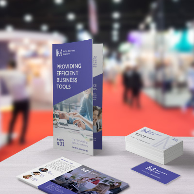
Business Cards
- Sizes:
- 3.5″x2″
- Options:
- Standard square or rounded corners
- Ultra-thick (34pt)
- Sandwich cards (color filled)
- Ideal use: A show-specific URL on your business card can add much value. Leading prospects to a landing page chock full of product spec sheets, testimonials or a white paper can reinforce your booth presentation.
- Print tip: Maximize selling opportunities on the backside of business cards so that your contact information is not compromised and still can be passed along.
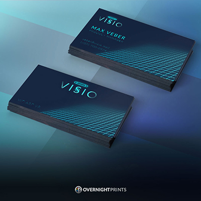
Mini Business Cards
- Sizes:
- 2.75″x1″
- Options:
- Single-sided or double-sided
- Satin matte, Full gloss or Soft touch laminate
- Ideal use: Use mini business cards as name tags for booth staff on the show floor or at related networking events and after parties.
- Print tip: To make text easy to read, opt for satin matte finish and place the mini business card in a card holder.
One-Sheet/Flyer/Leaflet
- Sizes:
- 8.5″x11″
- Options:
- Single-sided or double-sided
- Ideal use: For a quick overview, affordable flyer handouts might contain product lists, rates and pricing, important statistics and contact information.
- Print tip: Order personalized batches for each sales person with his or her individual contact information, or leave space where each can attach a business card.
Folded Brochures
- Sizes:
- 8.5″x11″
- 11″x17″
- Options:
- Tri-fold
- Bi-fold
- Z-fold
- Unfolded
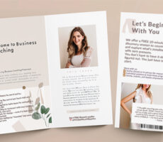
- Ideal use: Brochures are great for detailed product information, especially high-value products. The panels easily divide information into categories and help educate the buyer with both visuals and text.
- Print tip: 100# aqueous gloss finish will look professional and polished. Be sure to submit designs with full bleed to avoid any unwanted white borders when they are cut down to size.
Marketing Postcards
- Sizes:
- 4″x6″
- 5″x7″
- Options:
- Square or rounded corner
- Ideal use: This portable print is the perfect giveaway for high traffic booths. A double-sided postcard offers a quick read, is easy to carry and has high impact.
- Print tip: For a more vibrant pop, choose 15pt premium glossy stock. If you want attendees to write notes on the postcard, opt for smooth 110# uncoated paper on one or both sides.
Presentation Folder Sales Kit
- Sizes:
- 9″x12″
- Includes:
- 4″ deep pockets
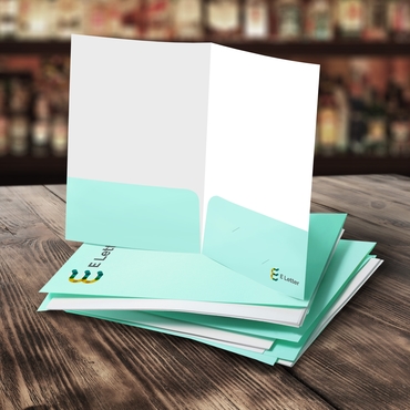
- Ideal use: The granddaddy of them all, the presentation folder is practically money in the bank. Save this one for red-hot leads that just need to finalize paperwork when they return to the office. Add everything in those pockets from one-sheets and brochures to booklets and notepads.
- Print tip: Don’t forget to design the two inside pockets for a complete brand identity, and include your business card in the convenient die-cut before handing out the folder.
RETAILERS
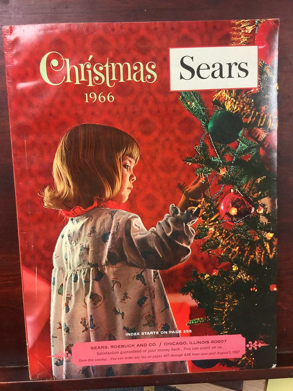
Remember the golden age of the Sears catalog? What started as a mass mailer for watches and jewelry in 1888 expanded into a major retail merchandiser. The mail order catalog that brought home goods to 19th century rural America defined the country’s shopping habit and led the era of 20th century department store chains.
“In an era when print media reigned supreme, Sears dominated the rural retail market through its huge catalog, an amazing work of product advertising, consumer education, and corporate branding,” said Historian Vicki Howard.
Originally retired in 1993 after a 50-year run, the Christmas Wish Book was reinvented and revived with a limited copy in 2017. Customers shopped its 120-page print and digital editions for toys, home furnishings, appliances and plenty of other apparel and electronics on Santa’s wish list. In contrast, the debut gift guide in 1933 advertised Mickey Mouse toys, fruitcakes and live animals like canaries.
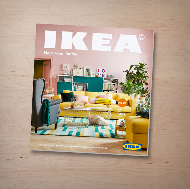
Today, modern shoppers may be more familiar with the IKEA catalog. Printing 203 million copies in 2017 alone, the 300-plus-page home furniture catalog took 18 months to compile, was translated in 17 languages, and ate up 70 percent of the annual marketing budget.
But don’t call it a catalog. IKEA touts its “eternal battery life” as it is “not a digital book or e-book. It’s a bookbook.” So how does the behemoth print marketing piece still get such fanfare in a digital age?
Leave it up to the furnishing giant to figure out how to market to a multicultural audience spanning 28 countries worldwide with a single publication. By tailoring campaigns to specific regions, IKEA justifies producing its massive print catalog with its highly targeted representation of different lifestyles by capturing furniture trends and everyday domestic life on each page.
The retailer has it down to the finest detail including region-specific variations of architectural elements, such as European versus American door styles. It also pays extra close attention to product placement. Props and people are rearranged accordingly to reflect living space size or various family makeup of that locality.
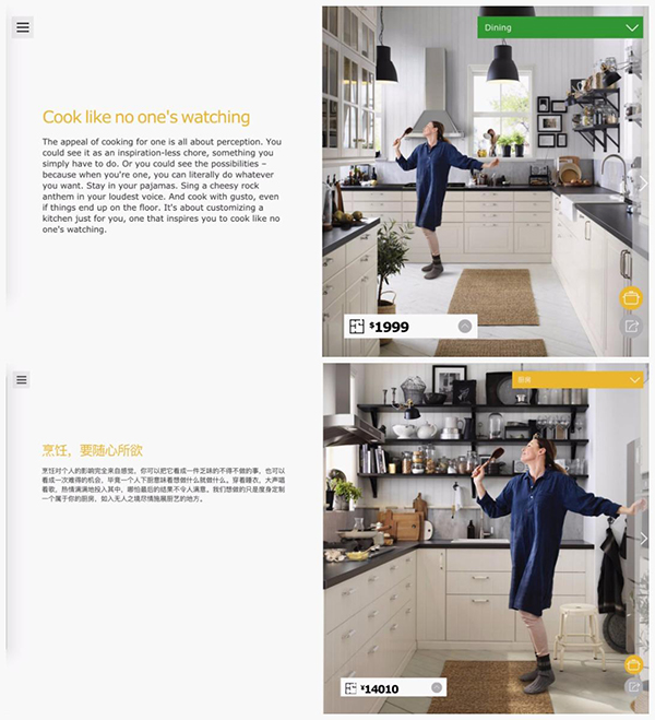
How do you sell to all types? Speak their language. The brand demonstrates its keen market research by seamlessly incorporating the latest fads and fashion into timeless settings. Go Cubic was the theme of its 2003 edition when tiny spaces were all the rage in the 2000’s. IKEA advertised small space solutions with vertical cabinetry, stackable storage and multifunctional products. Today, it embraces modern family life by showcasing scenes of single parents, stay-at-home dads or blended families.
The IKEA catalog is not just a picture book though. 2018 will introduce editorial in the form of 13 feature stories like that of the 10-year-old designer behind a SAGOSKATT hippo-crocodile plush toy. Ranging from one to two pages, the stories are part of a planned evolution to inspire readers to keep the printed piece.

“Years ago [retail catalogs were] a selling tool, and now it’s become an inspirational source. We know customers love a tactile experience,” said Felix Carbullido, executive vice president and chief marketing officer, Williams-Sonoma brands.
Don’t judge the IKEA catalog by its cover, or actually in this case, do. It’s not just what’s inside the pages that matters to its marketing. The paper stock and finishing on the catalog also need to be considered. Working with 31 printers and five paper suppliers, IKEA Group catalog leader Tanja Dolphin looks at paper brightness and more to deliver customers a “magazine moment” when perusing the pages.
“It’s different market-to-market. Sometimes matte paper is perceived as better quality, sometimes glossy,” she explained.
Newer product catalogs are looking more and more like magazines. Adopting a storytelling approach to its product shots, the IKEA catalog places the customer right into the scene, much like visiting the store’s fully decorated showrooms where visitors are invited to try out sofas and kitchen counters.

These brands prove that direct mail can still persuade shoppers to spend. Postcards, pamphlets and booklets can make sales both in-store and online if executed well.
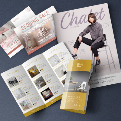
Direct Mail Postcards
- Sizes:
- Classic: 4″x6″, 5″x7″
- Specialty: 4.25″x5.5″, 5.5″x8.5″, 6″x11″
- Large: 8.5″x11″, 4″x9″
- Options:
- Square or rounded corner
- Ideal use: Use targeted mailing lists to send postcard mailers with discounts and coupon codes to nearby neighborhoods. Offer incentives to loyal customers, such as referral bonuses.
- Print tip: Follow USPS Regulations closely for mailing out postcards, including leaving spaces for the stamp, mailing and return addresses and post office barcode.
Brochures/Pamphlets
- Sizes:
- 8.5″x11″
- 11″x17″
- Options:
- Tri-fold
- Bi-fold
- Z-fold
- Unfolded
- Ideal use: Promote limited edition or new collection of products with detailed brochures and pamphlets.
- Print tip: Consult with USPS before designing mailing brochures to create artwork with proper scoring, safe line, cut line and bleed.
Booklets
- Sizes:
- 5.5″x8.5″
- Options:
- Self cover
- Card cover
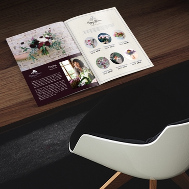
- Ideal use: Go with flexible saddle stitched booklets for thinner product catalogs that are affordable and easy to ship.
- Print tip: You must review all USPS requirements for size, material, gluing, etc., before mailing enveloped booklets.
For more print marketing products, visit overnightprints.com.

