A postcard gives you very little space—and that’s exactly why most people get it wrong.
When space is limited, every decision matters.
What you say.
What you show.
What you leave out.
And most postcards fail for the same reason: They try to say too much.
Instead of focusing on one clear message, they become a mix of:
- offers
- descriptions
- branding
- and filler text
The result is something people glance at… and move past.
If you want your postcard to work, the goal isn’t to include more.
It’s to make every element count.
The only question your postcard needs to answer
Before thinking about layout or design, start here: What do I want someone to do after reading this?
That answer determines everything.
Because a postcard without a clear action is just information.
A postcard with a clear action becomes a tool.
What every effective postcard includes
There’s no single “perfect” template.
But every high-performing postcard includes the same core elements.
Not more. Not less.
1. A headline that makes people stop
This is the first thing people see.
And it has one job: make them read the next line
Weak headlines describe.
Strong headlines promise something.
Instead of:
“Now offering new services”
Try:
“Save 20% on your next service this month”
Clarity always beats creativity here.
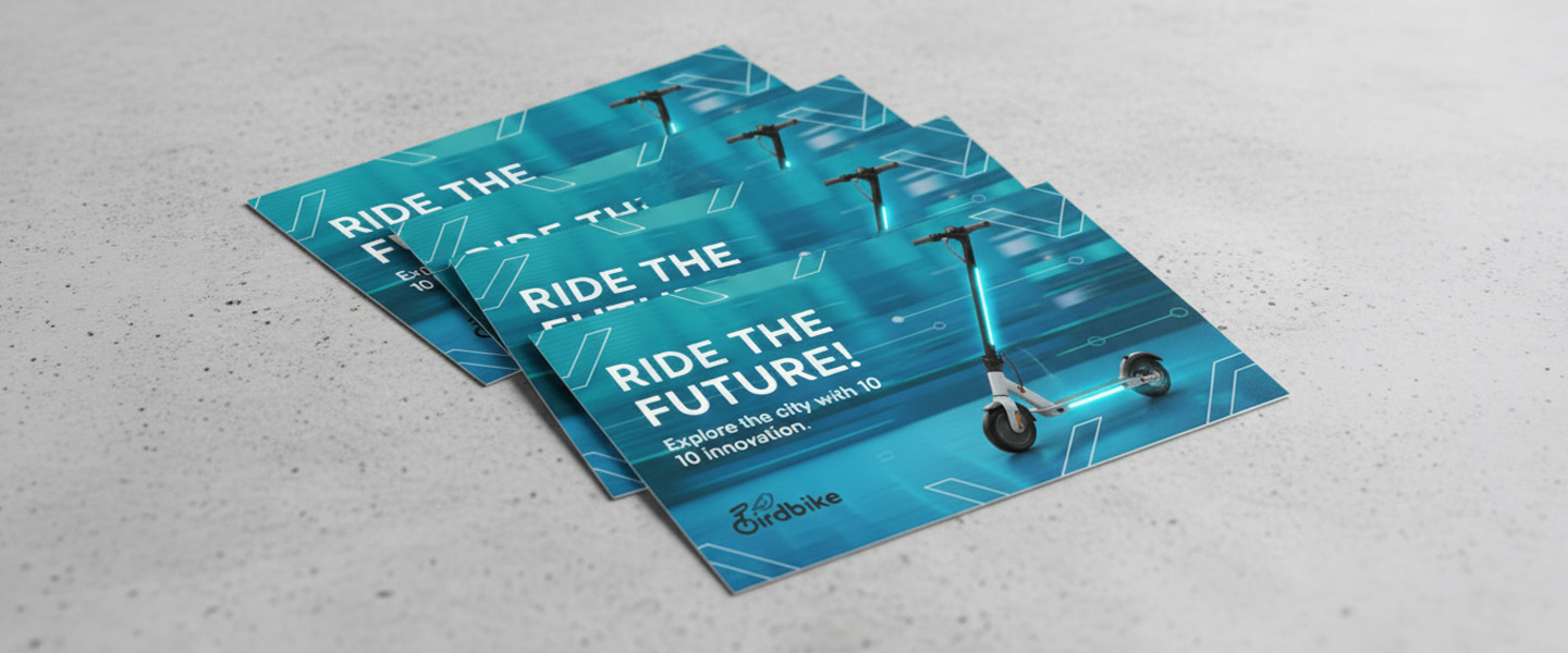
2. A visual that supports the message
Images don’t decorate postcards.
They reinforce the message.
If your headline promises something, your visual should make that promise feel real.
For example:
- before/after images for services
- product photos for retail
- location-based visuals for local businesses
If the visual doesn’t add meaning, it becomes noise.
3. A short, focused message
This is where most postcards break.
People try to explain everything.
But postcards don’t work like brochures.
They work because they’re quick to read.
A good rule: if it takes more than a few seconds to understand, it’s too much
Keep your message tight:
- one idea
- one benefit
- one direction
4. A clear call to action (CTA)
If there’s no clear next step, the postcard stops working.
Your CTA should answer: what should I do now?
Examples that work:
- “Call today to book your appointment”
- “Visit our website to claim your offer”
- “Bring this card in for 15% off”
What doesn’t work:
- vague phrases
- no urgency
- multiple competing actions
One postcard = one action.
5. Contact and trust elements
People need to know how to act—and who they’re dealing with.
Include:
- phone number or website
- location (if relevant)
- brand name
If space allows, small trust elements like:
- testimonials
- years in business
- guarantees
can increase response without adding much clutter.
How to structure your postcard (simple layout that works)

You don’t need a complex design.
You need a layout that guides attention.
A simple structure looks like this:
Front side
- headline
- visual
- supporting message
Back side
- details
- CTA
- contact information
This keeps the message clean and easy to follow.
If everything is placed on one side, it becomes harder to scan.
If your message requires more space, many businesses use flyers for more detailed messaging instead of trying to fit everything into a postcard.
Real CTA examples based on goals
The CTA changes depending on what you want.
Here’s how it typically breaks down:
If your goal is appointments
→ “Call today to schedule your visit”
If your goal is store traffic
→ “Bring this card in for your discount”
If your goal is online conversions
→ “Scan the QR code to get started”
If your goal is event attendance
→ “Join us this Saturday at 10 AM”
Each one is specific.
Each one is easy to act on.
The most common mistakes (and why they happen)
Most postcard issues come from trying to make it do too much.
The most common problems are:
- too much text with no hierarchy
- multiple messages competing for attention
- weak or missing CTA
- visuals that don’t support the message
When everything is included, nothing stands out.
If you’ve ever wondered why some print materials feel easy to read and others don’t, this breakdown of How to Design Print Materials That Actually Get Read (Not Thrown Away) explains how structure changes everything.
How this connects to design (and results)

Copy and layout are not separate.
They work together.
A strong message with a poor layout gets ignored.
A clean layout with a weak message doesn’t convert.
When both align:
- the message is clear
- the action is obvious
- the response improves
If you want to see how this plays out in real campaigns, this guide on Postcards for Local Marketing: What Actually Works breaks down what actually drives results.
Before you print your postcard
Before sending anything to print, check three things:
- is the message clear in a few seconds?
- is the next step obvious?
- does the layout guide the reader naturally?
If the answer is no, fix that first.
Printing won’t solve a clarity problem.
Ready to turn your postcard into something people act on?
Once your message and layout are clear, you can choose your size, paper, and finish here: Postcards
This is where the idea becomes something tangible—and something people can respond to.
Final takeaway
A good postcard doesn’t try to say everything.
It says one thing clearly—and makes it easy to act on.
That’s what gets results.