Most postcards don’t fail because people don’t see them. They fail because nothing stands out.
People do look at their mail.
They just don’t stop for long.
And if your postcard looks like everything else—generic layout, no clear message, no reason to act—it gets ignored within seconds.
That’s why the goal isn’t just to design something “nice.”
👉 It’s to create something that makes people pause, read, and respond.
Below are 25 postcard design ideas that actually work in real campaigns—plus why they work, so you can adapt them to your business.
Before you start: what makes a postcard work
Every high-performing postcard—no matter the industry—has three things:
A clear message, a strong visual, and a reason to act.
If one of those is missing, the design won’t carry the result.
If you’re still figuring out structure, this guide on what should you put on a postcard will help you build the foundation first.
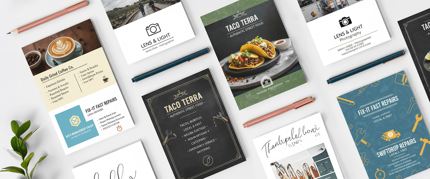
What Does a Successful Postcard Look Like?
While designs vary by industry, most high-performing postcards follow a similar structure.
A typical postcard includes:
- A strong headline
- One primary image
- A clear offer or message
- Contact information
- A call-to-action
The most effective postcards guide the reader’s attention naturally from the visual to the offer and then to the next step.
If your design requires too much effort to understand, response rates usually suffer.
25 Postcard Design Ideas (That Actually Get Responses)
1. The “One Bold Offer” postcard
One message. One benefit. One call to action.
This works because it removes confusion and tells the reader exactly what to do.
2. The “Before & After” transformation
Show the result visually.
Perfect for services like cleaning, real estate, fitness, or beauty.
3. The “Limited-Time” promotion
Urgency increases response rates.
Use deadlines that feel real, not exaggerated.
4. The oversized postcard
Larger cards stand out in the mailbox.
If you’re competing for attention, size matters.
If you’re comparing formats for promotions, you can also read our guide on postcards vs flyers for local campaigns.
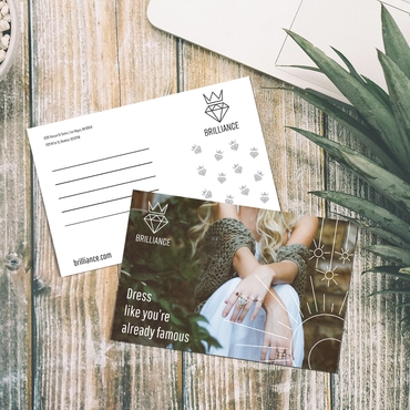
5. The “Local & Personal” postcard
Reference a neighborhood, city, or event.
People pay attention to things that feel relevant to them.
6. The minimalist layout
Less text, more space.
This works especially well when paired with high-quality printing.
7. The handwritten-style design
Fonts that mimic handwriting feel more personal and less corporate.
8. The “Top 3 Benefits” format
Instead of explaining everything, highlight the three reasons someone should care.
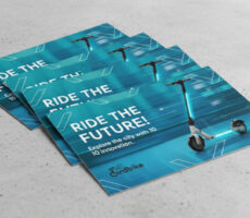
9. The image-first postcard
A strong visual grabs attention before text does.
This works well when the image tells the story.
10. The QR code postcard
Bridge print and digital.
Send people to a landing page, offer, or booking link.
11. The testimonial postcard
One of the fastest ways to build trust is to let customers speak for you.
A testimonial postcard uses:
- A customer quote
- A customer success story
- Before-and-after results
- Star ratings or reviews
This format works particularly well for:
- Home services
- Real estate
- Healthcare
- Professional services
The key is keeping testimonials short and highly specific.
12. The “problem → solution” layout
Start with a pain point, then show how you solve it.
13. The event invitation postcard
Clear date, time, and reason to attend.
Works for local promotions and launches.
14. The real estate announcement
Real estate remains one of the biggest users of postcard marketing.
Popular designs include:
- Just Listed announcements
- Just Sold updates
- Market reports
- Open house invitations
- Neighborhood success stories
Strong photography and local relevance tend to outperform text-heavy designs.
15. The seasonal promotion
Tie your design to current events, holidays, or seasons.
16. The bold typography design
Large, readable text makes your message impossible to miss.
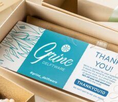
17. The back-side strategy
Use the back for details, offers, or additional context.
Don’t leave it blank.
18. The “how it works” postcard
Break down your service into 3 simple steps.
19. The premium-feel postcard
Heavier paper and clean design signal quality instantly.
You can explore high-quality options here: Postcards
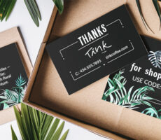
20. The discount + value combo
Instead of just offering a discount, explain what they’re getting.
21. The “Did you know?” hook
Start with a surprising fact to pull attention.
22. The comparison postcard
Show why your service or product is different.
23. The referral incentive
Encourage people to share or recommend your business.
24. The “quick win” offer
Give something small but valuable immediately.
25. The brand-focused postcard
Sometimes consistency matters more than promotion.
Use this when reinforcing brand awareness.
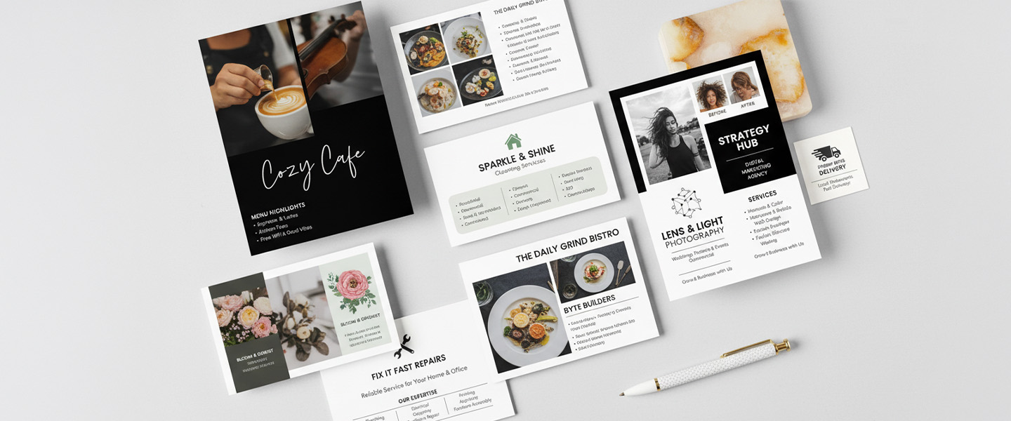
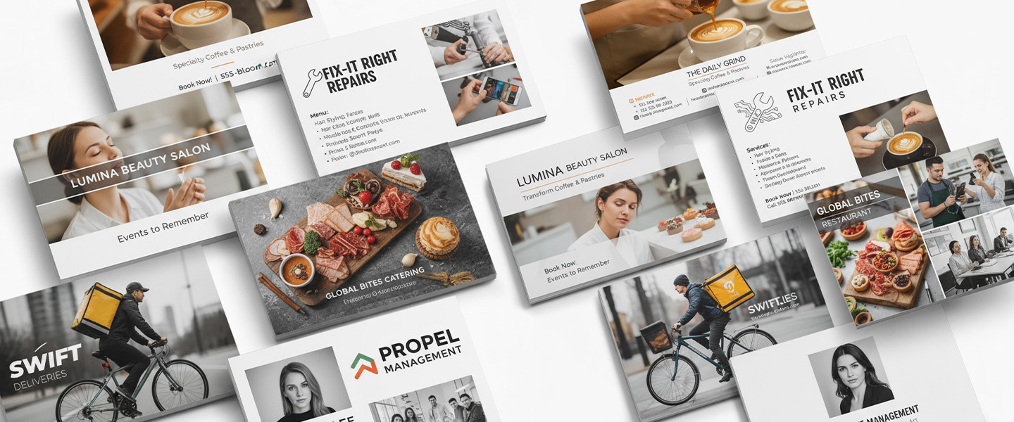
Business Postcard Ideas for Different Industries
Different industries often benefit from different postcard strategies.
Restaurants
- New menu announcements
- Seasonal promotions
- Loyalty rewards
Service Businesses
- Before-and-after examples
- Free estimates
- Local neighborhood offers
Retail Stores
- Product launches
- Flash sales
- VIP customer events
Professional Services
- Educational tips
- Client success stories
- Consultation offers
The most successful business postcards connect the offer directly to the audience’s immediate needs.
Popular Postcard Layout Ideas
Great postcard design isn’t just about visuals. Layout plays a major role in readability.
Some of the most effective layouts include:
Hero Image Layout
Large image with minimal text.
Split Layout
Image on one side, offer on the other.
Headline-First Layout
Bold headline at the top with supporting details underneath.
Grid Layout
Multiple products, services, or promotions organized into sections.
Choosing the right layout depends on how much information you need to communicate.
Why these ideas work (and most postcards don’t)
If you look closely, these ideas aren’t random.
They follow patterns.
They either:
- make something easier to understand
- create urgency
- feel more personal
- or stand out visually
Most postcards fail because they try to do too much at once.
Too many messages.
Too much text.
No clear action.
If you simplify the structure, the results improve.
If you want to go deeper into performance, this guide on postcard marketing what actually works shows how these ideas translate into real results.
The biggest design mistakes to avoid
Most issues come from execution, not ideas.
The most common mistakes are:
- unclear messaging
- weak or missing call to action
- overcrowded layouts
- choosing cheap printing that reduces impact
If your postcard feels disposable, it will be treated that way.
For a deeper look at design fundamentals, this guide on how to design print materials that actually get read breaks down what actually matters.
Before you print your postcards
Once you choose your idea, make sure everything is aligned.
Your message, layout, and call to action should all support the same goal.
If one part is off, the whole piece underperforms.
Ready to turn your idea into a printed postcard?
If you already have a design direction, you can customize your postcard size, paper, and finish here:
This is where your idea becomes something people actually hold—and respond to.
Final takeaway
Good postcard design isn’t about creativity alone.
It’s about clarity, intention, and execution.
Because the best-performing postcards don’t try to impress everyone.
They make the right person stop—and take action.
FAQ Section
What makes a postcard design effective?
The best postcard designs combine a strong visual, clear message, and compelling call-to-action that encourages the recipient to respond.
What size postcard gets the best response?
Larger postcards often attract more attention, but effectiveness depends on the audience, offer, and overall design.
Should I use both sides of a postcard?
Yes. Many successful campaigns use the front for attention-grabbing visuals and the back for details, offers, and contact information.
Are postcards still effective for marketing?
Yes. Postcards remain one of the most effective direct mail formats because they are immediately visible and easy to read.
What industries use postcards most successfully?
Real estate, restaurants, retail stores, healthcare providers, home services, and professional service businesses frequently use postcard marketing.
Should I include a QR code on my postcard?
In many cases, yes. QR codes help connect print campaigns with digital experiences such as landing pages, booking forms, and online offers.