People almost never read flyers from top to bottom. Most customers scan flyers in seconds, looking first for whatever feels easiest, clearest, or most visually important. That’s why the design hierarchy of a flyer matters far more than simply adding more information.
Attention spans are shorter than ever. Customers are constantly filtering visual noise throughout the day, especially in busy local environments where flyers compete against:
- storefront signs
- digital screens
- social media
- menus
- advertisements
- event promotions
A flyer usually has only a few seconds to answer one silent question:
“Is this worth my attention?”
And according to print designers, the answer often depends on what customers notice first.
Not necessarily what businesses think they notice first.
That difference is where many flyer campaigns fail.
What Do People Notice First on a Flyer?
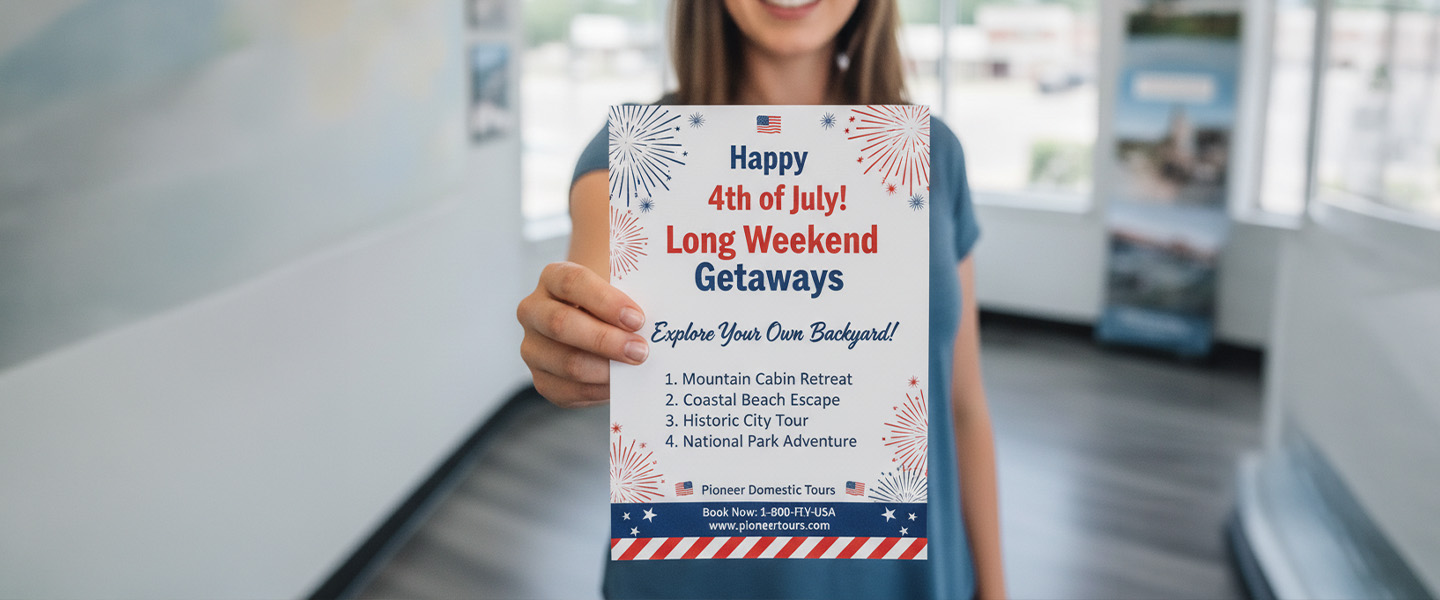
Most people notice the headline first, followed by the main image, the primary offer, and finally supporting details such as contact information or business hours. Print designers intentionally organize flyers this way because customers scan before they read. A clear visual hierarchy helps people understand your message within seconds and encourages them to continue reading.
Why Aren’t People Reading My Flyers?
Many businesses assume the problem is distribution, when in reality the issue is often the design itself.
If customers don’t immediately understand what your flyer is offering, they may stop looking before reading a single sentence.
Common reasons flyers fail include:
– Weak or generic headlines
– Too much text
– Poor visual hierarchy
– Low contrast
– Multiple competing offers
– No clear call to action
Improving these elements can dramatically increase the chances that someone reads beyond the headline.
The Headline Usually Decides Everything
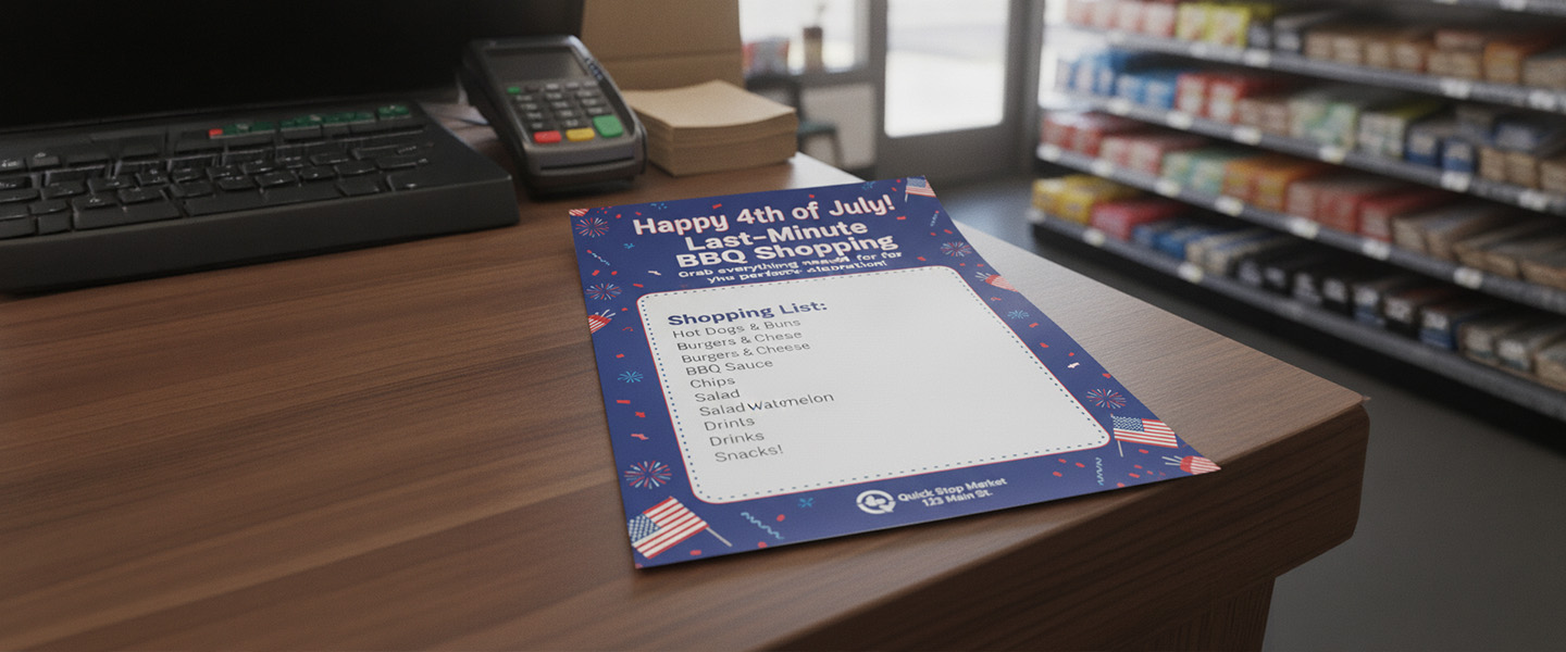
Before customers read details, prices, or contact information, they almost always notice the main headline first.
This happens because the brain naturally searches for the largest and clearest piece of information on the page.
If the headline feels:
- confusing
- generic
- visually weak
- too long
- hard to scan
the flyer immediately loses momentum.
The strongest flyer headlines usually communicate one clear idea very quickly.
For example, customers react faster to:
“Free Coffee This Weekend”
than:
“Join Us for an Exciting Promotional Weekend Event Featuring Complimentary Beverage Samples.”
The second sentence technically contains more information.
But the first one creates faster understanding.
That speed matters.
Especially because flyers are usually consumed while people are:
- walking
- driving
- shopping
- waiting in line
- multitasking
- passing through crowded environments
The easier the headline feels to process, the higher the chance customers continue reading.
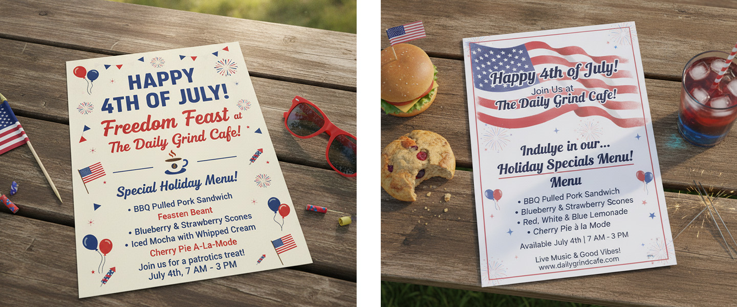
Images Usually Get Attention Before Body Text
This is another area businesses misunderstand constantly.
Many companies spend most of their time writing detailed copy, but customers often decide how they feel about a flyer before reading the paragraph itself.
Strong visuals create emotional direction immediately.
A restaurant flyer with appetizing photography creates a completely different reaction than one overloaded with text.
A fitness flyer with strong movement and energy creates faster engagement than one packed with schedules and explanations.
Print designers often think about visuals as “entry points.”
The image helps customers emotionally enter the flyer before they consciously process the information itself.
But there’s an important balance.
If the visual dominates too aggressively without supporting the message, the flyer may become memorable without actually communicating anything useful.
The best flyers create alignment between:
- the headline
- the visual
- the offer
- the emotional tone
When those elements support each other naturally, customers stay engaged longer.
Customers Usually Scan Before They Read
This is one of the most important realities in flyer marketing.
People do not “study” flyers initially.
They scan them.
That means customers are subconsciously asking:
- What is this about?
- Does this matter to me?
- Is this easy to understand?
- Is this worth more of my time?
all within seconds.
This is why spacing becomes so important.
Flyers that feel visually crowded often perform poorly because customers associate visual overload with mental effort.
Meanwhile, flyers with:
- cleaner spacing
- shorter sections
- stronger hierarchy
- easier readability
feel safer and easier to engage with psychologically.
Good flyer design reduces friction.
If you’re creating a new marketing campaign, our guide on how to design print materials that get read offers additional tips for improving readability and customer engagement.
And reducing friction increases attention.
Color and Contrast Influence What Customers Notice First
Print designers pay enormous attention to contrast because the human eye naturally notices visual separation faster than detail.
For example:
- dark text against light backgrounds improves readability
- strong color contrast increases visibility
- oversized accent colors help guide attention
But too many competing colors often create confusion instead of impact.
This is why many effective flyers actually use fewer colors than businesses expect.
Strong flyer marketing is usually more intentional than decorative.
Customers should instantly understand:
- where to look first
- what matters most
- what action to take next
without feeling overwhelmed visually.
Most Flyers Fail Because Everything Looks Equally Important
This is one of the biggest design mistakes businesses make.
When:
- every section uses bold text
- every sentence feels urgent
- every graphic competes for attention
- every offer looks oversized
nothing truly stands out anymore.
The flyer becomes visually flat even if it contains “important” information.
Good design hierarchy creates priority naturally.
The customer should instinctively feel:
- what to notice first
- what to read second
- where to look afterward
without consciously thinking about it.
This is exactly how professional print designers approach flyer structure.
Not by asking:
“How much can we fit?”
But by asking:
“What should customers notice first?”
Quick Breakdown: What Customers Usually Notice First on a Flyer
| Visual Element | Typical Attention Priority |
| Main headline | First |
| Large image or graphic | Second |
| Discount or offer | Third |
| Brand name or logo | Fourth |
| Supporting details | Last |
After the table, continue naturally:
This order can shift slightly depending on the flyer design, but in most cases, customers process flyers visually before they process them logically.
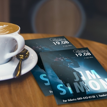
Example: How a Coffee Shop Can Increase Flyer Engagement
Imagine a local coffee shop promoting a weekend special.
Instead of filling the flyer with menus, store history, and multiple promotions, the design focuses on:
– A bold headline: “Free Coffee This Saturday”
– A large photo of the featured drink
– One promotional offer
– A QR code linking to the menu
Because the flyer communicates its value immediately, customers are more likely to stop, read, and visit the business.
The same principles apply to gyms, restaurants, retail stores, salons, real estate agencies, and community events.
Simpler Flyers Usually Convert Better
This surprises many businesses because they assume adding more information increases persuasion.
In reality, the opposite often happens.
The flyers that perform best are usually:
- easier to scan
- faster to understand
- emotionally clearer
- visually calmer
Especially for local marketing campaigns.
Customers rarely make decisions because a flyer contained “enough information.”
They usually respond because the flyer made the offer feel:
- relevant
- immediate
- trustworthy
- easy to act on
This is why many high-performing flyer campaigns focus on:
- one message
- one promotion
- one clear action
instead of trying to communicate everything at once.
If you want examples of stronger flyer structure, this guide on flyers that sell explains how professional flyer layouts influence customer engagement and conversion rates.
The Importance of Visual Hierarchy in Flyer Design
Professional designers often talk about visual hierarchy, the deliberate arrangement of elements to guide a reader’s attention.
An effective hierarchy typically follows this order:
1. Headline
2. Main image
3. Offer
4. Supporting information
5. Contact details
6. Logo
When every element has a clear purpose, customers can quickly understand the message without feeling overwhelmed.
Good visual hierarchy makes flyers easier to scan, easier to remember, and more likely to generate action.
Flyer Size Also Changes Attention Patterns
Design hierarchy changes depending on flyer dimensions.
Smaller flyers usually require:
- larger headlines
- shorter messaging
- stronger visual simplicity
Larger flyers allow more room for:
- secondary information
- supporting visuals
- additional structure
This is why flyer size should support the campaign objective itself.
If you’re choosing flyer dimensions for a promotion or event, this guide on standard flyer sizes explains which formats work best depending on visibility goals and distribution style.
Effective Flyers Feel Easy to Understand
Ultimately, that’s what customers respond to most.
Not complexity.
Not excessive information.
Not aggressive design.
People engage with flyers that feel:
- clear
- visually intentional
- relevant
- easy to process
And in crowded marketing environments, clarity often becomes the biggest competitive advantage.
Because customers rarely reward businesses for making them work harder to understand the message.
Final Thoughts
What customers read first on a flyer usually determines whether they continue reading at all.
That’s why flyer marketing is less about adding more information and more about controlling visual attention strategically.
The highest-performing flyers usually:
- lead with a strong headline
- use clear visual hierarchy
- simplify the message
- reduce visual friction
- guide customer attention naturally
Effective flyer design is ultimately about making information feel faster and easier to absorb in real-world environments where attention is limited.
Explore professional Flyer Printing options at Overnight Prints to create marketing materials designed for real-world attention and customer engagement.
Frequently Asked Questions
What do people look at first on a flyer?
Most people notice the headline first, followed by the main image and the primary offer.
How long do people spend looking at a flyer?
Many customers decide within a few seconds whether they want to continue reading, making a strong visual hierarchy essential.
What makes a flyer easy to read?
Clear headlines, concise copy, generous spacing, and high-contrast colors all improve readability.
Should a flyer have lots of text?
Usually not. Customers tend to scan flyers before reading them in detail, so shorter, well-organized content often performs better.
What’s the most important part of a flyer?
The headline is usually the most important element because it determines whether someone continues reading.