My mother-in-law approached me at a family get-together last week asking me if I would redesign her husband’s business card. She said that her husband, John, has had the same “boring” business card for over 20 years now, and that she wanted him to have something snappier and more modern – with a “fancy logo” on it (like her friend, Mabel’s, who had just had a lovely logo done for her cake-making business!)
John, on the other hand, was not so happy about having his business cards redesigned. He told me that his customers had never complained about his business cards and that his cards were straightforward and honest – like his business!
As you can imagine, after all the fuss that was being made over his card, I was intrigued to see it. Here is a picture of John’s business card:
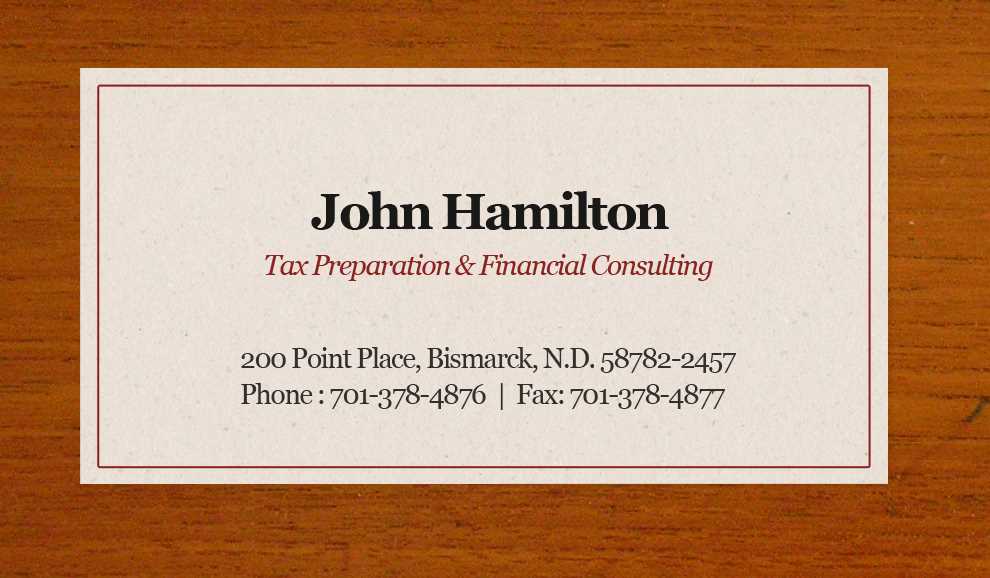
After seeing his card, I couldn’t help thinking that there wasn’t a darn thing I needed to change! I explained to my mother-in-law (to the delight of John) that it would be foolish to mess with this excellent design.
I think my mother-in-law was a little shocked! I’ve done some really elaborate design work for relatives in the past – creating logos, brochures, flyers, and other design materials. I think she was hoping that I would give John’s business cards the same kind of “design makeover.” I gave her the following reasons why this business card should NOT be messed with:
- The business card perfectly fulfills its purpose; to pass business and contact details onto another person.
- As a self-employed financial consultant, does he really need a complex business card? The simple and elegant design fits John’s “straightforward” and “honest” business model perfectly.
- Although this card was originally designed in the 80’s, the design has a timeless quality to it. I love the sharp font (I think it’s Georgia!) and the minimal black and red design layout.
- Nowadays, small businesses are always being told that they need a “fancy logo” to represent their business! Is this really necessary for John’s small financial business? He’s not selling a cool brand and his business really does not need to represent a specific lifestyle or target audience! In fact, his target audience of local businesses and other self-employed taxpayers could even react “negatively” to a change of image and a change of business card. Would a fancy business card design add any value whatsoever to his company? As John said: “I’ve been doing taxes for some of my clients for over 20 years! They’ve gotten used to me and my “boring” business card…I don’t think they’d want me to change it!”
I think he’s right.
Reflecting on John’s minimal design, I can’t help but think that, as designers, we’ve gotten a bit too obsessed with the idea that all companies MUST HAVE a “fancy logo” and a “fancy business card design!”
The fact is, that as designer who specializes in corporate branding and business card design, I may well be out out of a job if everyone created a simplistic” business card! However, I feel that maybe design has gone too far the opposite way, with everyone trying to out-do one another with forever bigger and bolder designs, and with lots of special print effects that can sometimes detract from the design. After all, a business card fulfills a function! It’s there to get your business message across to another individual as immediately and as effectively as possible.
John’s business card hankers back to a time when a business card was a white piece of card with nothing more than your name and number in a sharp looking font; no logo, no photographs, and no clutter! It pre-dates a digital print world in which full-color printing was really expensive and people couldn’t afford to go “hog-wild” with rainbow colors, high-gloss finishes, and photo-printing!
John’s card is reminiscent of the business cards that are portrayed in the movie, American Psycho, in which the main character and his upwardly mobile friends covet each others business cards and discuss the merits of the various fonts, paper, and quality! “Look at that subtle off-white coloring, the tasteful thickness off it” says Patrick Bateman (played by Christian Bale), “Oh my god, it even has a watermark!”. This scene perfectly conjures up the eighties – the golden era of the business cards, when business cards were judged in more subtle graphical terms (for those readers who have never seen this movie – here is the scene that I’m referring too)
American Psycho — Business Card Scene from Jason Lin on Vimeo.
If you look at how graphically stylish the 80’s style business cards are in American Psycho, I think that most designers will agree that we’ve definitely lost a great deal of “savoir-faire” when it comes to business card design. As a business card designer, I can’t tell you how much it makes me “cringe” to see a card, such as the one below!

Compared to John’s business card, this card looks “cheap” and “tacky”. Just because in today’s digital marketplace it’s easy and affordable to create glossy, full-color photo business cards, doesn’t mean that you have to! I mean, I’m not necessarily saying that everyone should start dressing like Crockett and Tubbs again, listening to Phil Collins, and carrying their “eggshell white with raised-letter” business cards around in a silver-snappy-case, but simple and uncluttered design works far better for a business card than trying to fill a 3.5″ x 2″ design space with everything but the kitchen sink!
For a customer viewing a business card, from both a visual and practical standpoint, it is FAR easier and more enjoyable to look at a well-designed, simple business card then try to visually process lots of imagery and small, difficult-to-read text! My advice when designing your card is to keep it simple and legible. The most important aspect of your business card is its immediacy -choose the fastest way to get your information from the card to the viewer. Elaborate cards are off-putting.
To prove my point, I’ve compiled an image list of some great business card designs that have adopted a simple “text based” approach. It may convince you that including anything more than sharp text and an elegant layout might be “overkill” when it comes to your design:
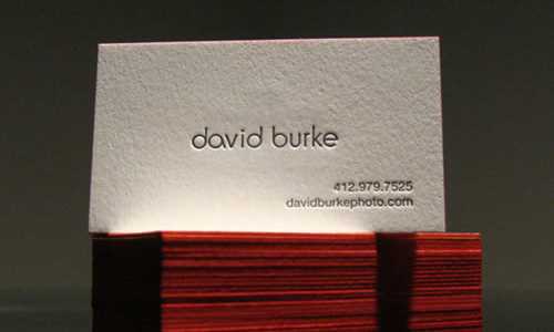
Photographer, David-Burke’s single-sided business cards with name, phone, and website only! Love the red edges!
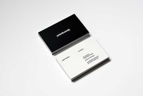
A super elegant design – black on one side, white on the other!
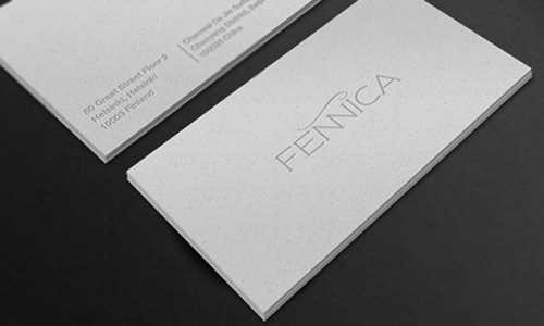
Fennica business card – a simple logo treatment on one side, and company details on the other.
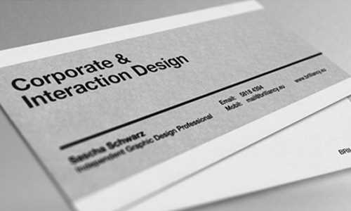
Single-sided business card – using Helvetica, the designers friend!
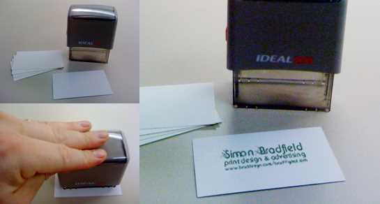
Simon Bradfield’s hand- printed minimalist cards.
These business cards will hopefully give you some ideas for creating your own minimalist business cards. It’s surprising to think that while everyone else has “upgraded” their business cards to feature “fancy logos” and lots of color, people like John have successfully marketed their businesses using the SAME business card for over twenty years! This goes some way to proving that simple and elegant is better!
Create your own minimalist business card
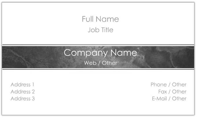
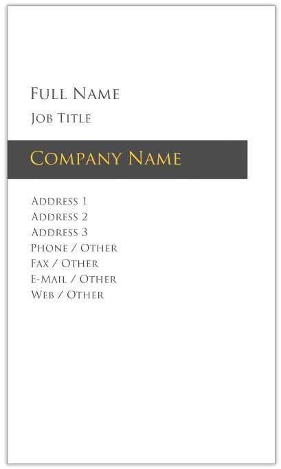
Here are some links to Overnight Prints’ simple and elegant business card templates:






2 Comments
Hi,
Great resource. I liked the david burke one, it truly amplifies the simplistic design.
Love the minimalist David Burke card. Can you contact me to get card at email? thanks CJB