We’re all too familiar with that irresistible scent of freshly popped, buttery movie theater popcorn. That can only mean one thing: It’s movie awards season, and the buzz of the red carpet has fans eagerly awaiting the winner for Best Picture of the Year. The 2017-2018 film awards season will be coming to a finale with the 90th Academy Awards – an evening of over-the-top designer ballgowns, dapper tuxedos, and likely a celebrity group selfie or two. What makes this night so magical? We’re applauding the screen actors who entertained us during first dates, family night out or a fun friends’ weekend.
But before we get to the glitz and glamour of the award show, let’s go back to the release of the movies themselves. Everything about a movie poster tells a story, from the imagery to the typography. The challenge is whether it can tell enough of a tale to convince audiences to sit through a 2-hour motion picture without turning them off or giving too much away. Let’s peek behind the curtain at leading graphic design principles that help direct how a blockbuster movie poster is created.
MOVIE POSTER DESIGNS
Several rules guide the design of movie posters, ranging from iconography to style and space composition.
- AIDA – Attraction is key. Under AIDA (attention, interest, desire, action), designs should intrigue enough to drive audiences to take action (i.e. buy movie tickets).
- Iconography – With good iconography, audiences can easily identify the theme of the film from the images and subjects used.
- Style – Not just important for red carpet fashion, movie poster styles must be marketable in print and digital formats.
- Appeal – Hey, good lookin’! An inviting movie poster that appeals to a broad target audience reigns at the box office.
- Focus point – I spy with my little eye a focal point that draws attention (and fills seats) from afar to a central place on the poster.
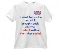
- Typography – Word for word, font selection can and should set the mood and quickly define the movie genre.
- Color – Chase the rainbow because colors can reveal the movie’s tone, such as dark and serious, fun and light-hearted, etc.
- Space – Image and text placement should be pleasing to the eye and give insight to the storyline. Too far apart or too little space should not make the final cut.
- Recognition – If a movie poster design can stand alone, independent of the feature film, it is a visual masterpiece worthy of its own golden statue.
REVIEW: 2018 OSCARS
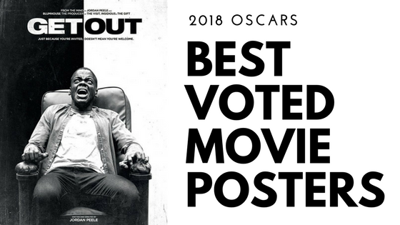
The Overnight Prints Design Services team rated the movie poster designs of 2017’s most critically acclaimed motion pictures. Scored from 1 to 10 as the highest score, our graphic designers critiqued each poster’s ability to attract moviegoers and accurately promote the movie based on the guiding principles. This year’s top design is a tie between “Get Out” and “The Shape of Water.” Both posters are full of emotion, make smart use of color, and let the characters’ expressions do the work.
 Source: IMDB
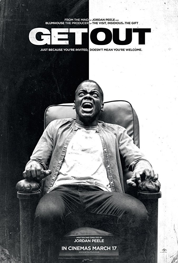
Get Out (9.6 out of 10)
You’ll laugh and cry at Jordan Peele’s directorial debut in “Get Out,” a horror/comedy about an interracial couple visiting Caucasian parents in suburbia. Its black and white imagery is a literal social commentary on race relations with the main character’s gripping terror suggesting he is trapped in more than just the chair.
Albina – 9
Perfect.
Daria – 10
A very intriguing poster that makes you want to see the film.
Nastia – 10
Desaturated colors are a great contrast to the vivid emotions of the character.
 Source: IMDB
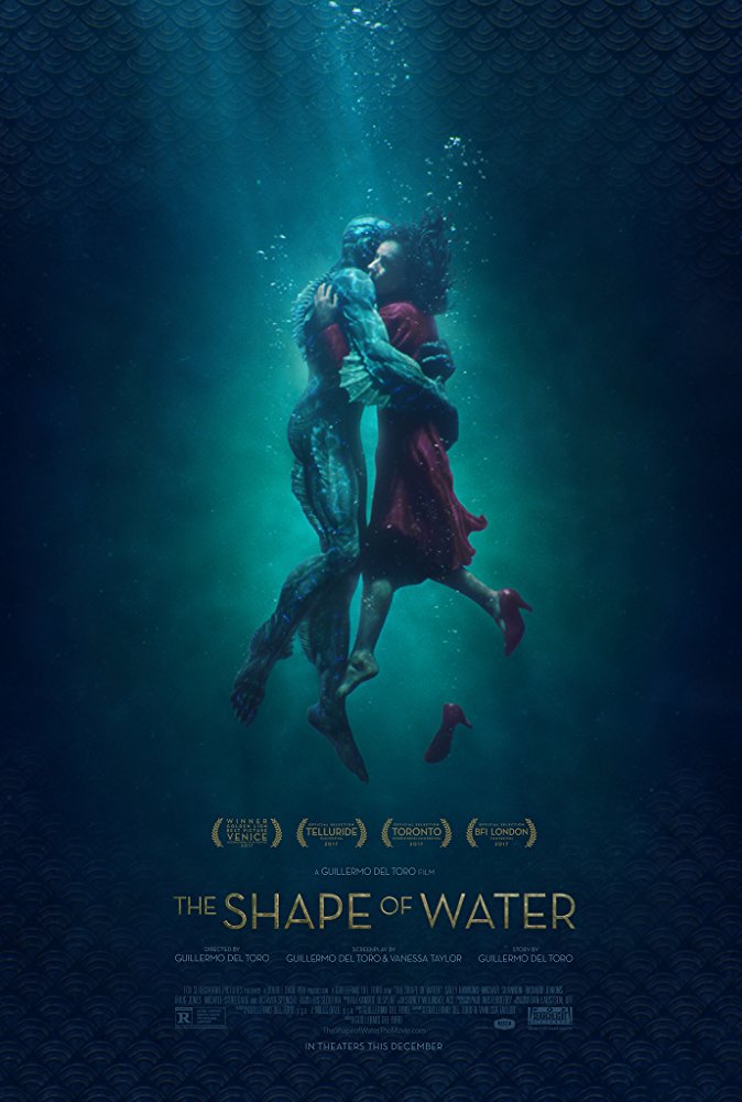
The Shape of Water (9.6 out of 10)
Direct and to the point, “The Shape of Water” really is about a woman’s relationship with an underwater creature. Audiences are reeled in by the soothing blue waters and characters’ warm embrace in this tale of an unlikely love in a secret laboratory during the Cold War.
Albina – 9
It’s just simply beautiful. Great artwork & typography.
Daria – 10
Great one. This poster gives a real insight in the film.
Nastia – 10
Everything is perfect here – choice of color and dynamic composition.
 Source: IMDB
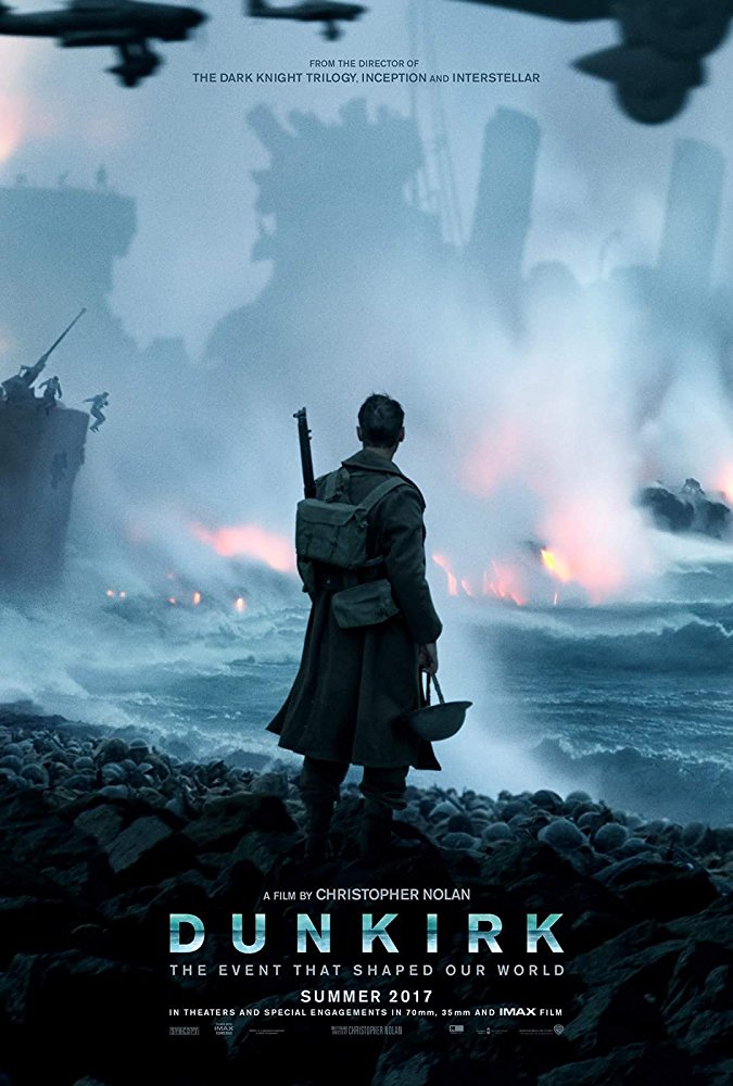
Dunkirk (8.6 out of 10)
“Dunkirk” recalls a frightful encounter when 400,000 Allied troops fight for their lives in a tumultuous evacuation. The World War II thriller disrupts a beach setting with a grim battle scene as a lone soldier, surrounded by a sea of abandoned helmets, looks on.
Albina – 6
Just imagine an actual guy peacefully viewing this scenery without his helmet in hand.
Daria – 10
The poster does certainly attract attention, but it’s not really related to the plot of the film.
Nastia – 10
Great poster. The static pose of a character contrasts against the dynamic action on the background. Almost monochromatic with slight splashes of red across the raging sea looks very strong and attracting.
 Source: IMDB
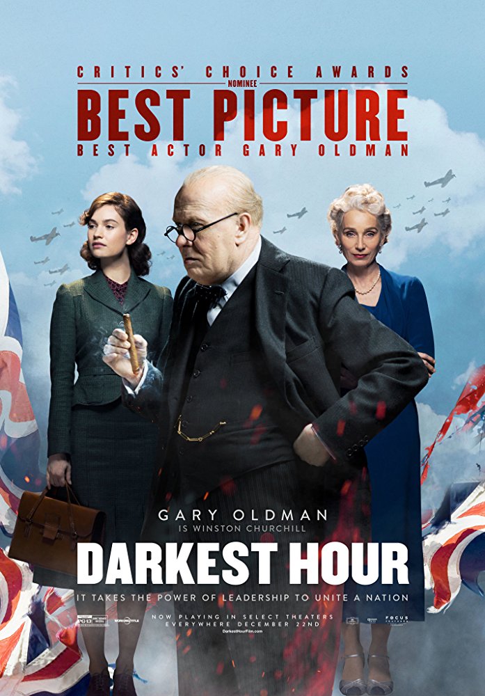
Darkest Hour (7.6 out of 10)
Hour by hour, Gary Oldman gets closer to an Oscar win for his earnest portrayal of Winston Churchill in “Darkest Hour.” The World War II biopic puts its main character front and center as he battles a war within himself and against his country, clearly depicted by a torn British flag and fighter planes overhead.
Albina – 7
Nice composition and choice of colors. You can definitely understand what this film is about.
Daria – 5
Classic composition that is widely used in cinema posters.
Nastia – 8
The color solution speaks of historical cinema; the narrow and bold typeface with center composition denotes the film as a drama. The poster fully matches your expectations.
 Source: IMDB
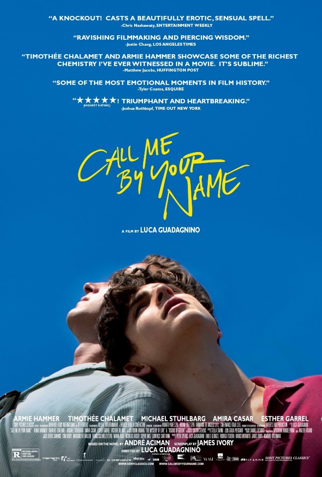
Call Me By Your Name (6.6 out of 10)
“Call Me By Your Name” follows the journey of a teenager discovering his emerging sexuality in the arms of an older man. Its poster singles out the two lead actors, who comfortably lean against each other in an emotionally charged pose while the young boy’s dreamy gaze seeks clarity in the clear blue sky.
Albina – 4
Boring.
Daria – 8
Bright and fresh. Looks like an Oscar nominee.
Nastia – 5
Pure, saturated colors symbolize youth at its peak. We get the feeling that the characters are close. The spirit of the 80’s can be traced in the typography and style of the poster.
 Source: IMDB
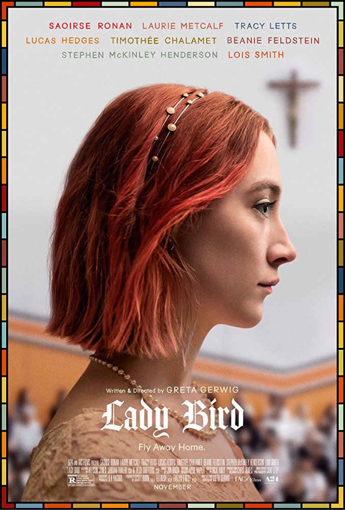
Lady Bird (5.6 out of 10)
The subtle cross in the background and somber expression on the title character’s face are a stark contrast to the plot of “Lady Bird,” a modern coming of age story centered around a rambunctious teenage girl’s complex relationship with her Catholic mother. While the colors are reminiscent of an earlier time period and perfectly complement the imagery, the overall concept (probably intentionally) misleads audiences.
Albina – 7
Combination of medieval and contemporary. Nice choice of colors as well as hidden clues in the background. Nothing flashy, but good.
Daria – 3
The border around the poster looks lame. The font implies that this film is historical drama. But that is all.
Nastia – 6
Colors and font remind us of religious paintings, which are related to the environment of the character, but do not give a hint to the plot.
 Source: IMDB
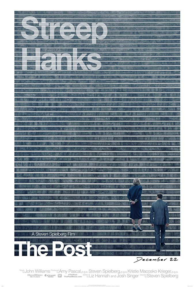
The Post (5.3 out of 10)
The movie title – the one and only indication that “The Post” is actually a true story about a newspaper exposing a government cover-up – is placed at the bottom of the list as far as important design elements go. Instead, the film relies on the power of an all-star cast to draw audiences with only the backsides and last names of the lead actors appearing on the poster.
Albina – 9
Minimalism in all its might.
Daria – 6
This would’ve probably been better with a different font choice.
Nastia – 8
The idea for the poster is nice, but the graphical solution is not the best.
 Source: IMDB
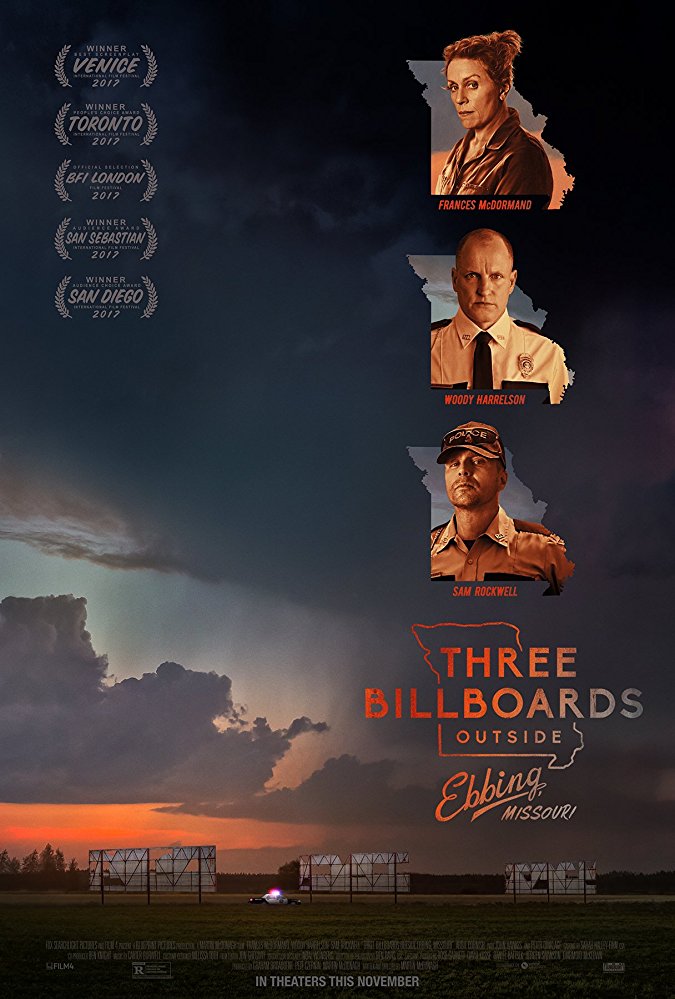
Three Billboards Outside Ebbing, Missouri (4.6 out of 10)
“Three Billboards Outside Ebbing, Missouri” took a literal approach with three tattered billboards along a rural stretch of road at dusk. The theme quickly becomes redundant with three stern-looking characters are in placed in three outlines of the state of Missouri, taking away from the riveting drama about a daughter’s unsolved murder and a mother’s fiery public appeal to local law enforcement.
Albina – 7
The film is much better than the poster. HOW COME?
Daria – 2
Not a fan. Composition is not balanced and falls to the right. But the color choice is good.
Nastia – 5
This is the perfect example when too many details bring nothing but mediocre result.
 Source: IMDB
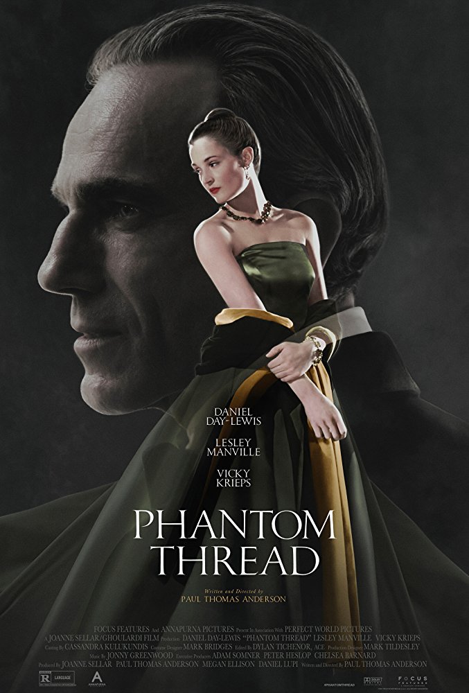
Phantom Thread (4.3 out of 10)
The beauty of the dress fades away with the plot as audiences struggle to understand what or who “Phantom Thread” is really about – a 1950’s melodrama about an overly controlled British fashion designer. The only clue lies in the actress’ longing gaze at the actor’s cold demeanor. Left in the background, the placement of the actor’s portrait tells audiences that the lead character is not, in fact, the main focus of the film.
Albina – 3
One word – cliché.
Daria – 8
Simple and very beautiful.
Nastia – 2
This could be a poster to any melodramatic film.
Read last year’s critique of the 2017 Oscar nominees for Best Picture of the Year.
To schedule a consultation with Overnight Prints Design Services team, email designservices@overnightprints.com.