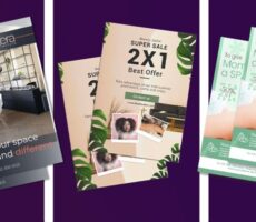
A brochure can look attractive and still fail to communicate effectively.
The colors may match your brand. The photography may look professional. The layout may seem polished.
But can someone quickly understand what you’re offering?
Do they know where to look first?
Can they find the information that matters?
And most importantly, do they know what to do next?
Customers rarely approach marketing materials with unlimited time and attention. They often scan a brochure first and then decide whether it is worth reading more closely.
If the cover is confusing, the text is overwhelming, or important information gets lost in the layout, that decision can happen quickly.
Effective brochure design therefore needs to do more than look good.
It needs to create a clear path through the information.
Before sending your next brochure to print, use this checklist to identify 10 common brochure design mistakes—and how to fix them.
Key Takeaways
- Effective brochure design is about more than making a printed piece look attractive. The design should make information easy to understand and act on.
- Too much information, weak hierarchy, poor typography, and unclear calls to action can make readers lose interest.
- Brochure format and fold should be selected before the final layout because they influence reading order and available space.
- High-quality images, intentional white space, and clear typography make brochures easier to scan.
- The physical printed product—including size, folds, paper, finish, bleed, and color—should be considered during the design process rather than after it.
- A final pre-print checklist can catch expensive mistakes before the brochure reaches production.
What Makes a Brochure Effective?
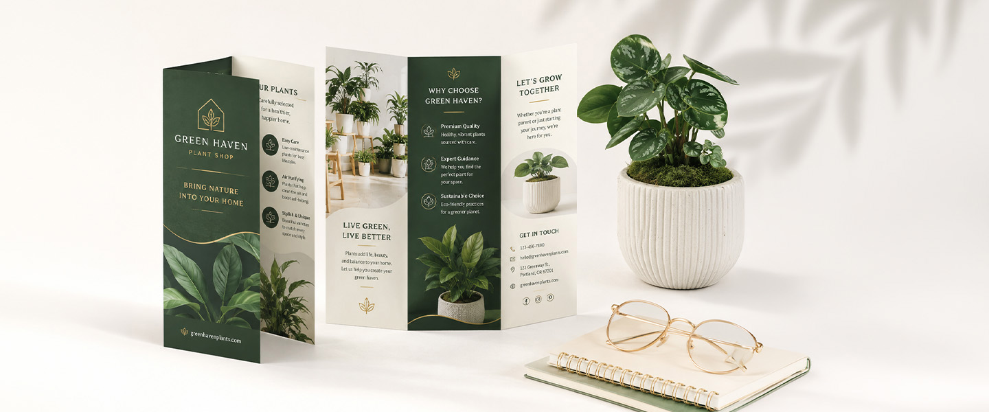
A successful brochure should make communication easier, not more complicated.
Whether you’re introducing a company, explaining a service, promoting a product, or supporting a sales conversation, an effective brochure should:
- capture attention quickly,
- communicate a clear purpose,
- organize information logically,
- make important details easy to find,
- maintain consistent branding,
- and give readers an obvious next step.
These goals depend on several design elements working together.
Content
What does the reader genuinely need to know?
Layout
Where should each piece of information appear?
Visual Hierarchy
What should readers notice first, second, and third?
Typography
Can someone comfortably read the information?
Images
Do the visuals reinforce the message?
Format
How will the physical brochure open and unfold?
Call to Action
What should the reader do after reviewing it?
Treating these decisions separately can create a brochure that looks polished in a design file but feels confusing once printed and folded.
A strong brochure considers the entire experience.
Why Brochure Design Matters
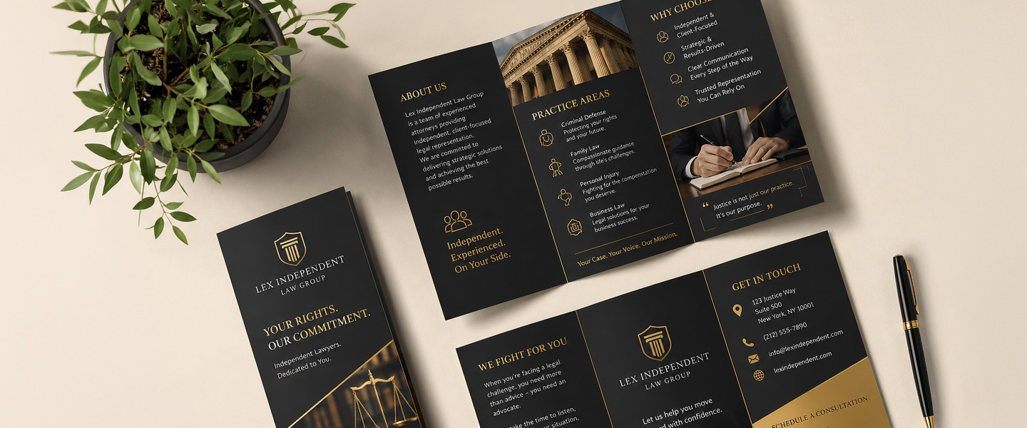
Good design helps readers move from initial interest to understanding and, ideally, action.
First Impressions
The cover is often the first opportunity to earn someone’s attention.
If it contains a generic headline, too much information, or an unclear image, readers may have little reason to explore further.
A strong cover quickly communicates what the brochure is about and why the information matters.
Readability
Typography, spacing, contrast, paragraph length, and layout all influence how easily someone can process the information.
A brochure can contain excellent copy and still be difficult to read if that copy is presented poorly.
Message Retention
Clear organization makes important information easier to identify and remember.
Headlines, short sections, supporting visuals, and logical content flow help readers understand the main message without having to study every word.
Brand Perception
Your brochure represents your business when you’re not there to explain it.
Inconsistent branding, blurry images, crowded layouts, or obvious production mistakes can affect the impression the piece creates.
Consistent, carefully prepared materials create a more cohesive presentation.
Customer Action
Marketing materials should lead somewhere.
A brochure may encourage someone to:
- visit a website,
- request a quote,
- book an appointment,
- visit a location,
- attend an event,
- call the business,
- or learn more about a product.
The design should make that next step easy to identify.
Brochure Design Checklist: 10 Mistakes to Avoid
Here are 10 problems worth checking before sending your brochure to print.
Mistake #1: Trying to Say Too Much
One of the easiest brochure mistakes to make is treating the available space as something that needs to be filled.
You have six panels, so you fill six panels.
Every service gets a paragraph.
Every company achievement gets mentioned.
Every feature gets a bullet point.
Soon, the brochure starts feeling more like a report.
The problem isn’t simply the number of words.
It’s that too much information makes it harder for readers to identify what actually matters.
How to Fix It
Ask:
What does someone need to understand before taking the next step?
Prioritize that information.
Instead of explaining every detail, use the brochure to introduce the most persuasive points and direct readers somewhere else for deeper information.
For example:
Brochure: Main services + key benefits + CTA
Website: Complete service details, FAQs, case studies, specifications, and additional information
Your brochure doesn’t have to answer every possible question.
It needs to make someone interested enough to continue.
Mistake #2: Not Having a Clear Main Message
A brochure promoting five unrelated ideas equally can leave readers unsure what they’re supposed to remember.
Before opening your design software, define the brochure’s primary job.
Is it meant to:
- introduce your business?
- explain a service?
- promote a product?
- generate leads?
- support a sales presentation?
- promote an event?
- drive people to a location?
Those are different goals and may require different content structures.
How to Fix It
Write one sentence:
“After reading this brochure, I want the reader to ______.”
For example:
“After reading this brochure, I want the reader to request a consultation.”
Now evaluate every section against that objective.
If information doesn’t support the primary purpose, consider removing or reducing it.
Mistake #3: Using a Weak Cover
A brochure cover doesn’t need to explain everything.
It needs to give someone a reason to open it.
Common cover problems include:
- generic headlines,
- long paragraphs,
- vague messaging,
- unrelated stock photography,
- excessive branding,
- and too many competing elements.
Imagine a cover that says:
Welcome to ABC Solutions
That identifies the company, but it doesn’t tell the reader why they should care.
Compare it with:
Make Your Next Renovation Easier
Now there is a benefit and a reason to keep reading.
How to Fix It
Build the cover around three elements:
- A clear headline
- A relevant visual
- Your brand identity
Keep supporting information concise.
The inside panels can explain the details.
Mistake #4: Ignoring Visual Hierarchy
If everything looks important, nothing looks important.
A brochure without clear visual hierarchy might use:
- similar font sizes everywhere,
- long uninterrupted text blocks,
- equally prominent images,
- little distinction between headings and body copy,
- and CTAs that blend into surrounding content.
Readers then have to work out the structure themselves.
Many won’t.
How to Fix It
Create visible levels of importance.
For example:
Primary headline
Largest and most prominent
Section headings
Clearly differentiated from body text
Subheadings
Organize supporting information
Body copy
Readable and consistent
CTA
Easy to identify
A reader who spends only a few seconds scanning the brochure should still be able to understand its basic message.
Mistake #5: Choosing the Wrong Brochure Fold
The fold isn’t just a production decision.
It is part of the design.
Different brochure folds reveal information differently.
A tri-fold gives readers a familiar panel-by-panel structure.
A Z-fold creates an accordion-like sequence.
A gate fold opens toward a central reveal.
If you design all the content first and choose the fold afterward, you may discover that:
- content appears in the wrong order,
- an image crosses an awkward fold,
- important text sits near a crease,
- or the panels don’t work as intended.
How to Fix It
Choose the brochure format before finalizing the layout.
Map out:
- front cover,
- back panel,
- inside panels,
- reading sequence,
- main images,
- CTA,
- and contact information.
Then design around that structure.
If you’re deciding between formats, read our guide to Z-Fold, Tri-Fold or Gate Fold Brochures to compare how different folds influence content flow and presentation.
Mistake #6: Using Fonts That Are Difficult to Read
Typography can completely change the usability of a brochure.
Common problems include:
- text that’s too small,
- decorative fonts used for paragraphs,
- too many font families,
- insufficient contrast,
- excessive use of uppercase text,
- inconsistent typography,
- and overly tight spacing.
A font can look beautiful as a headline and be exhausting as body copy.
How to Fix It
Prioritize readability.
Use a consistent typography system with clear roles for:
- headlines,
- subheadings,
- body copy,
- captions,
- and calls to action.
You usually don’t need a large collection of fonts.
Instead, create variety through:
- size,
- weight,
- spacing,
- and placement.
Most importantly, evaluate the typography at actual printed size, not only while zoomed in on your monitor.
Mistake #7: Using Low-Quality Images
A blurry photograph can immediately weaken an otherwise professional brochure.
Common image problems include:
- low-resolution files,
- screenshots,
- images downloaded at small web dimensions,
- excessive enlargement,
- awkward cropping,
- stretched photographs,
- and generic visuals that don’t support the message.
An image may look acceptable on your screen but reveal quality problems once printed.
How to Fix It
Start with high-quality original images appropriate for professional printing.
Avoid enlarging small images far beyond their original dimensions.
Also review:
- cropping,
- composition,
- color,
- brightness,
- and how the image interacts with folds.
Remember that screen and print color are not identical.
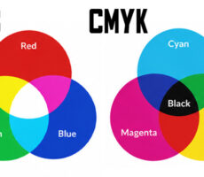
RGB is primarily used for digital displays, while commercial printing commonly relies on CMYK.
For more information on preparing colors correctly, read CMYK vs. RGB: Which Color Mode Should You Use for Professional Printing?
Mistake #8: Ignoring White Space
Empty space is not wasted space.
Trying to fill every inch of a brochure can make the entire piece feel overwhelming.
Without enough breathing room:
- sections run together,
- headlines lose impact,
- images compete with text,
- CTAs become harder to notice,
- and readers have difficulty identifying where to look.
How to Fix It
Use white space intentionally around:
- headlines,
- images,
- sections,
- margins,
- important messages,
- and calls to action.
White space doesn’t literally have to be white.
It simply means giving elements enough visual separation.
A brochure with less content but better spacing can often communicate more effectively than one packed with information.
Mistake #9: Forgetting a Clear Call to Action
A reader reaches the end of the brochure.
They’re interested.
Now what?
This is where some brochures simply stop.
Others include five equally prominent actions:
Call us.
Email us.
Follow us.
Visit our website.
Scan this QR code.
Visit our office.
When everything is presented as the primary next step, readers have to choose for themselves.
How to Fix It
Identify one primary action.
For example:
Request a Quote
Schedule an Appointment
Visit Our Website
Find a Location
Book a Consultation
Register Today
Supporting contact information can still appear elsewhere.
But the main CTA should be easy to identify and understand.
If you’re using a QR code, tell readers what happens after they scan it instead of displaying an unexplained code.
Mistake #10: Designing Without Considering the Final Printed Product
Your brochure isn’t going to live permanently on a computer screen.
It will be printed, trimmed, folded, held, opened, closed, carried, and possibly mailed or displayed.
Designing without considering that physical experience can create problems such as:
- text too close to trim edges,
- important elements positioned on fold lines,
- incorrect bleed,
- unexpected color changes,
- poor image quality,
- awkward panel transitions,
- and finishes that don’t support the intended design.
How to Fix It
Design for the physical product from the beginning.
Before finalizing your artwork, consider:
Size: What are the final dimensions?
Fold: Where will each fold occur?
Bleed: Do background images and colors extend correctly?
Safe area: Is important content safely away from trim and fold areas?
Color: Is the artwork prepared according to the printer’s requirements?
Paper: Does the stock support the intended use?
Finish: How will the surface affect the visual experience?
Resolution: Are images suitable for printing?
Proofreading: Is every final detail correct?
With Overnight Prints, custom artwork should also follow the current file-preparation specifications provided for the selected Brochure.
How to Check Your Brochure Before Printing
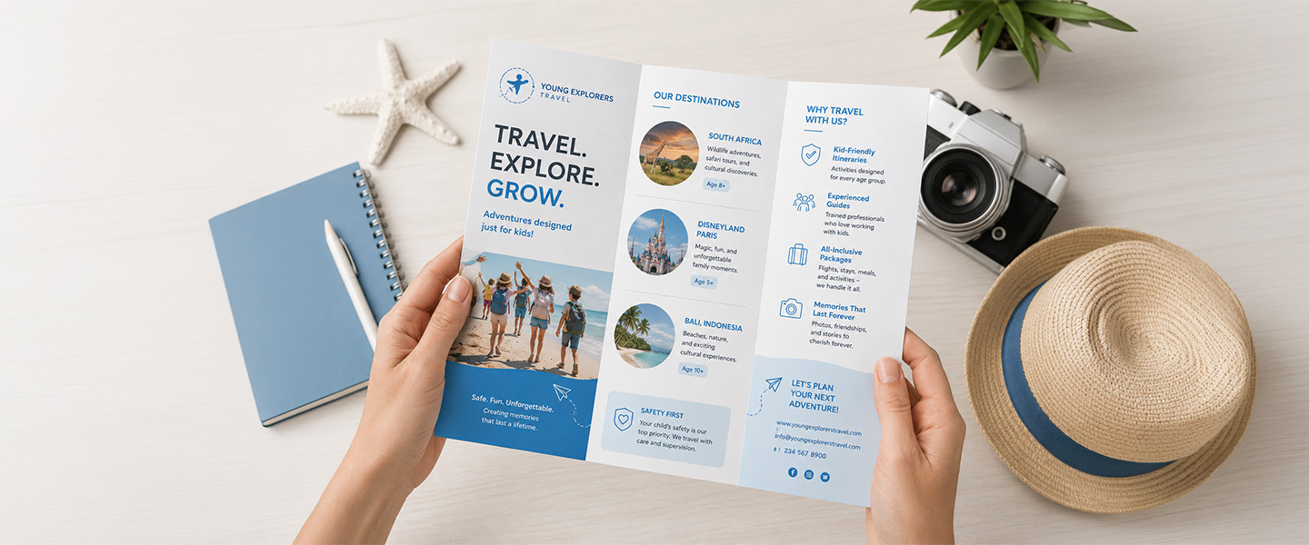
Before clicking “Order,” run through this checklist.
Message
- Is the main purpose immediately clear?
- Does the cover give people a reason to keep reading?
- Does every section support the primary message?
- Have unnecessary details been removed?
Layout
- Is the information easy to scan?
- Are headings and sections clearly organized?
- Is there enough white space?
- Does the content flow logically from panel to panel?
- Have fold locations been considered?
Typography
- Is all text comfortably readable?
- Is there clear hierarchy between headlines and body copy?
- Are fonts used consistently?
- Is contrast strong enough?
Images
- Are images high resolution?
- Are they cropped appropriately?
- Have they been checked at final print size?
- Do they support the message?
Call to Action
- Is there one clear primary CTA?
- Is it easy to find?
- Does the reader understand what happens next?
- Are phone numbers, URLs, QR codes, and contact details correct?
Production
- Are the final dimensions correct?
- Has bleed been included where necessary?
- Is important content inside safe areas?
- Are folds accounted for?
- Are colors prepared according to the printer’s specifications?
- Have paper and finish options been considered?
Final Proofreading
Check every:
- name,
- price,
- date,
- phone number,
- email,
- URL,
- address,
- promotional code,
- and offer condition.
Then have someone who did not design the brochure review it.
Fresh eyes often catch mistakes the designer has stopped noticing.
How to Choose the Right Brochure Design for Your Goal
Your marketing objective should influence the design.
| Marketing Goal | Design Priority |
| Introduce Your Business | Clear brand story, services and differentiation |
| Promote a Product | Strong visuals, key benefits and CTA |
| Explain a Service | Easy-to-follow information and clear hierarchy |
| Generate Leads | Strong value proposition and prominent CTA |
| Promote an Event | Essential details and visual hierarchy |
| Support a Sales Meeting | Professional presentation and concise messaging |
| Showcase Multiple Services | Clear categories and easy navigation |
| Drive Website Traffic | Concise information with a strong digital CTA |
For example, a brochure supporting a sales meeting may contain more detailed information because a representative can guide the prospect through it.
A brochure picked up from a counter needs to communicate independently.
The design context matters.
How Print Choices Affect Brochure Design
Design and printing shouldn’t be treated as two completely separate stages.
Physical specifications affect what you can do creatively.
Brochure Size
Available space determines how comfortably you can present information.
A larger format doesn’t mean you should automatically add more content.
Instead, additional space can be used for:
- larger photography,
- stronger headlines,
- improved spacing,
- and easier reading.
Fold Type
Fold type determines how the reader experiences the content.
A Tri-Fold Brochure naturally breaks information into smaller sections.
Other fold structures can create different sequences or reveals.
Choose based on how you want information to unfold—not simply because one format looks more interesting.
Paper Choice
Paper contributes to the physical impression of the brochure.
Consider:
- how the brochure will be distributed,
- how long recipients may keep it,
- how frequently it will be handled,
- and the overall presentation you want to create.
A brochure for a temporary event may have different needs from a premium sales piece intended for prospective clients.
Finish
Finish affects both appearance and how the printed piece interacts with light.
Gloss can support vibrant photography and high-impact visuals.
Lower-shine options can create a different presentation and may work better for designs where readability under varying lighting conditions matters.
Available options depend on the selected product specifications, so review the current Overnight Prints Brochure options before finalizing your design.
Why Choose Overnight Prints for Brochure Printing?
Once your brochure passes the design checklist, the next step is turning the digital layout into a physical marketing piece.
Overnight Prints offers custom Brochure Printing for businesses, organizations, events, products, and marketing campaigns.
Businesses can create their own artwork or customize a design online, with multiple brochure configurations and professional full-color printing available.
For the best results, select your final brochure specifications before completing the artwork and follow the corresponding file, bleed, color, and layout requirements.
A good print job starts with a design that was built to be printed.
Frequently Asked Questions
What are the most common brochure design mistakes?
Common mistakes include trying to include too much information, lacking a clear main message, using a weak cover, ignoring visual hierarchy, choosing the wrong fold, using difficult-to-read typography, using low-quality images, eliminating white space, forgetting a clear CTA, and designing without considering the final printed format.
What makes a brochure easy to read?
Clear hierarchy, concise copy, readable typography, sufficient contrast, intentional white space, logical sections, and a well-planned content flow all improve readability.
Readers should be able to scan the brochure and understand its basic message before reading every word.
How much information should a brochure include?
There is no universal word count.
Include enough information to help readers understand the offer and decide what to do next without turning the brochure into a complete report.
More detailed information can often live on your website.
What should go on the front of a brochure?
The front should typically establish the main message quickly.
Consider including:
- a clear headline,
- relevant visual,
- business or brand identity,
- and a concise supporting message when necessary.
Avoid trying to summarize the entire brochure on the cover.
How many fonts should you use in a brochure?
There is no strict number that applies to every design, but consistency is more important than variety.
A small, intentional typography system is generally easier to manage than many unrelated fonts.
Use differences in size, weight, and spacing to create hierarchy.
What is the best layout for a brochure?
The best layout depends on the amount and type of information, the reading sequence, the brochure’s purpose, and how it will be distributed.
Tri-folds are versatile for general business information, while other folds may work better for sequential information or more visual presentations.
How do you organize information in a tri-fold brochure?
Start by mapping the physical panels before designing.
Identify the front cover, back panel, opening panel, and interior sections. Then arrange information in the order readers will encounter it as they open the brochure.
Don’t assume the panels appear in the same order in your design file as they do when someone holds the finished piece.
What resolution should images be for brochure printing?
Use high-resolution images that meet your printer’s specifications at their intended printed dimensions.
Avoid relying on small web images or screenshots and then enlarging them for print.
Always check the requirements for your specific printer and product.
What should a brochure call to action include?
A good CTA clearly communicates the next step.
Examples include:
- Visit Our Website
- Request a Quote
- Schedule an Appointment
- Contact Us
- Find a Location
- Register Today
When appropriate, support the CTA with the necessary URL, phone number, QR code, address, or other contact information.
What should I check before printing a brochure?
Review:
- message clarity,
- spelling and grammar,
- names and dates,
- typography,
- image resolution,
- color settings,
- folds,
- dimensions,
- bleed,
- safe areas,
- contact information,
- URLs,
- QR codes,
- paper options,
- finish,
- and the final CTA.
Review the complete brochure at its intended physical size before submitting it.
Conclusion
An effective brochure isn’t simply an attractive piece of graphic design.
Every element should make the message easier to understand.
The cover earns attention.
The hierarchy shows readers where to look.
The typography makes information easy to process.
The images reinforce the message.
The fold controls how information is revealed.
And the call to action tells readers what happens next.
Many brochure problems come from treating those decisions separately—or waiting until the design is nearly finished to think about printing.
Before sending your artwork to production, check for the 10 most common mistakes:
Too much information.
No clear main message.
A weak cover.
Poor visual hierarchy.
The wrong fold.
Difficult typography.
Low-quality images.
Not enough white space.
No clear CTA.
And a design that ignores the physical printed product.
Fixing those issues before printing is far easier than discovering them when hundreds or thousands of brochures have already been produced.
When your artwork is ready, explore Custom Brochure Printing from Overnight Prints to turn your finalized design into a professionally printed marketing piece.
Resources
- Adobe – InDesign User Guide – Professional resources for page layout, typography, images, color, and preparing documents for print.
- Adobe – Prepare Documents for Printing – Guidance for checking and preparing professional layouts before production.
- AIGA – The Professional Association for Design – Resources covering graphic design, typography, visual communication, and professional design practices.
- PRINTING United Alliance – Industry information and resources covering professional printing, production, color, and print technology.