You create a design on your computer.
The colors look bright, vibrant, and exactly the way you imagined.
Then you print it.
Suddenly, that electric blue looks slightly different. The bright green is less intense. A photograph doesn’t have quite the same glow it had on your monitor.
What happened?
One of the main reasons is the difference between RGB and CMYK color modes.
Digital screens and commercial printing do not create color in the same way.
Screens produce color using light.
Most professional full-color printing creates color using ink.
RGB—Red, Green, and Blue—is designed primarily for digital displays. CMYK—Cyan, Magenta, Yellow, and Key (Black)—is commonly used for commercial printing.
Because the two systems have different color ranges, a color that looks spectacular on a bright screen may not reproduce exactly the same way with ink on paper.
Understanding CMYK vs. RGB can help you make better design decisions, prepare artwork correctly, and reduce unexpected color changes when creating professional print materials.
Here’s what you need to know before sending your next design to print.
Key Takeaways
- RGB and CMYK create color in fundamentally different ways: RGB uses light, while CMYK uses ink.
- RGB is primarily used for screens, websites, social media, and other digital content.
- CMYK is commonly used for professional printing, including business cards, flyers, brochures, postcards, posters, and booklets.
- Some bright RGB colors cannot be reproduced exactly within the CMYK color range, which can cause visible changes during conversion.
- Printed colors may look different from a screen even when the artwork has been prepared correctly.
- Overnight Prints recommends designing and uploading files in CMYK using the GRACoL2006_Coated1v2 color profile.
- Reviewing colors before printing and following your printer’s file requirements can help make the final result more predictable.
What Is RGB?
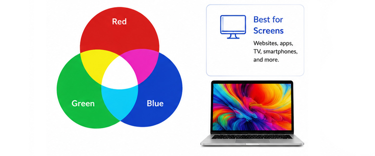
RGB stands for:
Red
Green
Blue
RGB is an additive color model based on light.
Digital displays create different colors by combining varying intensities of red, green, and blue light.
When all three are combined at full intensity, they produce white light.
When there is no light, the result is black.
Because screens emit light directly toward your eyes, RGB can reproduce bright and highly saturated colors that can appear especially vivid on digital displays.
That makes RGB ideal for designs intended to remain digital.
When Is RGB Used?
RGB is primarily used for content displayed on screens.
Common examples include:
- websites,
- social media graphics,
- digital advertisements,
- mobile apps,
- computer displays,
- digital presentations,
- online graphics,
- email graphics,
- and video.
If you’re designing something that people will primarily view on a phone, computer, television, or tablet, RGB is usually the appropriate environment.
Professional printing works differently.
That’s where CMYK enters the picture.
What Is CMYK?
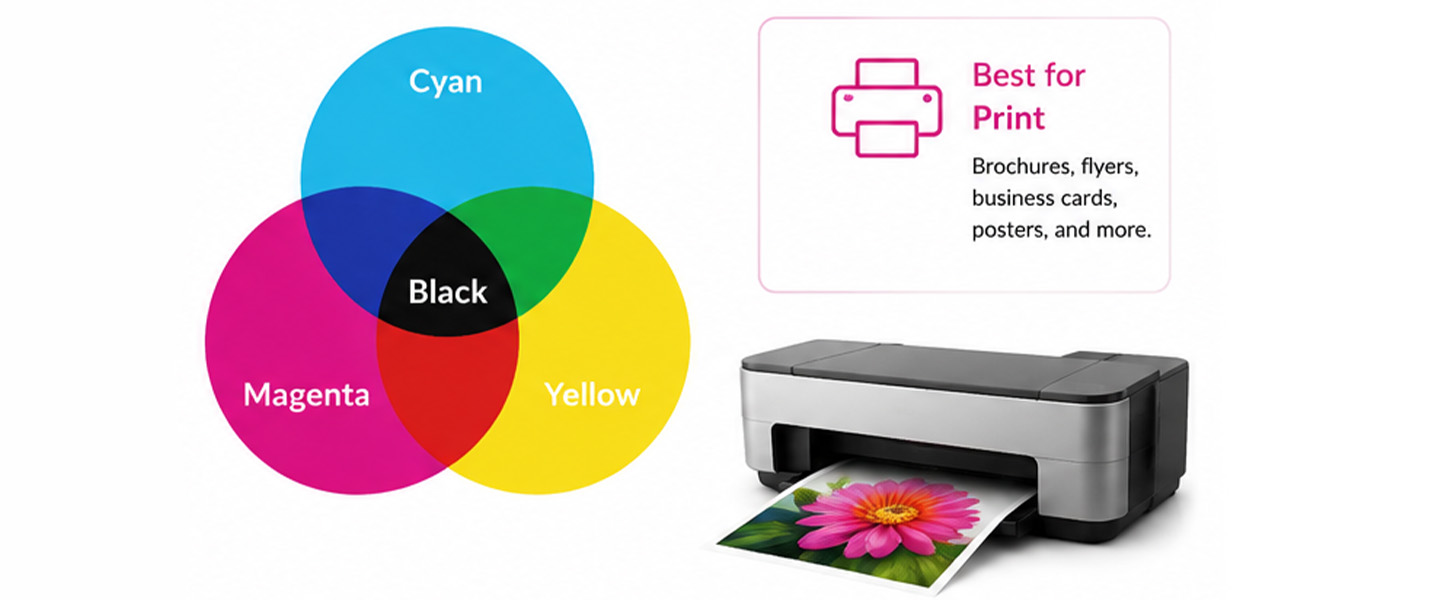
CMYK stands for:
Cyan
Magenta
Yellow
Key (Black)
CMYK is a subtractive color model commonly used in commercial printing.
Instead of producing color with emitted light, CMYK creates printed color through combinations of ink on a physical surface.
Cyan, magenta, yellow, and black inks are applied in different percentages to reproduce a broad range of colors.
The word Key refers to black.
Although combinations of cyan, magenta, and yellow can theoretically create very dark colors, black ink is added in commercial process printing to improve shadows, detail, contrast, and practical color reproduction.
When Is CMYK Used?
CMYK is commonly used when preparing artwork for professionally printed products such as:
- Business Cards
- Flyers
- Brochures
- Postcards
- Posters
- Booklets
- Rack Cards
- Presentation Folders
- and many other full-color print materials.
If the final design is being produced with standard four-color process printing, CMYK is the color model you need to understand.
CMYK vs. RGB: What’s the Difference?
The simplest difference is this:
RGB creates color with light.
CMYK creates color with ink.
| Feature | CMYK | RGB |
| Stands For | Cyan, Magenta, Yellow, Key (Black) | Red, Green, Blue |
| Color Source | Ink | Light |
| Color Model | Subtractive | Additive |
| Primary Use | Professional printing | Digital screens |
| Color Range | More limited for some bright colors | Can display a wider range of bright digital colors |
| Best For | Printed materials | Digital content |
| Common Examples | Business cards, flyers, brochures, postcards | Websites, social media, digital ads, apps |
| Final Surface | Paper or another printable substrate | Screen |
| White | Usually comes from the printing surface | Produced by combining RGB light |
Neither color mode is inherently “better.”
They are designed for different environments.
If your project is digital, RGB makes sense.
If you’re preparing artwork for professional process printing, CMYK is generally the relevant model—and your printer’s specific requirements should determine how the final file is prepared.
Why Does Color Mode Matter for Professional Printing?
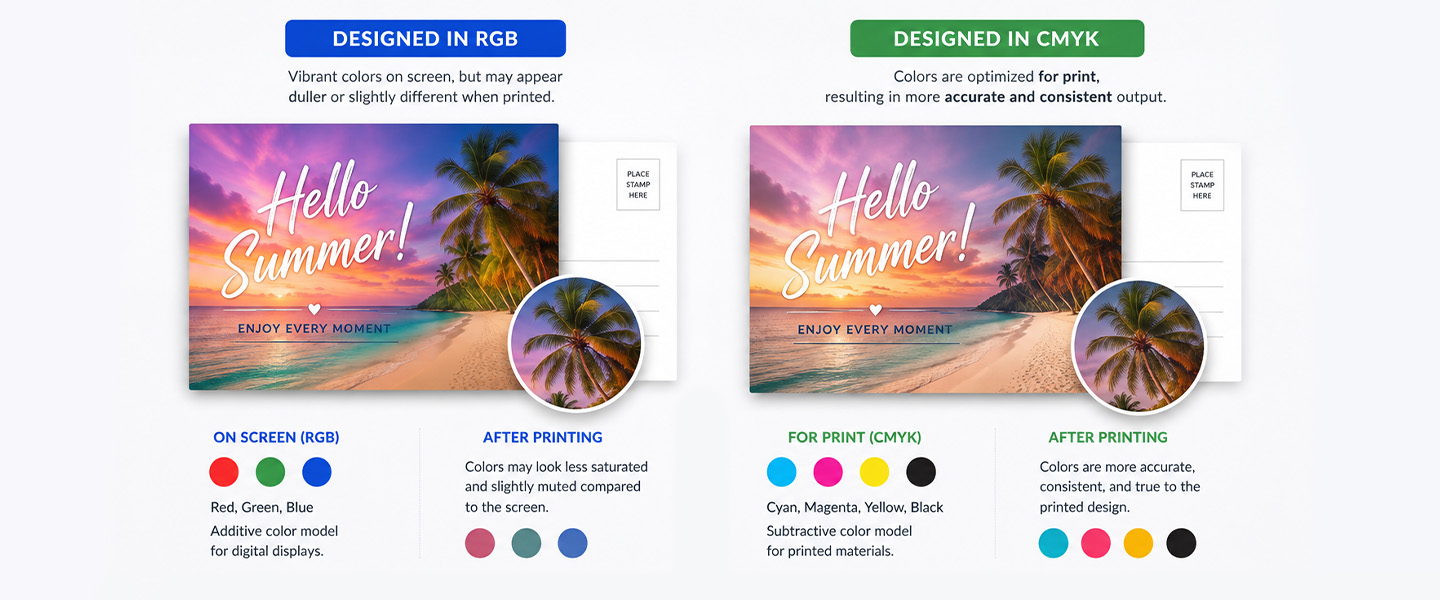
Choosing the right color mode helps you design with the final output in mind.
Screens and Printers Create Color Differently
A computer monitor emits light.
Printed paper reflects light.
That difference alone means the two experiences cannot be identical.
A bright screen can produce luminous colors because the display itself is generating light.
Paper cannot do that.
Ink absorbs some wavelengths of light and reflects others back toward your eyes.
This means a printed blue and a digital blue can have the same creative intention while appearing different in the real world.
Some RGB Colors Cannot Be Reproduced Exactly in CMYK
Every color space has a gamut—the range of colors it can reproduce.
RGB color spaces can include bright and highly saturated colors that fall outside the range achievable with standard CMYK process printing.
These are called out-of-gamut colors.
Examples can include certain:
- neon-like greens,
- electric blues,
- highly saturated purples,
- intense oranges,
- and other extremely bright digital colors.
When those colors are converted to CMYK, they have to be mapped to printable alternatives.
That can change their appearance.
Color Conversion Can Affect the Final Result
Imagine creating a social media graphic in RGB using an extremely bright blue.
Now you want to use the same design on a printed flyer.
During conversion to CMYK, the original RGB blue may not exist within the available CMYK gamut.
The software therefore needs to reproduce it using printable CMYK values.
The resulting color might appear:
- less saturated,
- slightly darker,
- less luminous,
- or subtly different in hue.
The amount of change depends on the original color and the color-management workflow.
Preparing Files Correctly Can Reduce Surprises
You cannot make paper behave exactly like a backlit monitor.
But you can prepare artwork with the final printing process in mind.
That means:
- checking your printer’s specifications,
- working with the appropriate color mode,
- using the recommended color profile,
- reviewing conversions,
- and avoiding assumptions based entirely on what appears on an uncalibrated screen.
The goal is not to promise a perfect screen-to-print match.
It is to make the printed result more predictable.
Why Do Printed Colors Look Different From Your Screen?
RGB vs. CMYK is an important reason—but it is not the only one.
Several factors influence the way color appears.
RGB and CMYK Have Different Color Gamuts
Some colors available in RGB cannot be reproduced exactly with standard CMYK inks.
When an out-of-gamut color is converted, the software needs to approximate it within the printable color space.
That can produce visible differences.
Screen Brightness Changes Your Perception
Your monitor is a light source.
Turn the brightness all the way up and colors can appear exceptionally vivid.
Printed paper does not emit light.
That means comparing a print directly with a bright smartphone or monitor can create unrealistic expectations.
Monitor Calibration Matters
Not every monitor displays the same color in exactly the same way.
Two people can open the same image on different computers and see slightly different results.
Display:
- brightness,
- contrast,
- color temperature,
- calibration,
- and hardware
can all influence what appears on screen.
This is one reason Overnight Prints does not guarantee that printed colors will exactly match the preview displayed on a customer’s monitor.
Paper Stock Affects Color
Ink interacts with the surface on which it is printed.
Different paper characteristics can influence:
- saturation,
- contrast,
- detail,
- and the overall visual impression.
A color printed on one paper stock may not appear identical when printed on another.
For more about how paper affects a print project, read A Complete Guide: Types of Paper for High-Quality Printing.
Matte vs. Glossy Finishes Can Change Appearance
Finish affects how light interacts with the printed surface.
A glossy surface reflects light differently from a matte or soft-touch surface.
As a result, the same artwork can feel different depending on the finish selected.
Ink and Printing Processes Matter
Commercial printing involves physical inks and production conditions.
Even when files are properly prepared, slight variation can occur within industry tolerances.
Lighting Changes the Final Appearance
A printed piece does not have one fixed visual appearance under every condition.
Look at the same business card:
- beside a window,
- under warm indoor lighting,
- under bright office lighting,
- and outside in daylight.
The colors may appear slightly different in each environment.
That is normal.
The light illuminating the printed piece affects what your eyes perceive.
Should You Design in RGB or CMYK for Printing?
There is no reason to guess.
Start with the requirements of the printer producing the final piece.
Check Your Printer’s File Requirements First
Different printers and production workflows can have different requirements.
For Overnight Prints specifically, custom files should be designed and uploaded in CMYK.
Overnight Prints recommends the GRACoL2006_Coated1v2 color profile for better color accuracy.
If an RGB file is uploaded, Overnight Prints converts it to CMYK, and the company notes that colors may not be as accurate after conversion.
That means preparing the file correctly before uploading gives you more opportunity to review how the colors behave.
Consider Designing in the Recommended Color Mode
If your final project is being produced by Overnight Prints, build the print version with CMYK output in mind.
This is particularly important for brand colors and designs containing highly saturated hues.
Instead of creating an entire print campaign around colors that only work well in RGB, evaluate their printable CMYK equivalents early in the design process.
Preview Color Changes Before Ordering
If your original artwork is RGB, review what happens during conversion.
Pay particular attention to:
- bright blues,
- saturated greens,
- purples,
- oranges,
- gradients,
- photography,
- and other highly saturated areas.
Do not simply convert the file and immediately export it.
Look for meaningful visual changes first.
Keep Original Design Files
A business may need the same creative concept for both digital and print applications.
For example:
Instagram ad: RGB
Website graphic: RGB
Printed flyer: CMYK
Business card: CMYK
Instead of repeatedly converting one flattened file back and forth, maintain editable source files that allow you to create appropriate versions for each environment.
How to Convert RGB to CMYK
Professional design applications such as Adobe Photoshop, Illustrator, and InDesign provide color-management and conversion tools.
The exact workflow varies by software, but the general process is similar.
Step 1: Open Your Original Design File
Work from the highest-quality editable source available rather than a heavily compressed exported image whenever possible.
Step 2: Save a Backup
Before converting anything, preserve the original.
This is particularly important because color conversion changes color values and some information may not be recoverable simply by converting back later.
Maintain your RGB version if you will also need the artwork for digital use.
Step 3: Convert to the Appropriate CMYK Profile
Use your design application’s color-management tools to convert the document to the CMYK profile recommended by your printer.
For Overnight Prints, the recommended profile is GRACoL2006_Coated1v2.
Do not assume that selecting “CMYK” alone completes every color-management decision. CMYK color spaces and printing conditions can vary.
Step 4: Review the Colors
After conversion, inspect the artwork carefully.
Look for:
- loss of saturation,
- changes in blues and purples,
- altered gradients,
- duller bright colors,
- and shifts in photographs.
Step 5: Adjust When Necessary
If an important brand or design color changes significantly, adjust the CMYK version rather than expecting the original RGB appearance to reproduce automatically.
The objective is to create the best printable version of the design.
Step 6: Export According to the Printer’s Requirements
Once the artwork is ready, use the printer’s recommended:
- file type,
- dimensions,
- resolution,
- bleed,
- color settings,
- and export specifications.
Adobe provides detailed instructions for color-mode conversion in Photoshop and other Creative Cloud applications.
How to Prepare Colors for Professional Printing
A few habits can make print color much easier to manage.
Review Your Printer’s Artwork Guidelines
Do this before finishing the design.
Confirm:
- required color mode,
- recommended profile,
- resolution,
- file formats,
- bleed,
- and other production specifications.
Use the Recommended Color Mode
For Overnight Prints, prepare and upload custom artwork in CMYK.
This prevents the workflow from relying on an automatic RGB-to-CMYK conversion after upload.
Use the Recommended Color Profile
Overnight Prints recommends GRACoL2006_Coated1v2.
A color profile helps define how numerical color values should be interpreted within a specific color space and printing condition.
Don’t Rely Solely on Your Screen
Your monitor is useful for designing.
It is not an absolute representation of the finished print.
Avoid making critical color decisions based only on how vibrant something looks on a bright, uncalibrated display.
Check Images After Conversion
Photographs deserve particular attention.
Skin tones, skies, products, clothing, artwork, and other color-sensitive images can change when converted between color spaces.
Zoom out and evaluate the entire photograph rather than only checking individual colors.
Pay Attention to Highly Saturated Colors
Extremely vivid RGB colors are more likely to create noticeable changes.
If a bright color is essential to the brand or campaign, evaluate it early rather than discovering the limitation at final export.
Consider Paper and Finish
The same CMYK values can create a different visual impression depending on the physical product.
Think about how your chosen:
- paper,
- coating,
- texture,
- and finish
support the design.
Keep Your Original Files
Never make the converted print file your only editable version.
Maintain an original so you can create separate versions for future digital and print applications.
Consider Proofing When Color Is Critical
When a printing provider offers an appropriate proofing option, consider using it for projects where color reproduction is especially important.
Remember that even proofing methods have limitations, so understand exactly what type of proof is being provided and what it represents.
What Color Profile Does Overnight Prints Use?
This deserves special attention if you’re preparing files specifically for Overnight Prints.
The recommended profile is:
GRACoL2006_Coated1v2
Overnight Prints recommends using this profile with CMYK artwork for better color accuracy.
The company’s current color guidelines also state:
- files should be designed and uploaded in CMYK,
- RGB files are converted to CMYK,
- color shifts caused by RGB-to-CMYK conversion are not covered as printing defects,
- and printed color is not guaranteed to exactly match what appears on a customer’s monitor.
That last point is important.
Proper CMYK preparation improves predictability, but it does not turn a monitor into a perfect physical proof.
Screens and printed materials remain fundamentally different.
CMYK vs. Pantone: What’s the Difference?
CMYK and Pantone are related to printing, but they are not the same system.
CMYK Process Printing
CMYK reproduces colors by combining percentages of:
- cyan,
- magenta,
- yellow,
- and black.
Thousands of colors can be visually created from combinations of those four process inks.
This is why CMYK works so well for:
- photography,
- illustrations,
- colorful marketing materials,
- and designs containing many different colors.
Pantone and Spot Colors
The Pantone Matching System, commonly abbreviated as PMS, identifies standardized colors that can be reproduced using specific spot-color formulations.
Instead of creating a particular color from standard CMYK process dots, traditional spot-color printing can use a specifically formulated ink.
Spot colors can be useful in workflows where particular brand colors or specialty colors are important.
However, availability depends on the printing provider, product, and production method.
Do not assume that choosing a Pantone color in your design software means it will automatically be printed as a separate Pantone spot ink.
Check with your printer first.
For Overnight Prints orders, follow the company’s CMYK file-preparation requirements unless the specifications for a particular product explicitly say otherwise.
Common CMYK and RGB Mistakes to Avoid
Designing Entirely in RGB Without Checking Print Requirements
RGB may be perfect for the digital version of your campaign.
But if the final piece will be printed, check the printer’s requirements before completing the artwork.
Assuming Screen Colors Will Look Identical in Print
They won’t necessarily.
Screens emit light. Paper reflects it.
Even correctly prepared artwork should not be expected to look identical to a backlit display.
Converting at the Last Minute Without Reviewing
Clicking “Convert to CMYK” is not the final step.
Review the artwork afterward.
A color that was central to the original design may need adjustment.
Using Extremely Bright RGB Colors Without Considering Gamut
Neon-like and highly saturated digital colors can be especially difficult to reproduce with standard CMYK process printing.
Consider printable alternatives early.
Ignoring Paper Stock and Finish
Color does not exist independently of the material.
The selected stock and finish contribute to the final appearance.
Using Low-Quality Images
Correct color mode cannot fix poor image quality.
Use appropriate high-resolution source files for professional printing.
Ignoring File Preparation Guidelines
Color mode is only one part of preparing artwork.
Also check:
- resolution,
- bleed,
- dimensions,
- safe areas,
- file type,
- and export settings.
Expecting Every Monitor to Display Colors Identically
Your customer, designer, marketing manager, and printer may all view the same artwork on different screens.
Those displays may not reproduce color identically.
Use proper color-management practices rather than relying on visual comparison between random monitors.
CMYK or RGB for Common Marketing Materials?
A simple way to remember the distinction is to ask where the final design will live.
| Marketing Material | Recommended Environment |
| Website graphic | RGB |
| Social media post | RGB |
| Digital advertisement | RGB |
| Email graphic | RGB |
| Online presentation | RGB |
| Business Card | CMYK for Overnight Prints |
| Flyer | CMYK for Overnight Prints |
| Brochure | CMYK for Overnight Prints |
| Postcard | CMYK for Overnight Prints |
| Poster | CMYK for Overnight Prints |
| Booklet | CMYK for Overnight Prints |
If you’re creating the same campaign for digital and print, prepare separate output versions rather than expecting one file to be ideal for both.
Why Choose Overnight Prints for Professional Printing?
Overnight Prints offers professional custom printing across a wide range of marketing and business products.
Businesses can create coordinated print campaigns using products such as:
For custom artwork, Overnight Prints provides specific color and file-preparation guidelines, including CMYK artwork and the recommended GRACoL2006_Coated1v2 profile.
Preparing artwork according to those specifications before uploading gives you greater control over how your digital design is translated into print.
Frequently Asked Questions About CMYK vs. RGB
-
Which color mode works best for creating print publications?
CMYK is generally the best color mode for publications produced with standard four-color commercial printing. It uses cyan, magenta, yellow, and black inks to reproduce colors on paper. For Overnight Prints, custom artwork should be prepared in CMYK using the recommended GRACoL2006_Coated1v2 color profile.
-
Should I use CMYK or RGB for printing?
Use CMYK when preparing files for standard professional printing, unless your printer specifies a different workflow. RGB is primarily designed for digital screens, while CMYK is commonly used for printed materials such as business cards, brochures, flyers, postcards, and posters.
- What is the difference between CMYK and RGB?
RGB stands for Red, Green, and Blue and creates color using light. CMYK stands for Cyan, Magenta, Yellow, and Key (Black) and creates printed colors using ink. RGB is mainly used for digital displays, while CMYK is commonly used for commercial printing.
-
Why is CMYK better for printing than RGB?
CMYK is commonly used in professional printing because it represents the four process inks used to reproduce colors on paper. Preparing artwork in the printer’s recommended CMYK profile helps you review color changes before production. Some bright RGB colors cannot be reproduced exactly using standard CMYK inks.
-
What happens if you print an RGB file?
An RGB file may need to be converted to the printer’s output color space before printing. During conversion, certain bright or highly saturated colors may become less vibrant or change slightly. Overnight Prints converts uploaded RGB artwork to CMYK, so preparing the file in CMYK beforehand is recommended.
-
Should posters be designed in CMYK or RGB?
For posters printed through a standard commercial CMYK process, prepare the final artwork in CMYK according to your printer’s specifications. RGB is more appropriate for posters intended for digital screens. If you need both printed and digital versions, maintain separate output files.
-
How do I convert RGB to CMYK for printing?
Open your original artwork in a design application that supports color management, save a backup, and convert the document using the CMYK profile recommended by your printer. Review colors, gradients, and photographs after conversion, then export the file according to the printer’s requirements. Overnight Prints recommends GRACoL2006_Coated1v2.
-
Why do CMYK colors look different from RGB on a screen?
Screens emit light, while printed materials reflect light. RGB and CMYK also have different color ranges, so certain vivid RGB colors cannot be reproduced exactly with standard CMYK inks. Monitor calibration, paper stock, printing conditions, and lighting can also affect the final appearance.
Conclusion
RGB and CMYK are designed for different environments.
RGB uses red, green, and blue light and is primarily suited to digital screens.
CMYK uses cyan, magenta, yellow, and black inks and is commonly used for professional process printing.
The distinction matters because the two color models do not reproduce exactly the same range of colors.
A bright RGB design may contain colors that cannot be reproduced exactly in CMYK. When the artwork is converted for printing, those colors may become less saturated or shift slightly.
And color mode is only part of the equation.
Your monitor, color profile, paper stock, finish, ink, printing conditions, and viewing environment can all influence the final appearance.
For more predictable print results: check your printer’s requirements, use the recommended color mode and profile, review your artwork after conversion, and don’t rely solely on what you see on a screen.
For Overnight Prints specifically, prepare and upload custom artwork in CMYK and use GRACoL2006_Coated1v2 when available.
Explore professional printing options from Overnight Prints for business cards, flyers, brochures, postcards, posters, booklets, and other custom marketing materials.
Resources
- Adobe – Understanding Color Modes – Official guidance explaining RGB, CMYK, color spaces, gamut, and how different devices reproduce color.
- Adobe Photoshop – Convert an Image to Another Color Mode – Instructions for converting RGB artwork to CMYK and previewing color changes.
- International Color Consortium (ICC) – Technical information about color management, ICC profiles, and maintaining color consistency between devices.
- PRINTING United Alliance – Professional printing industry resources covering production, color management, and print technology.
- Overnight Prints – Color Guidelines – Current Overnight Prints requirements for CMYK artwork, color profiles, and color reproduction.