AI can generate a polished poster concept, background, illustration, or marketing graphic in seconds. But there’s an important difference between an image that looks good on a screen and a file that’s actually ready to print.
AI-generated designs can still have low-resolution images, distorted text, incorrect dimensions, missing bleed, colors that shift in print, or important elements placed too close to the trim line.
That doesn’t mean you shouldn’t use AI for print design.
It means AI should be treated as part of the creative process, not as the final prepress check.
Whether you’re creating business cards, postcards, brochures, flyers, posters, or other marketing materials, here’s how to use AI without sacrificing print quality.
Can You Use AI to Create Designs for Printing?
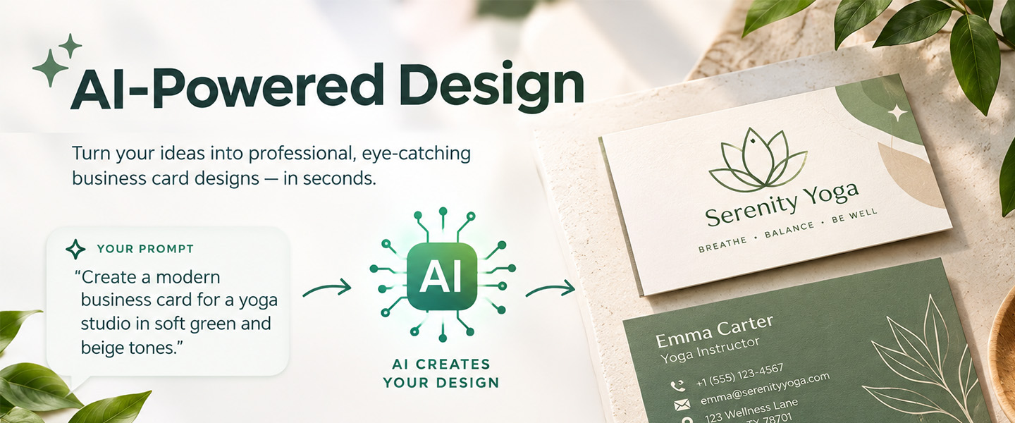
Yes. AI can be useful at several stages of the print design process.
For example, you can use it to:
- Brainstorm design concepts
- Generate backgrounds and illustrations
- Explore different visual styles
- Develop layout ideas
- Suggest headlines and calls to action
- Create mood boards
- Remove or replace backgrounds
- Explore different compositions
- Generate supporting imagery
- Create variations of an existing concept
The problem starts when an AI-generated image is treated as a finished print file without checking its technical specifications.
A beautiful AI-generated graphic isn’t automatically a print-ready graphic.
Why AI Designs Can Look Good on Screen but Bad in Print
Screens are forgiving.
A relatively small image can look sharp on a laptop or phone because you’re viewing it within a limited digital space. Printing that same image at a larger physical size exposes limitations that weren’t obvious on screen.
Resolution is one of the biggest examples.
Adobe notes that 300 PPI is commonly used as a general target for printed raster images, while enlarging an image beyond its intended size reduces its effective resolution.
AI image generators, however, generally create an image at a particular pixel dimension. The fact that an image looks detailed doesn’t tell you how large it can be printed while maintaining the desired resolution.
That’s why the workflow shouldn’t be:
Generate → download → print.
A safer workflow is:
Generate → inspect → resize correctly → rebuild/edit → prepare for print → proof → print.
1. Start With the Final Print Size
Before asking AI to create anything, know what you’re designing.
Are you making a:
- Business card?
- Postcard?
- Flyer?
- Brochure?
- Rack card?
- Poster?
The intended physical dimensions matter because the image needs enough resolution for the size at which it will actually be printed.
Suppose AI generates an image that’s 1,200 × 1,800 pixels.
At 300 PPI, those pixels correspond to approximately:
4 × 6 inches
Trying to use that exact image at 8 × 12 inches would cut the effective resolution in half.
So don’t begin by thinking:
“I need a cool promotional graphic.”
Begin with:
“I need artwork suitable for a 4 × 6-inch printed postcard.”
You can then build your AI workflow around the actual output instead of trying to force a small generated image into a larger format later.
For example, an AI-generated image intended for a small custom bookmark doesn’t need to fill the same physical area as artwork created for a brochure. If you’re designing a custom brochure, you also need to think about how the generated visual will work across panels and folds—not just whether the image looks good by itself.
The same applies to other formats. A vertical image may adapt naturally to a rack card, while a different composition may work better for a postcard. Knowing the final product before generating your visuals helps you request artwork with the right orientation, composition, and amount of negative space.
2. Don’t Ask AI to Create Your Entire Finished Print File
It can be tempting to generate something like:
Create a finished business flyer with our company name, phone number, website, offer, QR code and disclaimer.
The result may look convincing at first glance, but this creates unnecessary risk.
AI image generators can struggle with exact typography, small text, brand details, alignment, and other information that needs to be precise.
Instead, use AI for the elements it’s good at creating.
For example:
Use AI for:
- Background image
- Illustration
- Visual concept
- Decorative elements
- Creative direction
Then add critical information manually in your design software:
- Logo
- Headline
- Phone number
- Website
- Prices
- Dates
- Address
- Legal copy
- QR code
- Call to action
This gives you much more control over the elements that absolutely need to be correct.
3. Check the Resolution of Every AI-Generated Image
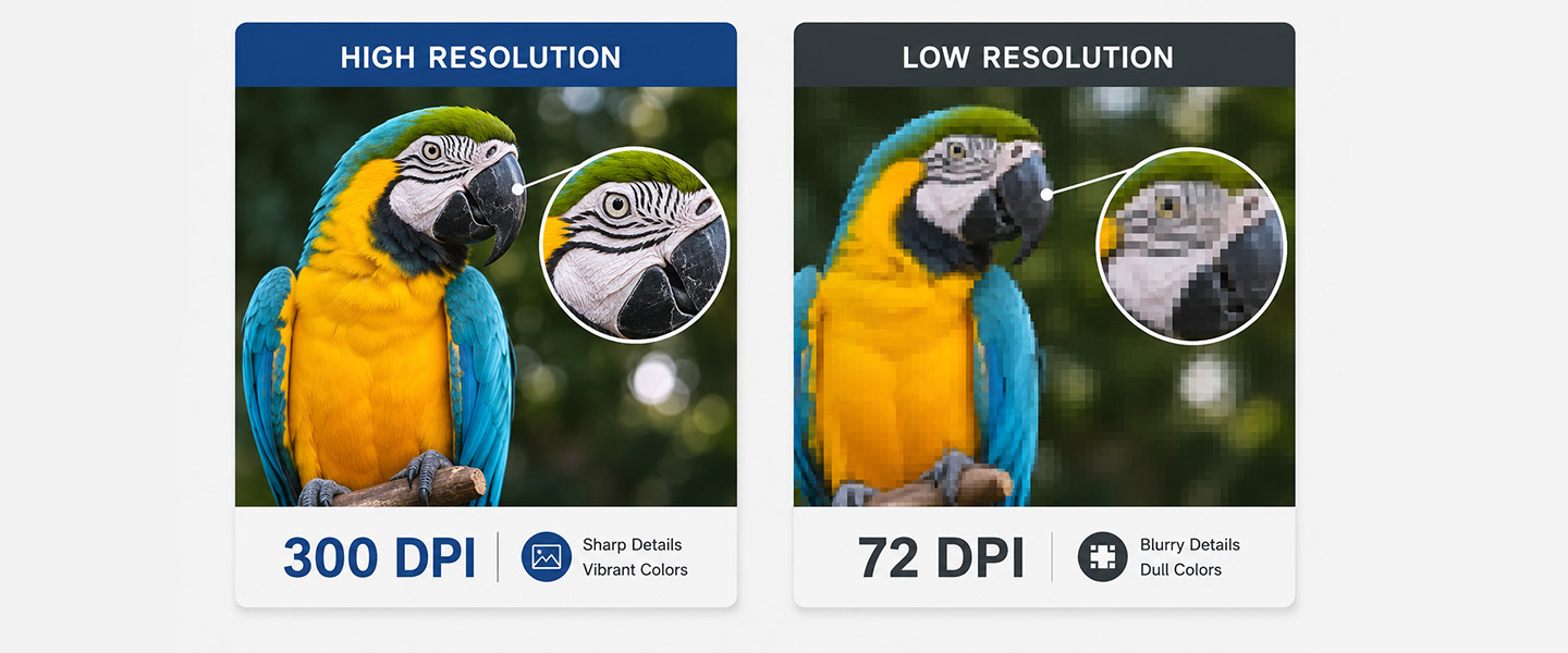
One of the most important steps is checking whether your generated image has enough pixels for its intended print size.
For many commercial print applications, around 300 PPI at final size is a useful general target for raster artwork. Adobe explains that image resolution needs to be considered at the actual size at which the image will be printed.
The important phrase is:
At final size.
A high-resolution-looking AI image can become a low-resolution print image if you enlarge it significantly.
A simple calculation
To estimate the pixel dimensions needed for a 300 PPI image:
Print width in inches × 300 = required pixel width
Print height in inches × 300 = required pixel height
For example, an image filling a 5 × 7-inch area would ideally have approximately:
1,500 × 2,100 pixels
at 300 PPI.
This doesn’t mean every print project universally requires exactly 300 PPI. Printing methods and products vary, so always follow the specifications for your particular project.
But it gives you a useful benchmark when evaluating AI-generated assets.
4. Don’t “Fix” a Tiny AI Image by Simply Changing It to 300 PPI
This is one of the easiest mistakes to make.
Imagine you have a small AI-generated image.
You open the file, change its resolution setting to 300 PPI and save it.
Did you suddenly create additional visual detail?
No.
Changing the resolution metadata or resampling an undersized image doesn’t restore real details that weren’t captured in the original.
Adobe’s printing guidance explains that interpolation essentially estimates missing pixel information and that there is no substitute for having appropriately sized source artwork with sufficient resolution.
AI upscaling tools can sometimes improve the appearance of an image, but the enlarged result should still be inspected carefully.
Look particularly closely at:
- Faces
- Hands
- Fine patterns
- Straight lines
- Product edges
- Small objects
- Repeating textures
- Logos
- Text-like elements
AI can introduce strange artifacts that become much easier to notice once they’re printed.
5. Inspect AI Images at 100%
Don’t judge an AI-generated image only from a small preview.
Open the final asset and inspect it closely.
Look for:
- Blurry sections
- Strange textures
- Misshapen objects
- Inconsistent shadows
- Distorted faces or hands
- Fake or unreadable lettering
- Broken patterns
- Unexpected objects
- Uneven edges
These details can disappear when you’re looking at a thumbnail but become obvious on a physical print.
This is particularly important for large-format designs.
A tiny visual error in a small digital preview can become a very visible error when enlarged.
This becomes especially important when an AI-generated illustration will be reproduced as a custom sticker. Check the edges of the subject, tiny decorative elements, textures, and any unusual AI artifacts before printing. A strange detail that’s easy to overlook while viewing the complete illustration can become much more noticeable when that illustration is the main focus of the finished sticker.
6. Recreate Text Instead of Using AI-Generated Text
If your AI-generated image contains lettering, don’t assume it’s accurate.
Recreate important text manually whenever possible.
This gives you control over:
- Font
- Size
- Spacing
- Alignment
- Spelling
- Color
- Position
- Print sharpness
It also makes last-minute corrections much easier.
Imagine generating a restaurant promotion where the AI embeds:
20% OFF THIS WEEKEND
directly into the image.
Later, the promotion changes to 15%.
If the text is embedded inside the generated image, changing it can become unnecessarily complicated.
If the background and text are separate elements, the update takes seconds.
The same principle applies to contact information, addresses, prices and dates.
7. Use Vector Files for Logos Whenever Possible
Your company logo shouldn’t need to be regenerated by AI every time you create a new piece.
Use the original brand asset.
Vector graphics are especially useful for logos because they can scale without becoming pixelated in the same way raster images do. Adobe recommends vector graphics for scalable elements such as logos, typography and illustrations.
Common vector formats include:
- SVG
- EPS
- AI
If you only have a small JPEG version of your logo, don’t ask an AI image generator to recreate it and assume the result is brand-accurate.
Use the original approved logo file whenever possible.
8. Add Bleed After Establishing the Design
AI doesn’t automatically know the bleed specifications required by your printer.
If your background, image, color, or graphic is supposed to reach the finished edge of the piece, it needs to continue beyond the trim line into the required bleed area.
Otherwise, small variations during trimming can expose unwanted white edges.
Adobe describes bleed as artwork extending beyond the final trim and recommends extending backgrounds into that area.
So if AI creates a background for your design, don’t simply crop it exactly to the finished dimensions.
Make sure you have enough artwork around the edges to accommodate the required bleed.
Imagine you’re creating an AI-generated landscape for the front of a custom postcard. You want the image to cover the entire front from edge to edge.
Don’t crop the generated landscape exactly at the finished postcard boundary. You’ll need enough additional image around the outside to extend through the required bleed area.
This is worth considering while generating the image, not only afterward. If the subject is already extremely close to the edge, extending or cropping the artwork later could cut into an important part of the composition.
9. Keep AI-Generated Details Away From Critical Edges
The safe zone matters just as much as bleed.
Don’t place important information directly against the trim line.
Keep elements such as:
- Logos
- Headlines
- Contact details
- QR codes
- Prices
- Promotional codes
- Important faces
- Essential parts of an illustration
comfortably inside the safe area specified for the product.
AI may create a composition where the most important subject sits directly against an edge. That might look dramatic digitally but create problems when adapting the image to a physical printed piece.
Leave yourself enough flexibility to crop and reposition the generated artwork.
10. Pay Attention to RGB and CMYK
AI-generated images are typically created for digital viewing, where colors are displayed on screens.
Screens commonly use RGB, while commercial printing commonly uses CMYK inks.
These systems don’t reproduce color in exactly the same way.
That means the extremely bright blue, neon green, or saturated pink you see in an AI-generated image on your monitor may not reproduce identically on paper.
Canva’s print guidance, for example, notes that screens display colors using RGB while printing uses CMYK, meaning some color shifts—particularly with bright colors—are normal.
Don’t assume:
Bright on screen = equally bright in print.
Follow the color requirements provided by your printing service and proof important brand colors carefully.
11. Be Careful With AI-Generated Gradients and Dark Areas
AI imagery often uses dramatic lighting, deep shadows, glows and complex gradients.
These effects can look impressive on a bright screen.
But print doesn’t emit light.
Very subtle shadow details may become less visible, while some extremely saturated colors may reproduce differently than expected.
Before printing, inspect:
- Very dark backgrounds
- Black-on-black details
- Subtle gradients
- Neon colors
- Low-contrast text
- Fine details inside shadows
Ask yourself whether the design still communicates clearly without relying on the brightness of a screen.
12. Don’t Let AI Generate Your QR Code
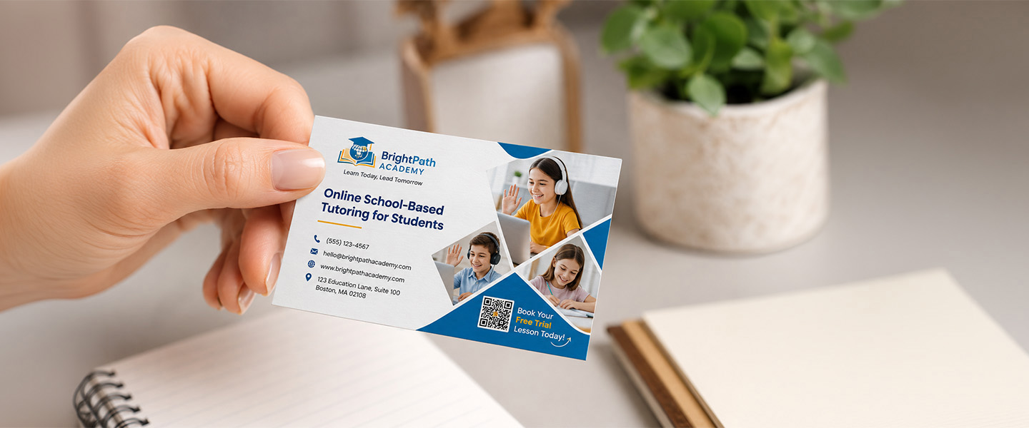
If your printed design needs a QR code, create the actual code separately using a reliable QR-code workflow.
Don’t ask an image generator to visually reproduce one.
A QR code needs to contain real encoded information and remain machine-readable.
Once you’ve added the real QR code:
- Keep it clear of other graphics.
- Give it sufficient surrounding space.
- Keep it inside the safe zone.
- Print or view it at its intended size.
- Scan it with multiple phones if possible.
- Verify the destination URL.
If you’re using QR codes specifically on networking materials, our guide to QR code business cards covers additional ways to combine physical print with digital information.
13. Proofread Everything Yourself
AI can help generate copy, but it shouldn’t have final approval over factual information.
Before printing 500 or 5,000 copies, manually verify every important detail.
Check:
- Names
- Phone numbers
- Email addresses
- URLs
- Dates
- Times
- Prices
- Discounts
- Addresses
- Product names
- Spelling
- Terms and conditions
Pay particular attention to numbers.
A beautifully designed flyer with the wrong event date is still a failed print project.
14. Use AI to Generate Variations, Not Just One Design
One of AI’s biggest advantages is speed.
Use that advantage during ideation.
Instead of generating one image and immediately building your print piece around it, explore several directions.
For example, ask for variations with:
- More negative space for text
- Subject positioned on the left
- Subject positioned on the right
- Simpler background
- More natural lighting
- Less visual clutter
- Different compositions
- More room around the edges
This can make the final print layout much easier.
If you know your headline will appear on the left side of a flyer, generate artwork that intentionally leaves visual space there.
You’re effectively using AI as an art-direction assistant rather than letting it randomly determine the final composition.
Think about how the composition needs to change depending on the printed product.
For a rack card: Ask AI for a vertical composition with the main subject positioned away from the area where you’ll place your headline, offer, or QR code.
For a postcard: Generate several versions with negative space for a headline and call to action rather than allowing the AI image to fill every part of the design.
For a brochure: Generate supporting visuals that can work within individual panels instead of creating one complicated image that becomes awkward when the brochure is folded.
AI becomes much more useful when your prompt accounts for the physical format where the artwork will eventually appear.
15. Build the Final Layout in a Design Program
Once you have the AI-generated assets you want, assemble the final piece in software that gives you control over the actual layout.
Your workflow might look like:
AI tool
Generate the visual concept, background or illustration.
↓
Image-editing tool
Clean up artifacts, adjust the image and prepare the visual asset.
↓
Layout/design software
Add approved logos, typography, QR codes, contact information, dimensions, bleed and other production elements.
↓
Preflight
Check resolution, safe zones, spelling, bleed, color and final dimensions.
↓
Export
Create the file according to your printer’s requirements.
↓
Upload the approved final artwork.
The important point is that AI doesn’t need to perform every step.
Using the right tool for each part of the process gives you much more control.
AI Print Design: What AI Should and Shouldn’t Do
Here’s a simple way to divide the work:
| AI Is Useful For | You Should Verify or Handle |
| Brainstorming concepts | Final dimensions |
| Generating backgrounds | Bleed |
| Creating illustrations | Safe zones |
| Exploring visual styles | Resolution |
| Suggesting layouts | Logo accuracy |
| Drafting headlines | Final typography |
| Creating variations | QR codes |
| Removing backgrounds | Contact information |
| Generating supporting imagery | Prices and dates |
| Creative experimentation | Final print specifications |
Think of AI as a creative assistant, not your prepress department.
A Print-Ready AI Design Checklist
Before submitting a design that contains AI-generated elements, check the following:
- Is the document built at the correct finished size?
- Do AI-generated raster images have enough resolution at their final printed size?
- Have you inspected generated images closely for artifacts?
- Has important text been recreated rather than embedded in an AI image?
- Are logos coming from approved brand files?
- Do backgrounds extend through the required bleed?
- Is essential content inside the safe zone?
- Have you considered how screen colors may reproduce in print?
- Are QR codes real and tested?
- Have names, dates, prices and contact information been manually verified?
- Have you reviewed both sides of the piece?
- Does the exported file meet your printer’s current specifications?
If the answer to all of these is yes, AI can fit very comfortably into a professional print-design workflow.
AI Can Speed Up Design—But You Still Control the Final Print
AI makes it easier than ever to experiment with visual ideas.
A small business that doesn’t have an endless library of professional photography or illustrations can explore concepts much faster than before. Designers can test compositions, backgrounds and creative directions without starting every idea from scratch.
But speed shouldn’t replace quality control.
The most important thing to remember is that AI creates visual content; it doesn’t automatically create production-ready print files.
Use AI to explore and create. Then take control of resolution, dimensions, typography, bleed, safe zones, color, branding and proofing yourself.
That’s how you get the benefit of AI without discovering its mistakes after hundreds of copies have already been printed.
or resolution, dimensions, bleed, safe zones, typography, branding, and proofing still belongs to you.
Use AI for what it does best: generating ideas, exploring visual directions, and creating assets. Then prepare those assets specifically for the physical product you’re designing.
Once your artwork is ready, explore Overnight Prints to turn your print-ready design into the finished piece.