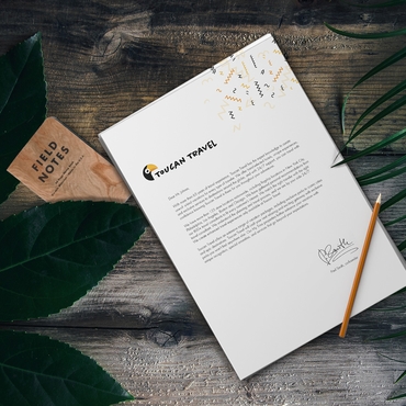
Professional business letterhead does more than display your logo—it gives every letter, proposal, contract, and client communication a polished, consistent look. The best letterhead designs combine clear contact information, strong branding, quality paper, and a clean layout that is easy to recognize.
Whether you’re a freelancer, small business owner, or corporate team, stationery reinforces your brand identity every time it’s sent. For more detailed instructions, see How to Create Professional Letterhead and the product-specific Envelopes page.
In this guide, you’ll learn how to create professional letterhead and matching envelopes for 2026, including what to include, how to keep your design consistent, which paper and envelope options to consider, and the common mistakes to avoid.
When to Use Printed Letterhead
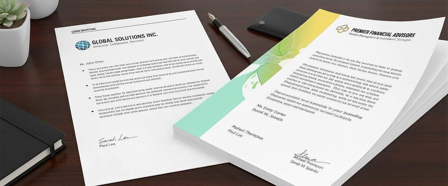
Letterhead is more than a decorative header — it’s your official business identity in print. You should use it anytime you want to make communication feel credible, formal, or memorable.
Here are the most important use cases for printed letterhead in 2026:
1. Contracts, Agreements & Proposals
Clients take documents more seriously when they’re printed on official letterhead. It reinforces trust and formalizes your relationship.
2. Client Welcome Packets
A printed welcome letter sets the tone for the rest of your onboarding materials. When paired with matching envelopes, it creates a polished first impression.
3. Invoices & Financial Documents
Even if you send most invoices digitally, printed versions are useful for high-value clients or situations where presentation matters.
4. Thank-You Letters & Follow-Ups
A handwritten or printed note on branded stationery feels personal, thoughtful, and high-touch, an advantage in competitive industries.
5. Legal & Compliance Communications
Real estate, law firms, medical offices, and consultancies rely heavily on printed stationery for formal notices.
6. Freelancers & Consultants
Independent professionals benefit the most from well-designed stationery because it helps them look established. See Print Materials for Freelancers & Consultants for additional ideas.
Product link: Letterhead
What Should a Professional Business Letterhead Include?
A professional business letterhead should make it easy to identify your company while keeping the page clean and easy to read. You don’t need to fill every available space—the most effective letterhead designs focus on essential information and consistent branding.
Include these key elements:
- Company name and logo: Keep your logo clear, high-resolution, and easy to recognize.
- Contact information: Add the most relevant details, such as your phone number, email address, website, or business address.
- Brand colors: Use the same colors found across your other marketing materials for a consistent look.
- Brand typography: Choose one or two fonts that are professional, readable, and consistent with your visual identity.
- Clean spacing and margins: Leave enough white space around the content so the letterhead doesn’t compete with the actual message.
- Optional header or footer: A simple line, color accent, website, or contact detail can add personality without making the design feel crowded.
The goal is to create a letterhead that looks professional on its own while leaving plenty of room for contracts, proposals, invoices, letters, and other business communication.
Business Letterhead Design Examples
The best business letterhead design depends on your brand, industry, and the type of communication you send. Some businesses benefit from a simple, understated layout, while others can use color and graphic elements to create a more distinctive look.
Here are five business letterhead examples to consider when designing your stationery.
1. Minimalist Business Letterhead
A minimalist letterhead uses a simple logo, essential contact information, plenty of white space, and one or two brand colors. Keeping decorative elements to a minimum helps the actual letter remain the focus.
This style works well for businesses that want a clean, professional look that can be used across contracts, proposals, invoices, and everyday correspondence.
2. Corporate Letterhead
Corporate letterhead typically uses a structured header or footer, clearly organized company information, restrained colors, and professional typography.
The company logo and name usually appear prominently at the top, while information such as the website, phone number, email, and address can be placed in the header or footer. This creates a consistent format that can be used across departments and different types of business communication.
3. Modern Letterhead
Modern letterhead designs can use bold logo placement, contemporary typography, subtle lines, geometric shapes, or small areas of brand color to create visual interest.
The key is to balance these elements with enough white space for the letter itself. A modern design should feel distinctive without distracting from the information on the page.
4. Professional Services Letterhead
Law firms, consultants, accountants, real estate businesses, financial professionals, and other service-based companies often benefit from a more formal letterhead design.
A professional services letterhead might feature the company logo and name at the top, followed by understated contact details and a simple footer. Neutral colors, readable fonts, and consistent spacing can help create a polished appearance suitable for proposals, agreements, client letters, and other formal documents.
5. Creative Business Letterhead
Creative businesses can make greater use of brand colors, typography, shapes, patterns, or other visual elements. This approach can work particularly well for design studios, agencies, photographers, event companies, and other visually driven brands.
Even with a more expressive design, readability should remain the priority. Keep the main writing area uncluttered and make sure decorative elements don’t compete with the message.
How to Create a Professional Letterhead Layout
A professional letterhead layout should make your company easy to identify while leaving enough room for the actual letter. Logo placement, contact information, margins, typography, and white space should work together to create a clear visual hierarchy.
Place Your Logo Strategically
The top-left and top-center areas are common locations for a business logo because they make the brand immediately visible. Keep the logo large enough to recognize without allowing it to dominate the page.
Decide What Belongs in the Header and Footer
You don’t need to place every business detail at the top of the page. The header can contain your logo and company name, while secondary information such as your website, email, phone number, and address can appear in the footer.
Separating this information helps keep the main writing area clean.
Organize Your Contact Information
Include the contact details that are most useful to the recipient. Group related information together and use consistent spacing so readers can quickly find what they need.
Avoid filling the header with unnecessary details that make the design feel crowded.
Use Consistent Margins
Leave sufficient space between your design elements and the edges of the page. Consistent margins make the letterhead look balanced and prevent the branding from interfering with the document’s main content.
Leave Plenty of White Space
White space is an important part of letterhead design. It separates branding from the letter itself and makes longer documents easier to read.
Avoid filling empty areas simply for decoration. A clean layout often looks more professional than one with too many visual elements.
Create a Clear Font Hierarchy
Use typography to distinguish your company name, contact information, and letter content. One or two complementary fonts are usually enough for a professional letterhead.
Your company name or logo can be more prominent, while contact information should remain smaller but easy to read.
Use Brand Colors Consistently
Choose colors from your established brand palette and apply them consistently across your logo, typography, lines, and other design elements.
Your letterhead and matching envelopes should use the same colors so they feel like part of one stationery set.
Leave Enough Room for the Letter
The design should never compete with the reason the stationery exists: the message. Make sure the body of the page has enough uninterrupted space for letters, proposals, contracts, invoices, and other business documents.
A simple professional letterhead layout might look like this:
Top: Logo + company name
Main area: Date + recipient information + letter content
Bottom: Website + email + phone number + business address
This structure keeps your branding visible while giving the main content enough space to remain clear and readable.
Envelope Design Tips
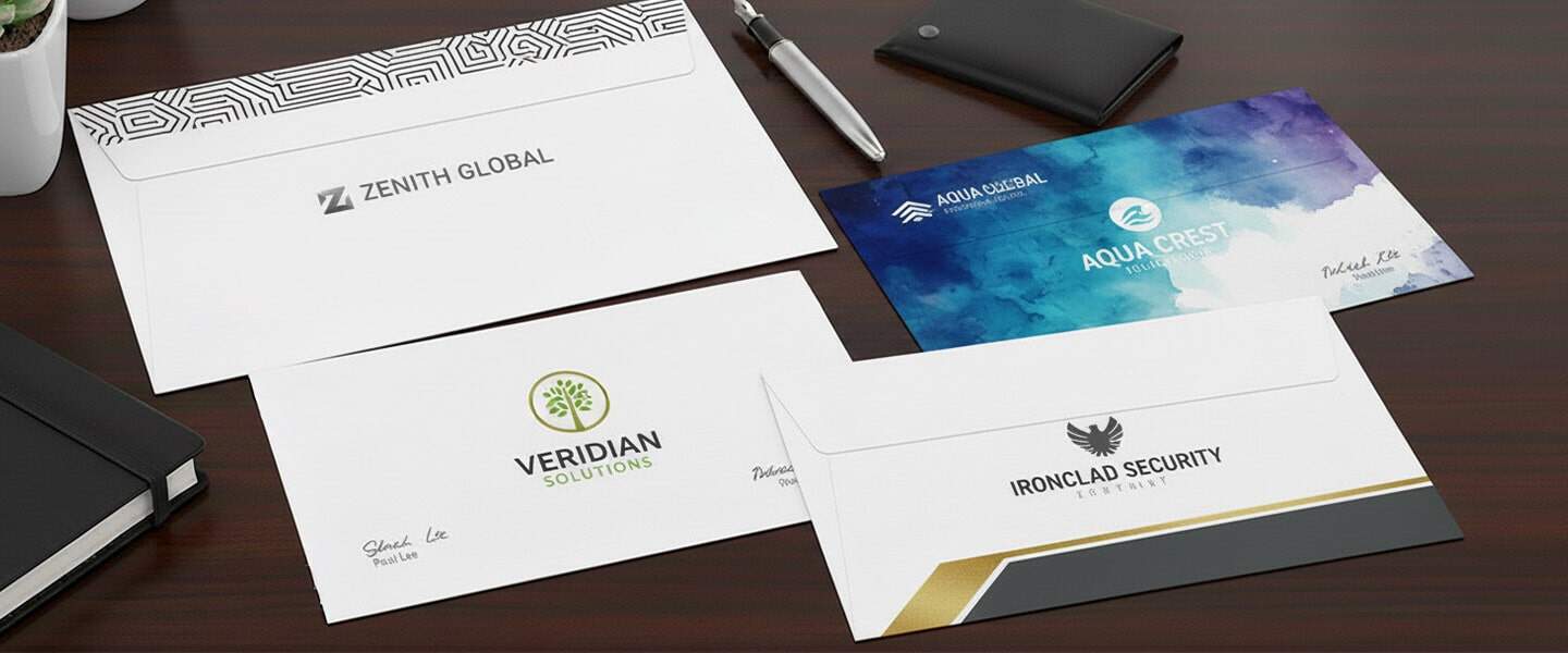
Your envelope is the first part of your stationery that someone sees and often the one that determines whether they open the letter immediately or save it for later. A well-designed custom envelope increases open rates and elevates your brand identity.
Here are smart design principles for 2026:
1. Keep the Front Clean and Professional
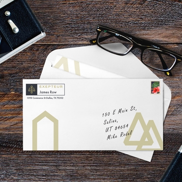
Place your logo or business name in the top-left corner and keep the rest of the space uncluttered. Simplicity communicates confidence.
2. Match Your Letterhead Layout
Use the same colors, typography, and design style. Matching stationery sets create a more cohesive and premium look.
3. Choose the Right Envelope Size
Make sure your envelope fits your most common deliverables:
- #10 envelopes for letters
- 9×12 for presentations or multiple inserts
- Square envelopes for creative brands
Product link: Envelopes
4. Use High-Quality Paper Stock
Thicker paper instantly feels more substantial and encourages recipients to open your letter. It also improves print clarity on your design.
5. Add Return-Address Printing
This small detail saves time, reinforces branding, and looks far more professional than printed labels.
6. Consider a Matching Custom Stamp
A branded self-inking stamp can add personality or reinforce your logo. It’s also a cost-effective alternative for small businesses printing limited quantities.
Product link: Self-Inking Stamps
New 2026 Examples
- Real estate agents sending listing packets
- Law firms sending engagement letters
- Accountants sending tax documentation
- Luxury service businesses sending welcome kits
- Healthcare providers sending patient communications
Branding Consistency
One of the main reasons stationery still matters is because it reinforces your brand identity. Consistency builds recognition and recognition builds trust.
Here’s how to keep your stationery on-brand:
1. Use the Same Color Palette Across All Materials
Subtle differences in shade can make your brand look unpolished. Use your primary brand colors or a refined monochromatic set.
2. Stick to One or Two Fonts
Typography plays a huge role in how professional your letterhead looks. Choose fonts that reflect your brand personality — clean and modern, elegant and serif-based, or friendly and rounded.
3. Align Your Layout Elements
Margins, spacing, and alignment should be consistent on your letterhead, envelope, and any supporting documents. This makes your stationery feel intentional and premium.
4. Add Your Logo Strategically
Place your logo where it’s visible but not overpowering. Most businesses prefer the top center or top-left corner.
5. Consider a Branded Header or Footer
A thin line, pattern, or accent color can add visual interest without overwhelming the document.
Consistency doesn’t just make your stationery look good — it sends a message that your business is structured, thoughtful, and dependable.
Letterhead and Envelope Printing Tips
A strong design is only part of creating professional business stationery. Proper file preparation, paper selection, and proofing can help ensure your letterhead and envelopes look as polished in print as they do on screen.
Use 300 DPI for Clear Printing
Prepare images, logos, and other graphics at 300 DPI whenever possible. High-resolution files help keep logos, text, and design elements sharp instead of blurry or pixelated when printed.
Prepare Colors in CMYK
For print projects, use CMYK color values rather than relying only on RGB colors designed for screens. Because colors can appear different on a monitor than they do in print, preparing your artwork for CMYK printing can help produce more predictable results.
Follow Bleed Specifications
If your letterhead or envelope design includes colors, images, or graphics that extend to the edge, make sure your artwork follows the printer’s bleed specifications. Extending these elements beyond the final trim area helps prevent unwanted white edges after cutting.
Choose the Right Paper
Consider how your stationery will be used when selecting paper. A practical stock can work well for everyday business correspondence, while a more substantial or premium paper can create a stronger impression for proposals, contracts, welcome letters, and other important communications.
Proof Everything Before Printing
Before submitting your files, carefully check your logo, brand colors, spelling, contact information, margins, alignment, and overall layout. Pay particular attention to phone numbers, email addresses, websites, and business addresses, since mistakes may require the stationery to be reprinted.
Keep Letterhead and Envelopes Consistent
Matching stationery creates a more cohesive brand experience. Use consistent logos, colors, typography, and design elements across your business letterhead and envelopes so recipients can immediately recognize that both pieces belong to the same brand.
Before printing a full stationery set, review the letterhead and envelope designs together to make sure they look consistent and complement each other.
How to Evaluate Letterhead and Envelope Print Quality
Good letterhead and envelope printing should look consistent, feel professional, and accurately reproduce your brand. Before using your stationery, check a few important details.
Check the Paper Weight and Feel
Paper should feel appropriate for your brand and intended use. A quality stock can make letterhead and envelopes feel more polished and substantial without making them difficult to print, fold, or mail.
Look at Logo and Text Sharpness
Logos, small text, and fine design elements should appear crisp and easy to read. Blurry edges or pixelated graphics can be a sign that the original design files were too low-resolution.
Check Color Accuracy
Compare the finished stationery with your established brand colors. Colors should remain consistent across your letterhead and envelopes so the pieces feel like part of the same stationery set.
Review CMYK Color Reproduction
Colors on a screen can look different once printed. Prepare print files using CMYK color values when required and review a printed proof when color accuracy is especially important to your brand.
Inspect Alignment and Margins
Check that logos, contact information, headers, and other design elements are properly aligned and have enough space from the edges. Consistent margins help your stationery look clean and intentional.
Look for Consistent Ink Coverage
Solid colors should print evenly without unexpected streaks, faded areas, or noticeable variations. Pay particular attention to large blocks of color and detailed logos.
Compare Your Letterhead and Envelopes
Finally, place the pieces next to each other. Your logo, colors, fonts, and overall design should look consistent across both. Matching letterhead and envelopes create a more cohesive and professional brand experience.
Mistakes to Avoid
Even the smallest stationery errors can make your brand look unprofessional. Here are the most common mistakes and how to avoid them:
1. Overcrowded Designs
Too much information makes the letterhead feel cluttered. Focus on essential contact details only.
2. Low-Resolution Logos
Blurry logos immediately reduce credibility. Always use high-resolution files (300 DPI minimum).
3. Inconsistent Colors
Avoid printing with mismatched color values. Stick to your brand palette and ensure your printer uses correct CMYK settings.
4. Using Office Paper Instead of Printed Letterhead
Generic white paper looks cheap and forgettable. Professionally printed letterhead elevates your brand instantly.
5. Forgetting White Space
Good design needs breathing room. Don’t stretch your logo or text to the edges.
6. Not Including a Digital Version
Even if you print your letterhead, keep a digital PDF version for emails and PDFs. This maintains consistency across all communication channels.
Print your professional stationery for 2026.
When Printed Stationery Makes the Biggest Impact
Printed letterhead works best when:
- You’re closing high-value deals
- Sending proposals or contracts
- Building long-term client relationships
- Positioning your brand as premium
In these moments, presentation directly affects perception.
Quick Letterhead Design Checklist
Before printing, make sure you have:
✔ High-resolution logo (300 DPI)
✔ Consistent brand colors (CMYK)
✔ Clean layout with white space
✔ Clear contact information
✔ Matching envelope design
Test it:
If it looks polished printed AND as a PDF → it works.
Frequently Asked Questions About Business Letterhead
1. What is a business letterhead?
A business letterhead is a branded header or stationery design used for official company communication. It typically includes the company name, logo, and contact information and can be used for letters, proposals, contracts, invoices, and other professional documents.
2. What should be included on a business letterhead?
A professional business letterhead should include your company name, logo, and relevant contact information, such as your website, email address, phone number, or business address. It should also use consistent brand colors and typography while leaving enough white space for the document’s main content.
3. What should company letterhead look like?
Company letterhead should look clean, professional, and consistent with the company’s visual identity. The logo and company name should be easy to identify, contact information should be readable, and the design should leave plenty of space for the actual letter. Avoid overcrowding the page with unnecessary graphics or information.
4. What size is standard business letterhead?
The standard business letterhead size in the United States is 8.5 × 11 inches, the same size as standard letter paper. This format works well for business correspondence and fits standard folders and envelopes when properly folded.
5. How do you design a professional letterhead?
Start with a high-resolution logo, your essential contact information, and your established brand colors and fonts. Create a simple header or footer, maintain consistent margins, and leave enough white space for the letter. For professional printing, prepare graphics at 300 DPI and follow the printer’s color, bleed, and file specifications.
6. Does business letterhead go on every page?
Full business letterhead is generally most prominent on the first page of a letter or document. For multi-page documents, subsequent pages can use a simplified header or footer containing elements such as the company name, logo, page number, or other identifying information instead of repeating the complete first-page design.
7. What should go on the second page of a business letter?
The second page of a business letter can use a simplified header containing information that helps identify and organize the document, such as the recipient’s name, company name, date, page number, or a simplified version of your company branding. The full letterhead design does not necessarily need to be repeated.
8. What is the difference between a logo and letterhead?
A logo is a visual symbol, wordmark, or graphic that represents a brand. Letterhead is the complete stationery layout used for business correspondence and can incorporate the logo along with the company name, contact information, brand colors, typography, and other design elements.
9. Should letterhead and envelopes match?
Yes. Using matching letterhead and envelopes helps create a consistent and recognizable brand experience. Use the same logo, colors, typography, and overall visual style across both pieces while adapting the layout to fit each format.
10. What is the best paper for business letterhead?
The best paper for business letterhead depends on how the stationery will be used and the impression you want to create. A practical, professional paper stock works well for everyday correspondence, while a heavier or more premium stock can be appropriate for proposals, contracts, welcome letters, and other important communications. Make sure the paper is also suitable for any additional printing or writing you plan to do on the letterhead.