Red is said to be the power of passion. Often associated with movement and excitement, the energetic color creates a sense of urgency among buyers. Countless companies have used this psychology to introduce the bold, powerful hue into their logo designs.
1. Coca-Cola (1893)
Soft drink
Well-known for its red script, Coca-Cola is easily one of the most recognized logos of all time. Originally created by the founder’s bookkeeper, Frank Mason Robinson, the logo has not changed much in over a century except for the introduction of its vibrant red coloring in 1893.
2. Kodak (1935)
Cameras
Kodak is believed to be the first company that integrated its name into a symbol when it was introduced in 1907. A mustard yellow and red square in 1935 changed shapes several times until the box was dropped in favor of the company name in a rounded text in orange-red. It recently returned to the retro look that first appeared in 1971.
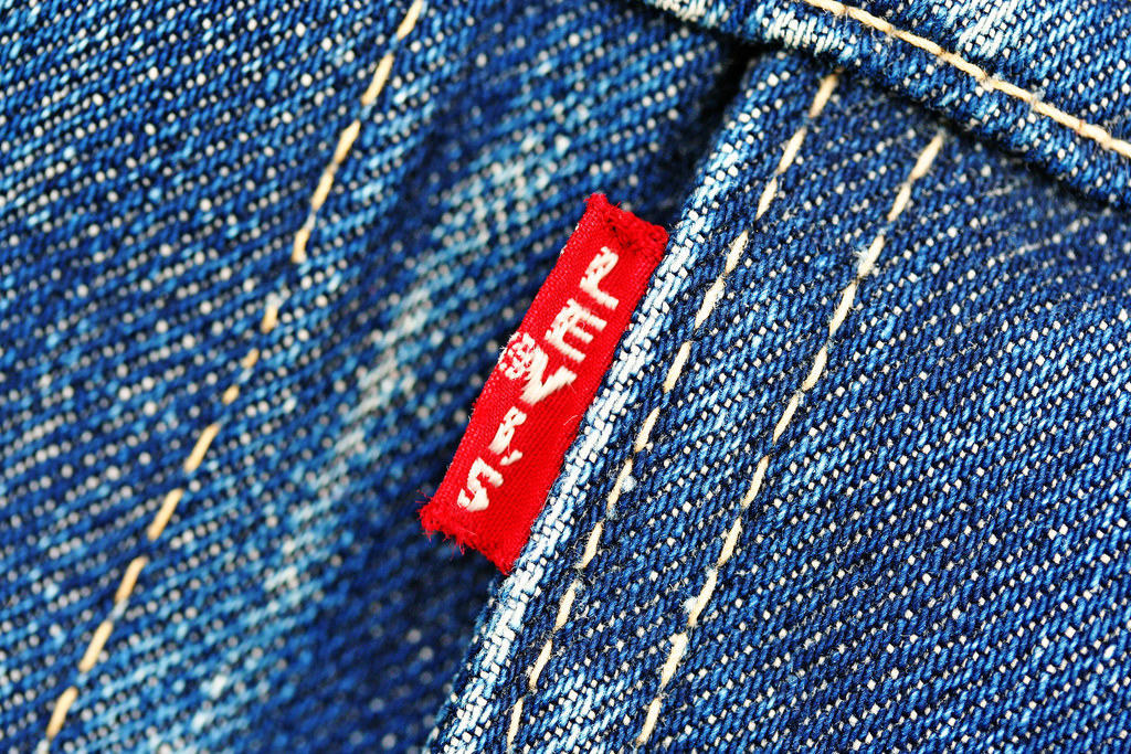
3. Levi’s (1940)
Apparel
The denim company once had two horses pulling a pair of jeans in opposite directions drawn into its logo to demonstrate its strong quality. Updating to a red background with white text in 1940, its removal of the trademark 1890 illustration helped modernize and easily identify the brand on its clothing items.
4. Xerox (1949-1958, 1994)
Technology
Originally the Haloid Company in 1906, the logo and name change to Xerox in 1948 was based on the company’s most successful product. Replacing the rounded black box to a colored text on white background included a transformation from black to blue to today’s red with a ball featuring an artistic striped X.
5. Lego (1950)
Toys
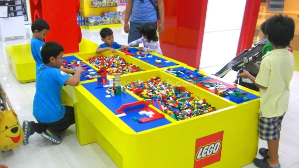
Lego has featured its company name since its first logo in 1934. In 1950, the red Lego name was surrounded by a black circle, an homage to its hometown of Billund, Denmark. Adopting a boxy red background in 1964, the company added a yellow outline to bubbly white text with black stroke in 1973.
6. Canon (1956)
Cameras
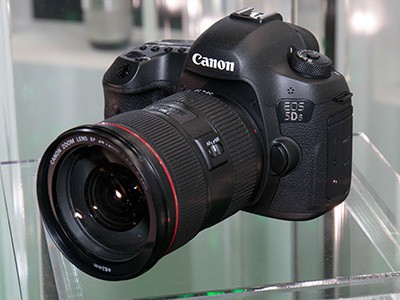
Canon’s logo evolved from a Buddhist goddess named Kannon in 1935 to a stylized text in a slightly muted red from 1956 to present-day.
7. Fisher-Price Toys (1957)
Toys
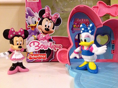
Today, Fisher-Price’s red banner with scalloped bottom in candy apple red can be easily identified by children of all ages. The original orange box with black text in 1931 changed to blue and red circles in 1957 and 1962 before the scalloped design was added in 1992 and the blue removed in 1994.
8. Target (1962)
Big box retailer
Target’s simple logo has always resembled (what else?) a bullseye target. A solid red dot in the center surrounded by negative space between another red ring debuted in 1968 and has since remained the same.
9. MasterCard (1966)
Financial institution
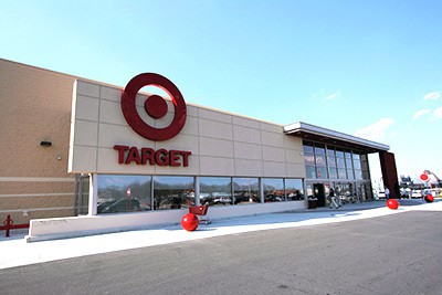
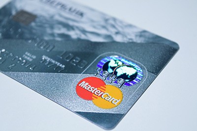
Two famous red and burnt orange circles with text overlay have been part of Mastercard’s logo design since 1966. The logo changed from interlocking stripes to overlapping circles then back to its original design 30 years later with slight updates in color.
10. 3M (1978)
Office supplies
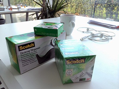
Looking nothing like its first design in 1906, 3M was originally the Minnesota Mining and MFG Co. featuring a black diamond within two rings. In 1942, the company name and logo were simplified to 3M, and designed in black until its bold, bright red update in 1978.
Need a logo design? Consult with an expert from Overnight Prints Design Services. Visit overnightprints.com/designservices


