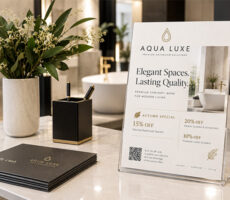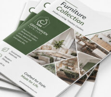
Choosing a brochure involves more than selecting colors, images, paper, and typography. You also need to decide how the brochure will open.
That decision affects how readers discover your information.
A brochure can introduce information one panel at a time, guide readers through a sequence, or open to reveal one large central message.
That is why the fold should be part of the design strategy rather than a production decision made at the end.
Three formats you may encounter are tri-fold, Z-fold, and gate-fold brochures.
They may begin with a similar printed sheet, but the way their panels fold creates very different experiences.
A tri-fold offers a familiar structure for organizing information. A Z-fold creates an accordion-style sequence. A gate fold brings two outer panels together before opening to reveal the center.
So, which brochure fold should you choose?
This guide compares the three formats and explains how content, design, distribution, and marketing goals can help determine the best layout for your project.
What Is a Brochure Fold?
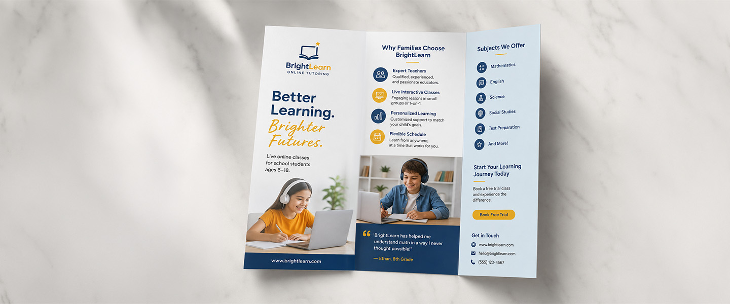
A brochure fold determines how a printed sheet is divided into panels and how those panels interact when the piece is opened.
The fold affects:
- how much information appears at once,
- which message the reader sees first,
- what comes next,
- where images can be positioned,
- and how the entire brochure feels when handled.
Think of each panel as part of a sequence.
One panel may introduce the company.
Another may explain the problem.
Another can present services or products.
And the final panel might contain contact information or a call to action.
The fold determines how those pieces connect.
This is why brochure design should begin with the intended fold.
If you create the entire layout first and choose a fold afterward, important information may end up on a fold line, panels may appear in the wrong reading order, and images may not align as expected.
The fold is not just how the brochure closes.
It is part of how the brochure tells its story.
For more general brochure design guidance, read How to Design Effective Marketing Brochures.
What Is a Tri-Fold Brochure?
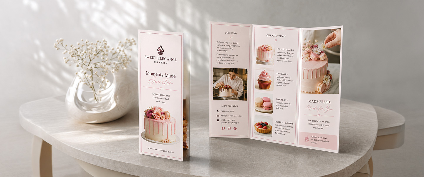
A tri-fold is one of the most recognizable brochure layouts.
The sheet is divided into three vertical sections, creating six panels when both sides are used.
The panels fold inward so the brochure becomes a compact piece that readers open section by section.
A typical tri-fold might organize information like this:
Front cover: Main headline, image, and brand.
Opening panel: Introduction or primary message.
Interior panels: Products, services, benefits, or supporting information.
Back panel: Contact information, address, website, QR code, or call to action.
Because readers are already familiar with opening this type of brochure, the format tends to feel intuitive.
It also gives businesses enough separate content areas to organize information without requiring a multi-page publication.
When Should You Use a Tri-Fold Brochure?
Tri-folds are particularly useful when your information can be divided into clear sections.
They work well for:
- business services,
- product overviews,
- restaurant information,
- healthcare services,
- real estate,
- local businesses,
- educational materials,
- company introductions,
- and general marketing campaigns.
For example, a service company might use separate panels for:
- who they are,
- what they offer,
- why customers choose them,
- testimonials,
- next steps,
- contact information.
That predictable structure makes tri-folds a versatile option for businesses that need to communicate several related ideas in a compact format.
For a more specific comparison with another common layout, see Tri-Fold vs. Bi-Fold Brochures: Which Layout Is Better?.
What Is a Z-Fold Brochure?
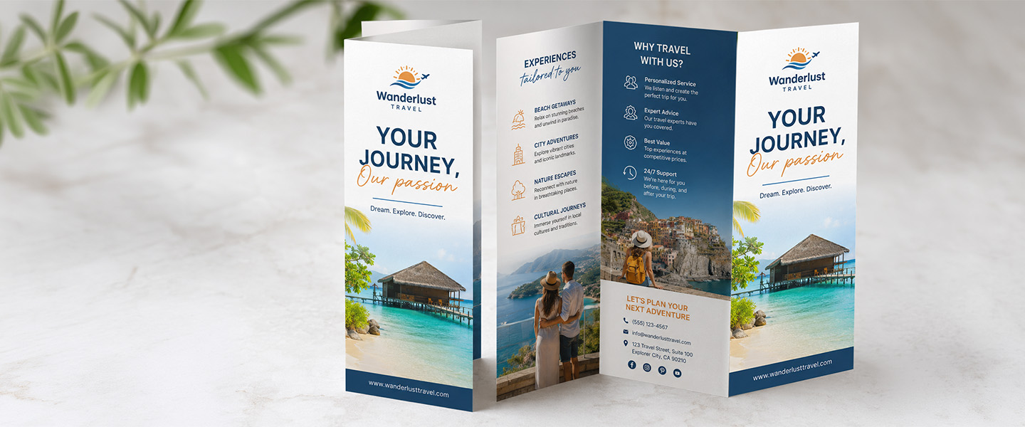
A Z-fold also divides the sheet into three panels, but those panels fold in alternating directions.
Viewed from above, the folded paper resembles the letter Z.
Instead of one panel folding inside another, the brochure opens like an accordion.
This creates an important difference in how information can be presented.
Readers can examine individual panels one at a time, or unfold the entire piece and see multiple connected panels together.
That makes the Z-fold particularly useful when information has a natural sequence or when graphics need to continue across several sections.
When Should You Use a Z-Fold Brochure?
Z-fold brochures are a strong choice for:
- step-by-step processes,
- maps,
- timelines,
- event schedules,
- product comparisons,
- service packages,
- travel and tourism information,
- instructions,
- and chronological information.
Imagine a travel brochure.
One panel introduces the destination.
The next shows where to go in the morning.
The third covers afternoon activities.
When the brochure is completely unfolded, those individual sections can become one larger itinerary or map.
The same principle works for a business process.
Step 1 → Step 2 → Step 3
The physical opening motion reinforces the order of the information.
That is where the Z-fold becomes more than a visual choice.
The format itself can help explain the content.
What Is a Gate-Fold Brochure?
A gate-fold brochure creates a different experience.
Instead of opening sequentially like a Z-fold, two outer panels fold inward toward the center.
The reader opens those panels like doors or gates.
Behind them is a larger central area.
That creates a natural reveal.
The outside panels can introduce an idea, image, or question, while opening the brochure reveals the main product, photograph, message, or campaign.
This makes gate folds particularly attractive for designs where visual impact is more important than dividing large amounts of information into equal sections.
When Should You Use a Gate-Fold Brochure?
Gate folds can work particularly well for:
- product launches,
- luxury brands,
- premium services,
- high-impact photography,
- event promotions,
- real estate developments,
- brand storytelling,
- hospitality,
- and visually driven campaigns.
For example, a real estate development could use the closed panels to introduce the property.
Opening them could reveal a large architectural rendering across the center.
A luxury brand could use minimal branding on the outside and reveal its main campaign image inside.
The format creates anticipation before the primary message appears.
However, that does not mean gate folds are automatically better or more premium.
If your brochure primarily needs to communicate several practical service categories, a simpler tri-fold may make the information much easier to navigate.
Z-Fold vs. Tri-Fold vs. Gate Fold: What’s the Difference?
Here is how the three brochure fold types compare:
| Feature | Tri-Fold | Z-Fold | Gate Fold |
| Structure | Three panels folded inward | Three accordion-style panels | Two outer panels open toward the center |
| Content Flow | Section by section | Sequential | Central reveal |
| Design Flexibility | High | High | More specialized |
| Reading Experience | Familiar and structured | Progressive and easy to follow | More dramatic and visual |
| Best For | General business information | Processes, schedules and connected information | Visual impact and premium presentations |
| Ideal Content | Services, products and company information | Steps, maps, timelines and comparisons | Photography, launches and key messages |
| Main Strength | Versatility | Sequential storytelling | Visual reveal |
| Potential Challenge | Requires careful panel hierarchy | Reading order must remain clear | Less suited to dense information |
There is no universal winner.
The better question is:
Which fold naturally supports the way your information needs to be understood?
Why Your Brochure Fold Matters
The fold changes both the design and the reader’s experience.
Content Organization
Brochures force you to prioritize.
Each panel has limited space, so information needs to be grouped logically.
A tri-fold naturally creates several distinct content sections.
A Z-fold can connect information across panels.
A gate fold places greater emphasis on the center.
Your content structure should therefore influence the fold—not the other way around.
Reading Flow
The order in which information appears matters.
If readers need to understand Point A before Point B, the physical brochure should reinforce that order.
This is where Z-folds can be particularly useful.
For general informational content where sections can stand independently, a tri-fold may be easier.
And when the central message matters more than a strict sequence, a gate fold can create a stronger reveal.
Visual Impact
Folds create boundaries.
Images, typography, and graphics need to work with those boundaries rather than accidentally fighting them.
Gate folds can create large visual moments.
Z-folds can connect graphics across several panels.
Tri-folds encourage designers to create clear individual sections.
Plan major visual elements around the physical format.
User Experience
A brochure should be easy to understand without instructions.
Readers should instinctively know:
- where to start,
- how to open it,
- what to read next,
- and where to find important information.
An unusual fold can attract attention, but novelty should never come at the expense of usability.
If the reader spends more time figuring out how the brochure works than understanding your message, the layout is getting in the way.
Brand Presentation
Format contributes to personality.
A tri-fold can feel practical, familiar, and organized.
A Z-fold can feel dynamic and informative.
A gate fold can feel more dramatic and presentation-focused.
Choose the experience that matches your brand rather than simply choosing the fold that appears most unusual.
How to Choose the Right Brochure Fold
Start with your content and marketing objective.
Consider How Much Information You Have
Ask whether your brochure is:
- simple,
- information-heavy,
- highly visual,
- or sequential.
Tri-folds work well when you have several clearly defined categories.
Z-folds work well when those categories connect.
Gate folds work best when one major visual or message deserves emphasis.
If you have enough content that every panel becomes overcrowded, you may need a different format altogether.
A Booklet, for example, may be more appropriate for detailed product catalogs, guides, or company publications.
Think About the Reading Order
Does your message need to follow a sequence?
If yes, a Z-fold can naturally guide the reader from one section to another.
If readers can explore sections independently, a tri-fold may provide greater flexibility.
If your primary objective is building toward one important visual or message, a gate fold may be stronger.
Consider Your Main Visual
Think about the largest or most important image in the design.
Does it belong on one panel?
Should it extend across several panels?
Should the reader discover it only after opening the brochure?
A gate fold can create an effective central reveal, while a Z-fold can allow connected graphics to run across a broader layout.
A tri-fold generally works better when imagery and text can be divided into clearly defined sections.
Think About How the Brochure Will Be Distributed
Distribution affects the format too.
Direct Mail
Compact, practical folds can make brochures easier to prepare for mailing, although exact mailing requirements should always be checked before production.
Trade Shows
People often collect several materials at once.
A brochure that is compact and easy to scan can be more useful than a complicated piece that takes time to understand.
Sales Meetings
A visually impressive brochure may have more value when a salesperson is actively guiding the customer through it.
Retail Counters
Customers may pick up the brochure without assistance, making intuitive organization especially important.
Events
Schedules, maps, and chronological information can benefit from the sequential structure of a Z-fold.
Welcome Packets
A brochure placed inside a Presentation Folder should complement the other materials in the packet rather than unnecessarily duplicating them.
Consider Your Brand and Marketing Goal
What should the brochure accomplish?
Inform: A tri-fold can organize practical information efficiently.
Educate: A Z-fold can guide readers through a process.
Compare: A Z-fold can make related options easier to view together.
Promote: Tri-folds and gate folds can both work depending on the campaign.
Impress: A gate fold can create a more visually dramatic presentation when the content supports it.
Start with the objective and choose the format that makes achieving it easier.
Which Brochure Fold Is Best for Your Project?
These recommendations provide a useful starting point:
| Project | Recommended Fold | Why |
| Company Overview | Tri-Fold | Easy to organize services, benefits and contact information |
| Step-by-Step Guide | Z-Fold | Creates a natural sequential flow |
| Product Launch | Gate Fold | Builds anticipation around a central message or visual |
| Restaurant or Service Menu | Tri-Fold | Organizes multiple categories clearly |
| Event Schedule | Z-Fold | Makes chronological information easy to follow |
| Luxury Promotion | Gate Fold | Creates a more presentation-focused reveal |
| Map or Travel Guide | Z-Fold | Works well with connected visual information |
| Healthcare Services | Tri-Fold | Separates services and practical information clearly |
| Real Estate Overview | Tri-Fold | Provides room for property details, images and contact information |
| Real Estate Development Launch | Gate Fold | Allows a central rendering or hero image to dominate |
| How-It-Works Guide | Z-Fold | Reinforces the progression between steps |
| General Marketing Handout | Tri-Fold | Familiar, compact and versatile |
These are recommendations rather than strict rules.
A strong designer can adapt any of these formats creatively.
The goal is simply to choose the fold that requires the least effort from the reader.
Tri-Fold or Z-Fold: Which Is Better for Marketing?
Because these two formats both commonly use three-panel structures, businesses often compare them directly.
Choose a tri-fold when you have separate information categories.
For example:
About Us | Services | Benefits | Testimonials | Contact
Choose a Z-fold when the sections form a connected sequence.
For example:
Problem → Step 1 → Step 2 → Step 3 → Result → CTA
Another way to think about it:
A tri-fold is generally better for categories.
A Z-fold is generally better for progression.
That simple distinction can make the choice much easier.
When Does a Gate Fold Make More Sense?
Gate folds are most useful when opening the brochure is part of the experience.
Ask yourself:
Is there something worth revealing?
Maybe it is:
- a new product,
- a property development,
- a dramatic photograph,
- an event announcement,
- a destination,
- or your primary brand message.
If the answer is yes, a gate fold can make that moment more impactful.
If there is no meaningful central reveal, the additional complexity may not add much value.
A premium format should serve the message, not simply make the brochure different.
Common Brochure Layout Mistakes to Avoid
Choosing the Fold After Designing the Brochure
This is one of the easiest ways to create layout problems.
Decide how the brochure will fold before determining where important content belongs.
Putting Important Information on Fold Lines
Avoid placing small text, faces, logos, or other critical details directly where the paper folds whenever possible.
Give important elements enough breathing room.
Ignoring Panel Order
The panel that appears beside another panel in your design file may not be the next panel the reader sees when the brochure is physically folded.
Create a simple folded mockup before finalizing the artwork.
Overloading Every Panel
Having six panels does not mean all six need to contain dense paragraphs.
White space helps readers separate ideas and identify what matters.
For more on this, read Why Some Brochures Get Read — And Others Go Straight in the Trash.
Using Images That Don’t Work Across Folds
A beautiful photograph can become awkward when a fold runs through an important focal point.
Consider panel boundaries when cropping and positioning imagery.
Forgetting Margins and Safe Areas
Important content needs enough distance from trim and fold areas.
Always build artwork according to the printer’s template and production specifications.
Making the Fold More Complicated Than the Message
A creative fold is not automatically a more effective fold.
If a standard tri-fold communicates your information perfectly, complexity may add cost or confusion without improving results.
Clarity comes first.
Brochure Fold vs. Brochure Design: Which Matters More?
They work together.
A great fold cannot rescue weak content.
And a beautiful design can become frustrating if the fold presents information in the wrong order.
A successful brochure combines:
- a clear objective,
- logical content hierarchy,
- readable typography,
- strong imagery,
- appropriate paper,
- intentional panel structure,
- and an obvious next step.
Before choosing an elaborate layout, make sure those fundamentals are working.
For additional design guidance, see How to Design Effective Marketing Brochures.
And if budget is influencing your format decision, Affordable Brochure Printing: How to Cut Costs Without Cutting Quality explains where businesses can reduce costs without weakening the finished product.
Why Choose Overnight Prints for Brochure Printing?
Overnight Prints offers custom Brochure Printing for businesses that need professional marketing materials for sales, promotions, events, product information, and customer communication.
Businesses can upload their own artwork or use available online design options to create brochures aligned with their branding.
Before creating your final layout, review the available product specifications and templates so your panel dimensions, folds, bleed, and safe areas are prepared correctly for production.
The best brochure starts with the right format—then uses design, paper, imagery, and printing quality to make that format work.
Frequently Asked Questions
What is the difference between a Z-fold and a tri-fold brochure?
Both formats commonly divide a sheet into three panels, but they fold differently.
A tri-fold folds panels inward to create a compact, overlapping format. A Z-fold alternates the direction of each fold, creating an accordion or Z shape.
Tri-folds work well for separate information categories, while Z-folds are particularly useful for sequential or connected content.
What is a gate-fold brochure?
A gate-fold brochure uses two outer panels that fold inward toward the center.
When those panels open, they reveal a larger central section, making the format useful for dramatic imagery, product launches, premium promotions, and other visually focused campaigns.
Which brochure fold is most popular?
Tri-fold brochures are among the most familiar and widely used formats because they provide a compact structure that works for many business applications.
However, popularity does not necessarily mean a tri-fold is the best option for every project.
Is a Z-fold or tri-fold better for marketing?
It depends on the content.
Use a tri-fold when your information can be separated into clear categories such as services, benefits, and contact information.
Use a Z-fold when information follows a progression such as steps, timelines, schedules, or connected comparisons.
Which brochure fold is best for a lot of information?
A tri-fold can organize multiple information categories efficiently, but no folded brochure should be overloaded with text.
If you have significantly more content than can comfortably fit across the available panels, consider whether a multi-page Booklet would provide a better reading experience.
What fold is best for a product brochure?
A tri-fold works well for general product information and multiple product categories.
A Z-fold can be useful for product comparisons or explaining how a product works.
A gate fold can work well for a major product launch where one hero image or message deserves a central reveal.
When should you use a gate-fold brochure?
Consider a gate fold when the central reveal contributes meaningfully to the design.
It is particularly useful for product launches, luxury promotions, high-impact photography, real estate developments, events, and visually driven brand campaigns.
How do I choose the right brochure layout?
Start by identifying:
- how much information you have,
- whether it needs to be read in a specific order,
- which visual is most important,
- how the brochure will be distributed,
- and what action you want readers to take.
Then choose the fold that presents that information most naturally.
Conclusion
There is no single brochure fold that works best for every project.
Each format creates a different experience.
Tri-fold brochures offer a familiar and versatile structure for business services, product information, menus, real estate, healthcare, and general marketing.
Z-fold brochures work particularly well when information needs to follow a sequence, making them useful for processes, schedules, timelines, maps, and comparisons.
Gate-fold brochures create a central reveal that can add greater visual impact to product launches, premium campaigns, photography, and brand storytelling.
The right choice ultimately depends on:
your content, audience, distribution method, marketing goal, and desired reading experience.
Do not choose the most complicated fold.
Choose the one that makes your message easiest—and most interesting—to understand.
Explore custom Brochure Printing from Overnight Prints and review the available formats and templates before building your final design.
Resources
- PRINTING United Alliance – Commercial printing resources covering production, finishing, paper, and print terminology.
- Adobe – Print Booklets and Documents – Resources for preparing professional print layouts, pages, bleed, and production-ready artwork.
- Adobe – Set Page Margins – Guidance for setting up margins, columns, and layout structure in InDesign.
- AIGA – The Professional Association for Design – Professional resources covering graphic design, typography, visual communication, and design practice.