If you’re choosing between a tri-fold and a bi-fold brochure, the right option depends on how much you need to say and how you want people to experience it.
Tri-fold brochures work better for structured, step-by-step information, while bi-fold brochures are ideal for visual storytelling and simpler messages.
Most brochures don’t fail because of bad design. They fail because the layout doesn’t match the message.
You can have great visuals, strong copy, and still end up with something that feels confusing, or worse, forgettable, if the structure is wrong.
It’s not about which one looks better. It’s about how your content is delivered, in what order, and how easily someone can understand it in a few seconds.
If you’ve ever felt like your brochure looks “fine” but doesn’t actually do anything, this is usually why.
In this guide, we’ll break down how each layout works, where it makes sense, and how to choose the one that actually helps your message land.
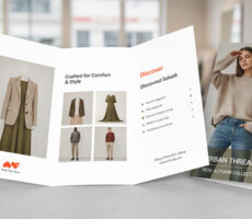
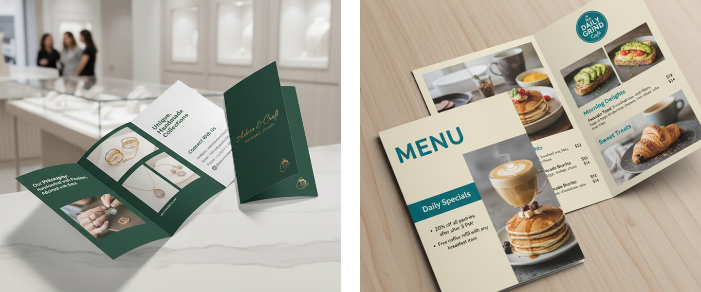
What Is a Bi-Fold Brochure?
A bi-fold brochure is a single sheet of paper folded once down the middle, creating four panels: a front cover, two inside panels, and a back cover.
Because it opens like a book, a bi-fold brochure provides larger design areas and a more spacious layout. This makes it a popular choice for businesses that want to showcase strong visuals, tell a brand story, or present products and services without overwhelming readers with too much information.
From a brochure design perspective, bi-fold brochures offer more room for large images, product photography, and clean layouts that create a premium feel.
Bi-fold brochures are commonly used for:
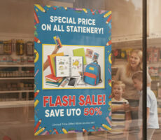
- Restaurant menus
- Product catalogs
- Travel brochures
- Real estate property showcases
- Luxury service businesses
The larger panels allow photos, graphics, and key messaging to stand out while creating a polished, professional presentation.
If your goal is to make a strong visual impression while keeping your message simple and focused, a bi-fold brochure is often the best choice for marketing materials that rely heavily on design and branding.
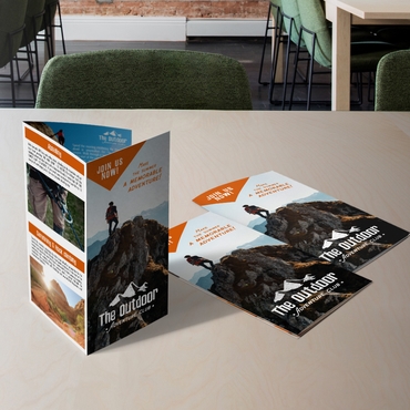
What Is a Tri-Fold Brochure?
A tri-fold brochure is a single sheet of paper folded into three sections, creating six separate panels.
This is one of the most widely used brochure formats because it naturally guides readers through information in a specific order. Each panel serves a purpose, helping businesses organize content into smaller, easy-to-read sections.
Unlike a bi-fold brochure, a tri-fold brochure is often chosen when the brochure design needs to communicate multiple services, explain a process, or educate potential customers step by step.
Tri-fold brochures are commonly used for:
- Service overviews
- Healthcare information
- Educational materials
- Event guides
- Company presentations
Because the layout breaks information into multiple panels, it works especially well when you need to explain a process, compare services, or walk customers through a decision.
Many businesses choose tri-fold brochures because they provide enough space for detailed information while remaining compact, affordable, and effective for marketing campaigns, trade shows, and direct mail promotions.
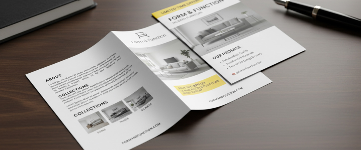
Tri-Fold Brochure Panel Layout Explained
One reason tri-fold brochures remain so popular is that they help control how readers discover information.
Instead of presenting everything at once, the content unfolds panel by panel.
A typical tri-fold brochure layout looks like this:
| Panel | Purpose |
|---|---|
| Front Cover | Grab attention and introduce the topic |
| Inside Flap | Provide a brief introduction or overview |
| Center Inside Panel | Present key information or services |
| Second Inside Panel | Expand on benefits, features, or details |
| Third Inside Panel | Add supporting information, testimonials, or examples |
| Back Panel | Include contact information and a call to action |
This structure creates a natural reading journey. Readers move from curiosity to understanding and finally to action.
For businesses creating marketing brochures, this layout often performs better when there is a lot of information to communicate. The panel structure helps organize content, improves readability, and supports a more effective brochure design.
Whether you’re promoting services, products, events, or company information, understanding how each panel works can significantly improve the effectiveness of your brochure.
The Layout Isn’t Just a Design Choice, It’s a Communication Choice
Most people approach brochures the wrong way.
They start by asking:
“Which one looks better?”
But brochures aren’t just visual, they’re sequential.
They guide how someone reads, what they notice first, and how they move through your message.
A tri-fold and a bi-fold brochure don’t just look different. They change how your content is experienced.
And that’s what actually determines whether they work.
Think About How Someone Will Open It
Before thinking about design, imagine the moment someone receives your brochure.
They don’t read it all at once. They open it. They scan it.
They decide, very quickly, whether it’s worth their attention.
That’s where layout starts to matter.
A Brochures with the right structure can guide that experience naturally. The wrong one can make even good content feel confusing or overwhelming.
The Case for Tri-Fold: When Structure Matters

A tri-fold brochure divides your content into panels.
That might sound like a small detail, but it changes everything.
Instead of presenting all your information at once, it lets you control the order in which it’s discovered.
That’s why tri-folds work well when your message needs progression.
Think about situations like:
- Explaining a service step by step
- Breaking down different offerings
- Leading someone toward a decision
Each panel becomes a moment:
- First impression
- Explanation
- Detail
- Call to action
It’s not just a brochure, it’s a guided experience.
But that structure comes with a limitation.
If your content doesn’t need that level of organization, a tri-fold can feel restrictive. It can force you to break ideas into pieces that don’t naturally belong apart.
The Case for Bi-Fold: When Impact Matters More Than Structure
A bi-fold brochure opens like a book.
Two large panels. Fewer interruptions. More space to breathe.
This makes it ideal for content that benefits from visual flow instead of segmentation.
Bi-fold layouts work especially well when:
- You rely on strong imagery
- You want a clean, premium feel
- Your message is simple but important
Instead of guiding someone step by step, a bi-fold lets them take in the message more freely.
It feels less like instructions and more like a presentation.
That’s why it’s often used for:
- Brand overviews
- High-end services
- Menus or product showcases
But again, there’s a trade-off.
If you have too much information, a bi-fold can quickly feel crowded, or worse, vague.
This Is Where Most Businesses Get It Wrong
The mistake isn’t choosing tri-fold or bi-fold.
It’s choosing the format before understanding the content.
A business with a complex service chooses bi-fold because it “looks cleaner”… and ends up with a brochure that feels incomplete.
Another business with a simple message chooses tri-fold… and ends up over-explaining everything.
The format should follow the message, not the other way around.
A Simple Way to Decide
Instead of overthinking it, ask yourself this:
“Does my message need to be guided—or experienced?”
If it needs to be guided:
→ Go with a tri-fold
If it needs to be experienced:
→ Go with a bi-fold
That one question is usually enough to make the right call.
What Happens After the Choice
Once the layout is clear, everything else becomes easier.
You’re not just placing text anymore, you’re shaping how someone interacts with your brand.
And that’s what brochures are really for.
If you want to take that further, this guide on How to Design Effective Marketing Brochures can help you refine how your content and design work together.
Final Thought
A brochure isn’t just something you hand out. It’s something people move through.
And whether that experience feels clear, engaging, or confusing depends largely on the layout you choose.
Tri-fold and bi-fold are both effective, but only when they match the way your message needs to be understood.
Frequently Asked Questions About Tri-Fold and Bi-Fold Brochures
What Is a Tri-Fold Brochure?
A tri-fold brochure is a single sheet of paper folded into three sections, creating six panels. This layout allows businesses to organize information into separate sections and guide readers through content step by step.
What Is a Bi-Fold Brochure?
A bi-fold brochure is a single sheet folded once in half, creating four panels. It opens like a book and provides larger design areas, making it ideal for visual storytelling, product showcases, and brand-focused marketing materials.
How Many Panels Does a Tri-Fold Brochure Have?
A standard tri-fold brochure has six panels: three on the front side and three on the back side. These panels can be used to introduce your business, explain services, showcase products, and include contact information or a call to action.
Which Brochure Format Is Best for Marketing?
The best brochure format depends on your goals. If you need to explain services, present multiple offerings, or guide readers through information, a tri-fold brochure is often the better choice. If your marketing relies on strong visuals and a simpler message, a bi-fold brochure may be more effective.
What Is the Difference Between a Tri-Fold and Bi-Fold Brochure?
The main difference is how the brochure is folded and how information is presented. A tri-fold brochure creates six panels and works well for structured content, while a bi-fold brochure creates four panels and offers larger design spaces for visual impact.
Are Tri-Fold Brochures Still Effective?
Yes. Tri-fold brochures remain one of the most popular marketing materials because they are compact, cost-effective, and versatile. They work well for trade shows, direct mail campaigns, healthcare information, real estate marketing, and service-based businesses.
Are Bi-Fold Brochures Better for Design?
Bi-fold brochures are often preferred when design and imagery play a major role in the message. The larger panels provide more room for photography, branding elements, and clean layouts that create a premium look and feel.
What Should Be Included in a Brochure?
Most effective brochures include:
- A compelling headline
- Clear information about products or services
- Benefits and key selling points
- Images or graphics
- Customer testimonials or proof points
- Contact information
- A strong call to action
The exact content should be tailored to your audience and business goals.
What Is the Most Common Brochure Size?
The most common brochure size is 8.5″ x 11″ folded into either a tri-fold or bi-fold layout. However, larger formats are often used for product catalogs, menus, and premium marketing presentations.
Ready to Choose Your Brochure Layout?
Explore your options here: Brochures