Print design continues to evolve in surprising ways. Even in a digital-first world, brands are rediscovering the value of materials that can be held, touched, and displayed. Print has become more intentional, less about mass distribution and more about creating emotional moments with customers.
As we move into 2026, the biggest trends reflect this shift. Colors are becoming richer and more expressive, finishes more tactile, and layouts more editorial. Whether you’re designing business cards, brochures, calendars, stickers, or multi-channel campaigns, the coming trends offer both inspiration and practical direction.
This guide dives into the color trends, finishes, textures, formats, and design movements that will define print in 2026, so you can bring fresh, modern energy into your branding.
For deeper insights into color strategy, explore the Science of Color, or for specific product inspiration, check out Business Card Trends and the Brochure Design Guide.
Let’s look ahead.
Color Forecast for 2026
Color is the core of how customers experience print. It sets a mood before they even read a word.
The 2026 palette reflects two cultural forces: a desire for grounding, natural tones and a renewed appetite for expressive, digital-inspired colors.
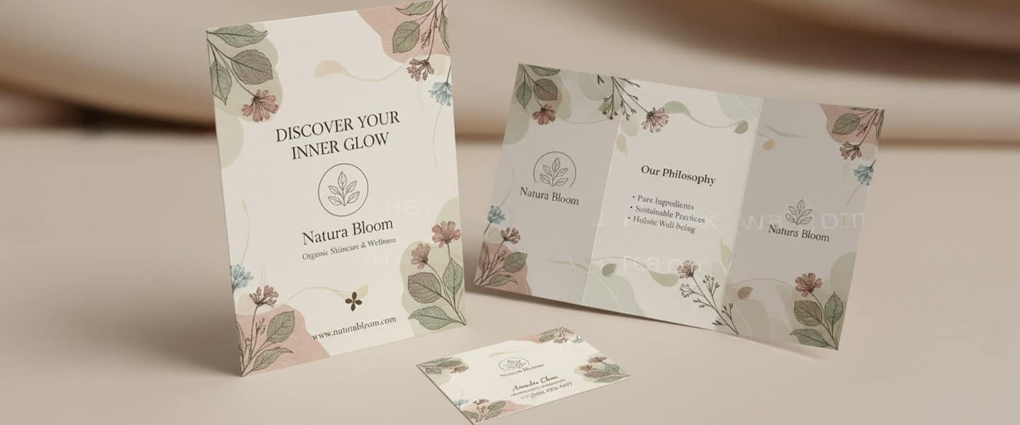
1. Earth-Infused Neutrals
Neutrals are shifting from cold grays to warm, nature-driven tones, including:
- Honey beige
- Soft terracotta
- Mushroom gray
- Sandstone
- Clay brown
These colors work well because they feel calming and honest, perfect for wellness, consulting, hospitality, and boutique retail.
They pair beautifully with textured stocks like linen or eggshell and are especially effective in brochures, business cards, and calendars.
2. Jewel Tones with Depth
Sapphire navy, emerald haze, garnet wine, and amethyst plum are returning in richer, velvety versions.
These tones reproduce extremely well on premium stocks and instantly convey sophistication. Jewel tones shine in:
When paired with soft-touch matte finishes, they feel luxurious without requiring metallic foil.
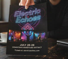
3. Digital Brights
Influenced by AI aesthetics and pop culture, digital brights are gaining momentum:
- Hyper-lime
- Electric teal
- Digital lavender
- Neon coral
These colors add energy when used sparingly, for example, in accent typography, sticker highlights, or promotional graphics. They’re especially appealing to younger audiences.
4. Soft Monochromes
Monochrome palettes remain a staple for brands that value clarity and professionalism. Soft blues, muted greens, and warm grays create a polished, timeless look. They work beautifully for:
- Calendar layouts
- Service-based branding
- Clean brochure designs
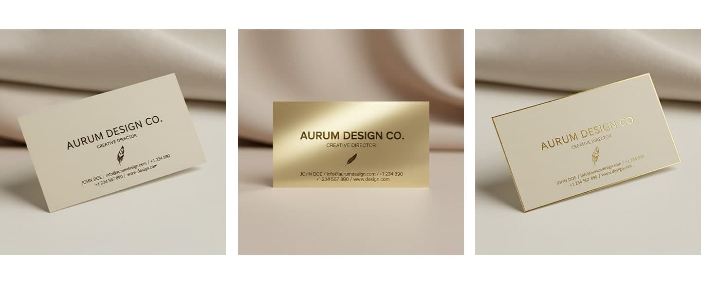
5. Metallic-Inspired Shades
Even without foil printing, brands are using colors that suggest metallic shine:
- Champagne
- Brushed gold
- Soft bronze
- Gunmetal
These tones work well in business card backgrounds, brochure accents, or calendar typography, especially when paired with matte finishes.
Trending Color Palette Examples for 2026
While color trends constantly evolve, several distinct palettes are emerging across print design.
Organic Luxury
A palette inspired by natural materials and premium craftsmanship.
Colors include:
- Honey beige
- Terracotta
- Clay brown
- Champagne
- Soft bronze
Best for:
- Hospitality
- Wellness brands
- Boutique retail
Digital Energy
Inspired by technology, gaming, and AI-generated art.
Colors include:
- Electric teal
- Hyper lime
- Digital lavender
- Neon coral
Best for:
- Startups
- Creative agencies
- Event marketing
Quiet Professional
Designed for brands that prioritize trust and clarity.
Colors include:
- Warm gray
- Soft navy
- Muted green
- Dusty blue
Best for:
- Consultants
- Financial services
- Real estate professionals
Editorial Contrast
A modern combination of high contrast and minimalism.
Colors include:
- Black
- Cream
- Charcoal
- Gold accents
Best for:
- Luxury brands
- Fashion
- Premium service providers
Photo Printing Trends for 2026
Photo printing continues to grow as consumers look for ways to display memories and personalize spaces. While digital photos often remain trapped on phones and computers, printed photographs create a lasting emotional connection.
Gallery Wall Collections
Instead of displaying a single large photo, many consumers are creating gallery walls using multiple coordinated prints. This trend works particularly well for:
- Family photography
- Travel photography
- Wedding photography
- Small business office décor
Retro-Inspired Prints
Vintage-inspired photography styles continue to influence print design. White borders, film-inspired color grading, and nostalgic layouts are becoming increasingly popular.
Large Format Statement Pieces
Large-format photo prints and posters are helping both businesses and consumers create focal points within their spaces. Restaurants, hotels, retailers, and offices are increasingly using oversized photography to strengthen their brand identity.
Personalized Calendars
Custom photo calendars remain one of the most practical and effective print products because they combine functionality with personal storytelling. Businesses also use branded calendars to remain visible throughout the year.
Texture & Finish Trends for 2026
If 2025 was the year of clean design, 2026 is the year of tactile experience.
Customers want materials that feel meaningful, something digital can’t imitate. This is where finishes become a powerful branding tool.
1. Ultra-Thick & High-Weight Stocks
The moment someone holds an ultra-thick card, they instantly perceive value. Expect significant growth in:
- Sandwich-style layered cards
- Ultra-thick premium business cards
- Heavy-weight brochure covers
These stocks help brands feel established and confident. Explore options like Fat Business Cards or Ultra-Thick Cards for inspiration.
2. Soft-Touch Matte
Soft-touch matte continues to be the most requested finish because it feels premium and elevates both photography and color. It works well across:
- Brochures
- Business cards
- Calendars
- Presentation folders
Matte also complements earthy and jewel-tone palettes extremely well.
3. Textured Papers
Linen, felt, and eggshell papers are trending because they bring subtle visual dimension. These textures are ideal for:
- Letterhead
- Stationery
- Brochures
- Invitations
- High-end business cards
They support brands that want a handcrafted, thoughtful aesthetic.
4. Selective Gloss Accents
Instead of high-gloss pieces, designers are adding gloss only to specific elements, logos, headlines, illustrations, or patterns. This technique adds contrast without overwhelming the overall design.
5. Eco-Friendly Materials
Recycled and FSC-certified papers are becoming more popular not just for environmental reasons, but because customers appreciate the story behind them. Many have natural textures that add character to print pieces.
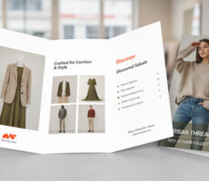
Catalog Design Trends for 2026
Catalogs are experiencing a resurgence as brands seek more engaging ways to showcase products. Unlike online shopping experiences that often feel transactional, catalogs create opportunities for discovery.
Lifestyle-Driven Product Presentation
Modern catalogs focus less on product grids and more on showing products in real-world environments.
Customers want to see:
- Products in use
- Complete lifestyle scenes
- Inspiration for purchases
- Brand stories
Magazine-Style Storytelling
Many catalogs now include:
- Interviews
- Editorial articles
- Product guides
- Customer stories
This approach keeps readers engaged longer and strengthens brand loyalty.
Premium Printing Materials
Luxury catalogs increasingly feature:
- Thick covers
- Soft-touch finishes
- Matte coatings
- Textured paper stocks
These materials elevate the perceived value of both the catalog and the products inside.
Format Trends for 2026
As brands refine their visual storytelling, the physical format of print has become more expressive. The following layout and format trends will shape how businesses create impactful print in 2026.
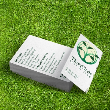
1. Square & Compact Cards
Square business cards and invitation formats continue to rise because they look modern and feel intentional. They stand out immediately in a stack and suit industries like:
- Creative services
- Boutique retailers
- Hospitality
- Lifestyle brands
Explore Premium and Euro Cards for modern sizing options.
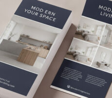
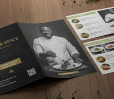
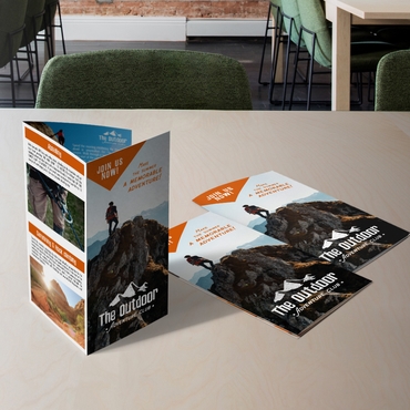
2. Oversized Brochures & Posters
Brands are embracing formats that allow more breathing room for visuals and bold typography. Oversized prints help businesses create “moment-making” pieces, ideal for:
- Storefront advertising
- Trade shows
- Restaurant menus
- Seasonal campaigns
See Brochures or Posters for examples.
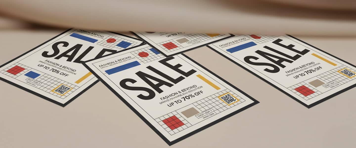
3. Custom-Shaped Stickers
Stickers continue to expand as a branding format thanks to their versatility. Die-cut options let brands create shapes tied to their personality, arches, stars, organic shapes, badges, and more.
They’re especially effective for product packaging, event giveaways, and loyalty marketing.
Related reading: Sticker vs Label Printing
Product link: Stickers
4. Editorial-Style Layouts
Inspired by print magazines, editorial design brings sophistication to everyday materials. Expect to see layouts that use:
- Wide margins
- Asymmetric grids
- Elegant type hierarchy
- Large photography sections
- Pull quotes
This approach is perfect for lookbooks, brochures, and calendars that double as brand storytelling tools.
5. Evolved Calendar Formats
Calendars are becoming both functional and artistic. 2026 trends include:
- Photo-centered designs
- Clean, minimal date layouts
- Seasonal color palettes
- Inspirational or branded messaging
- Illustrated themes
A well-designed calendar stays visible all year, making it one of the most effective long-term marketing tools.
Print Industry Trends Beyond Design
Design trends are only part of the story. Several larger shifts are influencing how businesses approach print marketing in 2026.
AI-Assisted Design Workflows
Artificial intelligence is helping designers generate concepts, create mockups, and explore color combinations faster than ever. While AI is accelerating creativity, human design expertise remains essential for strategic decision-making.
Hyper-Personalization
Variable data printing allows businesses to personalize printed materials with:
- Customer names
- Personalized offers
- Local messaging
- Customized imagery
This makes direct mail and promotional campaigns significantly more relevant.
Sustainable Printing
Businesses are increasingly selecting:
- Recycled paper stocks
- FSC-certified materials
- Soy-based inks
- Shorter print runs to reduce waste
Sustainability is no longer a niche consideration. For many customers, it influences purchasing decisions.
Short-Run and On-Demand Printing
Advancements in digital printing make it easier for businesses to order smaller quantities without sacrificing quality. This flexibility reduces waste while allowing brands to refresh designs more frequently.
25 Print Design Examples That Reflect 2026 Trends
If you’re planning new marketing materials, consider incorporating these ideas:
- Soft-touch matte business cards
- Ultra-thick layered business cards
- Square business cards
- Editorial-style brochures
- Fold-out brochures
- Minimalist calendars
- Photo-centric calendars
- Die-cut stickers
- Holographic stickers
- Sustainable packaging inserts
- Textured invitation cards
- Luxury presentation folders
- Large-format posters
- Event signage with QR integration
- Monochrome marketing kits
- Jewel-tone stationery
- Minimalist restaurant menus
- Lifestyle product catalogs
- Wellness-inspired brochures
- Metallic-inspired print designs
- Variable-data direct mail campaigns
- Branded photo prints
- Seasonal promotional postcards
- Magazine-inspired lookbooks
- Hybrid minimalist-maximalist marketing materials
These examples demonstrate how businesses are combining color, texture, format, and storytelling to create memorable print experiences in 2026.
Minimalism vs. Maximalism: The Duality Shaping 2026
What makes 2026 unique is that both minimalism and maximalism are trending and neither is going away.
Instead, brands are choosing the style that feels authentic to their personality.
Minimalism: Clean, Calm & Intentional
Minimalism continues to be a staple for brands wanting clarity and professionalism. Its core features include:
- Ample white space
- Soft gradients
- Neutrals and monochromes
- Thin line elements
- Precise typography
This approach works well for consultants, real estate professionals, agencies, and service-based businesses because it conveys trust and structure.
Maximalism: Expressive, Bold & Energetic
Maximalism counters minimalism with expressive visuals. Its 2026 version includes:
- Oversized typography
- High-contrast patterns
- Color layering
- Photo collages
- Dramatic compositions
It’s ideal for fitness brands, cafés, entertainment venues, and boutique retail, anyone who wants to create an emotional impact.
The Hybrid Approach
Some of the best designs blend both styles, minimal layouts with bold accent elements, or maximalist color stories contained within structured grids. This hybrid trend will be especially strong in brochures, calendars, and business card designs.
Start designing your 2026 print materials now.
2026 is the perfect year to elevate your print identity, through color, texture, thoughtful layouts, and formats that tell a fuller story about your brand.