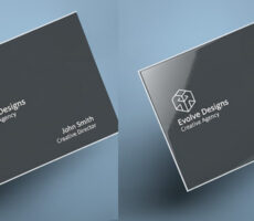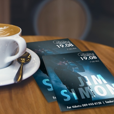
Glossy flyers are best for bright colors, photos, and attention-grabbing promotions, while matte flyers are better for readability, a softer appearance, and a more professional or premium feel. Neither finish is always better—the right choice depends on your design, audience, and how the flyer will be used.
Matte and glossy flyers attract attention in different ways. Glossy flyers usually stand out faster because of their shine and color vibrancy, while matte flyers often feel more modern, professional, and easier to read.
The better option depends on what you want customers to notice first.
That’s why choosing a flyer finish is not only a design decision — it’s a marketing decision.
In 2026, businesses are competing with constant visual overload. Customers scroll through ads all day, pass storefront signage every few seconds, and make quick judgments based on presentation alone. Physical marketing still works because it interrupts that digital fatigue, but the details matter more than ever.
And one of the most overlooked details is the finish itself.
Many businesses choose between matte and glossy based only on appearance. But customers react to each finish differently in real-world situations, especially when flyers are used for promotions, events, menus, local campaigns, or direct mail marketing.
Sometimes a glossy flyer grabs attention faster.
Other times, matte performs better because it feels cleaner, more premium, and easier to engage with.
The key is understanding how people actually experience print materials in real life.
Why Flyer Finish Changes Customer Perception
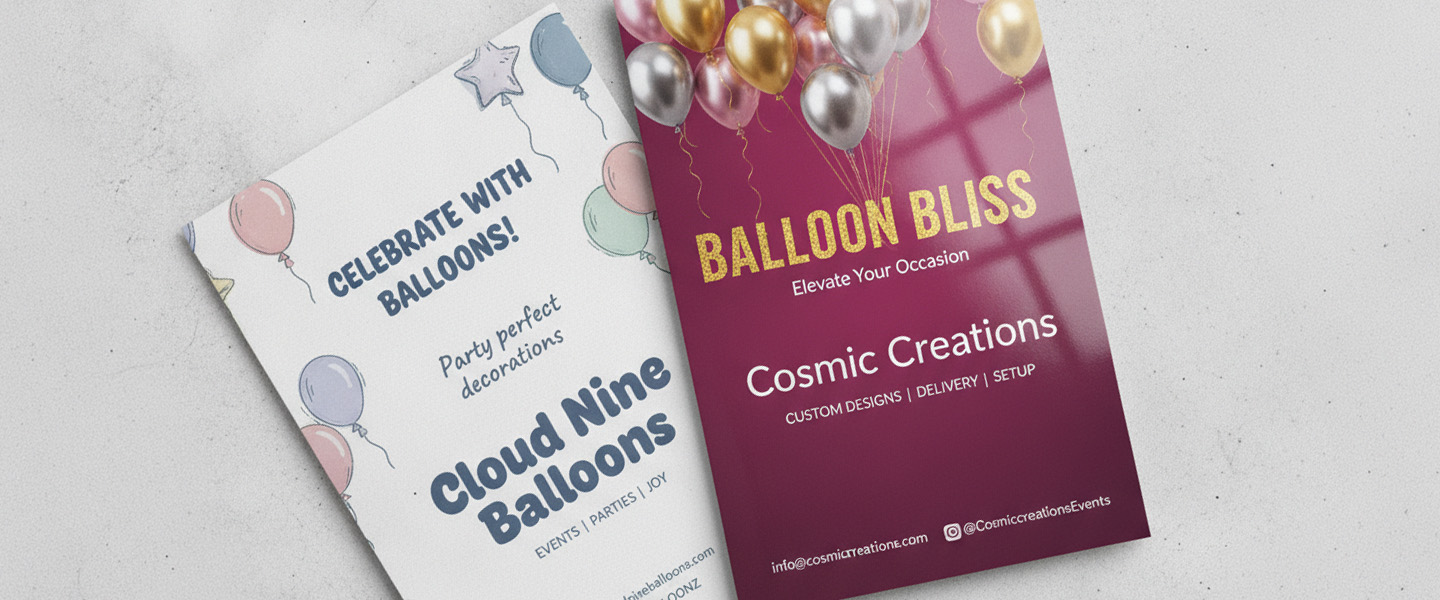
Most people won’t consciously say:
“I prefer matte lamination.”
But they absolutely react emotionally to how printed materials feel and look.
Glossy flyers tend to create:
- brighter color contrast
- more visual energy
- stronger shine
- sharper photo appearance
That’s why they’re commonly used for:
- nightlife promotions
- restaurant specials
- entertainment events
- retail discounts
- highly visual campaigns
Glossy finishes naturally attract the eye because light reflects off the surface more aggressively.
This can make colors appear more vibrant and make promotional designs feel louder and more urgent.
Matte flyers create almost the opposite reaction.
Instead of feeling flashy, matte usually feels:
- cleaner
- softer
- more modern
- more premium
- easier to read
That subtle difference can completely change how customers perceive a business.
Matte vs Glossy Flyers: Quick Comparison
Matte and glossy flyers differ in more than just appearance. The finish can affect color, readability, durability, glare, how the paper feels, and even whether customers can easily write on it. Here’s a quick comparison to help you choose the right finish for your flyer.
| Feature | Matte Flyers | Glossy Flyers |
| Overall Feel | Clean, modern, and premium | Bold, vibrant, and attention-grabbing |
| Best For | Luxury brands, consultants, real estate, wellness, and professional services | Restaurants, retail promotions, concerts, events, and entertainment |
| Color Appearance | Softer and more muted | Brighter and more vibrant |
| Readability | Easier to read under bright light | Can create glare under certain lighting |
| Customer Perception | Professional and sophisticated | Energetic and promotional |
| Cost | Cost varies by paper stock, quantity, and printing options | Cost varies by paper stock, quantity, and printing options |
| Durability | Good for everyday handling and materials where readability is important | Smooth coated surfaces can help printed pieces hold up well during handling |
| Best for Photos | Good for softer, more refined photography | Excellent for colorful photos and high-contrast images |
| Best for Text | Excellent for text-heavy designs because of reduced glare | Better for shorter messages paired with strong visuals |
| Glare | Minimal glare, making it easier to view in bright environments | More reflective and may produce glare under direct light |
| Paper Feel | Smooth, soft, and understated | Smooth, slick, and polished |
| Writing With Pen/Pencil | Generally easier to write on | Usually more difficult to write on because of the slick surface |
| Fingerprints & Smudges | Less noticeable | More noticeable |
| Photography & Visuals | More subtle and refined | Stronger color and visual impact |
| Best Environment | Offices, direct mail, professional services, and premium branding | Storefronts, events, retail spaces, and high-traffic promotions |
Neither finish is automatically better. Glossy flyers are generally better when vibrant colors, photography, and immediate visual impact are the priority, while matte flyers are better when readability, a professional appearance, and a softer feel matter most. Consider your design, audience, distribution method, and marketing goal when choosing between matte and glossy flyers.
Glossy Flyers Usually Win in High-Energy Promotions
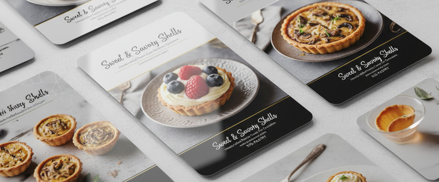
There’s a reason glossy flyers have been popular for years.
They’re built for visibility.
When businesses want customers to notice:
- bold colors
- food photography
- event visuals
- large discounts
- promotional graphics
glossy finishes often perform well because they create more immediate visual stimulation.
For example, glossy flyers are commonly effective for:
- concerts
- clubs
- grand openings
- fast-food promotions
- seasonal sales
- entertainment marketing
The shine itself creates movement under light, which naturally helps attract attention in busy environments.
This becomes especially important when flyers compete visually with:
- storefront signs
- posters
- digital displays
- crowded bulletin boards
- trade show materials
In fast-paced environments, glossy flyers can feel more aggressive and energetic.
And sometimes that’s exactly the goal.
Matte Flyers Often Feel More Expensive
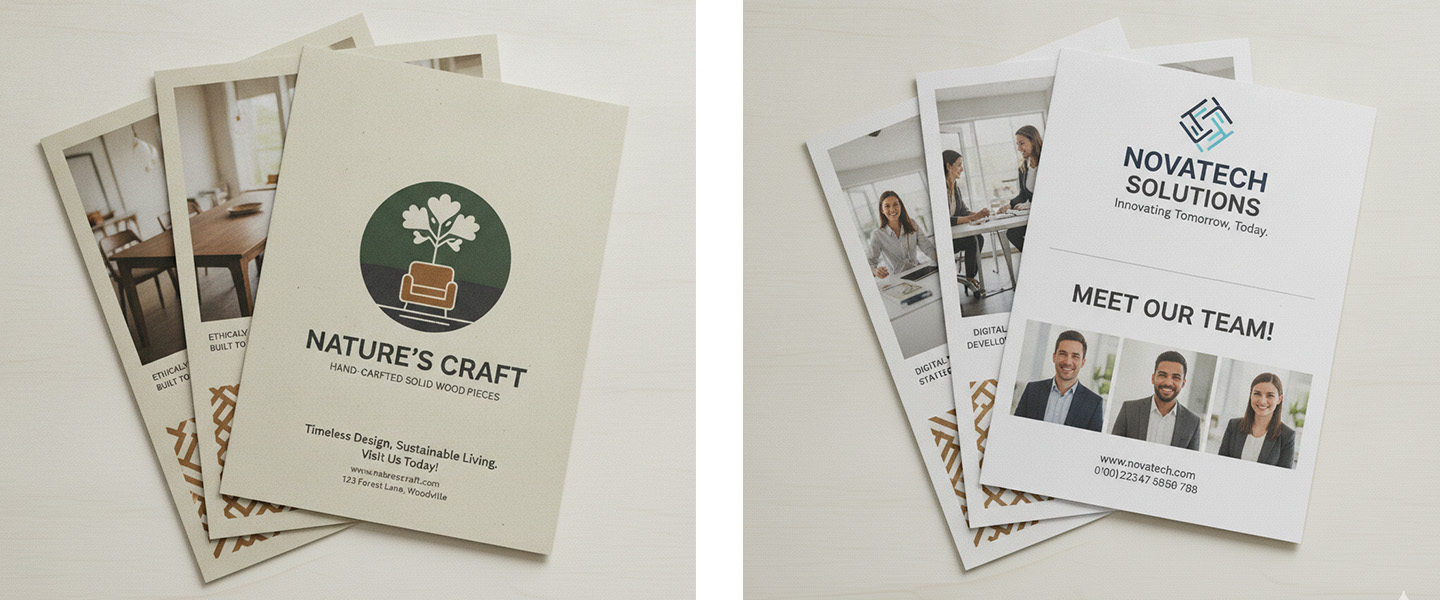
This is where perception psychology becomes very important.
While glossy finishes attract attention faster, matte finishes often create stronger trust and sophistication.
That’s because matte materials tend to feel:
- less promotional
- less cluttered
- more intentional
- easier on the eyes
Many modern brands now prefer matte because it creates a cleaner visual experience.
This is especially true for:
- luxury brands
- consultants
- real estate professionals
- wellness businesses
- high-end restaurants
- creative agencies
Matte flyers are also easier to read under bright lighting because they reduce glare significantly.
That small detail matters more than businesses realize.
If customers struggle to read the flyer comfortably, engagement drops immediately.
The Design Matters More Than the Finish Alone
One mistake businesses make is assuming the finish itself will save a weak design.
It won’t.
A glossy flyer with poor hierarchy still feels overwhelming.
A matte flyer with cluttered text still feels confusing.
The finish should support the message — not replace strategy.
For example:
- glossy often works better for highly visual promotions
- matte often works better for informational or premium branding campaigns
The design, audience, and environment should always influence the choice.
A luxury spa and a nightclub should not use the exact same flyer strategy.
Flyer Size Also Changes How Finishes Perform
This is something businesses rarely consider.
Smaller flyers often behave differently than larger ones because the viewing distance changes.
A glossy finish on a smaller handout can create strong visual impact quickly.
But on larger formats, excessive shine can sometimes make readability harder depending on lighting conditions.
That’s why flyer dimensions and finish should work together.
If you’re still deciding which flyer size makes the most sense for your campaign, this guide on standard flyer sizes explained breaks down which formats work best for different marketing goals.
Matte vs Glossy for Direct Mail Campaigns
Direct mail is another area where finish selection changes performance.
Glossy flyers often increase initial attention because they stand out visually inside mail stacks.
But matte flyers frequently feel more personal and less “advertisement-like,” which can increase trust depending on the audience.
This is especially relevant for:
- local service businesses
- healthcare providers
- consultants
- real estate marketing
- community campaigns
In some cases, matte flyers feel closer to premium editorial materials rather than mass advertising.
And customers react differently because of that.
The Most Effective Flyers Usually Feel Intentional
The highest-performing flyers rarely succeed because of one feature alone.
Not because they’re glossy.
Not because they’re matte.
They work because every decision feels aligned:
- the colors
- the typography
- the finish
- the message
- the audience
- the offer
That consistency creates stronger visual trust.
Businesses often underestimate how much customers notice when print materials feel professionally put together.
If you’re improving overall flyer performance, this guide on flyers that sell explains how layout, messaging, and design structure influence response rates beyond just printing finishes.
Should You Choose Matte or Glossy Flyers?
Glossy flyers usually attract faster visual attention.
Matte flyers often create stronger long-term brand perception.
Neither option is automatically better.
The right choice depends on:
- your audience
- your industry
- your environment
- your design style
- your marketing objective
If the goal is loud visibility and vibrant energy, glossy often performs well.
If the goal is professionalism, readability, and a more premium brand experience, matte usually works better.
The best flyer finish is the one that supports how customers should feel when they see your business.
- Choose glossy flyers if: you have photography, bold colors, promotional offers, restaurant imagery, events, retail sales, etc.
- Choose matte flyers if: readability matters, you have more text, want minimal glare, need a premium/professional appearance, or expect people to write on the flyer.
Final Thoughts
Flyer finishes affect much more than appearance.
They influence:
- attention
- readability
- trust
- perceived quality
- emotional response
In 2026, businesses that succeed with print marketing are usually the ones paying attention to these small details — because customers notice them too.
Glossy flyers can create stronger immediate visibility.
Matte flyers can create stronger perceived professionalism.
Both can work extremely well when paired with the right design and strategy.
Explore custom flyer printing options at Overnight Prints to create marketing materials designed for real-world attention and customer engagement.
Frequently Asked Questions About Business Letterhead
1. What is a business letterhead?
A business letterhead is a branded header or stationery design used for official company communication. It typically includes the company name, logo, and contact information and can be used for letters, proposals, contracts, invoices, and other professional documents.
2. What should be included on a business letterhead?
A professional business letterhead should include your company name, logo, and relevant contact information, such as your website, email address, phone number, or business address. It should also use consistent brand colors and typography while leaving enough white space for the document’s main content.
3. What should company letterhead look like?
Company letterhead should look clean, professional, and consistent with the company’s visual identity. The logo and company name should be easy to identify, contact information should be readable, and the design should leave plenty of space for the actual letter. Avoid overcrowding the page with unnecessary graphics or information.
4. What size is standard business letterhead?
The standard business letterhead size in the United States is 8.5 × 11 inches, the same size as standard letter paper. This format works well for business correspondence and fits standard folders and envelopes when properly folded.
5. How do you design a professional letterhead?
Start with a high-resolution logo, your essential contact information, and your established brand colors and fonts. Create a simple header or footer, maintain consistent margins, and leave enough white space for the letter. For professional printing, prepare graphics at 300 DPI and follow the printer’s color, bleed, and file specifications.
6. Does business letterhead go on every page?
Full business letterhead is generally most prominent on the first page of a letter or document. For multi-page documents, subsequent pages can use a simplified header or footer containing elements such as the company name, logo, page number, or other identifying information instead of repeating the complete first-page design.
7. What should go on the second page of a business letter?
The second page of a business letter can use a simplified header containing information that helps identify and organize the document, such as the recipient’s name, company name, date, page number, or a simplified version of your company branding. The full letterhead design does not necessarily need to be repeated.
8. What is the difference between a logo and letterhead?
A logo is a visual symbol, wordmark, or graphic that represents a brand. Letterhead is the complete stationery layout used for business correspondence and can incorporate the logo along with the company name, contact information, brand colors, typography, and other design elements.
9. Should letterhead and envelopes match?
Yes. Using matching letterhead and envelopes helps create a consistent and recognizable brand experience. Use the same logo, colors, typography, and overall visual style across both pieces while adapting the layout to fit each format.
10. What is the best paper for business letterhead?
The best paper for business letterhead depends on how the stationery will be used and the impression you want to create. A practical, professional paper stock works well for everyday correspondence, while a heavier or more premium stock can be appropriate for proposals, contracts, welcome letters, and other important communications. Make sure the paper is also suitable for any additional printing or writing you plan to do on the letterhead.