A design can look perfect on your screen and still come back from the printer with white edges, blurry images, or text sitting uncomfortably close to the edge.
Often, the problem isn’t the design itself. It’s how the file was prepared for printing.
Before sending artwork to print, you need to account for a few technical areas: bleed, trim, safe zones, image resolution, color, and final file setup. Understanding these basics can help your business cards, brochures, postcards, flyers, stickers, and other printed materials look much closer to what you intended.
Here’s what each term means and how to prepare a print-ready file.
Quick Guide: Bleed vs. Trim vs. Safe Zone
These three areas serve different purposes:
| Area | What It Means | What Goes There? |
| Bleed | Extra artwork extending beyond the finished edge | Background colors, photos and graphics that should reach the edge |
| Trim line | Where the printed piece is intended to be cut | The final edge of the product |
| Safe zone | Area inside the trim where important elements should stay | Text, logos, QR codes and important design elements |
Think of them as three boundaries surrounding your design.
The bleed extends outward, the trim defines the finished size, and the safe zone moves important content inward.
What Is Bleed in Printing?
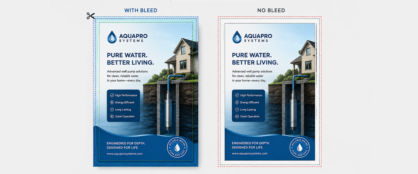
Bleed is the portion of a design that extends beyond the final trim edge.
During commercial printing, multiple pieces may be printed on larger sheets and then cut down to their finished dimensions. Because cutting isn’t something you should design around with zero tolerance, artwork that is meant to reach the edge should continue past the trim line.
Adobe similarly defines bleed as printing that extends beyond the edge where the sheet will eventually be trimmed.
For example, imagine a postcard with a blue background covering the entire front.
If the blue background ends exactly at the final postcard dimensions, even a very small variation during trimming could leave a thin white edge.
Instead, the blue background should continue into the bleed area.
What should extend into the bleed?
Elements intended to reach the finished edge should generally extend into it, including:
- Background colors
- Background images
- Photos touching an edge
- Patterns
- Decorative shapes or graphics that run off the page
Important text and logos should not be extended into the bleed.
How much bleed do you need?
The required amount depends on the printer and product, so always check the specifications or template for the exact item you’re ordering.
A commonly used print bleed is 0.125 inches (1/8″) on each side in U.S. printing workflows, while other workflows may use measurements such as 3 mm.
For example, Adobe notes that bleed requirements can vary and recommends checking the amount required by your printer.
So don’t assume that one bleed specification applies to every printer or every product.
What Is the Trim Line?
The trim line represents where the printed piece is intended to be cut to its finished dimensions.
Let’s say you’re creating a standard U.S. business card measuring:
3.5″ × 2″
Those dimensions represent the finished card after trimming.
If the artwork includes bleed, the submitted artwork extends beyond those final dimensions, but the finished business card itself remains 3.5″ × 2″.
This distinction is important.
Document/final size ≠ artwork including bleed.
Adobe’s print guidance recommends defining the document at its true trimmed product size and setting bleed separately rather than treating the larger bleed dimensions as the actual document size.
If you’re creating business cards, our business card size guide explains common finished dimensions in more detail.
What Is the Safe Zone?
The safe zone—or safe area—is the area inside the trim line where important content should remain.
While bleed protects elements that need to reach the edge, the safe zone does the opposite: it keeps important elements away from the edge.
That includes:
- Names
- Phone numbers
- Email addresses
- Logos
- Headlines
- QR codes
- Calls to action
- Important icons or graphics
Imagine placing your phone number extremely close to the trim line on a business card.
Even if none of the numbers are technically cut off, the text may still look cramped or uneven once the card is trimmed.
Moving it farther inside creates breathing room and reduces the chance of important content being affected by normal trimming variation.
Bleed vs. Safe Zone: What’s the Difference?
These two concepts are easy to confuse because both involve the edges of a print design.
The easiest rule to remember is:
Backgrounds go out. Important content comes in.
If a photo or background should reach the edge of the finished product, extend it past the trim line into the bleed.
If an element needs to remain completely visible, keep it inside the safe zone.
For example, on a custom postcard:
Background photo → extend into bleed
Business name → keep inside safe zone
Background color → extend into bleed
QR code → keep inside safe zone
Contact information → keep inside safe zone
This simple distinction prevents many common print-file problems.
Why Does Print Resolution Matter?
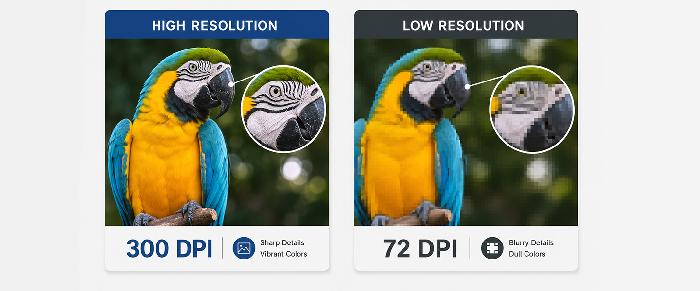
Bleed and trim determine where elements appear.
Resolution determines how sharp raster images can appear when printed.
Digital images are made from pixels. If an image doesn’t contain enough pixel information for the size at which you’re printing it, it can appear blurry, soft, or pixelated.
Adobe identifies 300 PPI as a common target for printed images and explains that simply increasing a low-resolution image to 300 PPI does not recreate detail that wasn’t present in the original.
That’s an important distinction.
Changing a number from 72 to 300 doesn’t magically make an image high resolution.
PPI vs. DPI: What’s the Difference?
You’ll often see DPI and PPI used interchangeably when people talk about preparing files for print, but technically they describe different things.
PPI (pixels per inch) refers to the pixel density of a digital image.
DPI (dots per inch) refers to the dots produced by a printer.
When you’re checking the quality of photos and raster graphics in your artwork, PPI is the more accurate measurement.
Adobe explains the same distinction: PPI describes image resolution, while DPI relates to printer output.
In everyday print conversations, however, you’ll still frequently hear people say “300 DPI” when they’re referring to artwork resolution.
Is 300 PPI Good for Printing?
For many commercial print projects, 300 PPI at the intended print size is a useful target for raster images.
The phrase “at the intended print size” matters.
Suppose you have an image that is 300 PPI when printed at 4 × 6 inches.
If you dramatically enlarge that same image for a poster, you’re spreading the available pixels over a much larger physical area. Its effective resolution decreases.
Adobe gives a useful example: scaling a 300 PPI image to 200% in a layout results in an effective resolution of approximately 150 PPI.
That’s why it’s better to start with images large enough for their intended use rather than trying to repair small images afterward.
Raster vs. Vector Graphics
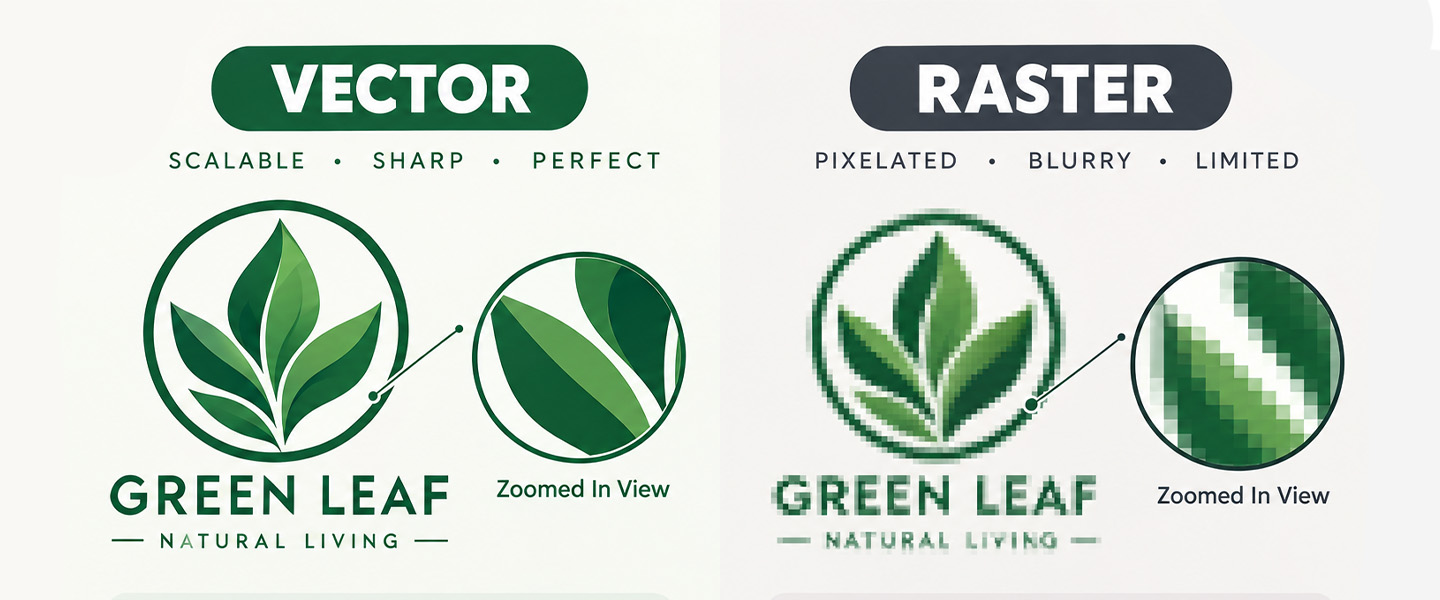
Resolution also depends on the kind of graphic you’re using.
Raster graphics
Raster files are built from pixels.
Common raster formats include:
- JPEG
- PNG
- TIFF
- PSD
Photographs are raster images.
When enlarged too much, raster images can lose sharpness because there are a limited number of pixels available.
Vector graphics
Vector graphics are based on mathematical paths rather than a fixed grid of pixels.
They are commonly used for:
- Logos
- Icons
- Illustrations
- Shapes
- Typography
Because vectors aren’t dependent on a fixed pixel grid in the same way raster images are, they can generally be scaled without becoming pixelated.
Adobe recommends vector graphics for elements such as logos and type when scalability is important.
Whenever possible, keep logos and similar graphics in vector format during the design process.
RGB vs. CMYK: What About Color?
Another difference between designing for screens and designing for print is color.
Screens create colors using light, typically through RGB: red, green and blue.
Commercial printing commonly reproduces colors using inks associated with CMYK: cyan, magenta, yellow and black.
Because screens and printed materials reproduce color differently, the printed result may not look exactly like the image displayed on your monitor.
Very bright or highly saturated screen colors can be particularly difficult to reproduce identically in print.
Before submitting artwork, check the color requirements for your specific printer and product rather than assuming the same color setup is required for every workflow.
Should You Use a Template?
If a printer provides a template for the product you’re ordering, use it.
A template can help you identify:
- Finished dimensions
- Bleed boundaries
- Trim lines
- Safe areas
- Fold positions
- Orientation
This becomes especially useful for folded or size-sensitive products such as brochures, rack cards, bookmarks, and business cards.
For brochures in particular, don’t assume that dividing the page into visually equal sections will automatically create the correct panel layout. The fold type and production specifications can affect how the artwork should be positioned.
If you’re still choosing your brochure layout, see our guide to tri-fold vs. bi-fold brochures.
How to Prepare a Print-Ready File Step by Step
Before uploading your artwork, work through these steps.
1. Start With the Correct Finished Size
Set up the design according to the final dimensions of the product.
Don’t take a small design and enlarge it at the last minute if you can avoid it.
Starting at the correct size makes it easier to judge text size, image quality, spacing, and margins.
2. Add the Required Bleed
Check the specifications for your chosen product.
Then extend all backgrounds, photos, colors, and graphics that touch the edge through the entire bleed area.
Don’t simply stretch the whole design. Extend the elements that are supposed to continue past the trim.
3. Identify the Trim Line
Know exactly where the finished edge will be.
This helps you see which design elements will disappear during trimming and which will remain on the finished piece.
4. Keep Important Content in the Safe Zone
Move essential text, logos, QR codes, and other important elements away from the trim line.
Don’t use the safe zone as a target where everything needs to sit. Think of it as a boundary that important content shouldn’t cross.
5. Check Image Resolution at Final Size
Review photographs and raster graphics at the size they’ll actually appear in the finished product.
For many print applications, aim for around 300 PPI at final size, unless the printer’s specifications say otherwise.
Pay particular attention to images downloaded from websites or social media. An image can look sharp on a phone screen and still be too small for high-quality printing.
6. Check Your Fonts and Text
Review:
- Spelling
- Phone numbers
- Email addresses
- URLs
- Dates
- Prices
- Font rendering
- Text placement
A technically perfect print file can still produce an unusable piece if the phone number is wrong.
7. Check QR Codes
If your design contains a QR code, test it before submitting the file.
Scan it from your phone and verify that:
- It works
- It goes to the correct URL
- The destination page works
- The code isn’t obstructed by other design elements
- It has enough surrounding space to remain easy to scan
This is particularly useful when adding QR codes to postcards, business cards, brochures, or other marketing materials.
You can also read our guide to QR code business cards for more ideas on connecting print with digital content.
8. Review Both Sides
For double-sided products, inspect the front and back separately.
It’s surprisingly easy to spend most of your time perfecting the front and overlook a typo, alignment issue, or outdated detail on the reverse.
9. Export According to the Printer’s Requirements
File-format requirements can vary by printing provider and product.
Follow the printer’s current specifications for:
- Accepted file format
- Bleed
- Dimensions
- Color setup
- Resolution
- Fonts
- PDF settings, when applicable
PDF is widely used in professional printing because it can preserve layout information, but don’t assume that simply saving something as a PDF makes it print-ready.
The underlying artwork still needs to be prepared correctly.
Common Print File Mistakes to Avoid
Before uploading your design, watch for these common problems:
- Backgrounds stopping at the trim line instead of extending into bleed
- Text placed too close to the edge
- Low-resolution photos
- Small images enlarged beyond their intended size
- Incorrect document dimensions
- Missing artwork on the reverse side
- Outdated contact information
- QR codes that haven’t been tested
- Important elements positioned over folds
- Assuming screen colors will look identical in print
- Ignoring the printer’s product-specific template
Many of these issues are easier to fix before ordering than after the piece has already been printed.
Print-Ready File Checklist
Before sending your artwork to print, ask:
- Is the document set to the correct finished size?
- Did backgrounds and edge-to-edge images extend into the required bleed?
- Are important elements safely inside the trim?
- Are raster images high enough resolution at their final printed size?
- Are logos and graphics sharp?
- Have all spelling, dates, prices and contact details been checked?
- Have QR codes been tested?
- Are folds accounted for where necessary?
- Did I review every side of the design?
- Am I following the specific file requirements for the product I’m ordering?
If you can answer yes to all of these, you’re much closer to having a file that’s ready for production.
From Screen to Print
Preparing a file for printing isn’t only about making the design look good on your screen.
You have to account for what happens after you upload it: the artwork is printed, trimmed, and—in some cases—folded before becoming the finished product you hold in your hands.
Remember the basic rule:
Extend backgrounds into the bleed. Keep important content inside the safe zone. Design around the trim line. Use high-resolution images at their final print size.
Those few habits can prevent many of the most common print-file problems.
Once your artwork is ready, you can explore Overnight Prints for custom printed marketing materials, including brochures, postcards, rack cards, bookmarks, and stickers.
FAQ
- How do I prepare a file for printing?
Start with the correct finished size, add the required bleed, identify the trim line, and keep important text and logos inside the safe zone. You should also check image resolution, colors, fonts, QR codes, and both sides of the design before exporting the file according to your printer’s requirements. - What are bleed, trim, and safe zones in printing?
Bleed is the extra artwork that extends beyond the finished edge of the printed piece. The trim line shows where the product will be cut to its final size. The safe zone is the area inside the trim where important elements such as text, logos, and QR codes should stay. The article already makes this distinction clearly. Pasted text - How much bleed should a print file have?
Bleed requirements depend on the printer and product. A common bleed in U.S. printing workflows is 0.125 inches (1/8″) on each side, while some workflows use measurements such as 3 mm. Always check the specifications or template for the product you are ordering. Pasted text - What resolution should images be for printing?
For many commercial print projects, 300 PPI at the intended print size is a useful target for raster images. Enlarging an image significantly can reduce its effective resolution, so it is better to start with an image large enough for its final printed size. Pasted text - What should stay inside the safe zone when preparing a print file?
Important information such as names, phone numbers, email addresses, logos, headlines, QR codes, calls to action, and other essential graphics should stay inside the safe zone. This helps prevent important content from appearing too close to the finished edge. Pasted text - Does saving a design as a PDF make it print-ready?
Not necessarily. PDF is commonly used for professional printing because it can preserve layout information, but the artwork still needs the correct dimensions, bleed, resolution, color setup, fonts, and other printer-specific requirements.