Print marketing feels cheap when it looks rushed, inconsistent, cluttered, or low quality. Customers notice details like paper quality, readability, spacing, finishes, and design clarity almost immediately — even if they never consciously talk about them.
And once something feels cheap, customers often assume the business behind it is too.
That’s why print branding matters far beyond aesthetics.
In 2026, customers are exposed to thousands of marketing messages every day. They scroll quickly, ignore advertisements instinctively, and form opinions about businesses within seconds. Physical print materials still stand out because they create a real-world interaction, but that also means flaws become more noticeable.
A blurry flyer, a thin business card, or an outdated brochure can quietly damage trust before a customer ever speaks to the company itself.
The difficult part is that many businesses don’t realize they’re creating that impression.
Cheap-Looking Print Marketing Is Usually a Combination of Small Problems
Most print materials don’t feel unprofessional because of one catastrophic mistake.
It’s usually several smaller details working against each other at the same time.
For example:
- low-resolution images
- overcrowded layouts
- inconsistent branding
- weak paper stock
- hard-to-read typography
- too many colors
- poor spacing
- generic templates
Individually, these issues may seem minor.
Together, they create visual friction.
And customers feel that friction immediately.
This is especially true for businesses competing in industries where trust strongly influences buying decisions, such as:
- real estate
- consulting
- legal services
- healthcare
- luxury services
- finance
- creative industries
In these markets, presentation becomes part of the product itself.
Thin Materials Often Create the Wrong Impression
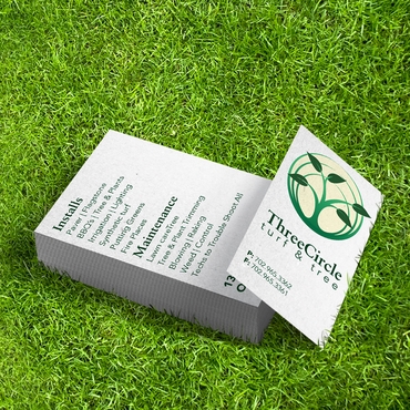
One of the fastest ways print marketing feels cheap is through material quality.
People physically associate weight and texture with value.
A flimsy business card often feels temporary.
A thin brochure can make the company feel less established.
A weak folder presentation may reduce confidence during meetings.
Customers may not consciously think:
“This cardstock feels inexpensive.”
But emotionally, they react to it.
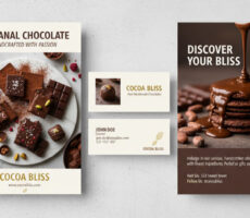
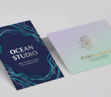
That’s one reason many businesses invest in:
- Premium Business Cards
- thicker paper stocks
- soft-touch finishes
- heavier brochure materials
- professionally printed presentation materials
The physical experience changes perception instantly.
And in many cases, that perception directly affects trust.
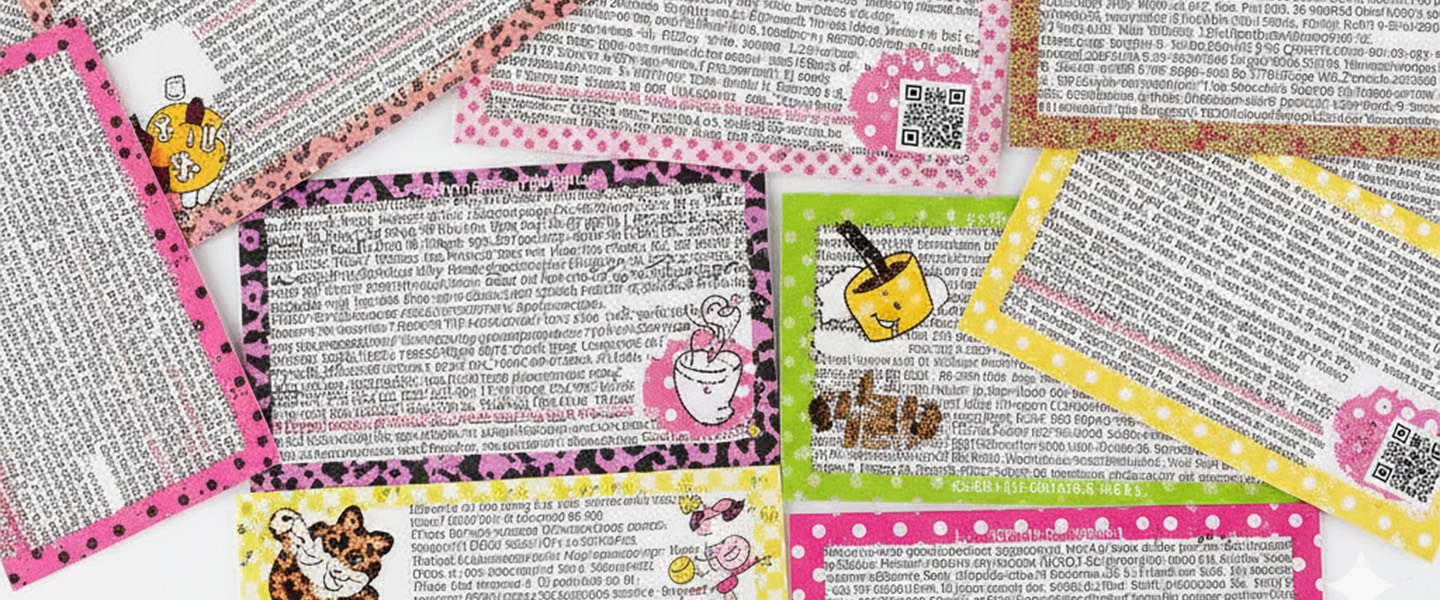
Overdesigned Print Materials Usually Feel Less Professional
This surprises a lot of businesses.
Many companies assume “premium” means:
- more graphics
- more colors
- more effects
- more text
- more design elements
In reality, the opposite is usually true.
The most professional print branding often feels:
- cleaner
- simpler
- more intentional
- easier to scan
Luxury brands rarely overload customers visually because simplicity creates confidence.
When print materials become visually overwhelming, customers subconsciously perceive the business as:
- disorganized
- outdated
- less credible
- harder to trust
That’s why spacing and hierarchy matter so much.
Good design guides attention naturally.
Cheap-looking design competes with itself.
Inconsistent Branding Creates Confusion
Many small businesses unintentionally damage their own brand perception by printing materials that feel disconnected from each other.
For example:
- business cards use one color palette
- brochures use another
- flyers use different fonts
- signage follows no clear style
- letterhead looks unrelated to the website
Customers notice inconsistency faster than businesses realize.
When branding feels disconnected, the business itself often feels less established.
Professional print marketing usually creates a sense of visual continuity.
That consistency helps customers remember the brand more clearly because every interaction reinforces the same identity.
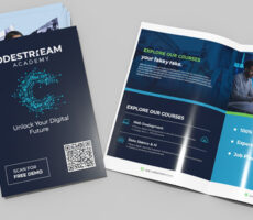
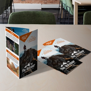
This becomes especially important for businesses using:
- Brochures
- Letterhead
- sales presentations
- event materials
- print handouts
- onboarding packets
The stronger the visual consistency, the stronger the perceived professionalism.
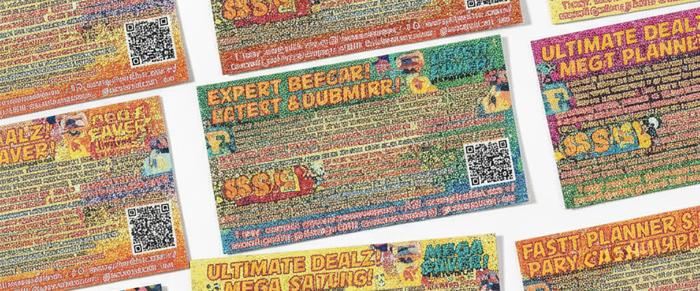
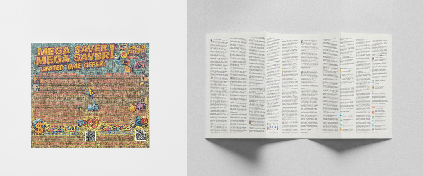
Print Marketing That Feels Cheap Usually Tries Too Hard to Sell
This is another common issue.
When print materials are overloaded with:
- giant discount graphics
- excessive exclamation points
- crowded promotions
- too many offers
- aggressive sales language
the brand often starts feeling less trustworthy.
Customers today are highly sensitive to marketing that feels desperate or overly promotional.
Ironically, calmer and more confident print materials usually perform better because they feel more credible.
Professional print branding focuses more on:
- clarity
- readability
- trust
- positioning
- customer experience
Instead of shouting for attention, premium print materials guide attention naturally.
Print Quality Influences How Businesses Feel in Person
This is especially important during:
- meetings
- networking
- sales presentations
- conferences
- consultations
- client onboarding
The quality of print materials changes the atmosphere of the interaction itself.
For example, professionally printed:
- presentation folders
- brochures
- business cards
- welcome packets
often make businesses appear:
- more prepared
- more organized
- more established
before the conversation even begins.
This is why physical branding still matters so much despite digital marketing growth.
A polished physical interaction creates a level of trust digital touchpoints alone often cannot replicate.
Businesses using pocket folders for presentations and sales meetings often notice this directly because customers associate organization with professionalism.
Customers Compare Businesses Faster Than Ever
Today, customers constantly compare brands — often subconsciously.
If two businesses offer similar services, people naturally lean toward the one that:
- looks more trustworthy
- feels more polished
- appears more established
- communicates more clearly
That comparison happens almost instantly through visual cues.
And print marketing still plays a major role in shaping those cues.
This is especially true for local businesses trying to compete against larger companies. Professional print materials help smaller businesses feel more credible and established without needing massive advertising budgets.
Professional Print Marketing Feels Intentional
That’s ultimately the biggest difference.
Cheap-looking print materials usually feel rushed.
Professional print marketing feels deliberate.
Customers notice when businesses:
- use cleaner layouts
- prioritize readability
- choose better materials
- maintain visual consistency
- invest in quality printing
- simplify messaging
Those small improvements create a stronger emotional response than many businesses expect.
Because customers don’t just react to the message itself.
They react to how the business presents the message.
Final Thoughts
Print marketing feels cheap when the experience feels inconsistent, cluttered, low quality, or visually overwhelming.
The businesses that create stronger brand perception usually focus less on adding more design elements and more on creating materials that feel clear, intentional, and professionally produced.
In 2026, print branding still shapes trust incredibly fast.
And often, the smallest details:
- paper quality
- spacing
- finishes
- consistency
- readability
are the things customers notice first.
Explore premium Business Cards, professional Brochures, Letterhead, and presentation materials at Overnight Prints to create print marketing that feels polished, trustworthy, and memorable.