Imagine this:
Two businesses hand you the same flyer.
One uses bright yellow and bold red.
The other is pale gray with soft pastels.
Which one grabs your attention?
The answer isn’t random, it’s science.
Because color doesn’t just look pretty. It influences emotions, decisions, and sales.
Today, we’re diving into the fascinating science of color in print marketing, and how you can choose the right colors to make customers say “yes.”
Why Color Matters in Print Marketing
Color psychology has been studied for decades.
Here’s why it’s crucial for your print materials:
- Color boosts brand recognition by up to 80%.
- Color influences up to 90% of first impressions.
- Colors evoke emotions that can:
- Build trust
- Drive urgency
- Increase conversions
In print, color becomes even more powerful because:
- It’s physical and tactile.
- It feels intentional and premium.
- Customers spend longer looking at printed pieces than digital.
👉 Learn more in Print Products That Make Your Brand Look Bigger Than It Is
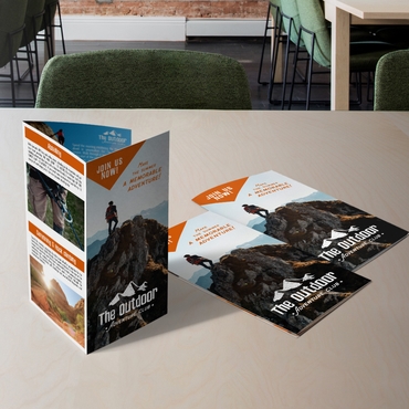
🔴 Red: Energy & Urgency

Red is powerful and intense.
It signals:
- Excitement
- Urgency
- Action
Use red when you want to:
✅ Highlight a sale
✅ Drive fast decisions
✅ Create a sense of urgency
Best for:
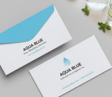
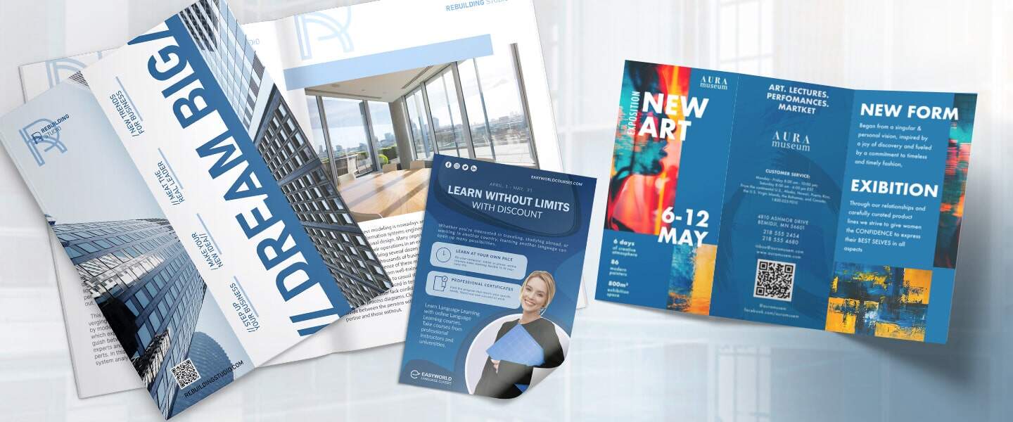
🔵 Blue: Trust & Stability
Blue is a favorite in business because it feels:
- Professional
- Safe
- Reliable
Studies show blue can:
- Lower anxiety
- Increase trust
Use blue when you want to:
✅ Build credibility
✅ Promote services like finance, healthcare, or consulting
✅ Calm your audience
Perfect for:
- Business Cards for consultants
- Brochures for professional services
🟡 Yellow: Optimism & Attention
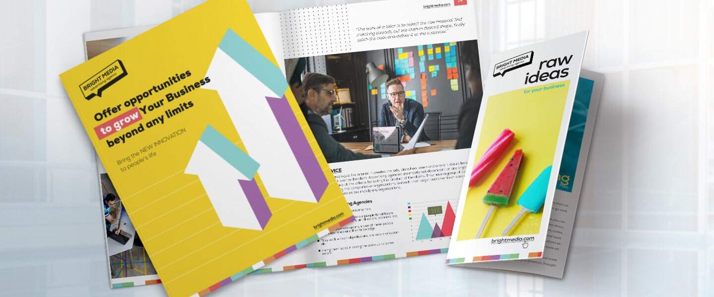
Yellow grabs attention and radiates positivity.
It’s perfect for:
- Drawing eyes to key headlines
- Creating a friendly, happy vibe
Use yellow when you want to:
✅ Promote creative industries
✅ Highlight special announcements
✅ Add energy without being too aggressive
Works beautifully on:
- Rack Cards for events
- Flyers with bold calls to action
🟢 Green: Growth & Wellness
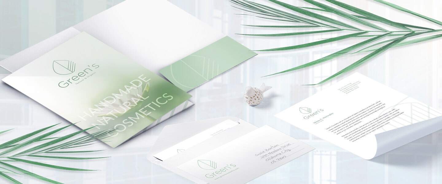
Green represents:
- Freshness
- Health
- Growth
It’s ideal for businesses in:
- Wellness
- Eco-friendly products
- Finance (think “growing wealth”)
Use green when you want to:
✅ Convey sustainability
✅ Promote relaxation
✅ Signal financial growth
Print ideas:
🟣 Purple: Luxury & Creativity
Purple has royal vibes and signals:
- Luxury
- Creativity
- Premium services
It’s less common—so it stands out fast.
Use purple when you want to:
✅ Position your brand as high-end
✅ Appeal to artistic audiences
✅ Convey uniqueness
Perfect for:
- Presentation Folders for premium proposals
- Business Cards in creative industries
⚫ Black & White: Elegance & Simplicity
Never underestimate black and white.
These colors:
- Feel sleek and modern
- Communicate sophistication
- Allow other colors to pop
Use black and white when you want to:
✅ Keep designs classy and minimalist
✅ Let your brand speak through typography and layout
✅ Save costs on multi-color printing
Great for:
Tips for Choosing Colors That Sell
- Know your brand personality. Are you playful or professional?
- Think about your target audience. Younger audiences love bright colors; B2B might prefer subtle shades.
- Keep it simple. Too many colors confuse the message.
- Use contrast to highlight calls to action.
- Test your designs. Print samples to ensure colors look as expected.
Dive deeper into effective print design in:
Ready to Print Colors That Convert?
Color is more than just a design choice—it’s a secret weapon that can make your brand unforgettable.
Choose your shades wisely—and turn your print materials into tools that sell.
Start designing vibrant, professional print pieces today at Overnight Prints.