Being invited to present an 18-minute TED Talk has the potential to be career defining. How does one score an invitation to the world-famous conference? To add the coveted title of “TED Talk speaker” to your resume, begin by growing your personal brand as an influential professional speaker in your field.
With the right marketing tools, you can book more speaking engagements, grow your influence and build your personal brand as a motivational speaker or life coach. Four key marketing materials you’ll need are an engaging speaker one-sheet, sleek personal logo, effective direct mail marketing and a standout business card.
1. SPEAKER ONE SHEET
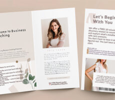
What is a speaker one sheet? This single piece of paper promotes your value as a professional speaker. It can be either single- or double-sided, and acts as a summarized biography of your expertise and experience. Your speaker sheet should include these 6 essential elements:
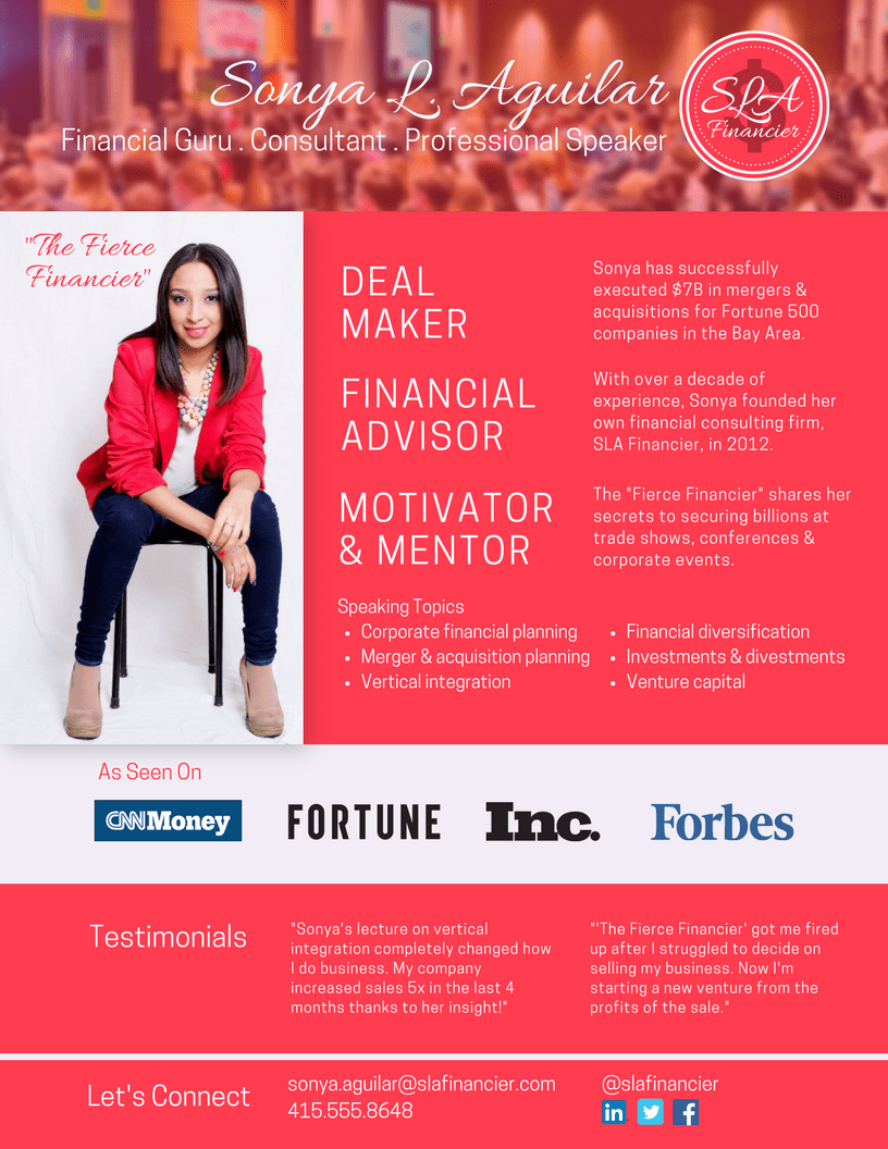
- Introduction and background
Begin with a catchy tagline that either describes or lists the benefits of the solution you offer. Basically, how well can you sell what you do? Plug in attention-grabbing adjectives that suit your profession and personality. Next, talk about your unique skills and accomplishments, photos of published works, and anything that differentiates and qualifies you as an influencer in your area of expertise.
- Speaking topics
Let people know how you can help. What will you be talking about? What new knowledge will attendees walk away with? Focus on the benefits of your solution to problems in business, finance, personal relationships, etc. - Past events and engagements
If you’ve been featured on TV, print media or at prominent industry events, don’t be shy. Brag about them with a couple logos. Note if you’ve been a keynote speaker or a featured speaker too. This speaks to your credibility and desirability as a paid professional speaker for trade shows, conferences and other events. - Testimonials
Sing your own praises! Here is where you can include a few quotes from audience members or event organizers who have nothing but nice things to say about your past presentations. - Contact information
Obviously, include your website, email or phone number for potential clients to schedule bookings. This is also a perfect way to drive organic traffic to your website or add to your online following by listing social media handles and pages. - Updated headshot
A current headshot will help put a name to a face. You ARE selling yourself here. The personal touch will go a long way to securing a rewarding career as a professional speaker.
Print high quality 8.5×11 flyers for your next speaking engagement. Speaker one sheets should also be made available as a downloadable PDF on your website to reinforce the handout.
2. PERSONAL LOGO
Just like a company, you should have a personal logo. Most professional speakers feature their name in a nice script or bold color, but this does not reflect who they are or what they teach. A good logo design gives a glimpse into what followers can expect.
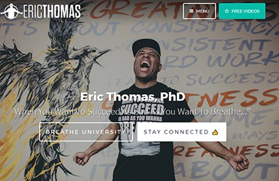
Eric Thomas – Motivational Speaker

“The Hip Hop Preacher” captures his personality perfectly with a simple silhouette for his personal logo. Eric “ET” Thomas is known for his casual dress, electric energy and “Thank God It’s Monday” tagline – all shown in the logo from his signature pose to the cap and T-shirt.
Zig Ziglar – Motivational Speaker and Trainer

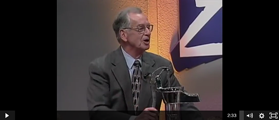
One of the most notable motivation speakers of all time, Zig Ziglar‘s Parable of the Pump explains his iconic logo. His lesson begins with priming the pump, or putting in some effort before expecting anything in return. Next is to sweat the pump, meaning one must put in the hard work necessary to get the flow of water started. Finally, reap the rewards and enjoy the flow of water from the pump.
Nick Vujicic – Evangelist and Motivation Speaker

Australian Christian evangelist and motivational speaker Nick Vujicic was born with a rare disorder that left him without arms or legs. His logo represents how his physical disability has not limited his capabilities. One of less than 10 known survivors living with tetra-amelia syndrome, Vujicic has learned to live a full life as a painter and skydiver who holds degrees in accounting and financial planning.

To start creating your personal logo, consult with a professional service like Overnight Prints Design Services.
3. DIRECT MAIL POSTCARDS
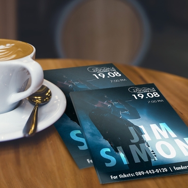
Unless you are the keynote speaker, chances are you’re competing with another presenter in the same timeslot. Drum up interest for your session through direct mail promotional postcards.
- Frequency
For a higher response rate, consider a series of postcards. Direct mail pieces mailed several weeks apart are good reminders leading up to the event. If the event is fast approaching, quickly follow up your postcard mailers with a personalized email instead. - Targeting
Hit the bullseye with a highly targeted mailing list. In addition to registered attendees, get ahold of the previous year’s list to invite prequalified prospects who have yet to sign up for your speaking engagement. - Sell a Solution
Value-proposition is one of the keys to an effective postcard mailer. Sell the benefit, not the product. A potential attendee wants to learn how a 2-hour, in-depth coaching session will exponentially increase sales rather than justify a costly business development course that takes up valuable time away from work to his or her boss. - Personalization
Work with a mailing service that personalizes each direct mail piece instead of a generalized “Dear Valued Customer” greeting that doesn’t make the recipient feel one-of-a-kind at all. - Sense of Urgency
An informative mailer does not incentivize action. To ensure a full house at your next event, let attendees know space is running out and offer limited time discounts or bonus materials for completing registration by a certain date. - Testimonials
Don’t dismiss the power of endorsements – it’s effortless, it appeals to emotions and it’s highly effective. One quote is all it takes to do half the selling for you.
Bonus Tip: Adhere carefully to USPS regulations when designing postcards or envelopes to avoid any delays in getting your direct mail sent out.
4. BUSINESS CARD
Follow these best practices for professional quality business cards that speak volumes.
- Size, Shape & Resolution
Choose from various business card shapes and sizes. Upgrade the standard calling card with an ultra-thick paper stock for a substantial feel or add a contemporary color insert. Ditch tradition entirely with a square or circle card. Whatever you fancy, set your design at 300 dpi for the most crisp text and images. - Color Mode
Keep in mind the differences between designing for print and web. RGB refers to the colors produced on screen while CMYK is the preferred color mode for print. - Add Bleed, Not Borders
Extending the background color or image by about 1/8 inch will help ensure your business cards have nice clean edges and no unwanted white stripes when the finished product is cut. - Legibility
Small text or “extra fancy” fonts might make your business card difficult to read. Choose more simple fonts sized at no less than 8 points for the best legibility. - Key Information
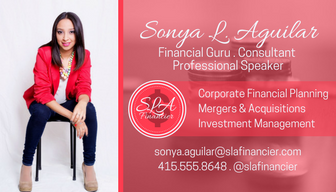
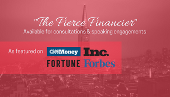
Of course your business card should have your basic contact information. Aside from your name, title, email address and website, include any other key information like social media handles. Also, take advantage of the backside with an inspiring quote or media mentions. - Saving Designs
Once you’ve designed the perfect business card, outline all text and images. Save the file in a file format accepted by your printer, such as JPEG, PNG or PDF.
With these marketing tools, you’re well on your way to branding yourself as an influential professional speaker. For more print marketing products, visit OvernightPrints.com


