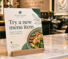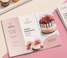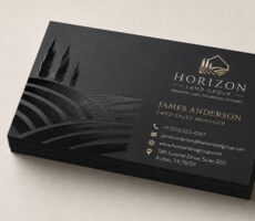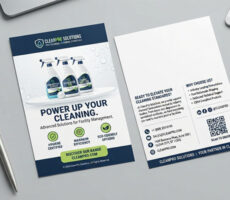
Both serif and sans serif fonts can work well in print; the best choice depends on what you’re printing, how much text readers need to read, the font size, and the personality you want your design to communicate.
Serif fonts have small decorative strokes at the ends of letters, while sans serif fonts don’t.
That’s the basic difference.
But when you’re designing something that will actually be printed, the decision becomes more interesting.
Should a business card use a clean sans serif? Are serif fonts easier to read in a brochure? What should you use for a flyer headline? Can you combine the two?
The answer isn’t simply serif = print and sans serif = digital.
Both can produce highly readable print designs when they’re used correctly.
Here’s how to choose.
What Is the Difference Between Serif and Sans Serif Fonts?
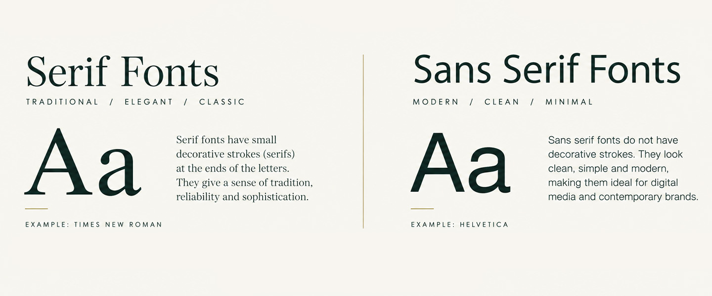
The main difference between serif and sans serif fonts is the presence of small strokes, often called serifs, at the ends of the letters.
Serif fonts have these additional strokes.
Examples include:
- Times New Roman
- Georgia
- Garamond
- Baskerville
- Bodoni
Sans serif fonts don’t have them.
“Sans” means “without,” so sans serif essentially means without serifs.
Examples include:
- Arial
- Helvetica
- Futura
- Open Sans
- Montserrat
Visually, that creates two noticeably different styles.
| Serif Fonts | Sans Serif Fonts |
| Have small strokes at the ends of letters | Don’t have decorative end strokes |
| Often feel traditional or editorial | Often feel modern and minimal |
| Frequently used in books and publications | Frequently used in branding, signage and digital design |
| Can work well for long printed text | Can work well for headlines and short printed text |
| Examples: Georgia, Garamond, Times New Roman | Examples: Helvetica, Arial, Futura |
Neither category is automatically better.
What matters is how the typeface works in the actual design.
What Is a Serif Font?
A serif font is a typeface with small strokes or extensions attached to the ends of its main letterforms.
Look closely at a traditional font such as Georgia or Times New Roman and you’ll notice these small details around letters like T, E, I, and H.
Serif fonts have a long history in printed typography, which is one reason they’re often associated with:
- Tradition
- Authority
- Elegance
- Sophistication
- Editorial design
- Formal communication
Adobe notes that serif typefaces are commonly used in books, newspapers, formal documents, luxury branding, and editorial design.
But that doesn’t mean serif fonts have to look old-fashioned.
A high-contrast serif paired with a minimalist layout, for example, can create a very contemporary design.
Popular Serif Font Examples
Common serif typefaces include:
Georgia — readable and versatile
Garamond — classic and elegant
Times New Roman — traditional and familiar
Baskerville — refined and formal
Bodoni — dramatic and sophisticated
The specific typeface matters just as much as the fact that it’s a serif.
Two serif fonts can communicate completely different personalities.
What Is a Sans Serif Font?
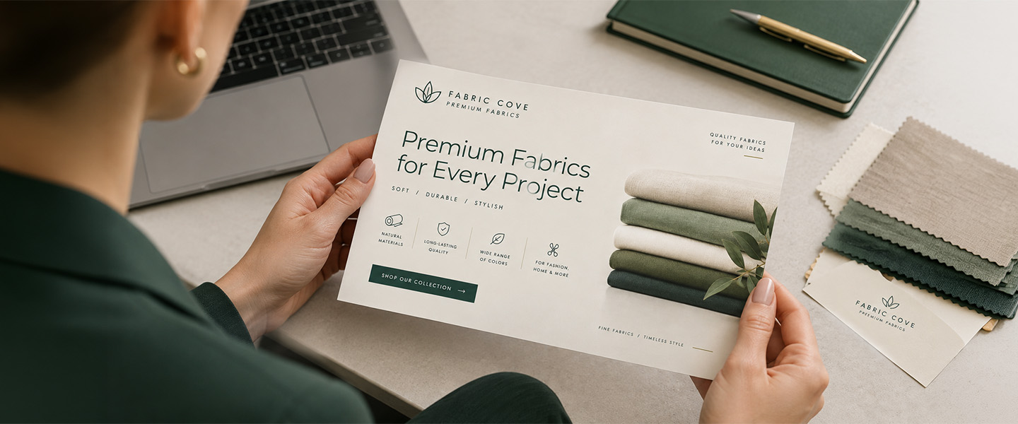
A sans serif font is a typeface without the small decorative strokes found on serif letterforms.
The result is generally a cleaner and simpler appearance.
Sans serif fonts are often associated with:
- Modern design
- Minimalism
- Simplicity
- Technology
- Direct communication
- Contemporary branding
You’ll see them frequently in logos, websites, signs, packaging, advertising, and business materials.
Popular Sans Serif Font Examples
Common sans serif typefaces include:
Helvetica — clean and neutral
Arial — familiar and versatile
Futura — geometric and modern
Open Sans — simple and highly readable
Montserrat — contemporary and bold
Again, don’t assume every sans serif communicates the same thing.
Futura can feel geometric and distinctive, while Arial is much more neutral.
Serif vs. Sans Serif: Quick Comparison
If you’re deciding between the two for a print project, start here:
| Serif | Sans Serif | |
| Appearance | Decorative strokes | Clean letterforms |
| Typical feel | Traditional, elegant, editorial | Modern, simple, direct |
| Long body copy | Often a strong choice | Can also work well |
| Headlines | Yes | Yes |
| Small print | Depends on typeface | Depends on typeface |
| Business cards | Yes | Yes |
| Flyers | Yes | Yes |
| Brochures | Especially useful for body copy | Useful for headings and body copy |
| Posters | Strong for stylistic headlines | Strong for bold, clear headlines |
| Branding | Traditional, premium, editorial | Modern, clean, approachable |
| Digital use | Works with appropriate design | Very common |
The important word throughout that table is depends.
Font category alone doesn’t determine whether something will be readable.
Size, weight, spacing, contrast, printing quality, and the individual typeface all matter.
Are Serif or Sans Serif Fonts Easier to Read in Print?
Serif fonts are traditionally associated with long-form print reading, but either serif or sans serif can be highly readable when the typeface, size, spacing, and layout are appropriate.
Serifs can help distinguish letterforms at smaller sizes, which is one reason serif fonts have historically been common in books, newspapers, and other text-heavy printed materials.
Adobe notes that serifs can support legibility at smaller scales in print and help distinguish individual letterforms.
However, that doesn’t mean putting a serif font on your design automatically makes it easier to read.
A cramped 7-point serif font with poor contrast may be much harder to read than a well-spaced 10-point sans serif.
When choosing a font for readability, consider:
- Font size
- Letter spacing
- Line spacing
- Line length
- Font weight
- Contrast
- Individual letter shapes
- Amount of text
- Printing size
The better question isn’t:
“Are serif fonts more readable?”
It’s:
“Is this particular font readable at the size and in the layout I’m printing?”
When Should You Use Serif Fonts in Print?
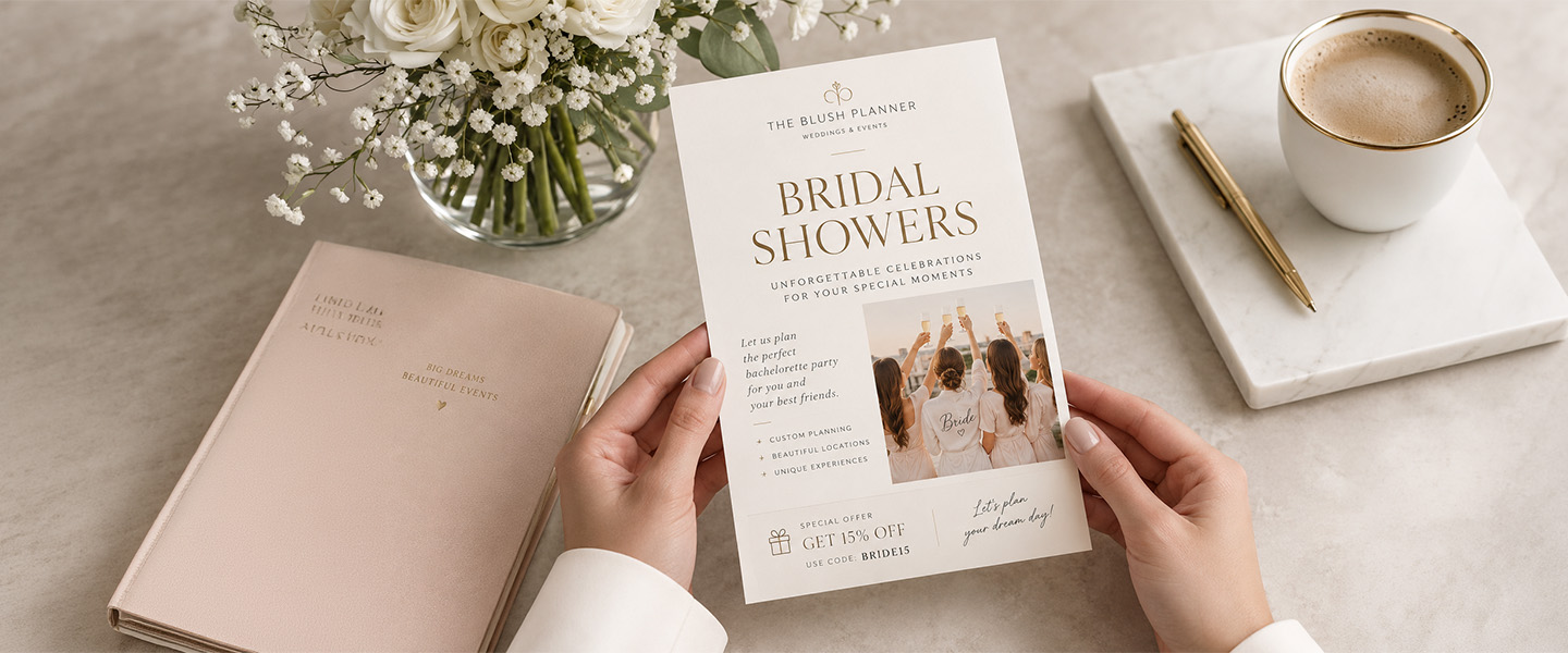
Serif fonts are worth considering when your design needs to feel established, refined, editorial, or traditional.
They can work particularly well for:
Books and Booklets
Serif fonts have a long history in long-form publishing.
If you’re creating a text-heavy booklet, a readable serif can work well for body copy.
The key is giving the text enough size and spacing rather than simply choosing a traditional-looking font.
Brochures
Brochures often contain more text than flyers or postcards.
That makes typography especially important.
A serif font can help create an editorial feel for the body copy, while a contrasting sans serif can be used for headings.
If you’re working on a brochure, our guide to designing effective marketing brochures covers additional layout and readability considerations.
Invitations
Serifs can add formality and elegance to:
- Wedding invitations
- Save-the-Dates
- Formal event invitations
- Announcements
Just be careful with extremely thin or decorative serif fonts, particularly when printing at small sizes.
Premium Branding
Some serif fonts can communicate heritage, craftsmanship, luxury, or sophistication.
That can make them useful for brands such as:
- Restaurants
- Boutiques
- Law firms
- Luxury businesses
- Hotels
- Beauty brands
- Professional services
But the typeface should still match the individual brand.
When Should You Use Sans Serif Fonts in Print?
Sans serif fonts are a strong option when your design needs to feel clean, contemporary, direct, or easy to scan quickly.
Consider them for:
Flyers
People often scan a flyer before deciding whether to read it.
Clear sans serif fonts can work particularly well for:
- Headlines
- Offers
- Dates
- Locations
- Calls to action
If you’re designing flyers, hierarchy is especially important. Readers should immediately understand what the flyer is about and what they’re supposed to do next.
Our guide to what people read first on flyers explains how hierarchy influences that first scan.
Posters
A poster may need to communicate from several feet away.
A bold sans serif with simple letterforms can make a headline easier to recognize quickly.
That doesn’t mean a poster must use sans serif, but highly decorative typography can become difficult to decipher at a distance.
Business Cards
Sans serif fonts are popular on modern business cards because they can create a clean design in a very limited space.
They can work particularly well for:
- Names
- Job titles
- Phone numbers
- Email addresses
- Websites
But don’t shrink the font simply because you’re running out of room.
If you’re struggling to fit everything, reconsider how much information belongs on the card. Our guide to what to put on a business card can help you prioritize.
Postcards
Sans serif fonts can also work well on postcards, particularly when the message needs to be understood quickly.
A short headline such as:
20% Off Your Next Visit
usually benefits more from clarity than elaborate typography.
Is Serif or Sans Serif Better for Business Cards?
Neither is universally better for business cards; choose the style that fits your brand while keeping names and contact information easy to read at the card’s final printed size.
A financial advisor might choose an understated serif to create a more established look.
A software company might use a geometric sans serif.
A luxury wedding photographer might combine an elegant serif name with a simple sans serif for contact details.
A contractor might use a bold sans serif throughout because clarity is the priority.
The practical rule is simple:
Brand personality determines the style. Readability determines whether the font stays.
Before ordering your cards, print your design at its actual 3.5 × 2-inch size and make sure every important detail remains comfortable to read.
For more design considerations, see our guide to common print design mistakes businesses make.
Is Serif or Sans Serif Better for Flyers?
For flyers, sans serif fonts are often useful for headlines and short messages, while either serif or sans serif can work for supporting text.
A flyer has to establish hierarchy quickly.
For example:
Headline: bold sans serif
Supporting copy: readable serif or sans serif
CTA: bold sans serif
But that’s only one approach.
A luxury event flyer might use a dramatic serif headline.
A bookstore could use serif typography throughout.
A modern gym might use a heavy sans serif.
Instead of choosing based on a rule, ask:
What does someone need to notice first?
Then make that element visually dominant.
Our flyer design guide covers how typography works alongside the offer, imagery, hierarchy, and call to action.
Is Serif or Sans Serif Better for Brochures?
Serif fonts can be particularly useful for text-heavy brochures, but well-designed sans serif fonts can work just as well.
Think about how much reading you’re asking someone to do.
A brochure containing several paragraphs needs typography that remains comfortable across the entire piece.
You could use:
Serif heading + sans serif body
or:
Sans serif heading + serif body
That contrast can also make it easier for readers to recognize the hierarchy between sections.
Whatever combination you choose, consistency matters.
Don’t introduce a new font every time you need something to stand out.
Can You Use Serif and Sans Serif Fonts Together?
Yes. Pairing a serif with a sans serif is one of the simplest ways to create typographic contrast in a print design.
For example:
Serif headline + sans serif body
creates one look.
Sans serif headline + serif body
creates another.
Because the two font categories have visibly different structures, readers can easily distinguish between levels of information.
Adobe recommends limiting designs to roughly two or three fonts rather than adding numerous competing typefaces.
That doesn’t mean you need three.
For many designs, two are plenty.
How to Pair Serif and Sans Serif Fonts
A good font pairing should create contrast without making the design feel disconnected.
Here are a few principles.
Give Each Font a Job
Don’t switch randomly between typefaces.
For example:
Font 1: headlines
Font 2: body copy
Use those roles consistently throughout the design.
Look for Contrast
Pairing two extremely similar fonts can make the difference look accidental.
Instead, try pairing:
- Elegant serif + clean sans serif
- Bold sans serif + classic serif
- High-contrast serif + neutral sans serif
Don’t Let the Fonts Compete
If your headline font has a lot of personality, consider keeping the supporting font simpler.
Two extremely distinctive fonts can fight for attention.
Keep the Brand in Mind
A pairing can look beautiful and still be wrong for the business.
Ask whether the typography feels appropriate for the brand’s:
- Audience
- Industry
- Personality
- Product
- Message
What Font Size Should You Use for Print?
There isn’t one perfect font size for every printed piece because fonts can appear significantly different even at the same point size.
An 8-point font with a large x-height may appear more readable than another typeface at 9 points.
That’s why you shouldn’t judge typography only on your monitor.
Print a test copy at actual size.
Look at it from the same distance a customer would.
For a business card, hold it in your hand.
For a flyer, place it on a counter.
For a poster, step several feet away.
Then ask:
Can I read the important information comfortably?
If not, make changes before ordering.
7 Font Mistakes to Avoid in Print Design
Choosing serif versus sans serif is only one typography decision.
Avoid these common mistakes too.
1. Using Too Many Fonts
More fonts don’t automatically make a design more interesting.
They often make it harder to follow.
Try using one or two typefaces with different weights and sizes to create hierarchy.
2. Making Important Text Too Small
If your contact information, terms, dates, or CTA are difficult to read, the design isn’t doing its job.
3. Using Thin Fonts on Busy Backgrounds
A delicate font can disappear against a photograph, pattern, or low-contrast color.
4. Using All Caps for Long Paragraphs
ALL CAPS can work for short headlines.
IT BECOMES MUCH MORE DIFFICULT TO SCAN WHEN EVERY SENTENCE LOOKS LIKE THIS.
Use it intentionally.
5. Choosing Style Over Readability
A beautiful script font isn’t useful if customers can’t read the phone number.
Decorative fonts are generally better reserved for short accents than essential information.
6. Ignoring Spacing
Typography isn’t only about the font.
Letter spacing, line spacing, margins, and white space affect how comfortably someone can read the design.
7. Only Checking the Design on Screen
Your printed piece has a fixed physical size.
A design that fills a 27-inch monitor can look very different when reduced to a business card.
Always review your artwork at its intended size before sending it to print.
If you’re preparing the final file yourself, follow our guide on how to prepare files for printing to avoid common production issues.
How to Choose Between Serif and Sans Serif for Your Print Project
If you’re still undecided, use these five questions.
1. How Much Text Is There?
For a few words on a poster, you have more freedom.
For several paragraphs in a booklet, sustained readability matters much more.
2. How Will People Read It?
Will someone hold it?
Scan it quickly?
Read it from across a room?
Spend several minutes reading it?
Design for the real viewing situation.
3. What Does Your Brand Feel Like?
Serif typography can help create a traditional, editorial, refined, or premium feeling.
Sans serif typography can help create a modern, clean, direct, or minimalist feeling.
These are associations—not rules.
4. What’s the Most Important Information?
Your font choice should support hierarchy.
Headlines, supporting copy, and calls to action shouldn’t all compete equally for attention.
5. Is It Actually Readable When Printed?
This is the final test.
Print it.
Look at it.
Read it.
Ask someone else to read it.
If your typography works in the real printed piece, that’s more important than following a rigid serif-versus-sans-serif rule.
Serif vs. Sans Serif: There’s No Single Winner
Choosing between serif and sans serif fonts isn’t about finding the font category that’s universally “best” for print.
It’s about matching typography to the job.
Use serif fonts when their readability and visual personality support your design.
Use sans serif fonts when their clarity and style better fit the message.
And use them together when contrast helps create stronger hierarchy.
Most importantly, don’t evaluate a font in isolation.
The best print typography considers the font, size, weight, spacing, contrast, hierarchy, medium, and viewing distance together.
Before sending your next business card, flyer, brochure, or postcard to print, look at the typography at actual size.
If it’s easy to understand and feels right for your brand, you’re on the right track.
Frequently Asked Questions
What is the main difference between serif and sans serif fonts?
Serif fonts have small strokes or extensions at the ends of their letters, while sans serif fonts do not. Serif fonts often have a more traditional or editorial appearance, while sans serif fonts often look cleaner and more modern.
Is serif or sans serif better for print?
Both can work well in print. Serif fonts are commonly used for long-form printed text, while sans serif fonts are common for headlines, signage, advertising, and modern branding. The individual font, size, spacing, contrast, and layout are more important than category alone.
Are serif fonts easier to read?
Serif fonts can work particularly well for long-form printed text, but serif isn’t automatically more readable. Typeface design, font size, spacing, contrast, line length, and the reader all affect readability.
What are examples of serif fonts?
Common serif fonts include Georgia, Garamond, Times New Roman, Baskerville, and Bodoni.
What are examples of sans serif fonts?
Common sans serif fonts include Helvetica, Arial, Futura, Open Sans, and Montserrat.
Should business cards use serif or sans serif fonts?
Either can work. Choose a font that reflects the brand while keeping names, phone numbers, email addresses, and other important information easy to read at the business card’s actual printed size.
Should flyers use serif or sans serif fonts?
Sans serif fonts are often effective for flyer headlines and calls to action because they can be simple and easy to scan. Serif fonts can also work for headlines or supporting copy when they suit the design and remain readable.
Can I combine serif and sans serif fonts?
Yes. Combining a serif with a sans serif can create clear visual contrast between headlines and body text. Keep the roles of each font consistent throughout the design.
How many fonts should I use in a print design?
One or two typefaces are enough for many print designs. Using different sizes, weights, and styles within those typefaces can create hierarchy without making the design feel cluttered.
What is the best way to test a font for print?
Print a test copy at the final physical size. Check important text for readability at the distance from which customers are likely to view the piece. This is particularly important for small products such as business cards and larger pieces intended to be read from a distance.