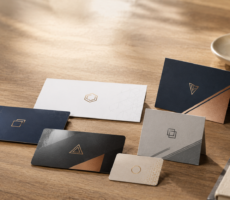
A good travel brochure makes people want to visit by combining inspiring images with useful information, a clear visual journey, and an easy next step for planning or booking the experience.
Imagine picking up two brochures for the same destination.
The first says:
WELCOME TO OUR BEAUTIFUL CITY
Then gives you three paragraphs about its history.
The second opens with:
48 Hours in Charleston
Walk cobblestone streets. Try Lowcountry classics. Watch the sunset from the harbor.
Underneath is a photograph that makes you want to be there.
Which one are you more likely to keep reading?
Travel brochures have an unusual job. They need to sell the feeling of a place while still being genuinely useful once someone becomes interested.
Too much inspiration and the brochure becomes a pretty advertisement.
Too much information and it becomes a directory.
The best travel brochure finds the space between the two.
Start With the Trip You’re Selling, Not the Brochure You’re Making
Before choosing photos, folds, fonts, or colors, answer one question:
What experience are you asking someone to imagine?
“Visit Miami” is broad.
“Spend a sunny weekend exploring Miami’s food, art, and beaches” gives the brochure a direction.
So does:
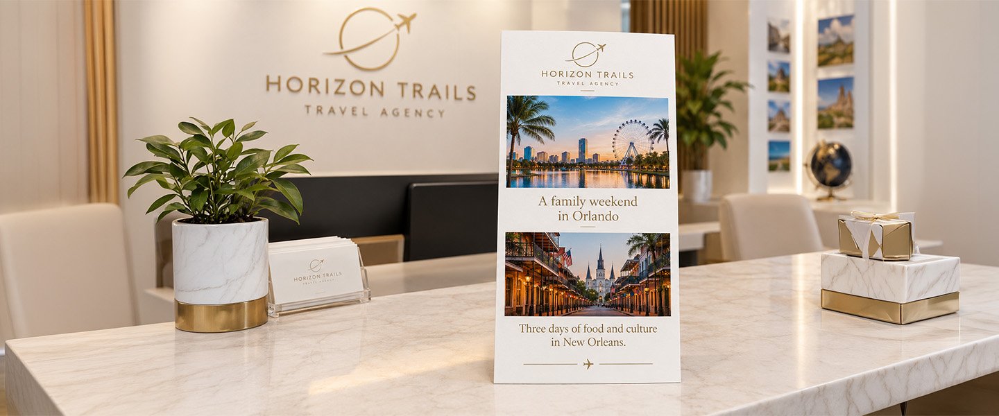
A family weekend in Orlando
Three days of food and culture in New Orleans
A romantic mountain escape
A self-guided historic walking tour
The best outdoor adventures in Colorado
The more specific the experience, the easier it becomes to decide what belongs in the brochure.
A family travel brochure might prioritize kid-friendly attractions, opening hours, transportation, and places to eat.
An adventure-tour brochure may focus on dramatic photography, difficulty levels, equipment, trip duration, and booking information.
A hotel brochure may spend more space on rooms, amenities, location, and nearby experiences.
Before you design anything, complete this sentence:
After reading this brochure, I want someone to ____________________.
Book a tour?
Visit a destination?
Explore an attraction?
Stay at a hotel?
Scan for an itinerary?
Come to the visitor center?
That’s your destination for the design, too.
Your Cover Has One Job: Make Me Open It
Don’t try to explain the entire destination on the cover.
Give people a reason to look inside.
A travel brochure cover generally needs three things:
A strong image
A destination or experience
A short hook
For example:
SAVANNAH
History around every corner.
Or:
DISCOVER THE BLUE RIDGE MOUNTAINS
Your weekend starts here.
Or even:
72 HOURS IN AUSTIN
Where to eat, explore, and listen.
Notice what’s missing?
A paragraph.
The cover isn’t where you explain everything.
It’s where you create curiosity.
Choose the Photo You’d Travel For
If you’re selling a destination, imagery does much of the emotional work.
Instead of choosing a photo simply because it’s technically beautiful, ask:
Does this show what makes the experience different?
A generic beach could be almost anywhere.
A recognizable coastline, local market, historic street, mountain trail, signature dish, or cultural experience tells a more specific story.
Whenever possible, prioritize authentic destination photography over images that feel interchangeable with another location.
Now Open the Brochure: What Should I See First?
Once someone opens the brochure, don’t immediately reward their curiosity with 400 words of text.
Give them orientation.
A strong opening panel might contain:
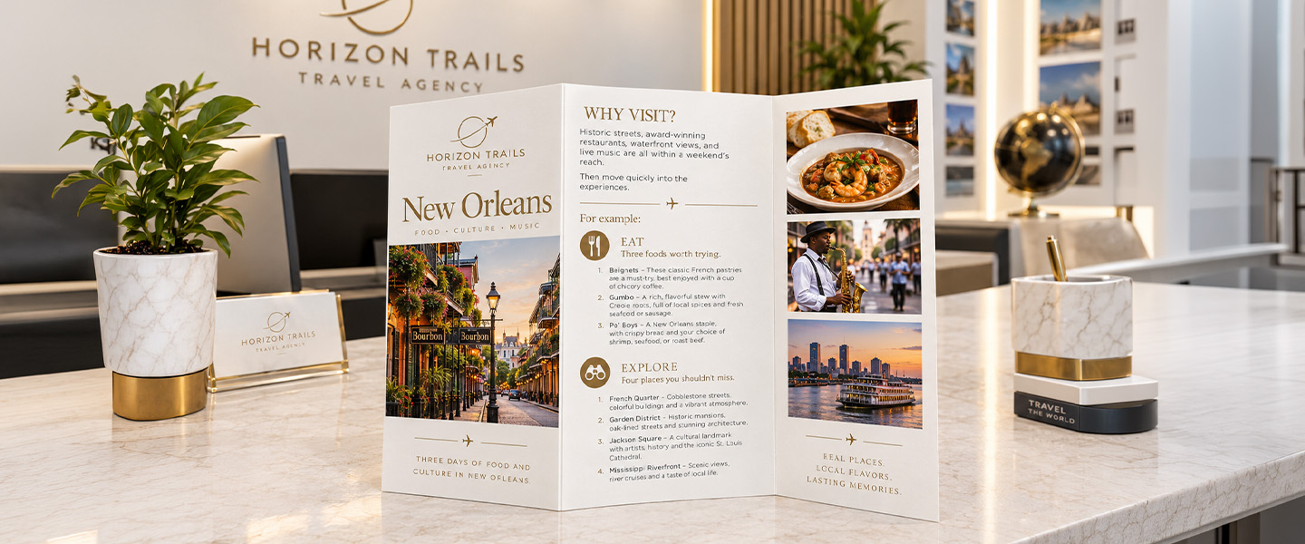
WHY VISIT?
Historic streets, award-winning restaurants, waterfront views, and live music are all within a weekend’s reach.
Then move quickly into the experiences.
For example:
EAT
Three foods worth trying.
EXPLORE
Four places you shouldn’t miss.
STAY
The neighborhoods that make the best base.
GO
The easiest ways to get around.
This approach makes the brochure easy to scan while still giving curious readers somewhere to go deeper.
Think in Experiences, Not Lists of Attractions
Here’s a common travel-brochure problem:
Museum of History
Central Park
Old Town
City Market
Waterfront
Cathedral
Art Museum
Technically useful.
Not particularly exciting.
Now compare:
Start in Old Town
Spend the morning exploring cobblestone streets, independent shops, and cafés before walking toward the waterfront.
Eat Your Way Through the City Market
Come hungry. Local vendors serve everything from regional specialties to quick snacks you can take with you.
End the Day by the Water
Head toward the harbor before sunset for one of the best views of the city.
Same destination.
Different experience.
One gives you a directory.
The other helps you imagine being there.
That’s one of the most important distinctions when writing travel brochures.
Don’t just tell readers what exists. Show them what they can do.
Give People Something They Can Actually Use
Inspiration gets attention.
Useful information gives the brochure a reason to stay in someone’s bag.
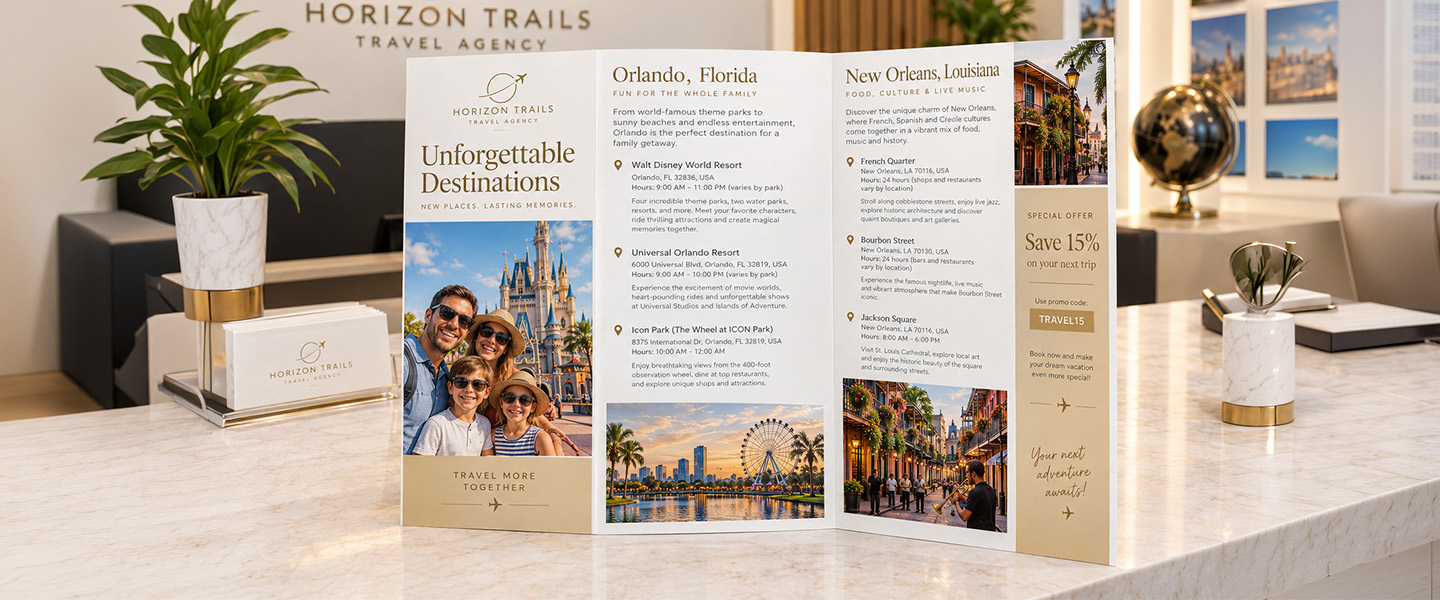
Depending on the destination, useful details could include:
- Opening hours
- Addresses
- Admission information
- Transportation
- Parking
- Walking distances
- Accessibility information
- Seasonal considerations
- Reservation requirements
- Tour duration
- Contact information
- Website
- QR code
- Visitor center location
You don’t need all of these.
Include the details someone realistically needs to take the next step.
A Tiny Map Can Do More Than Another Paragraph
If location matters, consider using some of the brochure’s space for a simple map.
It might show:
1 — Visitor Center
2 — Historic District
3 — City Market
4 — Museum
5 — Waterfront
The map doesn’t need every road in the city.
It needs enough context to answer:
Where are these places in relation to one another?
For walking tours, downtown districts, resorts, campuses, parks, attractions, and small destinations, that can be much more useful than another block of descriptive copy.
Build a Mini Itinerary
One of the easiest ways to transform travel information into something people want to save is to organize it into a trip.
Instead of another “Things to Do” list, try:
One Perfect Day in the City
9:00 AM — Start at the market
Grab breakfast from a local vendor before the crowds arrive.
11:00 AM — Explore the historic district
Walk the main streets and stop at the museum along the way.
1:00 PM — Lunch like a local
Try one of the neighborhood restaurants just beyond the main tourist area.
3:00 PM — Head to the waterfront
Walk the promenade or take a short harbor tour.
6:30 PM — Stay for sunset
Finish the day with dinner overlooking the water.
Now the brochure isn’t only promoting the destination.
It’s helping someone plan it.
That makes it much more likely to remain useful after the first read.
Don’t Hide the Local Details
People can search “top attractions in Boston” online in seconds.
Your brochure has an opportunity to tell them something more specific.
Try adding a small section such as:
KNOW BEFORE YOU GO
The historic district is easiest to explore on foot, so wear comfortable shoes.
LOCAL FAVORITE
Walk two blocks beyond the main square for smaller cafés and independent shops.
BEST PHOTO STOP
Visit the overlook just before sunset.
IF YOU HAVE AN EXTRA HOUR
Take the river path north from the visitor center.
These small details give the brochure personality.
They can also help establish why the organization behind the brochure knows the destination well.
What Should Actually Go in a Travel Brochure?
Instead of treating this as a checklist where everything must appear, think of the brochure in layers.
The Inspiration Layer
This makes someone interested.
Use:
- Destination photography
- Strong headline
- Short descriptive copy
- Distinctive experiences
The Planning Layer
This makes the brochure useful.
Use:
- Maps
- Addresses
- Hours
- Itineraries
- Transportation information
- Practical tips
The Action Layer
This tells someone what to do next.
Use:
- Website
- Booking information
- QR code
- Phone number
- Visitor center information
- Reservation CTA
If your brochure has all three layers, it can move someone from:
“That looks interesting.”
to:
“I’d like to go.”
to:
“Here’s how I can do it.”
Design the Panels as a Journey
If you’re creating a folded brochure, don’t think of it as one big sheet of paper.
Think about what happens as someone unfolds it.
For a tri-fold brochure, for example, you might create a flow like this:
| Panel | Purpose |
| Front Cover | Create desire |
| First Inside Panel | Introduce the experience |
| Inside Center | Highlight must-do experiences |
| Inside Right | Itinerary, map, or practical information |
| Fold-In Panel | Local tips or supporting information |
| Back Panel | Contact, QR code, booking information |
That’s only one possible structure.
The important part is that the content makes sense in the order the reader encounters it.
If you’re still choosing the physical format, our guide to tri-fold vs. bi-fold brochures explains how the different folds affect available space and content flow.
You can also explore custom brochure printing when you’re ready to choose the size, paper, and fold for the finished piece.
Let the Photos Breathe
Travel brochures naturally need strong imagery.
That doesn’t mean you need 17 photos.
One large, memorable photograph can have more impact than six tiny ones competing for space.
Consider using:
Hero image
One image that establishes the destination.
Experience images
A few supporting photos showing different things to do.
Detail image
Food, architecture, crafts, wildlife, or another close-up that adds personality.
Give important photographs enough room to work.
And avoid placing text over a busy image unless there is enough contrast for the words to remain comfortable to read.
Write Shorter Than You Think You Need To
Brochures have more room than flyers, but they’re still not books.
Compare:
Long version:
Our historic downtown district is one of the most popular attractions for visitors because it contains numerous historic buildings, independent boutiques, local restaurants, cafés, galleries, and other businesses that can be explored throughout the day.
Brochure version:
Explore Historic Downtown
Walk between historic buildings, local restaurants, independent shops, and galleries—all within a few blocks.
Same idea.
Less work for the reader.
Use:
- Short paragraphs
- Descriptive headings
- Captions
- Bullets where useful
- Callout boxes
- Short itineraries
If a section requires five dense paragraphs, consider whether the brochure should instead direct the reader to a website for the complete information.
Make Your Headings Do Some of the Writing
Compare these headings:
Attractions
Restaurants
Activities
They’re functional, but generic.
Now:
5 Stops Worth Leaving Downtown For
What to Eat While You’re Here
Spend an Afternoon Outdoors
Those headings communicate information before someone reads the paragraph underneath.
That’s useful because many people will scan the brochure first.
Your headings can answer:
What’s interesting here?
Why should I care?
What will I learn if I read this section?
Use Typography That Fits the Destination—but Still Reads Easily
Typography can reinforce the character of a place.
A heritage destination might suit a classic serif.
A contemporary city guide might use a clean sans serif.
A luxury resort could use more refined typography.
An outdoor adventure company might choose something bolder.
But don’t sacrifice readability to create atmosphere.
Decorative fonts can work for a short destination name or headline.
They become much harder to use for:
- Addresses
- Hours
- Instructions
- Itineraries
- Body copy
A simple approach is to use one distinctive typeface for headlines and a highly readable typeface for practical information.
Our guide to serif vs. sans serif fonts for print can help if you’re choosing between the two.
Give the Design a Sense of Place
The brochure should feel connected to the destination.
That can come from:
- Photography
- Color
- Typography
- Illustration
- Maps
- Local patterns
- Architecture
- Cultural references
But be selective.
A coastal destination doesn’t need seashells in every corner.
A mountain brochure doesn’t need every heading inside a pine tree.
A travel brochure can communicate place without becoming a collection of visual clichés.
Choose a few recognizable visual cues and use them consistently.
Don’t Let Branding Take Over the Destination
If you’re designing for a tourism organization, hotel, attraction, or tour company, the brand should be recognizable.
But remember what the reader is interested in.
Usually, it’s the experience.
A huge logo taking up half the cover is rarely more persuasive than a strong image of what someone could actually experience.
Keep:
- Logo
- Brand colors
- Typography
- Contact details
consistent without making the brochure feel like a corporate document.
The destination should remain the star.
Put the Call to Action Where the Decision Happens
A common brochure CTA is:
LEARN MORE
But you can be more useful.
Try:
Scan to build your weekend itinerary.
Book your walking tour.
See today’s opening hours.
Download the full trail map.
Reserve your stay.
Find events happening this weekend.
The CTA should tell someone what happens next.
A QR code can be particularly useful in a travel brochure because information such as prices, availability, events, and operating hours can change.
Instead of printing information that may quickly become outdated, the brochure can direct readers to a current online resource.
What Makes Someone Keep a Travel Brochure?
Think beyond the moment when someone picks it up.
Would they keep it?
A brochure becomes more useful when it contains something worth returning to, such as:
- Map
- Itinerary
- Checklist
- Walking route
- Restaurant recommendations
- Local tips
- Discount
- Event calendar
- Important contact information
This is why useful travel brochures often perform two roles:
Before the trip: inspiration.
During the trip: reference.
A brochure that can do both has a stronger reason to stay with the traveler.
Before You Print: Take the Brochure on a Test Trip
Don’t only proofread the words.
Pretend you’re the traveler.
Start at the cover.
Open the brochure.
Then ask:
Do I immediately understand where this is about?
Do I know why I should visit?
Can I find the most important attractions quickly?
Can I tell where things are?
Are addresses and hours easy to locate?
Can I read the smallest text comfortably?
Do I know what to do next?
Then check the production details.
Make sure:
- Photos have sufficient resolution
- Important content isn’t too close to trim lines
- Background images extend through the required bleed
- Text doesn’t disappear into folds
- QR codes work
- URLs are correct
- Phone numbers are correct
- Hours and prices are current
- Colors are prepared correctly for print
Our guide to how to prepare files for printing covers the technical side in more detail.
If you’re working with photographs, also remember that what you see on a screen doesn’t always reproduce identically in print. Our guide to CMYK vs. RGB for printing explains why.
A Travel Brochure Should Make the Trip Feel Possible
A beautiful destination photo can make someone stop.
But a useful brochure does more.
It helps them imagine the morning they’ll spend exploring downtown.
It tells them which neighborhood to visit.
It shows them how close the attractions are.
It gives them a route for the afternoon.
And when they’re ready, it tells them exactly where to book, visit, scan, or learn more.
That’s the balance to aim for:
Inspire enough to create desire.
Inform enough to make planning easier.
Design clearly enough that nobody has to work to find what they need.
If you’re creating tourism materials for a destination, hotel, attraction, visitor center, or travel business, custom brochures give you space to combine photography, practical details, maps, and storytelling in one take-away piece.
And when the amount of information grows beyond what a folded brochure can comfortably handle, a custom booklet may be a better format for longer visitor guides, destination guides, and multi-day itineraries.
The goal isn’t to fit everything there is to know about a destination into six panels.
It’s to include just enough that the reader wants to experience the rest for themselves.
Travel Brochure FAQs
What is a travel brochure?
A travel brochure is a printed or digital marketing piece that introduces a destination, attraction, accommodation, tour, or travel experience using a combination of imagery, descriptive content, practical information, and a call to action.
What should be included in a travel brochure?
A travel brochure can include destination photography, key experiences, attractions, maps, itineraries, local tips, addresses, transportation information, opening hours, contact details, a website or QR code, and a clear next step. The exact content should depend on what the traveler needs.
How do you make a travel brochure interesting?
Focus on experiences rather than simply listing attractions. Use strong destination-specific photography, descriptive headings, short copy, useful local details, and practical tools such as maps or itineraries.
How do you start a travel brochure?
Start by defining the specific experience you want to promote and what you want the reader to do afterward. Then build the cover around one strong image, the destination or experience name, and a short hook that gives someone a reason to open the brochure.
How much text should a travel brochure have?
Use enough text to explain the experience and provide essential planning information without creating dense panels. Short paragraphs, descriptive headings, maps, captions, itineraries, and callouts can make the information easier to scan.
What makes a good travel brochure cover?
A strong travel brochure cover usually combines an appealing destination-specific image, a clear destination or experience name, and a concise headline or hook. It should create curiosity rather than trying to explain the entire trip.
Should a travel brochure include a map?
Include a map when location and navigation are important to the experience. A simple map can be particularly useful for downtown districts, walking tours, attractions, parks, resorts, campuses, and destinations where several points of interest are close together.
What type of brochure is best for travel?
Tri-fold brochures are useful when information can be divided into several compact sections, while bi-fold brochures provide larger panels for photographs and longer content. Longer destination guides may work better as booklets. Choose the format based on the amount and sequence of information rather than automatically selecting a particular fold.
What is the purpose of a travel brochure?
A travel brochure can inspire people to visit while also helping them understand what to see, do, or book. Effective brochures balance destination marketing with useful planning information.
How can you make a travel brochure useful after someone arrives?
Include information travelers may need during the trip, such as maps, itineraries, local recommendations, addresses, transportation tips, opening information, QR codes, and useful contact details. This gives travelers a reason to keep the brochure rather than discard it after reading.