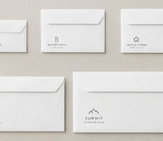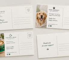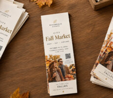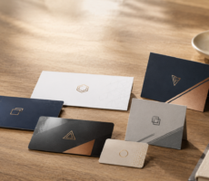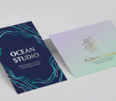
The most important layout design principles are visual hierarchy, alignment, balance, contrast, proximity, repetition, white space, and consistency—all of which help organize information and guide the reader through a print design.
A flyer can have beautiful colors and still be confusing.
A business card can use a great font and still feel unprofessional.
A brochure can contain exactly the right information and still be difficult to read.
The problem in all three cases may be the layout.
Layout determines where text, images, logos, calls to action, and other elements go—and how those elements work together.
Good layout design isn’t simply about making something look attractive. It helps people understand:
What should I look at first?
What information belongs together?
Where should my eyes go next?
What am I supposed to do?
Here are the core layout design principles you can use to create clearer, more effective print designs.
What Is Layout Design?
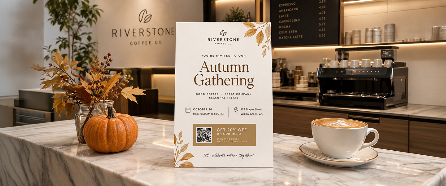
Layout design is the process of arranging text, images, graphics, and other visual elements within a defined space.
In print, that space might be:
- Business card
- Flyer
- Postcard
- Brochure
- Poster
- Booklet
- Menu
- Rack card
- Presentation folder
- Invitation
The goal isn’t simply to fit everything onto the page.
A strong layout organizes information so the reader can understand it in the intended order.
For example, an event flyer might guide the eye through:
Event name
↓
Date and location
↓
Main benefit or description
↓
Call to action
That sequence is intentional.
It’s the difference between placing information on a page and actually designing the page.
Why Are Layout Design Principles Important?
People don’t necessarily read a print design from the first word to the last.
They scan.
They notice some elements before others.
A large headline may attract attention first. A contrasting button or offer may pull the eye next. Smaller supporting copy may only be read after the viewer decides the message is relevant.
Layout design principles help control that experience.
They can make a design:
- Easier to scan
- Easier to understand
- More visually organized
- More consistent
- Less cluttered
- More professional
- More focused on the intended action
Canva describes visual hierarchy as the order in which people process information on a page. By intentionally prioritizing elements, designers can make content easier to understand.
That idea is especially important in print, where space is fixed.
You can’t scroll down for more room.
Every element has to earn its place.
1. Create a Clear Visual Hierarchy
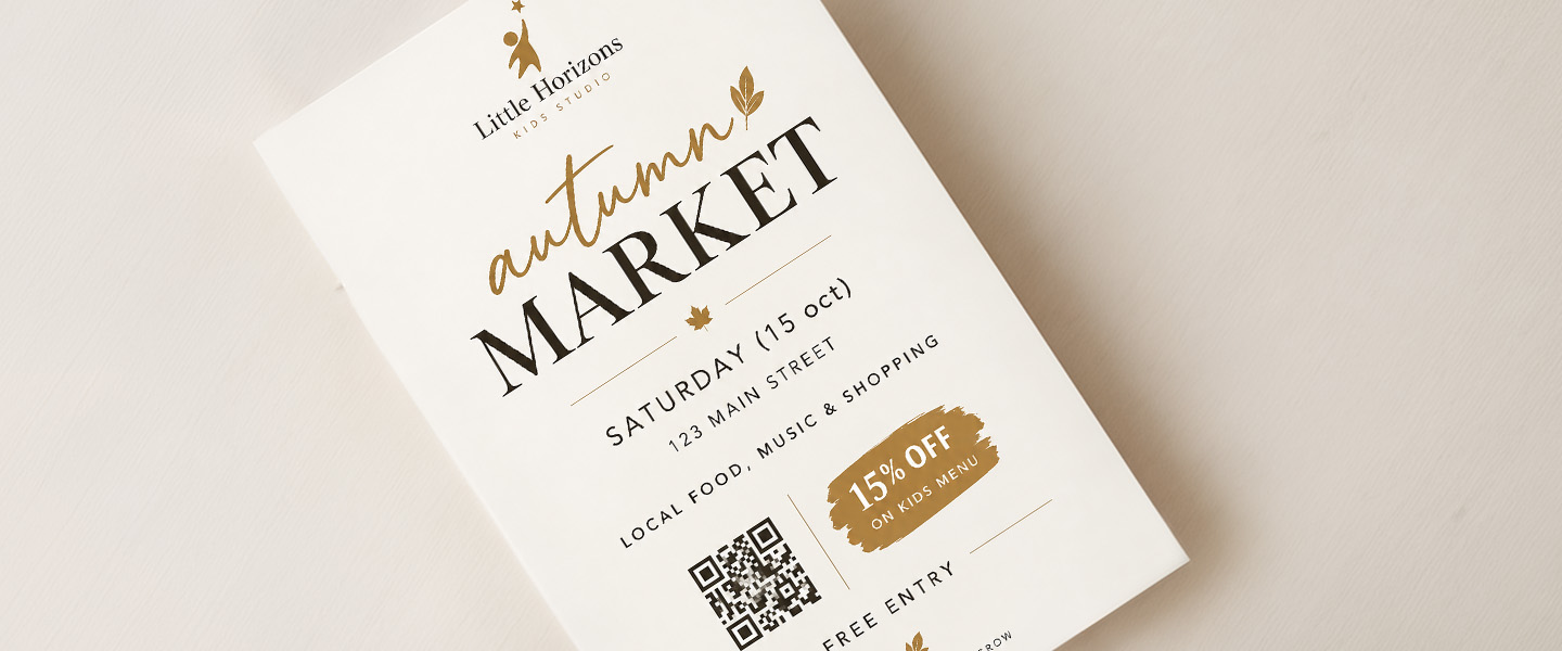
Visual hierarchy tells the reader what to look at first, second, and third.
It’s one of the most important principles in layout design.
Imagine a flyer where the following elements are all the same size:
SUMMER MARKET
SATURDAY, JULY 18
123 MAIN STREET
LOCAL FOOD, MUSIC & SHOPPING
FREE ENTRY
Nothing is technically missing.
But everything is competing for the same amount of attention.
Now imagine:
SUMMER MARKET
Local food, music & shopping
Saturday, July 18 · 10 AM–4 PM
123 Main Street
FREE ENTRY
The information hasn’t changed.
The hierarchy has.
You can create hierarchy through:
- Size
- Font weight
- Color
- Contrast
- Position
- Spacing
- Typography
- Images
Generally, the most important element should receive the strongest visual emphasis.
Adobe recommends identifying the main message first and establishing it as the focal point rather than allowing secondary information to overpower it.
Ask This Before Designing
Write down the three things someone needs to notice in order:
- __________________
- __________________
- __________________
Then make sure the layout visually reflects that order.
If everything looks equally important, nothing feels important.
2. Use Alignment to Create Order
Alignment means intentionally positioning elements in relation to one another.
Text, images, logos, and graphics shouldn’t look as though they were dropped randomly onto the page.
They should share visual lines.
For example:
Left-aligned
Headline
Supporting text
Offer
Website
creates a clear vertical relationship.
You can also align elements:
- Right
- Center
- Along a grid
- Along shared edges
- With other visual elements
There isn’t one alignment that’s correct for every design.
The important thing is that the alignment feels intentional and consistent.
Canva describes alignment as a principle that helps establish both order and hierarchy in a layout.
Misalignment, on the other hand, can make a design feel subtly wrong even when the viewer can’t explain why.
Be Careful With Center Alignment
Center alignment can work beautifully for:
- Invitations
- Formal announcements
- Simple posters
- Minimalist layouts
But long paragraphs of centered text can become difficult to scan.
For longer body copy, left alignment is usually easier to follow.
3. Create Balance
Balance is the distribution of visual weight throughout a design.
That doesn’t mean everything needs to be perfectly symmetrical.
There are two common approaches.
Symmetrical Balance
Elements are arranged similarly around a central axis.
For example:
Image
Headline
Supporting copy
CTA
all centered vertically.
Symmetrical layouts can feel:
- Formal
- Stable
- Orderly
- Calm
Asymmetrical Balance
Different elements are used on each side while the overall composition still feels balanced.
For example:
Large image on the left
balanced by
Headline + text + CTA on the right
The elements aren’t identical, but their visual weight feels intentional.
Adobe notes that balance can be symmetrical or asymmetrical; the goal is stability rather than making both sides identical.
How to Check Balance
Zoom out.
Does one corner feel unusually heavy?
Is every visual element sitting at the top?
Does one side contain several dark or large elements while the other is almost empty?
If something feels off, consider:
- Size
- Position
- Color
- White space
- Image weight
- Text density
Balance is about the composition as a whole.
4. Use Contrast to Show What’s Important
Contrast occurs when visual elements are noticeably different.
For example:
Large / small
Bold / light
Dark / light
Serif / sans serif
Color / neutral
Image / empty space
Contrast helps people distinguish one level of information from another.
Imagine a postcard where the headline, supporting copy, disclaimer, and CTA all use:
12 pt Arial Regular
Technically readable.
Visually flat.
Now imagine:
25% OFF YOUR NEXT ORDER
Supporting sentence in smaller regular type.
SHOP BY OCTOBER 31
The contrast creates hierarchy.
Adobe identifies contrast as a way to emphasize important elements and guide attention through a design.
Don’t Confuse Contrast With Chaos
Contrast doesn’t mean:
Five fonts.
Seven colors.
Three competing headline styles.
Contrast works when it helps distinguish meaningful differences.
Use it intentionally.
5. Group Related Information With Proximity
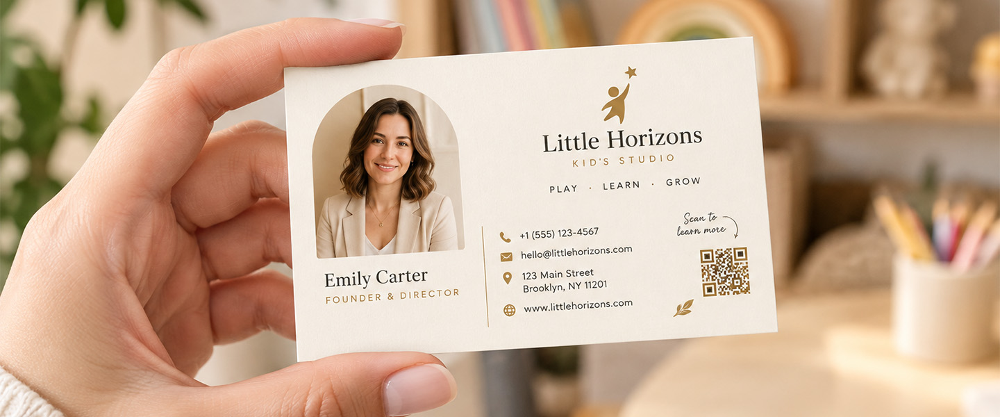
Elements that belong together should usually appear close together.
That’s the principle of proximity.
For example:
Sarah Johnson
Marketing Director
sarah@example.com
555-123-4567
Those elements form one logical group.
If the phone number were placed in the opposite corner of the design, the relationship would be less obvious.
Proximity can help group:
- Contact information
- Event details
- Pricing
- Product features
- Captions and images
- Offers and expiration dates
- Headlines and supporting copy
Adobe describes proximity as a way to organize related elements and create clearer relationships between information.
Space Can Communicate Relationships
If two things belong together:
Move them closer.
If they represent separate ideas:
Give them more space.
You don’t always need a border or box to separate information.
Sometimes spacing does the job better.
6. Don’t Be Afraid of White Space
White space is the area of a design that isn’t occupied by text, images, or other visual elements.
And despite the name, it doesn’t have to be white.
A large empty blue area is still white space.
So is the margin around a headline.
So is the space between two paragraphs.
White space can:
- Separate information
- Create emphasis
- Improve readability
- Give the eye somewhere to rest
- Make important elements stand out
- Reduce visual clutter
Canva emphasizes that white space helps organize layouts, create focus, and give the viewer’s eye a path through the design.
Empty Space Isn’t Wasted Space
A common beginner mistake is:
“There’s room here. Let’s add something.”
Another image.
Another icon.
Another sentence.
Another graphic.
Soon the design contains everything except a clear focal point.
Try asking:
Does this element help communicate the message?
If not, removing it may make the design stronger.
7. Use a Grid
A grid is an invisible structure that helps organize elements consistently.
Think of it as the skeleton underneath the design.
A simple grid might divide a page into:
2 columns
or:
3 columns
or:
Rows + columns
You can then align text, images, and other elements to those invisible guides.
Grids are particularly useful for:
- Brochures
- Booklets
- Menus
- Newsletters
- Multi-page documents
- Product sheets
- Presentation materials
They help keep:
- Margins consistent
- Columns aligned
- Images organized
- Text blocks related
- Pages visually connected
Canva includes grids among the tools designers can use to structure a composition and create visual flow.
Does Every Element Need to Stay Inside the Grid?
No.
Once you have structure, you can intentionally break it.
An image might span two columns.
A headline might stretch across the entire page.
A quote might extend beyond the main text area.
The difference is that you’re breaking the structure on purpose rather than positioning things randomly.
8. Use Repetition to Create Consistency
Repetition means reusing visual elements throughout the design.
That might include:
- Colors
- Fonts
- Shapes
- Icons
- Line styles
- Image treatments
- Heading styles
- Spacing patterns
Imagine a brochure where:
Page 1 uses blue headings.
Page 2 uses red headings.
Page 3 uses green headings.
Page 4 suddenly uses a different font.
Unless there’s a reason, the piece may feel disconnected.
Instead, establish patterns.
For example:
H1 → 26 pt Bold
H2 → 16 pt Bold
Body → 10 pt Regular
CTA → Brand color + Bold
Then repeat them.
Adobe notes that repetition helps tie elements together and is especially important for creating consistent brand communication.
9. Keep Typography Organized
Typography is part of the layout—not something you add after the layout is finished.
A simple typography hierarchy might contain:
Level 1: Headline
Largest and most prominent.
Level 2: Subheading
Smaller than the headline but clearly distinct from body text.
Level 3: Body Copy
Designed primarily for comfortable reading.
Canva recommends using typographic hierarchy to organize information and guide the reader through a layout.
You can establish those levels through:
- Size
- Weight
- Typeface
- Color
- Capitalization
- Spacing
You don’t necessarily need three different fonts.
Often, one font family with several weights is enough.
Or you might combine one serif with one sans serif.
If you’re choosing typography for a print project, our guide to serif vs. sans serif fonts for print explains when each style can work.
10. Use Color With a Purpose
Color should help organize and communicate—not simply decorate.
Use color to:
- Highlight a CTA
- Emphasize an offer
- Separate sections
- Reinforce branding
- Create contrast
- Establish hierarchy
For example:
If your entire flyer is blue and your CTA is orange, the CTA naturally attracts attention.
If everything is:
Blue.
Orange.
Yellow.
Red.
Green.
Purple.
then no color has much power to create emphasis.
Canva similarly recommends using color strategically rather than applying many competing colors that weaken hierarchy.
Color also carries associations, so consider how your palette supports the message and brand.
Our guide to print color psychology explores how color choices can affect the way printed materials are perceived.
11. Create a Focal Point
Every strong layout needs somewhere for the eye to begin.
That’s the focal point.
It could be:
- Headline
- Product photo
- Offer
- Event name
- Number
- Illustration
- CTA
Ask:
If someone sees this design for two seconds, what should they notice?
Make that element visually dominant.
You might use:
- Larger size
- Stronger contrast
- Different color
- Strategic positioning
- White space around it
Canva recommends establishing a focal point and then using secondary points of interest to guide the viewer through the rest of the composition.
A design with five focal points effectively has none.
12. Guide the Reader Through the Design
Once you’ve attracted attention, where should the eye go next?
A strong layout creates visual flow.
For a promotional flyer, that might be:
Headline
↓
Image
↓
Offer
↓
Date
↓
CTA
For a business card:
Name
↓
Role
↓
Company
↓
Contact information
For a postcard:
Offer
↓
Benefit
↓
CTA
Canva describes composition as arranging elements so the viewer is naturally guided through the design.
You can create that movement through:
- Position
- Size
- Alignment
- Directional imagery
- Contrast
- Spacing
- Shapes
- Lines
Don’t make the reader figure out where to look next.
13. Keep Important Information Away From the Edge
Print layout has an additional consideration that digital design doesn’t:
The paper gets cut.
Important text and logos shouldn’t sit directly against the trim edge.
Your print file may include:
Bleed: Artwork extending beyond the final trim size.
Trim line: Where the finished piece is intended to be cut.
Safe area: Space inside the trim where important content should remain.
Background colors and images intended to reach the edge generally need to extend into the bleed.
Important text, logos, and other essential elements should remain safely inside the trim.
The exact specifications can vary by product, so always check the printer’s template before submitting artwork.
If you’re preparing the artwork yourself, our guide to how to prepare files for printing covers resolution, bleed, color settings, and other production considerations.
14. Design at the Actual Print Size
A business card displayed across your entire computer monitor looks enormous.
The finished product isn’t.
That’s why one of the most important final layout checks is viewing your design at its intended physical size.
Print a test.
Then ask:
Can I read the smallest text?
Is the headline still dominant?
Does the spacing feel comfortable?
Are elements too close to the edge?
Is the CTA obvious?
Do images still look clear?
The intended use matters because print and digital designs are consumed differently. Adobe notes that print and digital formats have different size and resolution considerations.
A layout isn’t finished when it looks good at 300% zoom.
It needs to work in the customer’s hand—or from the distance where they’ll actually see it.
How Layout Principles Change by Print Product
The same principles apply across print products, but their importance changes depending on the format.
| Print Product | Layout Priority |
| Business Card | Simplicity + readable contact information |
| Flyer | Strong hierarchy + clear CTA |
| Postcard | Immediate message + strong focal point |
| Brochure | Grid + information organization |
| Booklet | Consistency + long-form readability |
| Poster | Distance readability + strong hierarchy |
| Rack Card | Fast scanning + vertical flow |
| Presentation Folder | Branding + clean organization |
| Menu | Grouping + hierarchy + easy navigation |
Understanding how the piece will be used should influence how you apply the principles.
Layout Design for Business Cards
A business card has very little room.
That makes restraint important.
Prioritize:
- Name
- Business
- Contact details
- Brand identity
Don’t make every element large because everything feels important.
Instead, establish hierarchy.
Our guide to what to put on a business card can help you decide which information deserves space.
Layout Design for Flyers
A flyer needs to communicate quickly.
Start with:
What should someone notice first?
Then:
What do they need to know?
Finally:
What should they do?
A simple structure might be:
Headline
Image
Offer / benefit
Details
CTA
For a deeper look at hierarchy, see what people read first on flyers.
Layout Design for Postcards
A postcard has to balance marketing content with the practical needs of the format.
Use the front to make the primary message immediately understandable.
Then use the back to support it with:
- Details
- CTA
- Contact information
- QR code
- Mailing elements
If you’re creating one from scratch, our guide to how to write a postcard explains what information belongs where.
Layout Design for Brochures
Brochures require more planning because information is distributed across several panels.
A brochure should help the reader understand:
Where do I start?
What do I read next?
Which information belongs together?
Use consistent:
- Margins
- Heading styles
- Image treatments
- Spacing
- Columns
If you’re deciding on the structure itself, see our comparison of tri-fold vs. bi-fold brochures.
Layout Design for Posters
Posters are often viewed from farther away than other print materials.
That changes the hierarchy.
Your most important information needs to be recognizable before someone gets close enough to read the smaller details.
A poster might prioritize:
EVENT NAME
↓
DATE
↓
LOCATION
↓
Supporting information
↓
CTA
Don’t treat a poster like an oversized flyer filled with paragraphs.
If you’re choosing the physical format, see our guide to poster sizes for storefronts, events, and promotions.
A Simple Layout Design Checklist
Before sending a print design to production, ask:
Hierarchy
- Is it obvious what I should look at first?
- Is secondary information visually secondary?
Alignment
- Do elements share clear alignment points?
- Does anything look accidentally out of place?
Balance
- Does the design feel visually stable?
- Is one area unnecessarily heavy?
Contrast
- Can I distinguish headlines, body copy, and CTAs?
Proximity
- Is related information grouped together?
- Is unrelated information clearly separated?
White Space
- Does the design have room to breathe?
- Have I filled space simply because it was available?
Typography
- Is the text readable?
- Are heading styles consistent?
- Am I using too many fonts?
Color
- Does color help create hierarchy?
- Is there enough contrast for important information?
Print Setup
- Is the document the correct size?
- Is bleed included where required?
- Is important information inside the safe area?
- Are images suitable for printing?
- Is the file using the required color settings?
Final Check
- Have I viewed or printed the design at actual size?
- Is the CTA obvious?
- Does the layout support the main message?
If several answers are “no,” keep designing.
Common Layout Design Mistakes
Making Everything Important
Large headline.
Large logo.
Large offer.
Large CTA.
Large photo.
If everything demands attention, the reader doesn’t know where to begin.
Centering Everything
Center alignment can work, but using it automatically for every element can weaken structure—especially in text-heavy designs.
Filling Every Empty Space
White space isn’t unfinished design.
Use it deliberately.
Using Too Many Fonts
Typography variety can create hierarchy.
Too much variety creates noise.
Ignoring Relationships
A caption shouldn’t look disconnected from its image.
An expiration date shouldn’t appear unrelated to the offer.
Use proximity to communicate relationships.
Designing Without a Grid
You don’t need a complicated 12-column professional grid for every project.
Even simple alignment guides can make the layout more consistent.
Forgetting About Print Production
A beautiful layout can still fail if text is cut off, images are low resolution, or colors don’t reproduce as expected.
Review our guide to common print design mistakes before finalizing your artwork.
Better Print Layouts Start With the Message
Good layout design isn’t about decorating every available inch.
It’s about organizing information so people understand it.
Start with the message.
Decide what matters most.
Build a clear hierarchy.
Align related elements.
Use proximity to create groups.
Add contrast where emphasis is needed.
Leave enough white space.
Use repetition to create consistency.
And check the finished composition at its real physical size.
Those principles apply whether you’re designing a business card, flyer, postcard, or brochure.
The dimensions change.
The amount of information changes.
The viewing distance changes.
But the goal stays the same:
Make it immediately clear what matters and guide the reader through the rest.
Frequently Asked Questions About Layout Design
What are the basic principles of layout design?
The basic layout design principles include visual hierarchy, alignment, balance, contrast, proximity, repetition, white space, consistency, and visual flow. Together, they help organize information and guide the viewer through a design.
What is visual hierarchy in layout design?
Visual hierarchy is the order in which a viewer notices and processes information. Designers create hierarchy using differences in size, color, contrast, typography, position, and spacing.
Why is alignment important in graphic design?
Alignment creates visual relationships between elements and makes a layout feel more organized. Text, images, and graphics that share alignment points are generally easier to navigate than elements positioned without a clear structure.
What is proximity in design?
Proximity is the principle of placing related elements near each other. It helps readers understand which pieces of information belong together without requiring additional borders, lines, or labels.
What is white space in graphic design?
White space, also called negative space, is any area of a layout that isn’t occupied by text, images, or other design elements. It doesn’t have to be white. White space can improve organization, readability, emphasis, and visual balance.
What is a grid in layout design?
A grid is an underlying system of rows, columns, margins, or guides used to organize elements consistently. Grids can help align text and images and maintain structure across a design or multi-page document.
What is balance in layout design?
Balance refers to how visual weight is distributed across a composition. A layout can use symmetrical balance, where elements are distributed similarly, or asymmetrical balance, where different elements create an overall sense of stability.
How do you create visual hierarchy in a print design?
Identify the most important information first, then use size, weight, color, contrast, position, and spacing to make it visually dominant. Secondary information should receive less emphasis so the viewer can understand the intended reading order.
How many fonts should you use in a print layout?
Many print designs can work effectively with one or two typefaces. Different weights, sizes, and styles within those typefaces can create hierarchy without introducing unnecessary visual clutter.
How can I make a print design look more professional?
Use consistent alignment and spacing, establish clear hierarchy, limit unnecessary elements, keep typography readable, use white space deliberately, maintain brand consistency, and review the design at its final physical size before printing.