Walk into a well-merchandised retail store and you usually know where to look first.
Products are grouped logically. Featured items stand out. Signs make promotions easy to understand. The layout naturally guides you from one display to another.
That’s visual merchandising at work.
Visual merchandising combines product placement, displays, lighting, signage, and store layout to make products easier to notice and shop. The goal isn’t simply to make a store look attractive—it’s to create an environment that helps customers discover products and make purchasing decisions.
Here are 15 practical visual merchandising tips and retail display ideas you can use in your store.
Key Takeaways
- Strong visual merchandising makes products easier to notice and understand.
- Grouping related products can help customers imagine how items work together.
- Retail signage should communicate promotions and product information quickly.
- Lighting, display height, and visual hierarchy help direct customer attention.
- Displays should be refreshed regularly to keep the shopping environment interesting.
1. Group Related Products Together
Instead of displaying products individually, show customers how multiple items work together.
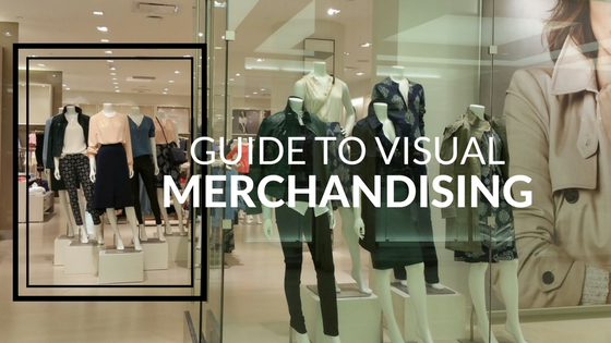
A clothing store might display a complete outfit. A home décor retailer could combine pillows, throws, and accessories into a room-inspired display. A beauty store could group products into a complete skincare routine.
This visual merchandising technique helps customers imagine how products could fit into their own lives.
It also creates natural opportunities for cross merchandising.
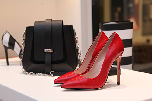
2. Use the Rule of Three
The Rule of Three is a simple visual merchandising technique: arrange products in groups of three.
Odd-numbered arrangements can create visual interest and help displays feel less rigid.
You can experiment with three:
- Products
- Sizes
- Heights
- Colors
- Related items
The products don’t necessarily need to be identical. The goal is to create a display that feels intentional while giving the eye somewhere to focus.
3. Create a Clear Focal Point
Customers shouldn’t have to figure out what they’re supposed to notice.
Every major retail display should have a clear focal point.
It might be:
- A new product
- A seasonal collection
- A promotional offer
- A bestseller
- A large image
- A bold headline
Use placement, scale, lighting, and signage to make the focal point visually dominant.
From there, supporting products can guide customers through the rest of the display.
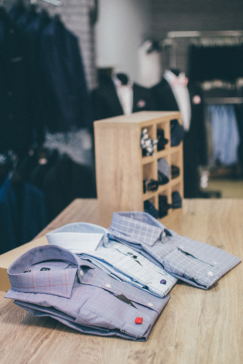
4. Use Different Heights
Displays where every product sits at the same level can easily blend together.
Varying product height creates dimension and helps important merchandise stand out.
Retailers can use:
- Display stands
- Shelves
- Product risers
- Tables
- Countertop displays
One option is a pyramid-style arrangement, where a taller or larger item becomes the focal point and smaller products are positioned around it.
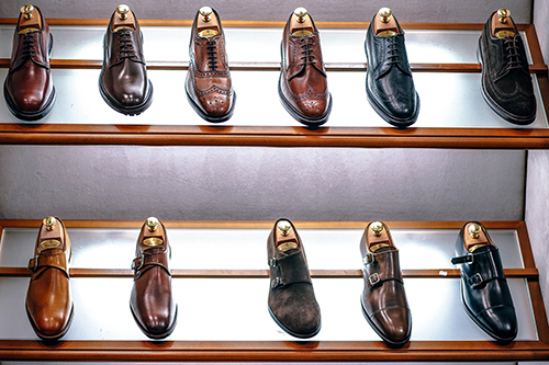
2. Use the Rule of Three
The Rule of Three is a simple visual merchandising technique: arrange products in groups of three.
Odd-numbered arrangements can create visual interest and help displays feel less rigid.
You can experiment with three:
- Products
- Sizes
- Heights
- Colors
- Related items
The products don’t necessarily need to be identical. The goal is to create a display that feels intentional while giving the eye somewhere to focus.
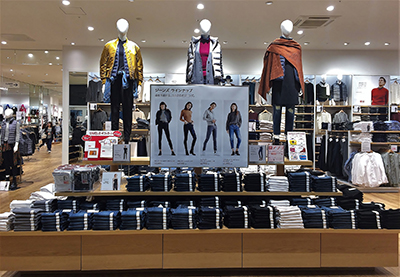
5. Use Lighting to Highlight Important Products
Lighting can influence which parts of a store customers notice first.
General lighting makes the store easy to navigate, while accent lighting can draw attention toward specific products or displays.
Consider using stronger lighting around:
- New arrivals
- Featured products
- Seasonal displays
- Window displays
- Promotional areas
Lighting should support the merchandise rather than make it difficult to see. Reflections and glare can reduce readability, particularly around printed promotional materials.
6. Use Cross Merchandising
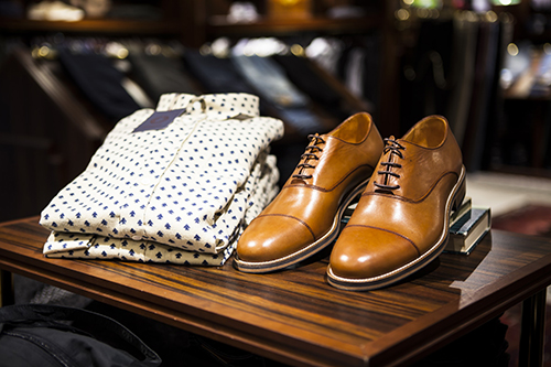
Cross merchandising means displaying complementary products together rather than separating everything strictly by category.
Think of the familiar online recommendation: “Frequently bought together.”
Retail stores can create the same effect physically.
A summer display, for example, could combine:
- Swimwear
- Sunglasses
- Sandals
- Beach bags
A home store might display coffee mugs beside coffee makers and specialty coffee.
The goal is to make related purchases feel natural and convenient.
7. Make Your Window Display Easy to Understand
Your storefront window may be a customer’s first interaction with your business.
Don’t try to show everything.
Effective window displays generally work better when they focus on one central idea, such as:
- A seasonal collection
- A new arrival
- An upcoming event
- A limited-time promotion
- A specific product category
Strong imagery, simple messaging, and a clear focal point can make the display easier to understand from outside the store.
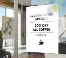
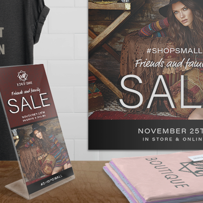
Printed Posters and Flyers can also provide context around promotions without overcrowding the display.
For more ideas, see our guide to the best poster sizes for storefronts, events, and promotions.
8. Add Retail Signage to Your Displays
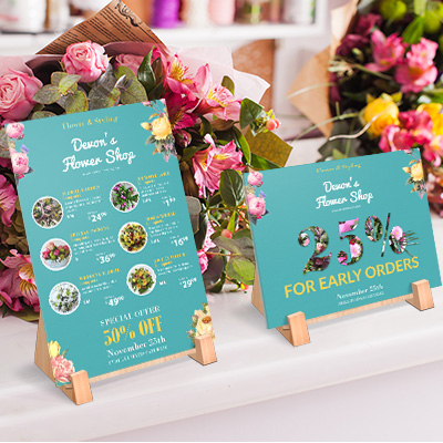
Products can attract attention, but signage explains why customers should care.
Retail signage can communicate:
- Prices
- Promotions
- Product benefits
- New arrivals
- Limited-time offers
- Directions
- Product categories
The most effective signage is usually easy to understand at a glance.
Instead of filling a sign with several messages, focus on one primary idea and create a clear visual hierarchy.
For temporary promotions, professionally printed Posters, Flyers, and Rack Cards can help reinforce the display.
Our guide to what people read first on a flyer explains how headlines, offers, and visual hierarchy influence attention.
9. Use Different Types of Retail Signage
Not every sign has the same job.
Directional Signage
Helps customers navigate the store and locate departments, checkout areas, fitting rooms, or other important spaces.
Informational Signage
Communicates practical information such as prices, product details, policies, or store information.
Promotional Signage
Highlights discounts, sales, seasonal campaigns, and special offers.
Persuasive Signage
Draws attention toward specific products using messages such as “New Arrival,” “Featured,” or “Limited Time.”
Before creating a sign, ask two questions:
Who needs to see it?
And:
What should they understand or do after seeing it?
10. Create Effective Point-of-Sale Displays
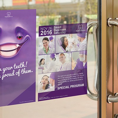
The customer journey doesn’t end when someone reaches the checkout counter.
Point-of-sale displays can highlight smaller or complementary products customers may want to add before completing their purchase.
Common examples include:
- Accessories
- Small gifts
- Seasonal items
- Low-cost products
- Promotional offers
Keep these displays simple.
Customers near checkout are already completing another task, so products and promotional messaging should be easy to understand quickly.
11. Make Promotions Visually Obvious
If you’re running a promotion, customers shouldn’t have to search for it.
Use signs and displays to clearly identify:
- Seasonal sales
- New arrivals
- Clearance merchandise
- Product bundles
- Limited-time promotions
- Special events
A professionally printed sign can give customers context that the merchandise alone cannot.
For example, instead of simply displaying several related products, signage can explain that they’re part of a seasonal collection or special promotion.
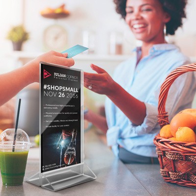
12. Design Displays Around How Customers Shop
Visual merchandising shouldn’t be based only on what looks good.
Consider how customers actually move through your store.
Which areas receive the most traffic?
Where do people naturally stop?
Which products require more explanation?
Which areas tend to be overlooked?
Your strongest displays should appear where they can realistically influence customer attention.
This may mean placing new products near entrances, impulse products closer to checkout, or complementary products beside items customers already intend to purchase.
13. Keep Displays Easy to Scan
More products don’t automatically make a better display.
Too many products, colors, signs, or messages can make it difficult for customers to understand what matters.
Instead, create a clear visual hierarchy.
Customers should be able to quickly identify:
- What the display is about.
- Which product or message matters most.
- What they should look at next.
The same principle applies to print marketing. Our guide to effective print design that gets read explains how hierarchy and simplicity can make marketing materials easier to process.
14. Refresh Displays Regularly
Customers who visit frequently can eventually stop noticing displays that never change.
You don’t need to redesign the entire store every week.
Instead, consider refreshing displays around:
- New inventory
- Seasonal changes
- Major promotions
- Holidays
- Local events
- Product launches
Even changing a focal product, sign, arrangement, or featured collection can give regular customers something new to notice.
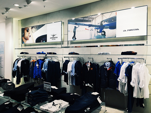
15. Match the Display to Your Industry
There isn’t one perfect visual merchandising strategy for every retailer.
Different businesses should adapt displays to how their customers shop.
| Retail Business | Visual Merchandising Idea |
| Clothing Store | Display complete outfits |
| Beauty Store | Group products into routines |
| Gift Shop | Create seasonal themed displays |
| Home Décor Store | Build room-inspired product arrangements |
| Electronics Store | Demonstrate products in realistic settings |
| Bookstore | Group titles by theme or recommendation |
| Specialty Food Store | Pair complementary products |
| Local Boutique | Highlight new and limited collections |
The strongest retail display ideas help customers understand not only what the product is, but also how it fits into their needs or lifestyle.
How to Increase Retail Visibility With Print
Visual merchandising isn’t limited to products and shelving.
Printed materials can help guide attention throughout the customer journey.
For example:
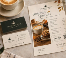
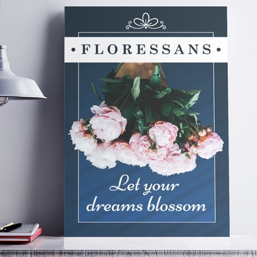
Posters can promote major offers in windows and high-visibility areas.
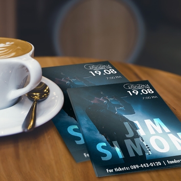
Flyers can provide information customers can take with them.
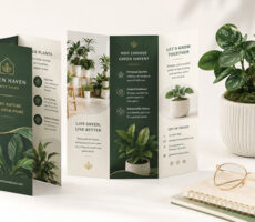
Rack cards can highlight services, promotions, or featured products at counters.
Booklets can provide more detailed product information when customers need additional context.
Car magnets can extend visibility beyond the physical store.
The format should match the amount of information customers need and where they’ll encounter it.
If you’re deciding between several promotional formats, our comparison offlyers vs. posters vs. rack cards can help you choose.
Common Visual Merchandising Mistakes to Avoid
Even attractive displays can become less effective when they’re difficult to understand.
Watch for these common mistakes:
- Displaying too many products at once
- Using too many competing signs
- Making promotional text too small
- Blocking important products with signage
- Using poor lighting
- Leaving outdated promotions on display
- Ignoring customer traffic patterns
- Keeping the same displays for too long
- Mixing unrelated products without a clear reason
- Creating displays that look good but don’t communicate a clear message
Always review your display from the customer’s perspective rather than from behind the counter.
Frequently Asked Questions About Visual Merchandising
What is visual merchandising?
Visual merchandising is the practice of organizing products, displays, signage, lighting, and other visual elements to attract attention and improve the in-store shopping experience.
What are some effective visual merchandising techniques?
Common techniques include grouping related products, using the Rule of Three, creating focal points, varying display height, using strategic lighting, cross merchandising, and adding clear retail signage.
What makes a good retail display?
A strong retail display has a clear focal point, is easy to understand, supports the products being promoted, and avoids unnecessary visual clutter.
What is cross merchandising?
Cross merchandising involves displaying complementary products together to help customers discover items they may want to purchase as a set.
Why is signage important in visual merchandising?
Signage gives customers additional context by communicating prices, promotions, directions, product information, and calls to action.
How often should retail displays be updated?
There is no single schedule for every store. Displays can be refreshed around new inventory, seasonal changes, promotions, holidays, or whenever existing displays are no longer attracting attention.
What is the Rule of Three in visual merchandising?
The Rule of Three involves grouping products or visual elements in sets of three to create an interesting, easy-to-view arrangement.
Final Thoughts
Good visual merchandising makes shopping easier.
Customers should be able to enter your store, understand what you’re promoting, find important products, and recognize relevant offers without having to work for the information.
Start with the basics: group related products, create clear focal points, use lighting strategically, keep displays easy to scan, and support important promotions with clear signage.
Then continue testing and refreshing your displays based on how customers actually interact with the store.
For professionally printed retail marketing materials, explore Posters, Flyers, Rack Cards, and other custom printing options from Overnight Prints.
Resources
- U.S. Small Business Administration (SBA) — Small business marketing and business planning resources.
- AIGA — Professional resources covering graphic design and visual communication.
- Federal Trade Commission (FTC) — Business guidance covering advertising and marketing practices.