Key Takeaways
- Overcrowded layouts make print materials harder to understand and can make a business appear less organized.
- Consistent colors, fonts, logos, and visual styles help create a more professional brand experience.
- Readability should always come before decorative design choices.
- High-resolution images and proper spacing can significantly improve perceived print quality.
- Paper stock, finishes, and overall printing quality influence how customers perceive a brand.
- The best print designs focus on what customers need to understand and do next.
Introduction
A business can offer incredible service and still look unprofessional because of its print materials.
Customers often form an impression long before they experience the actual product, service, or expertise behind a company. A Business Card handed over during a meeting, a Flyer displayed in a storefront, or a Brochure sitting at a reception desk can all influence how a business is perceived.
Most customers are not consciously analyzing the design.
They are reacting to how it makes the business feel.
Some print materials immediately communicate professionalism and attention to detail. Others create uncertainty because something about the design feels crowded, inconsistent, outdated, or difficult to read.
Fortunately, many of the print design mistakes that create these problems are relatively easy to identify and correct.
Why Professional Print Design Matters
Print materials are often part of a customer’s first interaction with a business.
That means small design choices can influence whether a company appears established, organized, trustworthy, or prepared.
Professional design is not necessarily complicated design.
In many cases, it is the opposite.
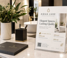
Clear hierarchy, consistent branding, readable typography, good spacing, strong images, and quality printing can make even simple marketing materials feel more polished.
This becomes especially important when businesses use multiple printed products across the customer journey.
For example, a customer might first see a Postcard, pick up a Flyer, receive a Business Card, and later review a proposal presented inside a Presentation Folder.
When those materials feel visually connected, the brand feels more established.
When they do not, the customer experience can feel fragmented.
For more ways physical materials influence brand perception, read Professional Print Materials for Businesses.
1. Trying to Fit Too Much Information Onto the Page
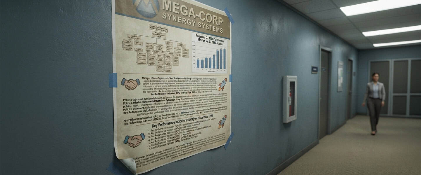
One of the fastest ways to make print materials feel unprofessional is overcrowding them.
Businesses often assume that more information creates more value, so they try to include:
- every service,
- every promotion,
- every social media platform,
- every contact method,
- and every selling point.
The result can quickly become visually exhausting.
Customers do not experience marketing materials like detailed reports. They usually scan them first and decide within moments whether something deserves more attention.
This is particularly important for Flyers, Postcards, Rack Cards, and Brochures.
Before adding another piece of information, ask:
What is the most important thing the customer needs to understand?
Then make that message easy to find.
A strong print piece should quickly communicate what matters, where the reader should look next, and what action they should take.
Clarity usually feels more professional than quantity.
For additional guidance on creating stronger visual hierarchy, see Effective Print Design That Gets Read.
2. Using Inconsistent Branding Across Print Materials
Your website looks modern.
Your social media uses your current branding.
But your brochure still uses an old logo.
Your business card has outdated typography.
And your latest flyer introduces completely different colors.
Individually, these changes may seem small. Together, they make a brand harder to recognize.
Strong branding should feel connected across products such as:
- Business Cards
- Brochures
- Letterhead
- Envelopes
- Postcards
- Presentation Folders
That does not mean every product needs to look identical.
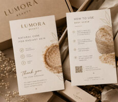
Instead, customers should recognize the same overall visual identity through consistent colors, typography, logo usage, photography, and tone.
Consistency creates familiarity, and familiarity can help build confidence in a business.
If your materials have accumulated over several years, a regular print audit can help identify products that no longer match your current brand.
3. Choosing Fonts That Prioritize Style Over Readability
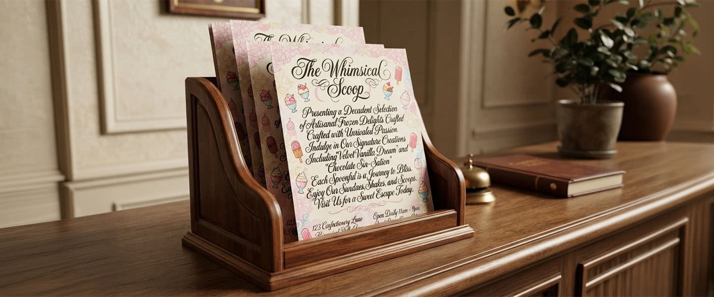
Typography has a major influence on how professional printed materials appear.
Decorative fonts can be useful in the right context, but they become a problem when style starts interfering with readability.
This happens frequently when businesses try to make designs appear more:
- creative,
- luxurious,
- modern,
- or unique.
Customers should not have to work to understand your message.
Professional print typography should generally feel clean, balanced, easy to scan, and appropriate for the brand.
Decorative typography can still be used for headlines or small accents, but important information such as contact details, prices, dates, addresses, and calls to action should remain easy to read.
This is particularly important on smaller formats such as Business Cards and Postcards, where available space is already limited.
The Most Common Print Design Mistakes
| Design Mistake | Why It Hurts Professionalism |
|---|---|
| Overcrowded layouts | Creates visual stress and makes information difficult to scan |
| Inconsistent branding | Makes the business feel less cohesive |
| Hard-to-read fonts | Reduces readability immediately |
| Low-quality images | Weakens perceived quality |
| Poor spacing | Makes layouts feel rushed and crowded |
| Too many colors | Creates unnecessary visual competition |
| Weak print quality | Reduces the impact of an otherwise strong design |
| Outdated information | Can create confusion and reduce customer confidence |
Most businesses do not intentionally create these problems.
They usually develop gradually through rushed updates, old templates, inconsistent design decisions, or attempts to force too much information into a limited space.
4. Using Low-Quality Images
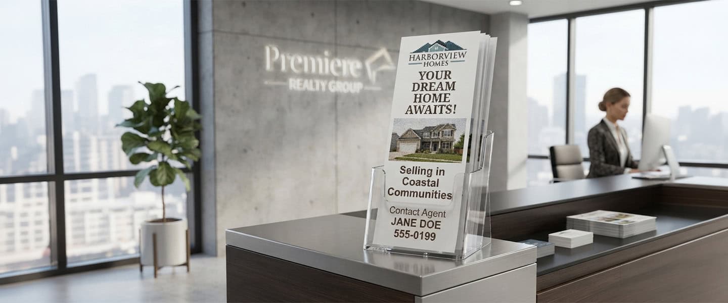
Customers interact with polished visual content every day, which means expectations around image quality are high.
Blurry graphics, pixelated logos, stretched photos, or poorly lit images can quickly make printed materials look dated.
Image quality is especially important for industries where visual presentation influences buying decisions, including:
- real estate,
- restaurants,
- beauty,
- fitness,
- hospitality,
- events,
- and professional services.
The solution is not necessarily to add more images.
Often, using fewer high-quality visuals produces a stronger result than filling a layout with multiple weak images.
Before sending a design to print, check that logos and photos are sharp, properly sized, and suitable for the final printed dimensions.
5. Ignoring White Space and Spacing
Spacing is one of the easiest design elements to underestimate.
When headlines, images, paragraphs, logos, and contact details sit too close together, the entire layout starts to feel crowded.
Good spacing gives each element room to work.
It also creates a visual path that helps readers understand:
- where to look first,
- what information comes next,
- and what they should do afterward.
This is especially useful for information-heavy products such as Brochures, Booklets, and Flyers.
White space is not wasted space.
Used intentionally, it makes important information easier to notice.
6. Using Too Many Colors
Color can make print materials memorable, but adding more colors does not automatically create a stronger design.
Too many competing colors can weaken hierarchy and make it difficult for customers to understand which elements deserve attention.
Instead, build designs around a controlled brand palette.
Use your primary brand colors consistently and introduce accent colors only when they serve a clear purpose, such as highlighting a promotion or call to action.
Color should help organize the design rather than compete with the message.
For a deeper look at how color influences perception, read Print Color Psychology.
7. Choosing Cheap Printing Over the Right Printing
A strong design can still lose impact when the physical print quality does not support it.
Thin paper, washed-out colors, faded blacks, weak finishing, or unsuitable materials can change how customers experience the finished product.
This matters particularly during high-value customer interactions such as:
- networking,
- consultations,
- sales meetings,
- trade shows,
- presentations,
- and proposals.
Customers experience printed materials through touch as well as sight.
For example, a Premium Business Card may be more appropriate for a business trying to create a high-end first impression, while Ultra Thick Business Cards can create an even more substantial tactile experience.
The right choice depends on the brand, audience, purpose, and budget.
For a closer comparison, read Cheap vs. Premium Business Cards and Choosing the Best Paper for Your Print Project.
8. Designing for Yourself Instead of the Customer
One of the biggest print design mistakes happens before the design process even begins.
Businesses sometimes make decisions based primarily on:
- personal preferences,
- internal opinions,
- design trends,
- or what competitors are doing.
But effective print marketing should start with the customer.
Ask:
What does the customer need to know?
How quickly will they see this material?
What information matters most to them?
What should they do next?
A restaurant menu, for example, has different usability requirements than a networking business card. A promotional poster has a different job than a detailed booklet.
The format and design should reflect how customers will actually use the material.
9. Forgetting to Update Old Print Materials
Even a beautifully designed piece can appear unprofessional when the information is outdated.
Common problems include:
- old phone numbers,
- outdated addresses,
- discontinued services,
- expired promotions,
- old logos,
- outdated social media handles,
- and incorrect business hours.
Because businesses often reorder existing designs, these mistakes can survive much longer than expected.
Before reprinting anything, review both the design and the information.
This is especially important for frequently reordered products such as Business Cards, Flyers, Brochures, and Letterhead.
See Print Materials Businesses Forget to Update for a more complete checklist.
How to Make Print Materials Look More Professional
Improving print design does not necessarily require starting over.
Begin by reviewing your current materials and removing anything that creates unnecessary visual competition.
Then check five areas:
Hierarchy: Is the most important message immediately visible?
Branding: Do the colors, fonts, logos, and visual style match your other materials?
Readability: Can customers understand important information quickly?
Spacing: Does the layout have enough breathing room?
Print quality: Does the paper, finish, and final production quality support the image you want your business to project?
Sometimes improving just two or three of these areas can significantly change the finished result.
For additional examples of what can weaken a printed piece, read What Makes Print Marketing Feel Cheap and Print Mistakes Small Businesses Make.
Which Print Materials Should Businesses Review First?
If you have a large collection of branded materials, start with the products customers see most frequently.
Business Cards
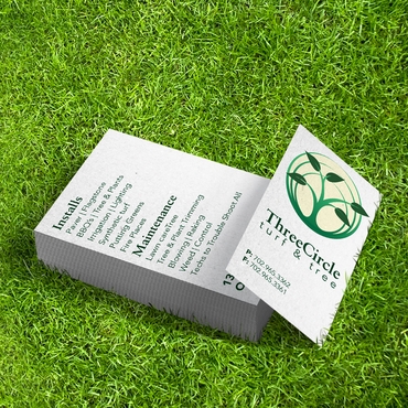
Your Business Cards often represent the brand during direct personal interactions.
Check the logo, contact details, typography, spacing, and overall print quality.
Flyers and Postcards
Flyers and Postcards need particularly strong visual hierarchy because customers may only give them a few seconds of attention.
Make the main message and call to action easy to identify.
Brochures and Booklets
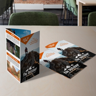
Longer formats such as Brochures and Booklets require consistent spacing, typography, and organization across multiple panels or pages.
Letterhead and Envelopes
Branded Letterhead and Envelopes may be simple, but outdated logos or inconsistent branding can make business communication feel less polished.
Presentation and Pocket Folders
Presentation Folders and Pocket Folders are often used during proposals, meetings, and presentations where professionalism matters considerably.
They should feel consistent with the documents and materials placed inside them.
Why Choose Overnight Prints for Professional Business Printing?
Good design works best when the finished product supports it.
Overnight Prints offers a wide selection of customizable print products businesses can use to create a more consistent and professional brand presence.
Businesses can coordinate products including Business Cards, Flyers, Brochures, Postcards, Letterhead, Presentation Folders, and more.
Whether you are refreshing one outdated piece or updating your entire collection of marketing materials, keeping design and print quality consistent can help create a stronger experience at every customer touchpoint.
Frequently Asked Questions
What makes a print design look unprofessional?
Common problems include overcrowded layouts, inconsistent branding, difficult-to-read fonts, low-resolution images, weak spacing, excessive colors, outdated information, and print quality that does not match the intended brand image.
How many fonts should I use in a print design?
In most cases, limiting the design to a small number of complementary fonts creates better consistency and readability. Different weights and sizes within the same font family can also create hierarchy without introducing unnecessary visual variation.
How can I make my flyers look more professional?
Start with one clear primary message, create strong hierarchy, use high-quality images, maintain consistent branding, leave enough white space, and make the call to action easy to find.
For more detailed guidance, see How to Design Flyers That Actually Convert.
Does paper quality affect how professional print materials look?
Yes. Paper thickness, texture, finish, and print reproduction all influence the physical experience of printed materials. The right option depends on the product, purpose, brand positioning, and budget.
Should all my business print materials have the same design?
They do not need to be identical, but they should clearly belong to the same brand. Consistent colors, fonts, logos, photography styles, and overall visual direction help create recognition.
How often should businesses review their print materials?
Businesses should review materials whenever important company information changes and periodically check frequently reordered products for outdated information, branding inconsistencies, or designs that no longer reflect the business.
Conclusion
The print design mistakes that make businesses look unprofessional are rarely dramatic.
They are usually small details that gradually weaken the overall impression:
crowded layouts, inconsistent branding, difficult typography, poor spacing, low-quality images, outdated information, or weak print quality.
Professional print design does not require adding more.
Often, the strongest improvement comes from simplifying the message, creating clearer hierarchy, maintaining consistency, and choosing print options that support the brand.
Before placing your next print order, review what customers actually see.
A few thoughtful design changes can make your materials easier to understand and help your business present itself more consistently.
Explore professional Business Cards, Flyers, Brochures, Postcards, and other custom printing options at Overnight Prints.
Resources
For additional guidance on branding, design, and professional marketing materials:
- U.S. Small Business Administration (SBA) – Resources for small business branding, marketing, and business development.
- PRINTING United Alliance – Printing industry education, technical resources, and information about professional print production.
- American Marketing Association (AMA) – Marketing research and resources related to branding, customer experience, and marketing strategy.